All the cheese that’s fit to print.

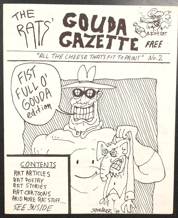
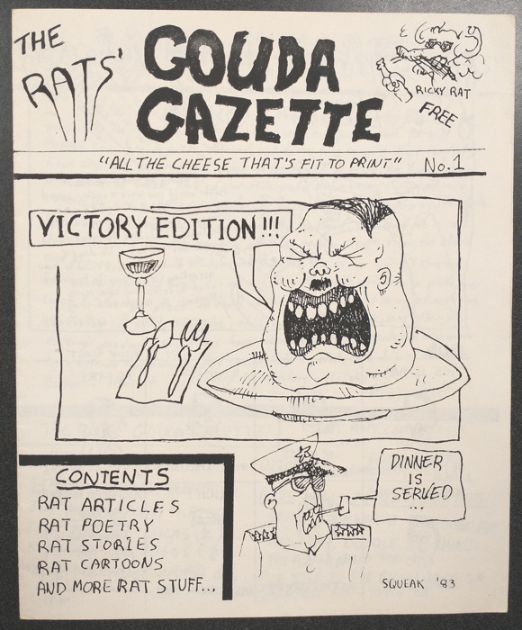
Continuing the nostalgia trip from Wednesday’s post are these two free ‘zines which I picked up in the early ’80s at Ralph’s Comic Corner, the Ventura, CA comic shop that would, just a few short years later, eventually become my place of employment.

Here is issue #1 of Gouda Gazette:

…and here is #2:

I don’t know if these were the only two to come out. If there were more, I never saw them. These were 8 pages (two folded pieces of paper, unstapled), mostly handwritten text with illustrations, like this example from the poetry pages the comprised the centerspread of both issues:

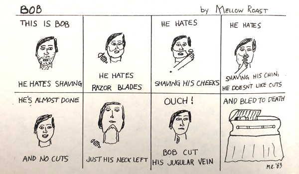
…as well as the occasional comic strip:

The last page was given over to a continuing story titled “Beach Pad Blowout ’83” (with part one coming out in 1983, and part two in the second issue from ’84). This tale involved The Rats themselves, the group of folks responsible for the production of this publication (who went by names like “Mojo,” “Doodle,” “Mellow Roast,” and Squeaker,” though their secret identities were given in a credits box).

I can find no information online about them, which, I suppose, shouldn’t be a huge shock. Best I can surmise is that they were a comedy performance group of some sort, as the second issue contains the blurb

“Come see The Rats at Ventura College Theatre perform their political satire ‘Twisted World’ Jan. 29th 9:00 P.M. Yeah!”

Well, darn, 37 years later I’m kind of wishing I’d gone to see that. You know, put some of those names to faces.

Anyway, these two artifacts have been floating around in my possession for decades, in that I knew I never threw them out but I also never had any idea where I had them stored. A rational person would have kept them with my other comics and magazines, but they always seemed to end up in storage boxes with other papers.

Since this week I’d been digging through boxes looking for old computer stuff, I came across them again, and this time I made sure to 1) put them in bags and boards to continue to preserve them (surprisingly they’re still in pretty good shape) and 2) PUT THEM IN THE ‘ZINES BOXES WHERE THEY BELONG. Now, when I’m 70 years old in 2039, I’ll be able to go right to them when I want to look at them again.

In which I talk too much about a comic strip I drew 31 years ago.

So I’ve been in the process of recovering files from ancient (like, 30+ years old) 3 1/2 inch computer diskettes, such as old college papers, textfile back-ups from BBSes I used to frequent, and, yes, my occasional forays into what passed for digital art back then. I posted one sample here from 1991…a silly picture I even used as a start-up screen on my Mac for a while.

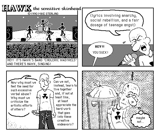
And then there was this, a digital comic strip I drew my own self:


My dad had a laser printer at work (an amazing piece of technology no mere college student such as myself could ever hope to afford), so I threw this made-entirely-in-MacPaint drawing on a disc and asked him to print out some physical copies for me.

Printing seemed to smooth out a few of the rough edges, and all the lines seemed a lot darker and thicker. Frankly, I think the printed product looked pretty good…and eventually,. during my Full-Frontal Harvey mini-comics days, I included said print out in one of our publications.

But here’s the image from the original file, in all its jagginess and “humor.” Mostly this was me seeing if I could do a digital cartoon, experimenting with the form, rather than trying to do a knock-out gag. (Figuratively, I mean…Hawk is pretty knocked about at the end there.) And…it looks okay, I guess. I’m no Mike Saenz but I accomplished what I was trying to do.

Some notes:

1. “Hawk” may or may not be named after an actual person I knew. YOU CAN’T PROVE NUTHIN’

2. All the figures in the crowd are the same, just copied-and-pasted over and over again, which I thought was kind of a neat trick at the time.

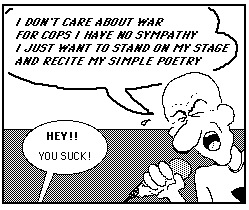
3. Some work files I made in prepping this strip included something I’d long forgotten about…I had actually written lyrics for Hawk to be singing. They are as thus:

Don’t know why I discarded these lyrics for the gag I ultimately used. I think they’re pretty funny and fitting for Hawk’s sensitive nature.

4. The band’s name “Choleric Wastrels” comes from a handle I used on a local BBS. I may or may not have used that account for some gentle trolling.

5. Why the “F” on the drum kit? I presume that stands for Hawk’s philosophy of “Fair Play,” just like Mr. Terrific.

6. The background in panel six I believe is the standard “brick” fill pattern that I went over with the eraser tool to rough it up a bit.

7. I *think* Hawk’s head shape in panel four is the same one from panel two, just flopped.

8. Somewhere are my layouts for a full (well, 8-page) Hawk mini-comic, in which he witnesses a hit-and-run car accident but somehow gets blamed for it when he tries to chase down the perpetrator. I seem to recall having a good ending to the strip, but this far out I can’t recall it, nor do I have any idea where those layouts may be. Alas, not digital so I won’t find ’em on the floppies I’m perusing…all handdrawn on actual paper, and there is a lot of paper in the boxes I’m looking through.

9. There was a handrawn Hawk strip also in 1990, which had a good gag, but there’s a line from an off-panel convenience store clerk that, in retrospect, didn’t age well. Fortunately the clerk wasn’t the butt of the joke…rather it’s about Hawk’s dichotomous nature of “Sensitive” vs. “Skinhead,” but still, it’ll require being returned for regrooving before reprinting here. Just didn’t know any better at the time.

10. For some reason I defaulted to “nuclear symbol” on shirts I’d draw for my characters. No meaning beyond “it looks cool.”

11. I was going to say that the guitar players on stage look like they’re playing mandolins, but knowing Hawk, maybe they were mandolins.

12. That’s a pretty good trashcan and bag of trash in that last panel, if I do say so myself.

Can’t think of much else to say about that strip. It was fun to make, and frankly I’m surprised I didn’t make more, though I’m finding other examples of digital drawings I slapped together at the time. That includes illustrations I made for the radio station program magazine at California Lutheran University, a school I wasn’t even attending! But that’s a story for another day.

Something old, something new, something variant, something blue.

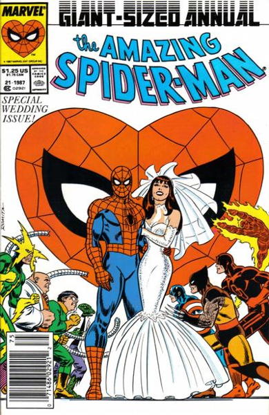
In 1987, Marvel Comics finally married off its most arachnoid of bachelors: Peter Parker, the Amazing Spider-Man, was going to tie the knotted webbing with that jackpot of a redhead, Mary Jane Watson, in a vast multimedia event. The marriage was going to take place more or less concurrently in the shockingly long-running Spider-Man comic strip; in an actual live event, with actors and everything, and Stan Lee himself officiating, at New York’s Shea Stadium in front of a possibly perplexed audience waiting for the baseball game to start; and of course in the actual medium of funnybooks, in Amazing Spider-Man Annual #21.

Given its presence here in our ongoing series on variant covers, you’d be correct in guessing that variants were indeed offered for this momentous event. It may seem underwhelming by today’s standards, where the equivalent event would require a dozen or more different covers of varying availability based on retailer orders (“1 in 10,000 ratio variant, featuring Steve Ditko’s blood in the ink — DON’T ASK HOW WE GOT IT”) but two covers were provided.

Harking back to the then-recent Man of Steel #1’s strategy, the image on the front of the version provided to your regular newsstand outlets, like your Stop ‘n’ Elevens and such, featured Spider-Man in his fightin’ togs, a be-wedding-dressed Mary Jane by his side, while super-powered mayhem was about to ensue in the background:

Meanwhile, direct market copies, sold through comic book stores and other specialized markets, provided a more subdued portrait, with Peter Parker in his tuxedoed civvies as the supporting cast looks on:
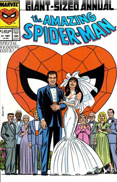

The different covers were, of course, aimed at attracting different audiences. The superhero-y newsstand version was more likely to grab the eye of the casual browsers, whereas the dedicated Spider-Man reader patronizing the comic shops would 1) buy their Spidey comics anyway, regardless of cover, and 2) would be more likely to recognize the characters. And naturally, there’s reason 3, discussed before, in which retailers were able to order copies of the newsstand version as well, meaning they had both versions side by side on the rack. And, as we know from, oh, the three and half decades of the comics market, if you offer multiple covers, a non-zero percentage of customers will buy more than one of them.

In researching the matter over at the invaluable Comichron, their year-end review for 1987 singles out the Amazing Spider-Man Annual for special attention, noting that the comic was in fact delayed in release by the decision to go with a variant cover. And that Diamond Comic Distributor orders for the direct sales version were close to double its orders for the newsstand edition. In addition, newsstand orders were actually very high for Amazing at the time, and even throwing in orders from the other comics market distributor Capital…it looks like significantly more copies of the newsstand version with Spidey on the cover were printed than the Peter cover for comic shops.

Now as far as I can tell, after checking eBay listings and various online retailers, the newsstand cover sold through comic shops retained the standard UPC code, and wasn’t replaced with a promo message, or Spider-Man’s head, or something similar. Not even the black crossbar across the UPC’s face. Thus, it looks like the newsstand cover available on actual newsstands and in comic shops were identical? Printing two covers delayed things already, so printing additional variants with different UPC boxes was a problem with which they didn’t bother?

I don’t know…my own entry into working comics retail came a year after this, so I don’t have direct experience with it aside from buying a copy (the Peter Parker cover, natch, from the store I’d eventually work at). Any additional information is welcome and I will update this post accordingly.

About twenty years later, DC followed suit by marrying the most iconic romantic couple in superhero comics history, aside from Popeye and Olive: Superman (or rather, Clark Kent) and Lois Lane were to be wed! Which came as bit of a surprise, as in the comics the characters were on the outs, in a storyline intended to last a while, until the Lois and Clark TV show opted to have the characters wed in their storyline, goosing DC a bit to alter their own plans.

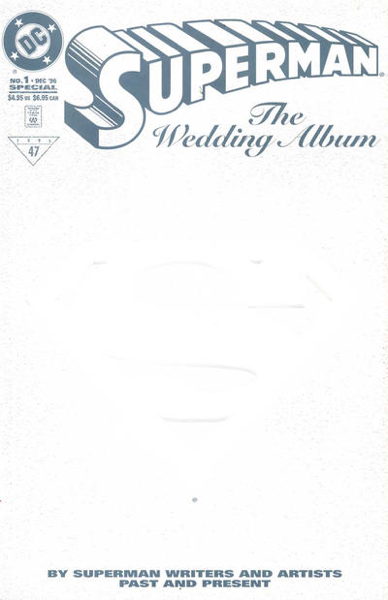
Whatever their motivation, DC ended up publishing Superman: The Wedding Album in 1996, featuring the official union of the two characters. And, you guessed it, with variant covers. There was the deluxe “Collector’s Edition,” a stiff embossed cover available exclusively in comic shops that’s just going to show up as all white here:

And there was the “standard edition,” which was the version available on newsstands:
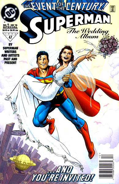

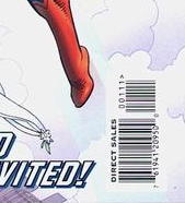
Unlike Amazing Spider-Man #21 (again, far as I know), the “newsstand” edition available in comic shops did have an altered UPC code, reading “direct sales” in the box:

And there was an edition printed with this “DC Universe” logo:
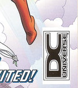

…which you can read about on this site. In short, a reprinted version of the original that was apparently sold on a cable shopping network…I’m guessing probably for way too much.

Anyway, back to ye old Comichron for the month of November 1996, and it’s probably no surprise that the Wedding Album deluxe edition outsold the direct market version of the standard edition by about 4 to 1. (Not sure what sales were on the actual newsstand version, but I’m guessing comic book sales through non-comic shop venues in the mid-1990s were not great.)

Now for this wedding I was behind the counter, slingin’ those comical books, so I have a little more direct experience with this release. I don’t recall the exact numbers we ordered (though I do have possession of the old store’s mid-1990s invoices that my former boss passed along to me for research purposes…I should actually start researching those someday) but I’m reasonably certain our orders were along the lines of Comichron’s sales charts: a lot more of the deluxe edition, not so much of the standard one.

In general I noticed, that when given the option, most customers would spring for a fancier edition of a comic book. Yes, it cost a little more, but the perceived value sometimes outweighs the price difference. Sure, you can get the regular version for a buck less, but for only a buck more you can get all the bells and whistles. You don’t want to miss out on anything, after all.

But what’s interesting in this specific case, the “Collector’s Edition” and the “Standard” editions of Superman: The Wedding Album both retailed for the same cover price of $4.95. I imagine in some cases that made the decision easier…you gotta drop a fin to read the story anyway, might as well get more for your money: i.e. that fancy cover.

Personally, I went with the standard version. I mean, that white cover was neat an’ all, but I wanted an actual image I could see on the comic I bought. I mean, sure, okay, that John Byrne cover is a tad bland-ish, but it suffices. Plus, I just have an easier time reading a comic when I’m not fighting that thicker, stiffer cardboard cover. Your basic floppier paper cover is fine by me, and certainly easier to handle.

Most of our customers did not agree with me, however, and ’twas the deluxe edition that moved out the door. Though I should note that we did sell out of the standard version…our orders were lower, sure, but still enough demand to wipe us out of them. And we had plenty of the deluxe version left over…we sold a lot of them, absolutely, but the remnants stuck around a bit. I do wonder, if we had more of the standard edition initially, if there would have been more parity between the two? Later acquisitions of the standard edition in collections would sell quickly as a back issue, while the deluxe copy’s sales were moribund. So…who knows?

The dichotomy of newsstand versus direct sales variations is still fairly cut and dried at this point, with the actual cover image (or other specific qualities) being the main driver in demand. It had long been conventional wisdom that all other things being equal, a comic where the only difference whether or not a UPC code was present made no difference in pricing. But now it is no longer necessary to have an entirely different cover; just being a newsstand version of a comic, with a regular ol’ UPC code, is enough to send prices skyrocketing, in this new back issue market desperate for new things to be collectible to replace the scarcer old things that don’t seem to show up quite as often anymore.

But perhaps that’s something we can talk about next time.
Hiya gang!

My eye has mostly recovered, and I should be back to my normal schedule next week. Thank you for the well-wishes and your patience…both were greatly appreciated.

I’ll see you Monday.

Site’s on hold for just a bit.

Had another eyeball incident over the weekend…not a huge one this time, but enough to blur out the vision in my good eye. So, if you showed up today waiting for the next installment in my variant cover-age, I apologize…it’ll be up next week. I’ll try to be back to updating here by the end of the week. Thanks for reading, pals, and we’ll talk soon.

The current (and ongoing) unpleasantness.

I generally liked Warren Ellis’s work. Okay, Ruins from Marvel I despised, and put me off reading his material for a while, but once I started picking up his work I found I enjoyed it. I mean, it was occasionally a little same-y, with many characters identically speaking in what I presume to be Ellis’s sardonic voice, but otherwise the stories were clever and well-constructed.

Do I think Ellis has more good comics writing in him? Well, sure. Would I like to see that work? Under normal circumstances, absolutely.

But.

About a year ago it came out that Ellis had been using his position as An Exalted Comic Creator to commit sexual coercion, emotional abuse, and grooming on young, vulnerable women, particularly fans and those who were in the industry. An alarming number of stories began to come out, and the website SoManyofUs.com was created to gather together testimonials on Ellis’s behavior. It’s harrowing and unpleasant reading, certainly revealing patterns of manipulation.

The creators of the website offered to Ellis a way…well, not “out,” but “through,” I guess, asking him to work with them to acknowledge his actions and find ways to improve himself and help to correct the cultural and industrial circumstances that allowed it. Which admittedly is a tall order, and who knows how much could actually be done, but doing something is better than doing nothing.

“Nothing,” however, is what’s been done, as far as anyone can tell. Maybe Ellis spent the year in private contemplation, working to better himself and identify ways he could work at preventing this behavior from perpetuating…you know, after sending a few more inappropriate messages to his victims after the news broke and he posted an apology (now gone from his official websites). According to SoManyofUs, he did send out a handful of personal apologies, that were apparently unconvincing.

The reason this is all coming up again is that an artist revealed he was working with Ellis on a revival of an old, abandoned comic project of theirs. And said artist got somewhat defensive about it, which you can see here.

It looked like the plan was to just kinda sneak back into the comics business, without so much as a “hey, how y’doin'” and hope enough people didn’t remember or care about the whole hoohar from last year to make the book profitable. Which, you know, kinda pissed everybody off, since Ellis’s half-baked apology at the time didn’t exactly strike anyone as useful (particularly taken to task was Ellis’s assertion that he was “unaware” of the position and power he held). And it’s been essentially radio silence since. Even Image, the publisher of this forthcoming Ellis book, basically responded to a direct question about the situation with “more details on that comic soon!”

However, the silence was just broken today, as Ellis finally, a year after the offer of opening dialogue was made, contacted the SoManyofUs.com site to see how he could work with them. I mean, that’s good an’ all, and maybe he needed that year to build up the courage or develop himself to the point of being receptive to change…or he saw the shitstorm his new comic announcement stirred up and rethought his career strategy.

Whatever the reason, this is at least some kind of step forward. I don’t know what will happen next, and I don’t know what kind of amends he can make…some testimonials emphasize the permanence of the emotional tolls and how forgiveness seems nearly impossible. But the opening is there, so we’ll see if any positive motion can happen in this whole ugly, disappointing, and disheartening situation.

This is not a fun thing to write about. I’m sure this is not a fun thing to live through, for all the people directly impacted by Ellis. I don’t know, when all is said and done, if any of us will be able to read Ellis comics with a clear conscience again. Maybe we can, if enough redemptive work is done, but honestly, “getting to read comics” is the least important thing about all this.

What is important is that this never happens again. That those not in power are not threatened or forced by those with power. …Again, like I said before, a tall order. But maybe we can get just a little closer to that ideal.

EDIT: Image Comics has released a statement.

EDIT 2: Warren Ellis has issued a statement addressing some of the concerns in my post. I mean, not directly in response to me, but you know what I mean.

P.S. If you’re thinking about being a drive-by dumbass in my comments, don’t bother…I’ll just delete whatever you expel.

The House of Lollipops.


Thanks to reader/mad genius Paul for sending this mock-up of what could’ve been for a Sterling Silver Comics retailer exclusive variant!

Following up on my discussion about that very topic from Monday, I’d actually pulled up an email I received from A Comics Publisher in response to an inquiry I’d made along these lines. Without going into a whole lot of specific detail, let’s just say my buy-in, just for the minimum copy purchase of the exclusive variant, would have been in excess of $10,000. That doesn’t count other minimum orders for the regular cover or other variants of your retailer variant, or for paying for the actual artwork by the artist.

Basically, it’s a lotta scratch…not undoable, entirely, but certainly an investment that would require some first class hustling to make that cash back. Which could be a problem in case you got a cover that didn’t grab the attention of the sort of folks who look for exclusive variants like this. But, to be honest, the way the marketplace is right now, seems like anything that has any form of scarcity is automatically in demand.

Anyhoo, something to think about the next time the opportunity arises.

But speaking of “scarcity,” apparently the latest issue of Usagi Yojimbo, #20, is “in demand” due to it being a first appearance of a character whose name I bet most of the people looking for it couldn’t even tell you. My distributor decided, alas, that this would be one of the comics they’d be shorting from my order last week (there’s usually a few every shipment). I figured that would be that, given it’s temporary hotness and all spare copies eaten up by reorders, I’d have to wait for the second printings to come along so I can get copies for customers who actually want to read it. Somehow, though, miracle of miracles, my replacements showed up! I mean, sure, half my Fireflys are missing and several of my Marvel Voices: Pride shorted or damaged, so it’s always something.

As to the Marvel Voices: Pride comic, it surprised me a bit by including select pages from Alpha Flight #106 (1992). In case you forgot, that’s the comic where Northstar finally just straight up said, after years of subtle-ish hints, “yeah, I’m gay.” Which was, granted, a pretty big deal, and demand for the issue warranted a second printing. But this was also at the height of the whole “gotta be EXTREEEME” art thing, and…yeah, it certainly looks a bit jarring side-by-side with more current art styles. Hey, gotta start somewhere! (Also, did they ever bring back Major Mapleleaf from that story?) (Yes, I know that was a nickname of Alpha Flight’s Guardian at one point.)

I should also note that my comments sections here on Rogressive Pruin occasionally take on a life of their own. So, if you ever wanted to delve deep into the origin of the word/sound/expression “vootie,” well, your day has come.

The Department of Variants.

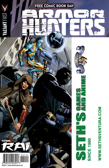
So back in 2014, when I was still at the previous place of employment, our prep for what would turn out to be the final Free Comic Book Day I worked at that store, we took advantage of a special deal Valiant Comics offered. If we ordered a minimum of 500 copies of that year’s FCBD offering from the publisher, Armor Hunters Special #1, we would be able to receive custom-printed copies with our logo on the cover. Now 500 copies at a quarter a pop our cost, for a total of $125, was just a drop in the bucket in the overall expenditures for our Free Comic Book Day event, so we went for it, resulting in this:


One, they actually ran two logos, one for Seth’s store and one for Ralph’s, though I suppose the restriction wasn’t “number of store logos” but rather “what will fit in that space, and hopefully isn’t straight-up pornography.” Two, you can probably tell which logo was actually by A Real Artist and which was by The Overworked Comic Shop Manager Who Knew How to Color In Letters in an Art Program. As to that URL, pretty sure I told ’em “just put it in there somewhere” and somewhere is indeed where they put it.

Anyway, aesthetics aside, one of the unintended but probably-should-have-expected-because-comics consequences was phone calls from collectors trying to obtain copies of our customized version of this freebie. Lots of calls. Valiant press-released a list of stores what went for these branded Armor Hunters, which sent folks our way. (Honestly, I’m surprised so few stores took part in this.) And I believe we did mail out quite a few, but true to the spirit of FCBD we didn’t charge for them (just asked for shipping costs…and waited to send ’em out after the event).

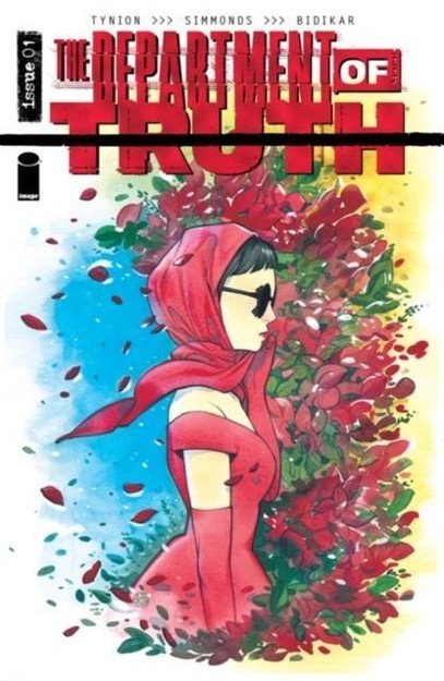
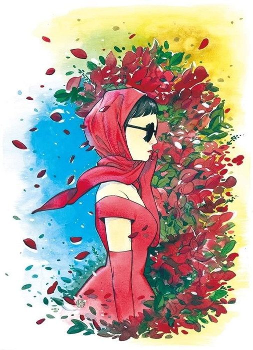
That was the one time I did the whole retailer-variant thing, which I’d been thinking about over the last couple of days in relation to a collection of comics I just took in. Specifically, I acquired a bunch of Department of Truth variants, several for each issue released so far. There were a handful of the regular variants available through Diamond, but the vast majority of them were covers specifically produced for retailers, like this cover for #1 by Peach Momoko:

Now, to get that Valiant variant, it was relatively easy…just hit that minimum and provide the artwork. For these kinds of variants, featuring specific artwork by actual professional artists, it’s a whole different scale of business there. I don’t know the specifics of what had to be done with these Department of Truth variants, but I do know with other retailer variants I’ve looked into, it required ordering a certain minimum number of the regular covers, then committing to a certain amount of the retailer variant, sometimes at a higher-than-normal wholesale cost. Regardless of the details, it costs a lot and you end up with a boatload of comic books. Huge numbers of books, more than my current rinky-dink operation can deal with.

Every time I crunched the numbers on these, it always looked like the end result would be me having to dump all those extra copies of the regular cover (above what I’d normally sell) for pennies on the dollar, or just plain recycle them, and hope sales on the retailer-variant cover the cost. But the larger stores with the more efficient (i.e. more than one dude running the shop) mail-order department probably is in a lot better position dealing with these. And that must be the case given the number of retailer variants that exist for comics. I mean, Department of Truth alone…

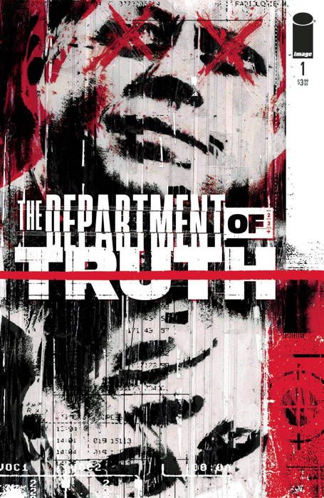
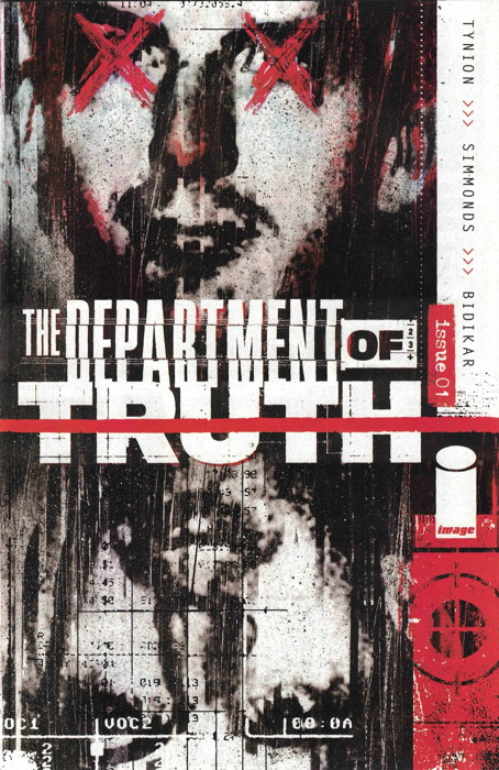
Anyway, speaking of that comic, I already knew there were a number of variants for issue #1, but I just wasn’t aware how many. The main cover of the first issue looked like this:


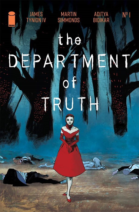
…but interspersed with this cover during its initial distribution was this cover (about 1 in every, what, 6 copies?) replacing Kennedy’s image with Lee Harvey Oswald:

And of course there were the usual “ratio” variants, where you could get 1 copy for every X copies of the regular you were ordering. These existed at the 1-in-10 and 1-in-50 levels (which you can refer to on this page, as I won’t be putting every cover up here). There was also a 1-in-100 variant, which I am putting up here:


…due to its “homage” to the writer’s other weirdly popular comic Something Is Killing the Children. It is noted as “Cover F” on the back cover…a letter designation is assigned to most, but not all, of these Department of Truth variants. (If you’re also wondering if this particular variant has staples, you know where to look.)

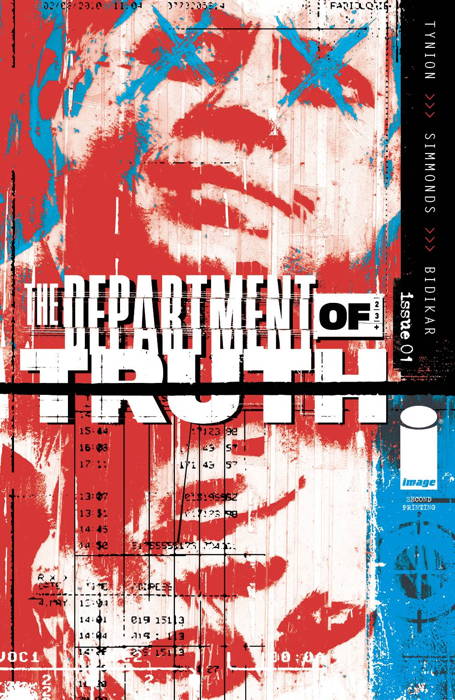
This series turned out to be in very high demand, and after the quick sellout of the first issue, reprints were quickly produced. Five printings of #1 as of this posting, with the 2nd print pictured here:

These reprints, at least on the first issue, were simply coloring variations on the initial release. But also wildly in high demand, often from collectors and investors looking toward resale. Like many reprints, which are seen by some as “rare” collectibles, their relative scarcity in comparison to the comic it’s reprinting, drive their demand to occasionally outrageous levels.

But nearly all the rest of the #1s are retailer comics, which you could buy at conventions, or, more likely since there weren’t conventions for a while, obtained via mail order. Often they had small print runs (like about 500 or so) and a quick scan of several of these retailers’ storefronts show them long out of stock. However, this version of that first Momoko cover I posted, but sans logo:

…was used for a foil variant that apparently was sold directly by the writer himself, if I understand correctly? This only had a print run of 100 copies, so the premium prices on the secondary market for this edition can run quite dear. (And yes, before you ask, I had one of those in this collection…it was one of the first to sell!)

As you scan down that catalog of variants, you see the process not slowing down much. A lot of the “altered color” reprints, along with a bunch of retailer exclusives, are listed for every issue. Issue 9 isn’t listed there yet, but I can assure you the same goes for that one as well.

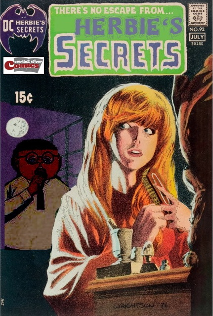
As I go through this collection of Department of Truth variants, it has me thinking again about looking into getting a retailer variant of my own. Given the response we had far and wide from folks trying to get that Armor Hunters variant, I imagine I could probably move enough copies of my own store-exclusive edition of…something. Just a matter of me deciding to put my dime (well, lots of dimes) down on something that I’d want representing my shop. I don’t know if I can top this Archie Vs. Predator exclusive, but I’d love to have a House of Secrets #92 homage on some comic for my store to sell. Too bad Herbie is off the stands…an HOS92-type cover with a lollipop sitting in the foreground with a shadowed Herbie lurking behind, with a giant “Sterling Silver Comics” logo adorning the image. It’s too beautiful to imagine.

Okay, I don’t know how educational all that was, and it was a little off-model from the rest of my variant cover-age posts. I know I said I’d do the Marvel 35-cent variants this time ’round, but that was turning into more of a thing than I was really up for at the moment. There’s a lot to unpack there, along with varying distributor marks, and the larger direct sales vs. newsstand editions secondary marketplace…I’ll get to it all eventually.

Then again, he famously complained about everything.*

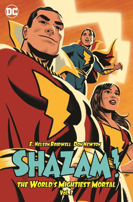
So the reprint book I’d been wanting for years has finally come out: Shazam! The World’s Mightiest Mortal volume 3:

…including stories from late 1970s/early 1980s issues of World’s Finest and two of the digest-sized issues of Adventure Comics. In fact, I think this is the first full-sized color reprinting of those Adventure stories, which is good since I could hardly read ’em at digest-size anymore.

Anyway, those World’s Finest issues features lots of artwork by Don Newton, who was one of my favorite artists, and sadly lost too soon. Such expressive and motion-filled illustration. And unlike the reprints of the Batman stories Newton illustrated, having these comics transferred over from the brown-ish paper with the dingy printing to nice white pages works out great.

The other bonus of this book is that, of course, everyone is called by their real names. “Captain Marvel.” “Captain Marvel Jr.” “Mary Marvel.” “Uncle Marvel.” None of this “oh yeah my name’s Shazam, like my magic word and also the guy who gave me the powers” horse-hockey. Sorry, yes, I know, that battle’s lost, I get why DC did it, but honestly “Captain Thunder” was right there. Or “Captain Shazam,” which I’ve championed before but have come to realize is almost as bad.

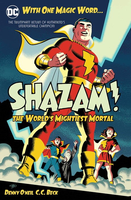
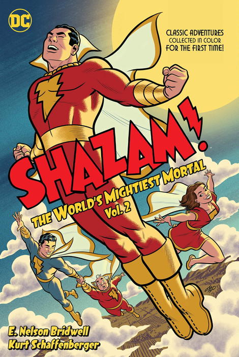
Now the problem with being a collector is, of course, not being happy with having “Part 3” of something when parts One and Two are readily available. So natch, I acquired Volumes 1 and 2 of the Mightiest Mortal reprint series as well:


And look, it’s not just out of a sense of “completeness” I got these. I used to have the majority of issues from the 1970s Shazam! run, but gave them all up to the store. I missed having them around, so this book collection will mostly suffice, though all the Golden Age reprints of classic Marvel Family stories that ran in the ’70s series are omitted. Some issues are only represented by their covers, as the entire comic had been reprints, with only a new cover drawn for them.

It should also be noted that Shazam! #25, featuring Isis, which was not reprinted in the black and white Showcase Presents Shazam! book, does appear here. Apparently whatever rights issues that prevented the character (who had her own TV show at the same time Cap did, and even guest-starred on occasion on his program) from appearing in that earlier reprint were resolved for this.

The second volume also contains the Superman Vs. Shazam! treasury edition, another comic I had and gave up to the shop. And again, missed having. Back in 2000, I referenced this treasury in my contribution to Jess Nevins’ Kingdom Come annotations for issue #4 (under “Page 16”).

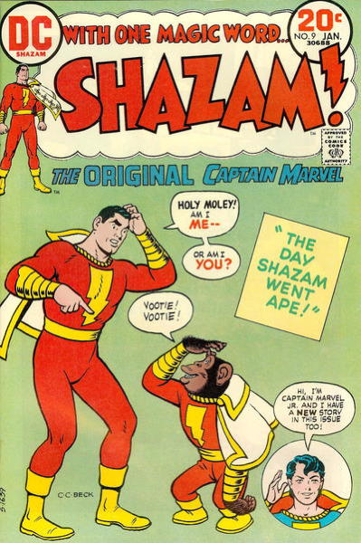
The first two volumes have a lot of wonderful art by Cap’s creator C.C. Beck (who famously complained about how he thought the new scripts were stupid, but you couldn’t tell from his drawings) and Kurt Schaffenberger, among others. The very first story starring the Big Red Cheese I’d ever read was issue #9, given to me in a big bundle of comics my grandmother picked up somewhere:


…which featured lots of new Beck work, on stories he probably hated but I loved. Look, one of them had a chimp who accidentally gets Cap’s powers, and the other story reintroduced Mr. Mind, the World’s Wickedest Worm, to the comics world, but introduced him for the first time to me. And man, I thought Mr. Mind was the coolest. It was like the extreme gap between Superman’s strength and Luthor’s brain, but made even more…well, extreme-er, I guess.

It’s nice to have all these comics together in these handsome collections. One hopes that a fourth collection can be managed, putting together Captain Marvel’s various appearances in DC Comics Presents (like this story, one of my all-time favorites), and…gee, what else? This weird mainline DC Universe tryout with the Captain Marvel-like Captain Thunder?


…as the actual Marvel Family characters were still sort of in their own “universe” and wouldn’t start meeting each other ’til issue #15 of Shazam! and that three-parter in Justice League of Ameria (the latter of which could also be reprinted in that theoretical fourth volume). Heck, I’d even allow some of those comics from the late ’80s Justice League revival, if we gotta round out the book somehow.


* …Except Axa. Cool Points to you if you get that reference.

I’ve had a long day.

So Tuesday took a lot out of me at the shop today, and ended up getting home pretty late. As such, let me just cover a couple things:

Readers added some good information to Monday’s post in regards to variant interiors and repackaged remainders. I added a big ol’ addendum to that entry to reflect these updates, instead of doing a brand new post about it, as I’d prefer to keep this series…self-sufficient, I guess? So you find all the info on a particular variant on just the one page, instead of having to read updates over the next three or four posts. Anyway, I wrote a bit there so check it out.

Next, I wanted to remind folks that there’s a lively discussion regarding the Legion of Super-Heroes and its scattered continuity/publishing going on in the comments to this post. In this case I’ll likely do an update post on the topic addressing some of your thoughts.

Finally, don’t forget, for your #1 Source in Comic Staples Information please visit Does This Comic Have Staples? and bask in the enlightenment.