You are currently browsing the this week’s comics category

This is a dirty political dealings issue showing Amanda Waller’s need for vengeance for her fallen family members leading to her paving the way to power. It’s interesting reading, and I want to see what comes next.
…Now, that said, even with this issue providing some humanizing for her, the current ongoing vilification of Amanda Waller feels, well, somewhat out of character. She’s tough and no-nonsense, certainly, but pitting her directly against superheroes (both here, in the DC movies, and in the excellent My Adventures with Superman cartoon) feels just a little weird. Yes, I realize I’m talking about a person who put bombs in villains’ necks in Suicide Squad.
But having read the whole of Suicide Squad not long ago, and the many, many pages and issues devoted to fleshing out Waller, her presence in this crossover seems more two-dimensional. This Origins issue does help counter that feeling a bit. Whether the story told here fits with the Waller story as presented in Suicide Squad, I can’t recall without checking, but I imagine someone’s already done the work.
The Absolute Power event overall has been enjoyable, and reading the earliest installments I would’ve sworn up and down this was leading to a new Justice League of America title. In actuality it’s leading to DC’s “All-In” Ultimate-esque line of books, so am I curious how they get from Here to There.

It’s…not bad, for a first effort at this newest EC revival attempt. I know I’m not going to open the cover and see Graham Ingels and Jack Davis staring back at me. But I think it’s maybe a thing where the stories…aren’t as dense? I mean, there’s lots of text, in the classic EC Leroy lettering (with more font effects than they ever used in the originals, which is fine). It just feels like there’s not as much story crammed into each of these entries, compared to the classics ECs.
Look, I know, it’s a different time, the original EC Look and Feel is hard to capture. The stories are fine, though the “shocking conclusions” to them don’t quite live up to their set-ups. Except for “Family Values,” which has a good twist along with some nigh-Eisner-ish art on the splash.
I’m not down on the book, honest. I’m glad it’s here, there’s always room for improvement, and I’m certainly looking forward to future issues (and the other EC title Cruel Universe). It’s overall a handsome looking package, certainly.

[SPOILERS for the original Hate series]
I’m enjoying Peter Bagge’s return to Buddy Bradley and his friends and family, with stories taking place Today as well as well as some set in the 1980s. In this issue we get not just the first meeting of Buddy with the legendary Stinky, but some decades-late Modern Day aftermath to his surprising death in the original Hate series. (And if you were there reading Hate at the time, I guarantee you were pretty well stunned when it happened.)
This second issue is an improvement on the first, probably given the extra Stinky content. The first issue’s focus on George was perfectly fine, but Stinky was such a large personality and a big part of the original Hate comics that he can’t help but energize the goings-on with his presence.

I read Peepshow #15 and it made me sad.
This is the final issue of Joe Matt’s autobiographical comic, released last week from Fantagraphics…final, due to Matt’s passing last year at a too-young age (though I’m sure he’d argue about the “young” part).
If you’re looking for a neat wrap-up to Matt’s comic book life as portrayed in Peepshow over the decades (having started publication in 1992), you’re not going to get one. In fact, one of the stories within is titled “Maggie – Part One” and there is no part two extant, though there are mentions of her in further stories and you can probably get a sense of what a Part Two might have been.
Another throughline in this issue is Matt’s move to Los Angeles, pending a potential television adaptation of his comics for HBO. While there’s a lot of grist for Matt’s unique mill here, there was obviously more to be told that we’ll not get (especially since the story dealing specifically on the topic also gets a “Part One” heading, no “Part Two” present). The ultimate conclusion is known — these stories take place years ago, and there is no Peepshow TV show now — but I’m sure Matt would’ve had more to say about the experience.
The only segment of the book that sorta feels like a final wrap-up is his brief summaries of all his sexual relationships to date. And this, as well as everything else in the book, is told with his trademark near-cringeworthy and hilarious bluntness and honesty. He never flinches from making sure his thought processes fully transparent, his mistakes completely exposed.
And I want to make sure that’s clear…it’s still funny. It’s still Joe Matt being the most Joe Matt, with all the cheapness and obsessiveness and selfishness completely on display. Even as he worries about his aging (40 in these stories, set 20 years ago) and his pursuit of some sort of financial and emotional stability, it remains told in a way that amuses in the Mighty Joe Matt Manner.
But it’s still sad, reading these strips and knowing this is the last chapter to his own story. I keep harping on “conclusions” and “wrapping up” in this little overview, even though obviously I know in my head that Matt couldn’t have realized this was going to be his last comic book. But my heart can’t help but want more.
And readers of comic books have an ingrained expectation that a final issue is going to tie everything up in a little bow, or that it ends on pithy note, gathering up your narrative experience in some clever way.
Peepshow #15 doesn’t do that. It gives you one more entertaining piece in the ongoing saga of Joe Matt, just like every previous issue did. It’s just sad that we’re not getting a #16, no matter how long we’re willing to wait.
So this week is the release of the Labyrinth #1 facsimile edition from Boom!/Archaia, reprinting the three issue adaptation of the Jim Henson movie originally published by Marvel in 1985.
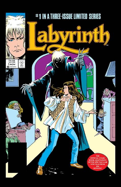
It does look nice, with the artwork by John Buscema and Romeo Tanghal appearing nice and crisp on the white paper. The paper stock used for the cover feels a little more fragile than I’d like, but that’s kinda par for the course in comics now, so I’ll live.
But one thing that does bug me is this little bit of business right here on the front cover:
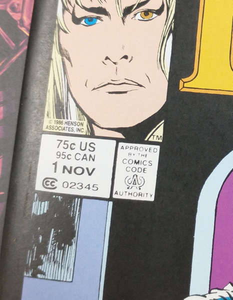
Yup, they reproduced the original cover down to the original prices. Before you ask, no, this comic is NOT selling for seventy-five cents, but rather for the $4.99 price indicated on the back cover. Which of course means I’m going to be asked “is this really $0.75?” all day.
Usually, when DC and Marvel do their facsimile editions, they either obscure/remove the original price, or change it “499¢” or whatever. Leaving the original price on the cover for a reprint like this always leads to customer confusion. Especially in recent years, when comics have been released with actual low gimmick prices, or seeing something supposedly selling for 75¢ would not be unheard of. It looks like this comic is getting a little sign under it on the shelf saying “REALLY IT’S $4.99.”
So anyway, publishers, don’t do this. It’s annoying for me as a comics retailer, and it’s frustrating for customers, some of whom will think someone’s pulling a fast one.
I did see some wondering online about why this is being reprinted in the first place, and I think the obvious answer is, like I said above, Boom!/Archaia have been doing Henson comics for a while now. This is just another one, only a reprint instead of new material. Hopefully they’ll get around to reprinting Dark Crystal next.
* I mean, they took the time to edit the Marvel logo out of the corner box, right?
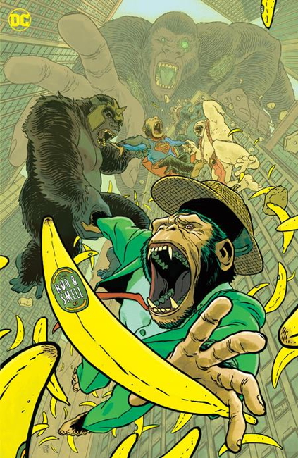
Due out this week is DC’s Ape-Ril Special one-shot, and one of the variants features a scratch ‘n’ sn–er, a rub and smell banana-scented cover:
Longtime readers of this site will remember that I have the perfect item with which to read this fine publication…the SCRATCH AND SNIFF 3-D GORILLA GLASSES:
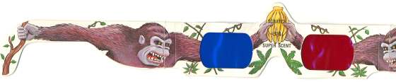
Here I am from almost twenty years ago sporting this fine item:

Anyway, hopefully you won’t soon be reading headlines like “COMICS RETAILER O.D.S ON DOUBLE BANANA SCENT DOSE.”
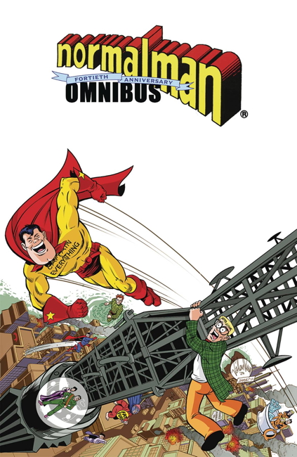
So I picked up a copy of the normalman 40th Anniversary Omnibus, reprinting in full Jim Valentino’s mid-1980s parody comic series from the mid-1980s. I believe this is the first color reprinting of the introductory back-up stories from Cerebus, as well as the story from A-V in 3-D, presented in color and non-3D. I also believe this is the first color reprinting of the concluding chapter, normalman 3-D in a non-3D format. I appreciate that, given it’s a little harder for my eyes to do 3D in print properly anymore. (These 3D stories have been reprinted in non-3D in previous black and white collections, from Slave Labor and from Image.)
Also featured is the crossover story from Journey #13 by William Messner-Loebs (presented in the original black and white by Messner-Loebs’ request). Other material, such as the later normalman specials from Image, ads, strips produced for conventions, unused pages, and the like round out the book. Sadly not included is 1997’s Max the Magnificent:
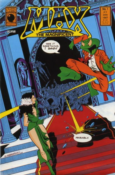
…a spin-off starring a character normalman runs into during the course of his adventures. The comic also features an appearance by normalman‘s Captain Everything, which makes it especially odd that it doesn’t make the cut.
Now for the most part, this is a nicely done book…the reproduction of the art is very sharp and clear. The original mini-series and 3D special, however, have been relettered, which…frankly, isn’t an improvement on the original lettering. Maybe in the earlier issues, where the lettering is a little less polished, it is a step up, but in these cases I would always prefer the original, with the lumpier handdrawn word balloons and occasionally funkier typography. However, it wasn’t that distracting, and especially for my eyes it made for an easier reading experience.
Except.
I understand there may be production issues where the art just has to be relettered. It happens, I get it. But it seems like every time relettering like this is done for reprint works such as this, misspellings and such slip in that weren’t in the original printing. As I recall, this happened with Image’s initial reprintings of Matt Wagner’s Mage: The Hero Discovered, and with those strange black and white collections of Jim Starlin’s Metamorphosis Odyssey from Slave Labor Graphics.
And it happens here, in this delxue volume of normalman I’d been wanting to see for years. Granted, for a several hundred page book, it’s not a whole lot, maybe a half-dozen or so errors that I’ve noticed, but they are still pretty distracting.
For example, from issue #1, here’s the original word balloon:
And here it is with an inexplicable word change:
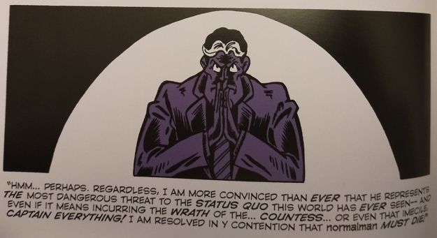
From issue #10, the original panel:
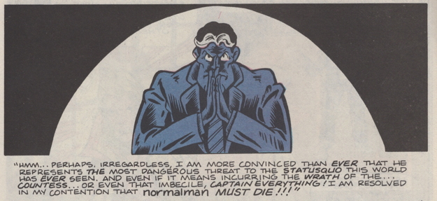
And how it appears in the omnibus, with a couple of extra typos (for “imbecile” and “my”):
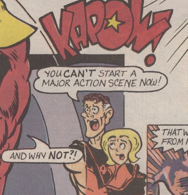
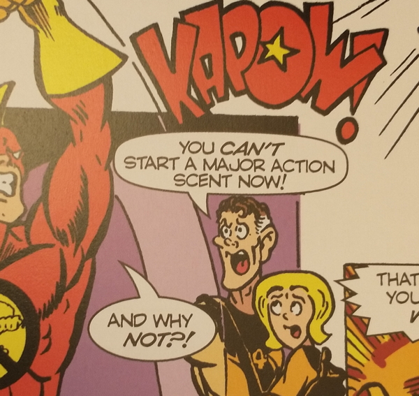
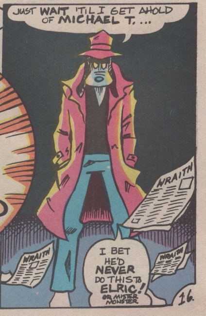
And here’s the one that really stood out to me, for what should be obvious reasons…from issue #4:
And here is it in the omnibus:
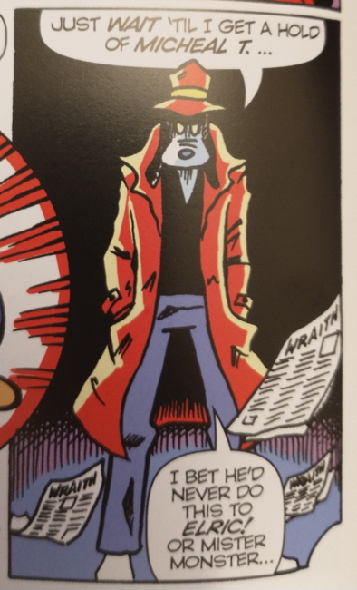
(Also, making “Or Mister Monster” the same size lettering does alter the gag a little.)
There are more examples (including at least one word balloon in the omnibus that I think has either misspelled a word or left a word out entirely, I haven’t checked yet).
This is just in the original normalman story, which is all I’ve read of this omnibus thus far. I don’t believe the other material has been rejiggered in this fashion. Plus, as I’ve said, it’s only a few of these errors that I’ve noticed, and I’m hoping they’ll be fixed in later reprintings. I should note that the Journey issue reprinted here has not been relettered.
As soon as I saw these, I did pull out my copies of the original series, actually kind of hoping the mistakes were in those. Somehow it would have been slightly less annoying if these were faithful reproductions of original errors, though undoubtedly I would then be complaining about “why didn’t they fix that?”
I am glad I have this book. I mean, mistakes happen — What Can You Do?™ — and given this hardcover was solicited with a first print run of only 1,500 copies, maybe like I said they can quickly fix these issues for new printings. It’s a classic and funny work that deserves to be in print, and I just want it to be in the best possible presentation.
Okay, this week on the site is a little wonky, given some early morning medical stuff I’ve got going on, so this may be the last post here ’til next Monday.
Anyway this week the new issue of Kevin Smith’s Quickstops came out, and I’ve been enjoying these. I saw this cover and thought “that’s pretty funny,” I’ll get this version:
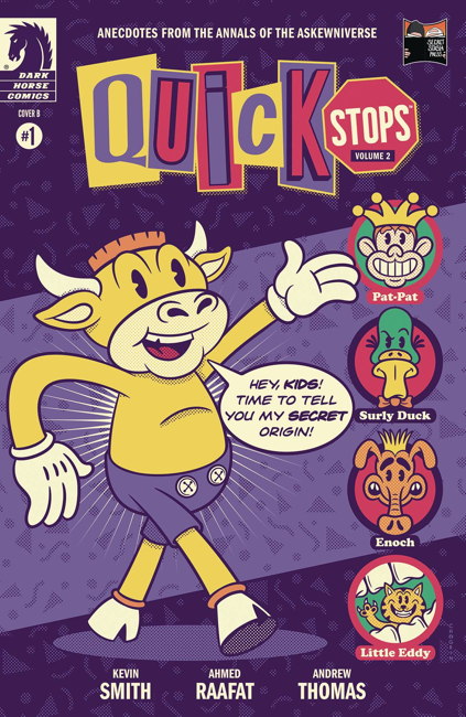
…and then I saw the other cover with the Watchmen parody, and the decision was made for me:
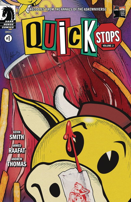
As as longtime appreciator of Watchmen ephemera, this is right up my alley, but it reminds me that there have been other parodies and references that I passed up at the time and sorta/kinda regret doing so. Like this one from 1987:
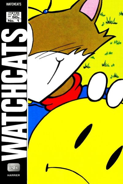
Not that I need to add another weird wrinkle to the old comic collecting I still do for myself, along with old fanzines, those last few Seaboard/Atlas comics I need, Popeye comics, and Nancy and Sluggo stuff. But, you know, what the heck.
Speaking of new comics for the week, you got your copy of this, right?
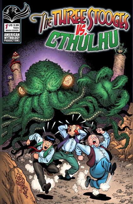
The Venn diagram of “high brow” and “low brow” forms a single circle for this comic. That’s meant as a compliment.
So it’s been a while since I’ve done just straight up reviews of the new comics on this site, which is primarily because I don’t tend to read the new comics during the week they’re new. Either I’m reading things well ahead of time (as the Marvel and DC books usually show up at the shop a week before their on-sale date), which is rare, or I read them well after release, which is more likely.
My eyeball troubles during their initial phase, when my vision was cloudy or just blacked out entirely, kept me from reading more or less anything for about a year and a half. I was able to read text on my computer screen by enlarging fonts, doing high contrast white-on-black colors, etc. But comics were a no-go for a while. And while I still continued to accumulate books to read during this period, they went unread for quite some time.
I’ve got quite the backlog, even with deciding to give up on some titles to thin out the stack. Adding to the problem is that now I’m able to read again, I’m not reading as quickly as I used to. And this is just comics. I’m not even bringing the prose books I’ve gathered up recently into this.
I’m trying to make time to read comics and get through these stacks. I have entire series that I’m eventually going to have to sit and buzz through their runs. I just did this with Ahoy Comics’ Second Coming and The Wrong Earth, and Howard Chaykin’s Hey, Kids! Comics! is up next.
Graphic novels are kind of a roadblock in this process, in that I could read 1 graphic novel or I can read (x) number of comics in that same period of time. Again, I read more slowly than I used to, so it’s a real decision to make.
But it’s no decision at all when Bill Griffith gets a book out:
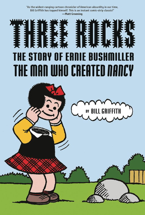
I mean, of course I’m going to read a biography of Nancy creator Ernie Bushmiller. It’s a dense retelling of not just Bushmiller’s career, but of the history of comic strips in general, going into details of the business from Bushmiller’s era. It’s not as emotionally devastating as his previous biography, Nobody’s Fool, the story of real-life pinhead Schlitzie, but watching Bushmiller’s rise and developing his methods of operation are both compelling and exciting.
There are several asides, from Nancy and Sluggo themselves (using redialogued Bushmiller art), and from Griffith himself, making appearances as the curator of an imaginary Nancy museum. Certainly strange, certainly fitting given the comics being discussed.
Good book, well worth spending the time absorbing this work. I would highly recommend this to anyone interested not just in Nancy and Bushmiller, but in the business of strips.
I do love the cover, taken of course from one of Bushmiller’s more nightmare-inducing strips:
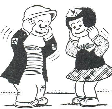
…which I of course used as a wallpaper on my original flip phone, and also appeared in my Sluggo Saturday feature. (I see someone else out there is using the “Sluggo Saturday” name — ACCEPT NO SUBSTITUTES.)
The book does bring up his use of assistants of course, which I was aware of even when I bought this original Nancy strip a few years back. Like I said in that post, even so it was nice to have something produced under Bushmiller’s watch. And seeing that period of Bushmiller’s career in Griffith’s book, it was nice to think “I have something from this point in his life.” It’s a solid, real connection to this story, and in its way, maybe Three Rocks is as affecting as Nobody’s Fool, at least to me and my personal minor link to Bushmiller.
It’s here, it’s here, in my hot little hands direct from Jason Sandberg himself, as predicted by prophecy, the new Jupiter #1:
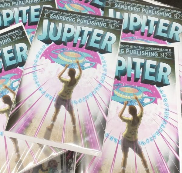
Jupiter was a black and white indie publisher too briefly in the 1990s, and I discussed that run here. Then in 2018 Jason put up a digital compilation of the best of Jupiter. And now, here we are, with a brand new color comic featuring his weird and wonderful cartooning.
Now, ever since I wrote that first blog post about Jupiter way back when, Jason and I have been online pals, chatting regularly, me hopefully being encouraging about his work, and he sending me the occasional goodie in the mail (like when he sent a stack of mini-comics he did for me to give away on Free Comic Book Day).
This time, he made sure I had plenty of the new Jupiter on hand, along with a few extra bits of business just for me.
First, he sent me a signed copy. That was nice!
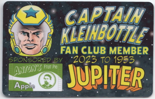
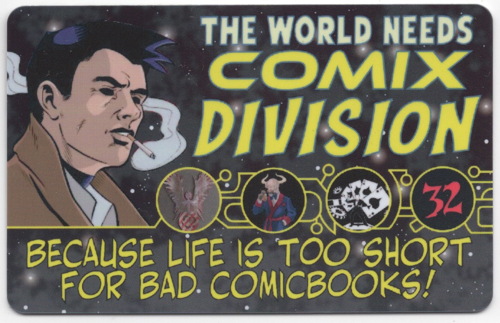
Then there were the membership/fan club cards:
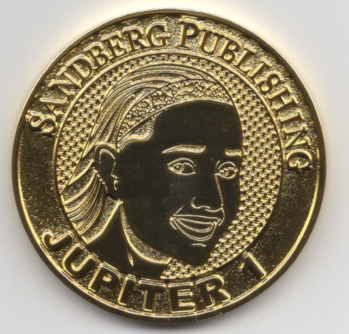
And of course, the official Jupiter coin:
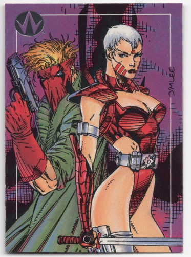
Then, inexplicably, or perhaps entirely explicably, this WildC.A.T.s promo trading card:
He also sent me a personal note, but that’s personal, like I said. MIND YOUR OWN BEESWAX
Last but not least, yours truly gets not one, but two mentions within this mind-shattering publication, including a plug for the very site you’re theoretically reading right now:
…as well as for the store I reportedly own:
“Drop?” “Drop in?” “DROP IT, PUNK?” “Dropout Boogie by Captain Beefheart?” You’ll have to buy the comic, or surreptitiously sneak a peek in the shop, to see the whole pulse-pounding prose Jason attached to mentions of ME ME ME.
Anyway, there it is. YEARS IN THE MAKING! I’m glad Jason’s funding campaigns were a success, and that hopefully more people will get exposed to his wonderful cartooning.
I think you can still order it from that Indiegogo link? I’m not sure. But while supplies last, you can order them from me! Tell me I sent you!
Nexus by Mike Baron and (usually) Steve Rude has been one of my favorite comics for a long time, dating back to almost, but not quite, the beginning of the series. I started reading Nexus (and Baron’s other book, Badger) when First Comics started publishing them. Fortunately, this was relatively early in both titles’ runs, so picking up the relative handful of previous issues published by Captial Comics wasn’t so onerous a task. However, I did pick up First’s trade paperback reprinting the original three Nexus black and white magazines, instead of buying all the originals. (I did eventually get the third magazine, because of the included flexidisc.)
So anyway, I’ve been a fan for a long time, and look forward to any new material featuring Nexus. After a bit of a dry period, we got some serialized stories in the 2011-4 run of Dark Horse Presents (reprinted as the Into the Past TPB), the Nexus Newspaper Strips TPB (which I think reprints material produced through Kickstarter or something similar, someone correct me), and there was also that 3 or 4 issue run (depending on how you count it) published in 2007 or so by Rude himself.
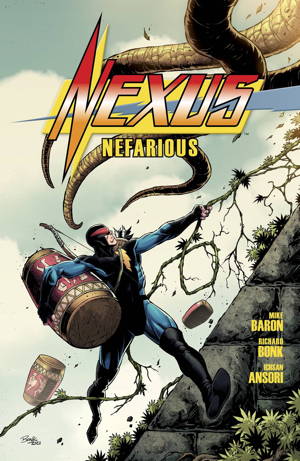
And then, this past week, we got a new Nexus graphic novel, Nefarious. It’s written by Baron, and illustrated by Richard Bonk, who does a good job, I think, and you can see sample pages over at Dark Horse’s site.
The story is relatively simple…Nexus gets accidenntally stranded on what amounts to being a prison planet without his powers. And, as it turns out, the prisoners may not deserve to be there. It moves quickly, with Nexus gathering allies (and encountering one strange old “friend” that I hadn’t expected to see again) and, probably not a spoiler, going after the person responsible for these unjust imprisonments (and worse).
It feels like classic Nexus, like the pre-First era, in that events are almost…dreamlike in their progression, no time is wasted on long exposition or explanations. Sometimes it is to the detriment of the narrative (like, I’m not sure entirely what happened when Nexus had to prove his identity to a pair of aliens early on…maybe I’m forgetting something from the original series involving that particular race), but overall it’s a fun read.
My main issue with this release is the format and cost. While it’s marketed as a “64 page hardcover” the story itself is 54 pages, with 8 pages presenting black and white copy-free artwork from that story, and a final page with an ad for the newspaper strip book. I know this is a format Dark Horse has used in the past, like with some standalone Hellboy stories (such as 2016’s 56-page Into the Silent Sea for $14.99), but $17.99 for this book seems…just a little too much. Maybe there are publishing and/or economic reasons for not just releasing this as a staplebound one-shot for, I don’t know, $6.99, where it would likely have stronger sales off the new comics rack.
I’m sure “longer shelf life” is a big part of it, and getting it into bookstores, too. But it was bit of a sticker shock when I saw that price. I’m not trying to pick on the Nexus book here, as this format at $14.99 I feel like was pushing it. $17.99 just seems like going a little too far, even with consideration for inflation and such. As a store owner, I have to consider perceived value, what prices would my customers consider reasonable for certain items. This has been a problem as comic periodical prices slowly creep up and up, but graphic novels have, at least, seemed to maintain that price/perceived value balance, more or less. It simply seems to me that this Nexus book is too far on the “less” side, which does a good comic a disservice.
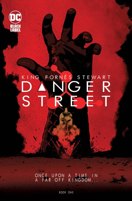
It was mentioned in the original solicitation, so I must have read it back then when I was placing orders on this book. Nevertheless, I was both a little tickled and a little proud of myself as I was reading this comic and it suddenly dawned on me that it was going to incorporate all the characters that had appeared in DC’s 1970s Showcase-esque try-out series 1st Issue Special. Now, it didn’t occur to me ’til Atlas showed up in the middle of the story, so I’m not too proud.
I’m a little surprised this series didn’t get the upscale printing treatment as writer Tom King’s other “modernized” updates to DC characters, like Human Target, Strange Adventures, and Mister Miracle, with the cardboard covers. But this series is styled like them, with a story image on the back cover instead of an ad. And the content is similar, with edgier, more “adult” updates to classic and not-so-classic characters. It’s interesting so far, and I like the gimmick of the book using this specific character set. We’ll see how it holds up for 12 issues.
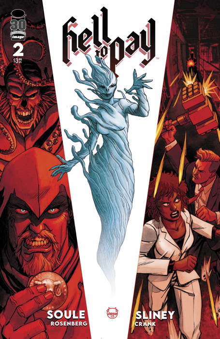
I feel like this is being overlooked a bit as compared to his other Image series, the excellent Eight Billion Genies, but Charles Soule (along with artist Will Sliney) is doing some fine occult-y adventure work on this book. Using the premise of our protagonists pressed into service to hunt down coins from hell (literally, Hell’s actual currency) as a framework to discuss and critique actual economic and financial issues is a clever one, and so far not overused or overbearing. Focus is definitely on the pursuit of the coins, a nice hook driving the plots, though I expect the series to become more than a simple “get the coin” story every issue, like Eight Billion Genies going from “look how wishes mess with our characters” to “look how wishes have altered all of society.” It’s a solid book that I’m enjoying, and I hope more people catch onto it.
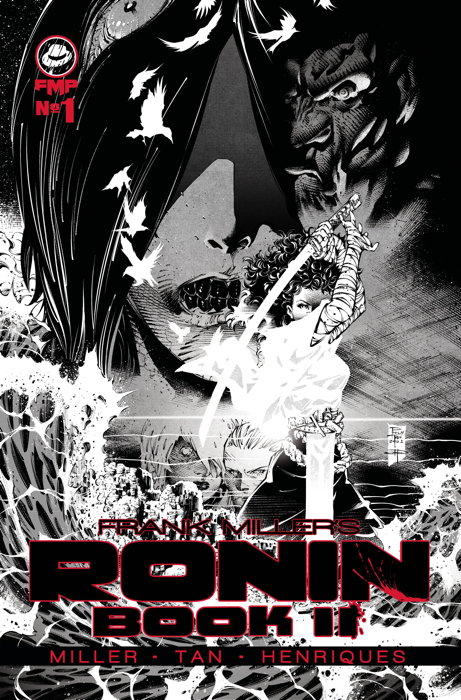
Okay, this actually came out a couple of weeks ago but I just now got around to reading it. It’s…fine, and I’m sort of feeling like how folks felt when they finally got their Dark Knight sequel a couple of decades back. Like, “huh, this is different from what I was expecting.” Casey from the original series carries over, as she and her son (who was obviously fathered by the eponymous Ronin himself) fight a demon roaming the city. There’s a lot of ‘splaining to do in regards to the premise of this series, but it’s only the first issue so presumably said ‘splaining is to come.
Story is told in mostly two-page splashes, written and laid out by Frank Miller and finished by Philip Tan and Daniel Henriques, so it’s certainly visually distinct from the original, as well as missing the rich coloring from that first series. As I said, I like it so far, but I need to see where it’s going exactly, which I suppose is a sign that this first issue did its job.
« Older Entries


