CoMike Attractions.

Hi pals…I haven’t had the blogging time I’ve needed for my longer-form posts lately. I still owe you all a follow-up spoiler-riffic post about the recent Swamp Thing 1989 mini-series, which I discussed in a more-or-less spoiler-free entry way back when. And another entry in the Fantastic Four-ay posts, as we’re moving firmly into the post-Byrne era. And of course the continuing entries in the Final ’90s Countdown of your favorite indie books of that decade.

I don’t know if it’s a case of biting off more than I can chew, but rather a “the body is willing, the clock is weak.” So, I’m sorry for the absolute onslaught of “Blogging About Blogging Is A Sin” posts lately, and I’m going to do my best to keep September free of then.

Also upcoming I have posts about some Kickstartered books I’ve received and one that appears to have dropped off the face of the Earth. I also may have another piece of original art on its way to my greedy clutches, so expect a post on that soon, too. I mean, I have a nice, shiny new website now, I should at least be using it.

Is there anything I haven’t covered lately, or at all, that you’d like me to discuss? Feel free to drop a request in the comments…no guarantee I’ll answer ’em all, but…yeah, c’mon, I usually do.

So there we go…adding yet another series of posts to my already three or four pre-existing ones. Making more work for myself…that’s the Progressive Ruin Promise!

Thanks for reading, pals, and I’ll try to get my act together for Monday.

To my iPhone (and probably other cellphone-using) pals.

I had a bit of style sheet programming that forced the sidebar to appear to the right on portable devices, like iPads, iPhones, and the like. This was regardless of whether of not you were viewing the “mobile” version of the site or if you had the “View Desktop Site” option selected.

Apparently, in Mobile view, that was causing some issues, making either the sidebar or the main section or both too squished to easily read. As such, I did away with the style sheet instruction and now the sidebar should render on your portable devices below all the blog entries on the page, as Steve Jobs intended.

However, if you select “view desktop site” for my page, it should just render normally in your browser, with the main section at the left and the sidebar at the right. It’ll be small, but you can expand it. Or you can look at the page with your phone held at the “horizon” position.

I’m just basing this all on what I can see on my end. I create the site on a desktop, which I feel like is the ideal way to view it. It looked fine on my iPad, both with the “forced” sidebar and with the sidebar at the bottom. And my cellphone…I don’t have an iPhone, my cell practically has a rotary dial*, but before it rendered…okay in Chrome, with the sidebar squished in Mobile view but the entire site looking fine in Desktop view. Now, of course, with that style sheet removed, the sidebar has moved to the bottom and the main section looks fine. (And Desktop view looks great.)

Which is a long way of saying…I don’t have immediate access to an iPhone to test things on. I know a couple of you longtime readers have noted that the page doesn’t look ideal to you on iPhones, so I’m hoping the change I made helps. I even ran the site through this Mobile View Website Checker, and everything seems to be good.

But you guys are of course the final say. Please let me know if things have improved. Clear the cache, reload the site, and hopefully you’ll be able to see at least the main blog easily. I hate not having the sidebar right up there with everything else at all times, so don’t forget to check it once in a while…at least for my weekly new icons!

* Note: I’m only joking, I just bought a new phone about a year ago. It did take me a couple months to realize “oh, it has a stylus!”

Did I almost include a picture of Sand Saref from Frank Miller’s The Spirit in this post? Maaaaybe.

First off, a few notes about the site. Yes, I tinkered with the appearance a bit, bringing it a little more in line with What Had Come Before. The post titles are now all caps again, we’ve got serif fonts back, and most importantly, I’ve brought the comments and category links to the top of each entry. Honestly, that last bit was driving me crazy ’til I fixed it.

I also enlarged the size of the text in the body of the posts a little, so I hope that helps with readability.

Anyway, I appreciate all your comments and thoughts on the new design. Coming up next…a musical background for the site that continually loops “Hamburger Lady” by Throbbing Gristle. That’ll improve the ol’ experience!

• • •

Following up on my Absolute Crisis post from Wednesday:

Somehow I didn’t clock that the cover to the main book in the set was the original George Pérez wraparound drawing produced for the previous hardcover edition, only without Alex Ross’s paintjob and now inked by Jerry Ordway. Here’s a bit of it, since the book is too big to fit onto my scanner:


Ooh, nice, right? Thanks for pointing that out, Greta!

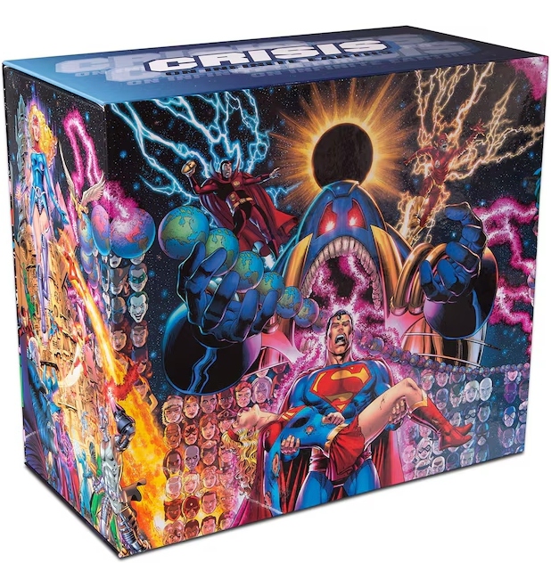
And Daniel T notes some other reprintings of the Crisis series, such as this big ol’ box set:


…and if you peek your peepers at that link, you’ll see that box set has everything. Hardcovers for all the Crisis on Multiple Earths books, all the Crisis tie-ins, all the pre-Crisis Monitor appearances, the JLA/JSA team-ups…I mean, really, the whole shebang. Yes, even that Legends of the DC Universe special I was lamenting last time.

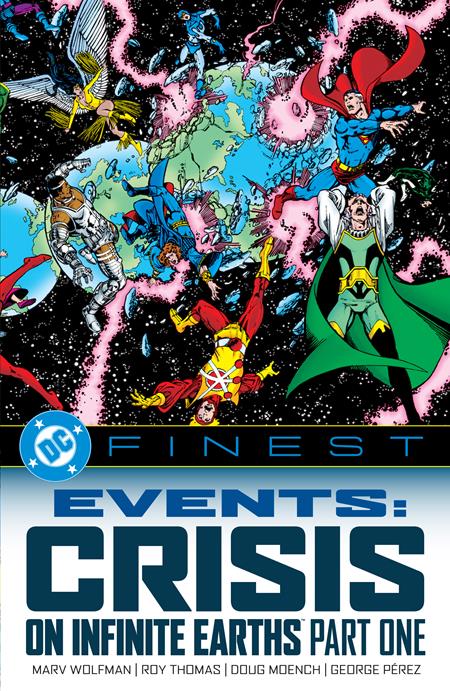
DC is also currently in the midst of publishing paperbacks of the Crisis-specific materal as part of their DC Finest line:


…that is presenting the main mini and DC’s many, many tie-ins in story order. Thanks, Daniel, for reminding me and my aging brain.

I’ve actually made my way through a few more pages of the supplementary book since we last met. I’m kinda/sorta skimming over Marv Wolfman’s plot outlines for now, though I definitely want to go over them more thoroughly to see what’s changed. I did notice some differences already, but I want to pin down some more specific ones to perhaps discuss here at some point.

Instead, I’m favoring the in-company memos on the book, especially the novel-length ones from Roy Thomas to the Crisis team, most of which amount to “don’t screw up my future plans for Infinity Inc..” Thomas does seem cooperative and willing to help with the event, but there are so many requests to leave this, that, or the other thing alone. It’s pretty amazing.

There’s also a memo to editors reminding them that if any new characters were developed and to be included idn Crisis, they first need to be established that they are DC Comics property and that creators don’t claim ownership. I mean, I realize that’s just how things are with some of these characters at the Big Two, but it still felt semi-dystopian to see it spelled out like that.

Speaking of the Big Two, there was some bullets fired over at Marvel’s own Big Crossover Event, Marvel Super Heroes Secret Wars, with the book text referring to its “short-lived” changes, and Marv himself calling it a “catastrophe” in one of his memos. (But one that sold tie-ins, which he was encouraging.)

So that Absolute Crisis just keeps on giving the right gifts. Like I said last time, we’re probably getting a lightly whitewashed series of events. That TwoMorrows Crisis Companion will likely be a little more forthcoming.

Progressive Ruin 4.0 is on the air!

And so there you have it…the all-new style for Progressive Ruin Industries dot Edu backslash HomeLoanOffers. This new template for the site should function a little better with different sized screens, I’m certainly hoping. (A note to folks using their cellphones…clicking on the three buttons and selecting “desktop site” (or however it works in your configuration) will improve the appearance. Sorry, that’s a side effect of me forcing the sidebar to its proper position for tablet users.)

I’ve also made a few cosmetic changes, like that new banner up there. I can fairly easily slot new images in and out of there as I see fit, keeping the banner a little less static than the exact same one I used for the past 16 years.

Also changed is the sidebar icon, where I increased the size on the darned thing, finally. Y’know, when I did that very first icon, lo these many decades ago, I just cropped and sized the pic almost at random, eyeballing the size I wanted for the page at the time. It’s only by pure chance that the dimensions were 131 by 150 pixels…that was not a conscious decision. The new icons are now 196 by 255, a totally deliberate and thought-out choice. Here you can see the difference, using this week’s icon, the charming and not terrifying at all Sluggo Doll…old tiny style on the left, JUMBO FAMILY SIZE on the right:


And this means we’ll be shifting to 4-per-row on the icon archive page. I’m sure after a while I’ll start wondering “how did I ever keep using such small images for this?”

Another small change is that the comments and category links are now at the bottom of each post, instead of at the top. It is possible to switch those back to the top, if that’s really bothering anyone. It kinda half-sorta want them at the top of the posts myself, since sometimes the category link is itself part of the gag I want you to see before diving in. I’ll think about it. It requires some style sheet shenanigans, and frankly I’ve done enough of those for this site already.

The links in the sidebar have had some minor tweaks and additions…I now have a link to America’s most valuable comic book news site, Does This Comics Have Staples, which somehow I didn’t have before. The links I had there before have all been moved to the Links page, and the links that had comprised this page previously have been saved to a local file I can fiddle with as I have time. I’m loathe to dispose of the record of all those links entirely, despite the immense linkrot, as that page may be one of the few records of some of our fallen blogging comrades. I’ll see what I can do about making it into some kind of archive.

A couple of final things: there’s now a button that appears on the right that will take you back to the top of the page once you scroll down a bit. And, at the very bottom, there’s a numbered page navigation tool. Currently 604 pages on the site! …That’s too many.

There are still some minor tweaks and fixes I’ll have to adjust over time, I’m sure, but..it took me long enough to change, and I’m glad I did.

In the title of this post, I call this “Progressive Ruin 4.0,” so let’s go over the previous versions:

Progressive Ruin 3.0 should be familiar, I mean, this is what you were looking at just a couple days ago:

This was the site’s appearance from 2010 to 2026, as I switched from the Blogger blogging system to WordPress.

Progressive Ruin 2.0 was the initial version of this incarnation of the site:

…from its launch in 2003 ’til its replacement in 2010. This was the Blogger period, using Google’s blogging tool to publish to my own domain. Except when it didn’t work and you couldn’t update the page for hours at a time, and that happened once too often and I made the switch to WP. I do miss the livelier sidebar I had there, with links to specific posts that I wanted to highlight. Plus, my “since 1969” tagline at the top of the page would randomly pick from a list every time you reloaded, versus me updating it once a week now.

And Progressive Ruin 1.0, which you probably didn’t see unless you happened to be a personal In Real Life friend of mine (or you followed the link from some computer magazine that featured the site…no, really):


…and this ran from 1996 ’til…well, I’m not sure when. The Wayback Machine has captures listed going to 2003, but none of those seem to work, and I think that page was gone before that. Anyway, it was mostly a page for our mini-comics concern, plus links to friends pages, and in-jokes, and Horrible Eyesores (really awful desktop patterns I created) and so on. An interesting thing, my “What’s New” pages were kind of a proto-blog, where I just kinda rambled on about stuff while also telling you what I’ve changed on the site recently. Here’s an archive from 1999, where none of the images seemed to have made it, but you can get a flavor of what I was up to.

So that was the blogging about blogging is a sin-iest post I’ve ever made. Now that my site update fun is, with any luck, mostly over, I can finally get back to what this project is really about…longform essays comparing Frank Miller’s All-Star Batman and Robin the Boy Wonder with Frank Miller’s The Spirit.

Thanks to everyone for your patience while I duct-taped this comics blog back together, here in the Year of Our Lord Two Thousand Twenty Six, and with any luck I’ll have many more years of comics blogging to come! I hope you’ll all join me!

I’ve been wanting to use one of these GIFs for years.


Okay gang, hold onto your shorts, as the New Progressive Ruin is launching next Monday!

I’ve been working in a secret laboratory, tinkering with templates and japing with jpegs, and I think I finally found the right formula to freshen up this site. I won’t bore you with details (“What? Who are you, and what have you done with Mike?”) but one template I was working with, that I sure was The One, turned into a huge pain in the Athol, Idaho, so I pivoted mid-stream to another and found that it did, like, 75% of the formatting for me.

So what’s left is that other 25%, which has taking a bit of learning new tricks, and just straight up downloading CSS and PHP code to plug into the new site to make things work the way I want them to.

Ultimately, things won’t be TOO different. I was trying to find a new design for the site that worked more or less like the old one. The priority was finding a more modern theme, one that’s been updated more recently than 2010 and will play nicely with the underlying WordPress mechanics. That said, there may be further poking and prodding of the template after Monday, after we all experience it in action.

Speaking of which, a big thank you to Andrea Mignolo, designer of the Hanami theme, which I’ve been using since I switched from Blogger to WordPress 16 years ago. That it’s functioned as well as it has for so long, through so many WordPress updates, is miraculous. And while that recent glitch wasn’t necessarily because of Hanami’s age, it was a reminder that it was time to bring the site at least a little more up to date. But…ah, Hanami, I shall miss you.

Anyway, the site should be up and running properly on August 10th, but if you pop in Sunday evening prior, things may be a bit of a mess as I’m updating, so…

The state of the site.

Don’t be alarmed by the title, everything’s fine, I’m not going anywhere. But like I noted yesterday, my initial attempt at my Monday post someway, somehow, caused a glitch in the matrix here. Comments couldn’t be posted on the post, and for some folks the site as a whole wasn’t loading properly.

Well, I managed to do a brand new version of that post that appears to work fine…some of you have posted a couple of comments, so it all looks good.

As I also said yesterday,I wondered if the 16-year-old template I’m using is part of the problem. I’m using a WordPress theme called “Hanami,” which has been a solid and faithful visual layout for my site for all this time, but it’s very possible the cracks are starting to show. Hence, my quest for a newer, more modern-looking theme that will retain the simplicity of what I have now, but be more responsive to, say, desktop and mobile screen sizes. Oh, and will also allow for a banner across the top of the page with my site name and tagline superimposed over it.

And also won’t break everything. That’ll be good, too. Any ideas, feel free to let me know in my hopefully-functioning comment section.

If you were around the last time I changed up the site, back in early 2010, you know that was a bit of a challenge. But that was switching from Blogger to WordPress, a full transition of blogging platforms. This new template, whatever it is, will hopefully just be a visual shift on an existing platform, one that will hopefully work better with the software involved.

My feeling is that it’ll be a smooth transaction, since my site isn’t terribly demanding programming-wise. But I imagine there will still be a period of adjusting things here and there once I make the switch, so I’ll give you sufficient warning before I start messing around with the site.

• • •

Speaking of that Squeak the Mouse post, a couple of you noted that the cat vs. mouse cartoon characters Herman and Katnip are more of a direct inspiration. In fact, it’s specifically cited by folks from The Simpsons as such…this in-depth article by Brian Cronin tells you all about it.

Plus, in response to my calling Justice League of America #200 “post-Bronze Age,” Athelind asks

“I’m intrigued that you refer to a 1981 comic as ‘post-Bronze Age,’ I tend to think of the Bronze Age as running from around 1970 (Adams/O’Neil on Batman and GL/GA, Kirby leaving Marvel, Spider-Man Drug Issues) to around 1985-86 (Crisis on Infinite Earths/The Dark Knight Returns/Watchmen, the shift from newsstands to specialty shops, the black & white/indy boom).

“I’m curious to know what your benchmarks are for the transitions between Silver, Bronze, and Iron.”

And…hoo boy. I’ve talked about this before (like here and here and here), and, okay, at that last link, I note that Overstreet defines “Bronze Age” as “1970-1984.” But I’m also old enough to remember when Overstreet used to define “Bronze Age” as an informal, not generally accepted term.

But to keep this from going on too long (too late, I know) in my head I generally think of “Silver” as “mid-’50s to late ’60s,” Bronze as “’70s,” and anything past that more or less as “Modern,” because I’m fighting “Copper Age” with all the power my aging body will allow. And I don’t think I’d ever heard Iron Age before, which Googling tells me is 1985 to 2011, and man, I just don’t have it in me right now. I know I’ve said “Modern Age needs to be broken up,” but every time someone suggests something my initial reaction is “no sir, I don’t like it.” So, yeah, don’t pay attention to me on this…I’ll come to terms eventually.

Basically, all I meant was “post 1970s,” as ’70s JLA certainly felt different from ’80s, even early ’80s, JLA.

And in other site news…I will be returning to the “My Fantastic Four-Ay” series shortly, and will be getting into my non-spoiler-free post about the final issue of Rick Veitch’s Swamp Thing 1989. So, yes, soon I shall posts on the site that aren’t just about the site. I’m sure you all will appreciate that!

Not really an End of Civilization post.

So it’s been a while since I’ve done an End of Civilization post (this notwithstanding) in which I go through the distributor catalogs and crack wise about some of the goodies appearing therein.

Part of the reason this series of posts went into decline is the lack of time I’ve had to put them together since opening my own shop back in 2014. Another is that my mindset seemed to have changed slightly because I was now a store owner, and…I don’t know, I don’t think I was more sympathetic to distributors, publishers and their products by any means, but I felt perhaps a little less inclined to be openly mocking them as I had been .

And of course, with the demise of the original Diamond Comic Distributors and their Diamond Previews print catalog, my main source of material has fallen to the wayside. Yes, every current comics distributor has their own catalog, or set of catalogs, that they release monthly, but making fun of just comic books isn’t quite the same as pointing out some new ridiculous Monopoly variant or a PVC statue of a schoolgirl in a bikini or whatever.

Plus, it was easier, at least in terms of “planning out a hopefuly-humorous blog post” if not “placing orders for the shop” to have everything in one spot. Now that it’s decentralized, I have to work harder for the laughs, and you all know how much I hate to work.

That said, I do have an account with the current owners of the Diamond brand, via which they primarily sell just toys and game pieces, and from whom I’ve received exactly one item (a Halloween Michael Myers action figure, ordered from the old Diamond long before its final collapse). I’ve spent many a week looking through their offerings, new releases and final calls to order, and have found basically nothing making it worth the effort I took to get an account at this new company in the first place.

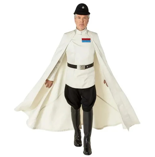
But I found something this past weekend that almost makes me think End of Civilization could perhaps rise from the ashes. And that’s the “Star Wars: Rogue One Director Krennic Cape,” available in multiple sizes:


Yes, for only $200, you can have a cape that you’ll want to wear to work, to jury duty, to weddings, pretty much every waking hour to justify dropping two C-notes. When I pointed this price out on the Blueskies, that I hadn’t priced capes in a while and had no idea if this cost was in line with your standard cape expenses, I was told “yeah, it’s in the proper range.” I don’t recall if the rest of the costume as shown in that picture was also available for sale, but maybe the manufacturer just assumes you have the clothes already. I mean, don’t you?

The starting date for Progressive Ruin.

Some search results (in particular, those powereed by “A.I.”) are stating the incorrect year for the beginning of my site. My very first post on this blog was December 5th, 2003. Unfortunately, I link to a specific “Wizard of Id” strip in that post that’s now blocked behind a paywall. Ah well. At least the link isn’t dead entirely, unlike so many other sites that I’ve linked over the last couple of decades.

Anyway – first post here: December 5th, 2003. Mark that down in your diaries.

“Comics Giveaway Day,” if you’re nasty.


Just a reminder that Free Comic Book Day is only a couple of weeks away, and I’m receiving my stacks of giveaways with my new comic shipments every week. What’s weird is that I hadn’t really thought about the approaching date until I started receiving those FCBD books a couple of weeks ago.

In the past, we usually started getting the promo stuff, like the posters and the shelftalkers and the window decals a little more ahead of time to start getting the word out. But, in the process of just, you know, running the store and doin’ things, I somehow never noticed that no such promotional materials had been offered this year.

I placed a call to Lunar Distribution, who’s handling the FCBD stuff in the U.S., and found out they hadn’t offered any such extra items for retailers. None of the buttons, shirts, posters, and so on, like Diamond would offer. I’ve speculated that perhaps the changing of ownership was finalized too late for such items to be put together for distribution this year…or maybe they just forgot about it, like I almost did.

Hopefully next year they’ll get their act together, but this year I had to print up my own posters and shelftalkers, and little flyers I’m giving out at the register. And, somehow, I still had a case of FBCD merchandise bags sittin’ around, so I’ve been using those. And a good sign: even when I ask the customers new to the store “so, do you know about Free Comic Book Day?” the answer is usually “yes, can’t wait!” Has FCBD become just common knowledge amongst the regular population?

So here’s hoping this year’s event continues the wild success of my previous years. And comics writer Amy Chase is coming back to sign more books and chat with customers, which went extremely well during her last appearance at FCBD. Alas, pal Dorian won’t be able to help out this year like he has before, but an old customer of mine, Deon, will be filling in! We should be on track for another good year, with any luck.

***

Just a brief blog note: I haven’t forgotten about the “My Fantastic Four-ay” series, I just took a break this week and I’ll be back to it next week. Those are a lot of work!

This week’s new issue of Krypto is good too.

Hi pals! I’ve been a tad out of sorts of late so the content-generating gears in my brain have been working slower than usual, for which I apologize. Proper content will resume shortly on this site, such as starting on answers to your questions and getting to the next entry in the Final ’90s Countdown.

In the meantime, why not hie yourself hither to the Longbox Heroes podcast run by close personal friends Todd and Joe, which while on the Patreon site, their main weekly comics podcast and their weekly After Dark show remain free. However, if you throw ’em a buck or five, you get all their bonus podcasts (sometimes right away, sometimes you have to wait a couple of weeks, depending on your subscription level).

Now, those bonus Patreon-only podcasts may be of interest to you, the Progressive Ruin Platinum Member Cardholder, in that I’m definitely involved in one, and may eventually be involved in the other. In the first case is their monthly “Previewing the Past” show, where they send 2 to 3 hours discussing the Diamond Previews released exactly 30 years ago this very evening WOOOoooOOOO spooky! And Todd and Joe were nice enough to invite me, or I shoved my way in, one of those two, and I’ve been supplying additional notes based on my own memories and experiences about some of the items in these old catalogs. Since, after all, I am quickly approaching my 37th anniversary in the business, so I sold all the stuff in those 30-year-old Previews!

I should emphasize I’m submitting written material for Joe and Todd to read, so you’re not going to hear my malodorous — er, mellifluous voice on the show. However, their other monthly Patreon podcast, “Comic Book Oddities,” is where the two lads discuss comic book movies of the past. The next episode’s movie is randomly picked at the end of each show, and somewhere in the mix is America’s greatest cinematic achievement, Frank Miller’s The Spirit. And Joe has said, on air, that should The Spirit ever turn up via random selection, they’ll find a way to have me actually on the episode. So, there you go, added incentive (or perhaps, decentive) to sign up.

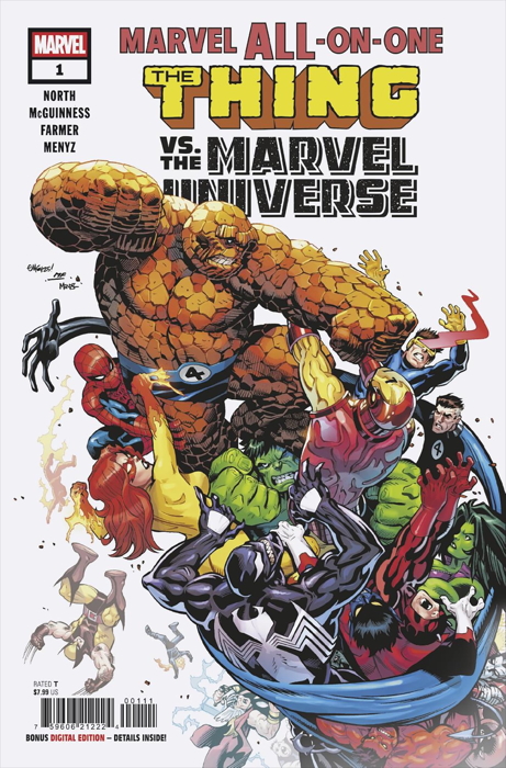
And, um, okay, here’s some actual comic book stuff: I read this week’s forthcoming release of Marvel All-on-One #1:


…and it’s a hoot. All splash pages inside, as befitting a comic where the Thing just beats the stuffing out of folks. Don’t reveal the surprise ending to your friends!