You are currently browsing the indies category

I read Peepshow #15 and it made me sad.
This is the final issue of Joe Matt’s autobiographical comic, released last week from Fantagraphics…final, due to Matt’s passing last year at a too-young age (though I’m sure he’d argue about the “young” part).
If you’re looking for a neat wrap-up to Matt’s comic book life as portrayed in Peepshow over the decades (having started publication in 1992), you’re not going to get one. In fact, one of the stories within is titled “Maggie – Part One” and there is no part two extant, though there are mentions of her in further stories and you can probably get a sense of what a Part Two might have been.
Another throughline in this issue is Matt’s move to Los Angeles, pending a potential television adaptation of his comics for HBO. While there’s a lot of grist for Matt’s unique mill here, there was obviously more to be told that we’ll not get (especially since the story dealing specifically on the topic also gets a “Part One” heading, no “Part Two” present). The ultimate conclusion is known — these stories take place years ago, and there is no Peepshow TV show now — but I’m sure Matt would’ve had more to say about the experience.
The only segment of the book that sorta feels like a final wrap-up is his brief summaries of all his sexual relationships to date. And this, as well as everything else in the book, is told with his trademark near-cringeworthy and hilarious bluntness and honesty. He never flinches from making sure his thought processes fully transparent, his mistakes completely exposed.
And I want to make sure that’s clear…it’s still funny. It’s still Joe Matt being the most Joe Matt, with all the cheapness and obsessiveness and selfishness completely on display. Even as he worries about his aging (40 in these stories, set 20 years ago) and his pursuit of some sort of financial and emotional stability, it remains told in a way that amuses in the Mighty Joe Matt Manner.
But it’s still sad, reading these strips and knowing this is the last chapter to his own story. I keep harping on “conclusions” and “wrapping up” in this little overview, even though obviously I know in my head that Matt couldn’t have realized this was going to be his last comic book. But my heart can’t help but want more.
And readers of comic books have an ingrained expectation that a final issue is going to tie everything up in a little bow, or that it ends on pithy note, gathering up your narrative experience in some clever way.
Peepshow #15 doesn’t do that. It gives you one more entertaining piece in the ongoing saga of Joe Matt, just like every previous issue did. It’s just sad that we’re not getting a #16, no matter how long we’re willing to wait.
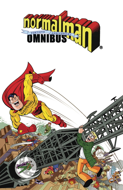
So I picked up a copy of the normalman 40th Anniversary Omnibus, reprinting in full Jim Valentino’s mid-1980s parody comic series from the mid-1980s. I believe this is the first color reprinting of the introductory back-up stories from Cerebus, as well as the story from A-V in 3-D, presented in color and non-3D. I also believe this is the first color reprinting of the concluding chapter, normalman 3-D in a non-3D format. I appreciate that, given it’s a little harder for my eyes to do 3D in print properly anymore. (These 3D stories have been reprinted in non-3D in previous black and white collections, from Slave Labor and from Image.)
Also featured is the crossover story from Journey #13 by William Messner-Loebs (presented in the original black and white by Messner-Loebs’ request). Other material, such as the later normalman specials from Image, ads, strips produced for conventions, unused pages, and the like round out the book. Sadly not included is 1997’s Max the Magnificent:
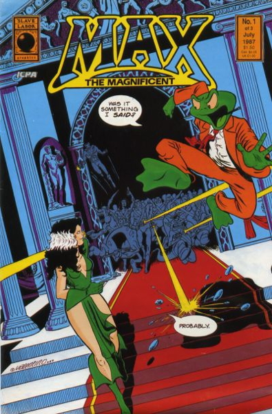
…a spin-off starring a character normalman runs into during the course of his adventures. The comic also features an appearance by normalman‘s Captain Everything, which makes it especially odd that it doesn’t make the cut.
Now for the most part, this is a nicely done book…the reproduction of the art is very sharp and clear. The original mini-series and 3D special, however, have been relettered, which…frankly, isn’t an improvement on the original lettering. Maybe in the earlier issues, where the lettering is a little less polished, it is a step up, but in these cases I would always prefer the original, with the lumpier handdrawn word balloons and occasionally funkier typography. However, it wasn’t that distracting, and especially for my eyes it made for an easier reading experience.
Except.
I understand there may be production issues where the art just has to be relettered. It happens, I get it. But it seems like every time relettering like this is done for reprint works such as this, misspellings and such slip in that weren’t in the original printing. As I recall, this happened with Image’s initial reprintings of Matt Wagner’s Mage: The Hero Discovered, and with those strange black and white collections of Jim Starlin’s Metamorphosis Odyssey from Slave Labor Graphics.
And it happens here, in this delxue volume of normalman I’d been wanting to see for years. Granted, for a several hundred page book, it’s not a whole lot, maybe a half-dozen or so errors that I’ve noticed, but they are still pretty distracting.
For example, from issue #1, here’s the original word balloon:
And here it is with an inexplicable word change:
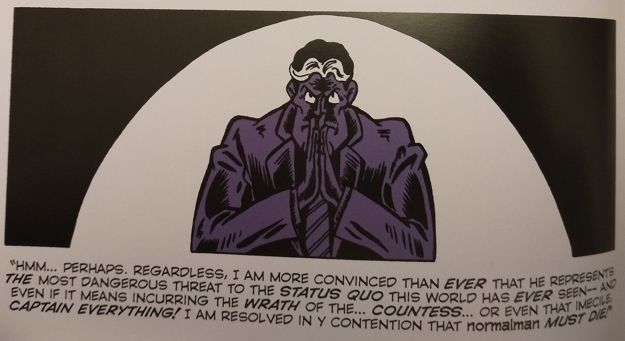
From issue #10, the original panel:
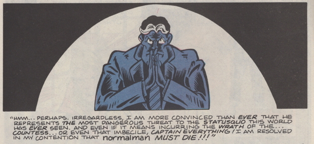
And how it appears in the omnibus, with a couple of extra typos (for “imbecile” and “my”):
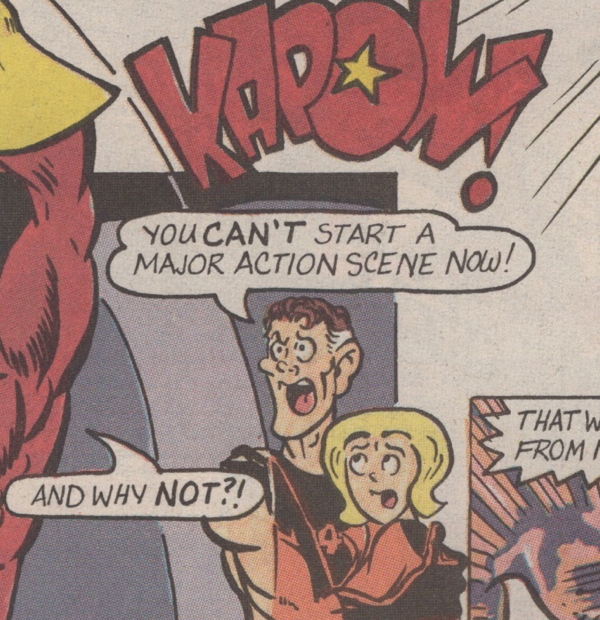
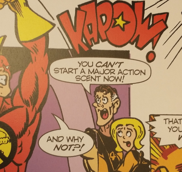
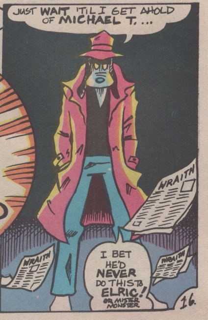
And here’s the one that really stood out to me, for what should be obvious reasons…from issue #4:
And here is it in the omnibus:
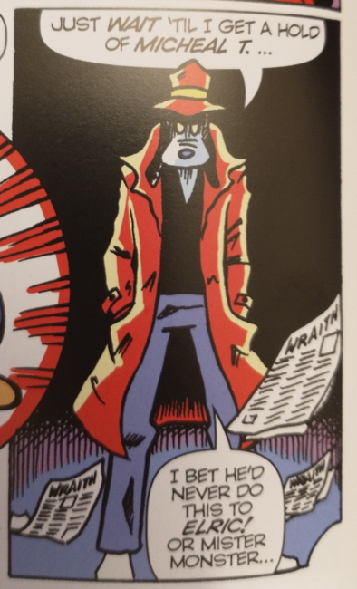
(Also, making “Or Mister Monster” the same size lettering does alter the gag a little.)
There are more examples (including at least one word balloon in the omnibus that I think has either misspelled a word or left a word out entirely, I haven’t checked yet).
This is just in the original normalman story, which is all I’ve read of this omnibus thus far. I don’t believe the other material has been rejiggered in this fashion. Plus, as I’ve said, it’s only a few of these errors that I’ve noticed, and I’m hoping they’ll be fixed in later reprintings. I should note that the Journey issue reprinted here has not been relettered.
As soon as I saw these, I did pull out my copies of the original series, actually kind of hoping the mistakes were in those. Somehow it would have been slightly less annoying if these were faithful reproductions of original errors, though undoubtedly I would then be complaining about “why didn’t they fix that?”
I am glad I have this book. I mean, mistakes happen — What Can You Do?™ — and given this hardcover was solicited with a first print run of only 1,500 copies, maybe like I said they can quickly fix these issues for new printings. It’s a classic and funny work that deserves to be in print, and I just want it to be in the best possible presentation.
§ November 10th, 2023 § Filed under indies § 5 Comments
Yes, here’s the necessary follow-up to Wednesday’s post with extra info on Jon Sable Freelance that I missed due to 1) ignorance and 2) being too old to work the internet properly.
First, let’s get this out of the way…several folks left comments or sent emails essentially telling me “hey Mike you dummy, that Soldier of Fortune text you linked to actually has a link to actual scans of the magazine.” Said comments/emails were accompanied by links and/or attachments showing THE ACTUAL AD, the very one my dad spotted back in 1986 and informed me about. Hence:
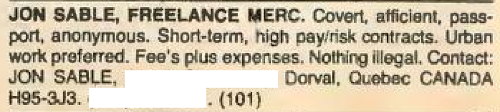
I edited out the address/phone number, obviously, even though it’s right there in the original scans if you want to trek to this Canadian apartment complex and find Mr. Sable. (LEGAL DISCLAIMER: don’t do that.) Anyway, first person through the gate with this info for me was Sleestak of “Lady, That’s My Skull” fame, so thanks to him and to everyone else who tried to set my ailing brain straight.
More additions/corrections:
Chris lets me know that there have been a couple of Kickstarter campaigns (here’s the most recent one) to issue nice hardcover collections of the original Jon Sable series. Of note is that one of the “rewards” is Jon Sable Graphic Album #1, a 56-page “DC’s Black Label” format oversized softcover. Apparently this is a planned ongoing reprint thing for 2024, but available to Kickstarter supporters first.
Pal Nat reminds me that 1987’s Word Warriors contained a jam story that included Jon Sable and work by Grell.
Customer Sean asks how many votes Mr. Sable received in my poll. He was a 4-voter!
Mixmat points out my mix-up, giving the wrong title for First’s crossover series. It’s actually Crossroads, and I should have known better because it’s not like i haven’t talked about it plenty of times on this site. Ah well, fixed now.
Roel Torres (one of the aforementioned four votes!) talks about what sounds like his very impressive collection of Grell art, and notes that Bill Jaaska, the main artist of the Sable series, had a sad end. I went looking for more info and found this detailed accounting of the man’s life. Worth a read in remembrance of an artist who, like many, never really got his due.
CP Bananas slips in this one last question:
“A sincere question for the Sable fans here, from someone who’s never read any and isn’t sure this is google-able: what was the deal with the stuff on his face? I always assumed it was a concession to make a ‘real-world’ character look more superheroic on the stands but what was the in-universe explanation?”
I don’t remember any specifics, but my presumption is that it’s just like “warpaint” or such to help disguise his appearance, and maybe act as a form of camouflage. Just looking at the covers, I presume this origin issue (which was one of the earlier issues I hadn’t read) gets into more detail:
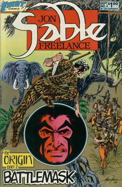
I’m sure one of you know the actual answer, so please leave it in the comments here! Thanks!
So in response to my post about the passing of Keith Giffen, LouReedRichards brings up a title that I’m sort of shocked at myself for not remembering. On one hand, I couldn’t list everything, but on the other hand, I really should have pointed out this comic from 1987:
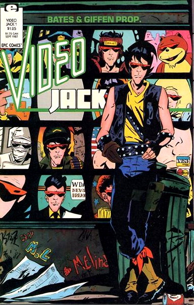
And here’s a sample page from the first issue:
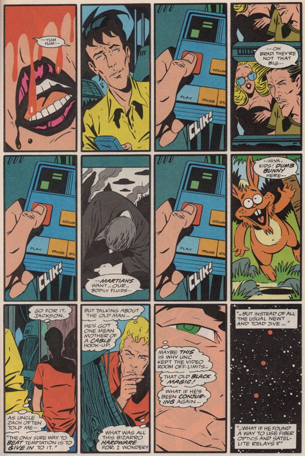
Did ol’ Keith do 12-panel pages throughout the series? Oh he sure does, for the most part, with some smatterings of six and nine panel pages, so this is one series dense with storytelling. Even the last issue, featuring several guest artists (like Fred Hembeck! Walt Simonson! Trina Robbins! Jim Starlin!) is mostly 6 or 9 panel grids. There’s the occasional breaking of the format, including a pretty stunning two-page spread in the first issue.
So here’s the thing about this comic.
I remember really looking forward to it. I even picked up one of the promo posters at the comic shop, where they had a stack they were giving away, and had it put up at home. And I bought each issue off the stands as it came out, its release coinciding with my beginning months of college.
And I’m pretty sure that was the one time I read it. Well, okay, I probably reread the whole series once it was complete. And it’s been 35+ years and I remember very, very little of it. As I flipped through my copies, extracted from what remains of the Vast Comics Archive, I remembered bits here and there, some of the conceits of the series, the character designs, etc. But there is a lot going on and I’m sure there are plenty of details I’m forgetting.
Hell, I even forgot that this was written by former DC Comics stalwart Cary Bates.
I remember really liking the series. But I couldn’t tell you really anything substantial about it, beyond “dude falls into a TV world” and I’m not even sure that’s 100% correct. But glancing through it, it’s definitely a showcase for this era of Giffen’s art. I definitely would love to be able to reread it, but “rereading older comics” is on the backburner while I’m still trying to catch up with the new stuff. As I posted on Bluesky:
“Well, if I’m going to reread every book and comic I’ve bought and kept over the last five decades, I’d better get started.”
In some cases, it may be just enough to remember that you liked a think, even if it no longer lives in your memory and you don’t have time to revisit. Ah well.
And it took three and half decades, but I finally get the punny joke of the title. …No one’s ever accused me of being too on the ball. Do I need to tell the Ms. Tree story again?
So like I was talking about in this post from last week, I find myself trying to pick between reading a lot of comics and getting the backlog cut down, or reading a single graphic novel in that same time.
Well, I finally decided to pick up Kate Beaton’s autobiographical graphic novel Ducks:
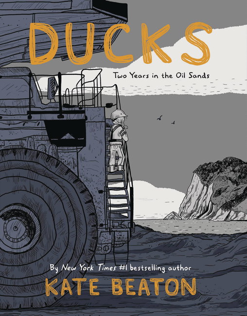
…and I’m only halfway through, but I definitely lost time Sunday evening reading this volume, looking at the clock, thinking “oh sure I’ve got time before I have to go” and then checking again and realizing “oops, I’m late.” That’s probably a sign of a good book, right?
It’s the story of Beaton’s post-college jobs in the Canadian oil fields, which she took to pay off student loans. It’s both fascinating in the details of the work she’s doing, and harrowing in the casual sexism and harassment a young Beaton has to face. It’s densely told, usually lots of panels per page, but it never feels cramped. And for my long-suffering eyeballs, the lettering and the black and white art are both crisp and easy for me to read.
Usually one should finish a book entirely before giving a recommendation, but even at the halfway point I feel confident telling folks this is one worth getting your mitts upon. I’ve long enjoyed her shorter humorous works, and I’m finding her longform dramatic storytelling to be just a compelling.
So Pedro said in response to Monday’s post about Mister X:
“So it sounds like this highly-voted for series kinda sucks, eh?”
And LouReedRichards already gave a solid response:
“I wouldn’t say it sucks, but like many projects, the parts are actually greater than the whole.
“It has good, often amazing (IMHO) art & design work, a wonderful setting and concept. Motter is a good writer and artist, from what I can remember from his other works.
“For some reason it just never comes together as a cohesive package.
“It’s definitely worth picking up any of the Vortex color issues in the cheap bins.”
Just so this isn’t a lazy post where I reprint what you guys wrote in my comments and call it day, I do have something(s) to add.
First off, the votes. I’m just a little ol’ blog that pleaded for readers (and for pals on Xwitter) to contribute to my poll. It’s not a wide-ranging, comprehensive poll by any means. I think it’s not a bad representation of what fans liked, and by and large I think the results of my poll more-or-less reflect fairly well my own experiences over the years in the shops I’ve worked in.
But my poll isn’t perfect, and some titles got fewer votes than I expected, some got more. All it took was enough fans of a certain title to decide to participate in my poll, or enough people deciding not to, to skew things one way or another. Mister X is one of those titles that I was honestly surprised that showed as well as it did when I tallied the numbers.
As LouReedRichards said, there is plenty to recommend the series, even despite its uneven production and storytelling. A failed experiment can still be compelling and interesting and worthy of attention, even if it rarely, if ever, gels as a complete package. And it could very well be that the World’s Biggest Mister X Fan is reading this right now, buildin’ up a head o’steam over me daring to suggest the comic was lest than perfect.
One of my all-time favorite comic books remains the Andy Helfer/Bill Sienkiewicz/Kyle Baker run on The Shadow. It very famously ended mid-story, where the Shadow’s head had been put on a robot body, and someone somewhere decided “ooookay, let’s put everything on pause for a sec.” Many claims had been made to exactly why the series ended, and I covered them in a long-ago post here, probably link-rotted. I would point out that what DC said and what one of the creators said very much contradict each other.
But it’s unfinished. Even so, if I were asked to vote in some kind of favorite comics poll for which this series was eligible (“Series Most Likely to Give Old Fans of the Property Heart Palpitations”), I 100% would hang that chad for The Shadow.
On a related issue, I thought Matt Wagner’s Mage was highly and widely regarded as a classic comic series. Turns out that wasn’t quite the case, and, well, there you go.
Ultimately, there were enough people participating in my poll to give Mister X the good showing it received. That it’s received a certain level of critique for things never quite working out, there was enough there to make it a favorite title of some. It may not have always succeeded in what it was trying to do, but it succeeded enough.
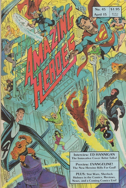
So pictured above is Amazing Heroes #45, the April 15, 1984 issue, back when it came out biweekly(!). This was the first issue of the ‘zine I purchased, and, enjoying the mix of reviews, interviews and humor within, I continued to buy each following issue for a few years. I did eventually drop off, likely more due to finances, but I did pick it up again eventually and kept onboard ’til the series’ eventual end.
Over the years I tracked down the issues I missed, both prior to my picking up that #45, and the issues I missed during my brief hiatus from reading it afterwards. (I did thankfully continue buying the Preview Specials and the always delightful and frequently hilarious Swimsuit Issues new off the shelf.) I currently have a full set of the Amazing Heroes magazine, ready for reference at a moment’s notice…
…assuming I know where to look. And after reading some of the responses to my post about Matt Wagner’s Mage, it brought to mind a review I remembered reading in Amazing Heroes of the first issue of the first mini-series, “The Hero Discovered.” I knew it was in that magazine, but where? Where?
Thus I did the logical thing…I went to the Grand Comics Database and checked the entry for Mage #1 to see if it had an on-sale date. Indeed it did (January 17th, 1984) with the added bonus that the entry indicated the release date info came from Amazing Heroes #40! With a starting issue in mind, all I had to do was quickly scan the contents page of each issue to see what comics were in that’s half-month’s review column…
…ending, naturally, with issue #45, the very issue I started with way back when. Probably should have been my first target, given that I probably read and reread that ‘zine nearly to the point of memorization, given that was my first sample of the title.
Anyway, seeing some of my good and faithful readers of this site wax…unenthused about Mage (either in part or as a whole) got me to thinking about that review. And look, of course it’s fine that you may not care for it. I’m not here to argue with you, though maybe I can move some to perhaps reevaluate the series for themselves. This is more about my perception, that my belief was that the series, despite its rough start, ended up culminating in a beloved series and a comic-bookical classic. Finding out that, no, some folks weren’t into it as much as I was, that’s a call for me to reconsider.
Not reconsider that I like the series, of course. I love the series. I think the first one, “Discovered,” is the best, with the second series “Defined,” being my second favorite, and “Denied,” the third, being, well, you know. But admittedly I’ve only read “Denied” the once, so upon a theoretical reread maybe it’ll go up a bit. But I still liked it.
Mostly what I’m reconsidering is the idea that Mage is not as universally highly regarded as I thought. What’s weird about this is…I know perfectly well not everyone likes every comic equally. Of course I know it. I run a comic book store, for Petes’ sake. How many times have I had someone ask me “do you have any really good comics, like [X]?” where X is a comic I wouldn’t read with someone else’s eyes?
Plenty of times, that’s how many. So I know how it is. But I just had a blind spot for Mage, assuming my love and appreciation for the specialness of the series was nigh-universal. Ah well, What Can You Do™?
Again, back to that early review of the first issue. I even said in my discussion of the comic that the first issue was relatively crude and amateurish, and that we got to see Wagner’s talent and skill grow over the course of the series. (Dave Sim is another example, where his linework and his lettering just became more and more refined over the clunky initial issues.)
This review, therefore, isn’t catching Mage at its best. The reviewer, R.A. Jones, goes on a little bit about the series’ seeming pointlessness and awkward dialogue, expressing surprise at the protagonist’s name, which, you know, fair enough, and concluding with this:
“A disjointed story, forced dialogue, and unimaginative art do not make for a big time winner. Comico’s titles have been dropping like flies, and Mage has only one wing to start with. Skip this one — you’ll be glad you did.”
Which is a bit tough. Yes, the dialogue needs some work, the art is amateurish, but not without its charms. And Jones states about Kevin:
“The ‘hero’ of our story — if such an appellation can be applied — is Kevin Matchsick(!!). Kevin is full of more self-pity than the Thing in his darkest moments. Since we see nothing to engender such pity, the man comes off as a whining bore.”
Now, I mean, the comic is subtitled “The Hero Discovered,” so we gotta start from somewhere, right? Seeing Kevin grow from this low beginning is part of the fun of the story, and the reviewer’s complaint that the titular Mage gives Kevin superpowers for no apparent reason…well, maybe there is a reason, to be revealed eventually. This is the just the first issue, after all.
I have the advantage of hindsight, of course…the review was written with only one issue in hand, and it’s not presenting Wagner at the height of his powers. I’m looking back, literally decades later, after the story has reached its final conclusion with its third series. I know where all that stuff complained about in the review of that initial installment is heading. Yes, I admit it’s rough, and that the protagonist’s surname of Matchstick is a bit something, outside any of its symbolic significance. But I happen to like that roughness, that amateurness, the idea that someone decided “hey I got a story to tell” and basically learned on the job how to tell it. That was wildly appealing to me, and I’m glad I didn’t skip this one.
However, the review stands as a reminder that not everyone found that endearing. And some of you folks reminded me, not everyone likes the same things I do. Which is not a lesson I really needed to be taught, as America’s #1 champion of Frank Miller’s The Spirit movie, but sometimes a little reminder is good. I love Mage, some of you don’t, and that’s all perfectly fine.
Sorry for skipping days here and there lately…just have a lot of stuff going on, on top of my aged body just being too tired to blog at the late hours that usually are the only time I have for such activity. So, let me get a few topics out of the way today and maybe sometime next week I can get back to the Final ’80s Countdown.
First off, it’s here, it’s here…or rather, they’re here, a sample of the very bullet and casing used to shoot them holes right through the much-discussed-on-this-site Jab #3.
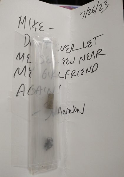
And there they are, direct from Jab #3 contributor and “Too Much Coffee Man” creator Shannon Wheeler his own self. The accompanying note reads “Never let me see you near my girlfriend again!” and the temptation was to just hide this item somewhere in my collection, unexplained, and leave some serious questions behind for anyone eventually handling whatever passes for my estate. But no, here I am blabbing about it on my comic book weblog, which of course has immense worldwide reach so all my secrets are revealed. Ah well.
But big thanks to Mr. Wheeler for offering up this peculiar bit of comic book history (and also for kindly answering my questions about the whole Jab #3 project). Also, I need to add links to the older Jab posts so they get the whole story if they come upon my writings via Google or Ask Jeeves or whatever.
• • •
Next up, reader Cassandra asked if I could post a link to
William Messner-Loebs’ GoFundMe, and yes I can! That poor guy and his wife have had a real time of it for years now, and I most sincerely hope they can get themselves into a comfortable, stable place.
What would be nice is if more of his comic book work were in print and providing him at least a little money. Like, was any of his Flash work collected? A recent DC Pride one-shot had that one story of his with the Pied Piper, but beyond that there wasn’t a lot of comprehensive reprinting of his run, far as I can tell. I don’t think even #50 was reprinted anywhere, and that was kind of a hot issue at the time.
A chunk of his Wonder Woman made it into a trade that could stand reprinting. And how ’bout a nice big archival hardcover of Journey? Or maybe a new printing of Epicurus the Sage? Or just giving him new work if he wants to do it?
Anyway, help him out, even if it’s just spreading the word.
• • •
Sean asked about Pee Wee Herman (RIP the great Paul Ruebens) in comics, and the first thing I thought of was this:
…which, if memory serves, was a kinda/sorta parody of Pee Wee, maybe…it’s been a while since I’ve read it, but it’s something like that. Anyway, there you go.
• • •
Longtime reader Michael G. came by the shop in person and admonished me,
tongue-lashed me in the cruelest manner, for my lack of content this week. But to show me all is forgiven, he gifted me with some Dave Sim
Cerebus trading cards, which are, of course, the Dave Simmest, but you’d be disappointed if they weren’t:
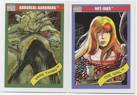
Yup, they’re Swamp Thing-ish…the other cards are nice too, but look, I’m too tired to keep this post going for too much longer, so let’s just throw out one more scan here and call it a night.
• • •
As promised, one more scan, this time from my fanzine collection:
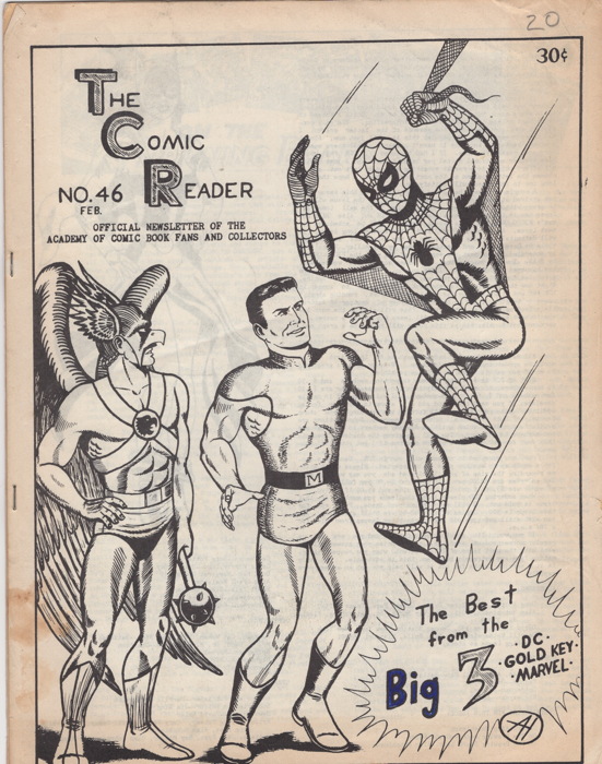
This ‘zine is from 1965, which means Spider-Man had only been around about three years. Weird, huh?
It’s here, it’s here, in my hot little hands direct from Jason Sandberg himself, as predicted by prophecy, the new Jupiter #1:
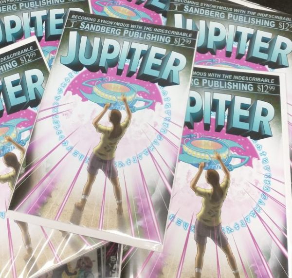
Jupiter was a black and white indie publisher too briefly in the 1990s, and I discussed that run here. Then in 2018 Jason put up a digital compilation of the best of Jupiter. And now, here we are, with a brand new color comic featuring his weird and wonderful cartooning.
Now, ever since I wrote that first blog post about Jupiter way back when, Jason and I have been online pals, chatting regularly, me hopefully being encouraging about his work, and he sending me the occasional goodie in the mail (like when he sent a stack of mini-comics he did for me to give away on Free Comic Book Day).
This time, he made sure I had plenty of the new Jupiter on hand, along with a few extra bits of business just for me.
First, he sent me a signed copy. That was nice!
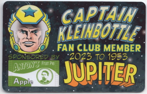
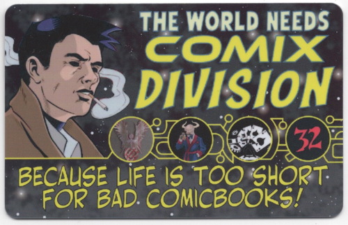
Then there were the membership/fan club cards:
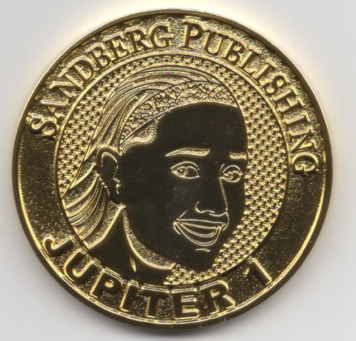
And of course, the official Jupiter coin:
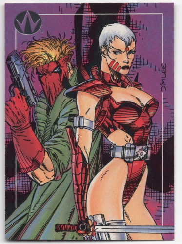
Then, inexplicably, or perhaps entirely explicably, this WildC.A.T.s promo trading card:
He also sent me a personal note, but that’s personal, like I said. MIND YOUR OWN BEESWAX
Last but not least, yours truly gets not one, but two mentions within this mind-shattering publication, including a plug for the very site you’re theoretically reading right now:
…as well as for the store I reportedly own:

“Drop?” “Drop in?” “DROP IT, PUNK?” “Dropout Boogie by Captain Beefheart?” You’ll have to buy the comic, or surreptitiously sneak a peek in the shop, to see the whole pulse-pounding prose Jason attached to mentions of ME ME ME.
Anyway, there it is. YEARS IN THE MAKING! I’m glad Jason’s funding campaigns were a success, and that hopefully more people will get exposed to his wonderful cartooning.
I think you can still order it from that Indiegogo link? I’m not sure. But while supplies last, you can order them from me! Tell me I sent you!
So I somehow ended up in a Twitter thread with Too Much Coffee Man‘s creator, the wonderful cartoonist Shannon Wheeler, and I took the opportunity to ask him a couple of questions about Jab #3. You know, the comic what had a bullet shot through its middle?
My questions both involved this ad that was inside the comic, for copies of the magazine shot with more powerful guns than the .22 caliber used on the “normal” books.
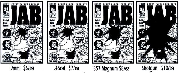
My first inquiry was “were the variants advertised a real thing?” to which Mr. Wheeler replied “Yep!” He stated they only did a few, and that they didn’t take any pictures of the process. That was a shame.
My next question was “did you sell any?” and his reply was that they “seemed like they sold a handful, but not many.” He did volunteer the added info that the shotgun variant “was the most fun (but scary)” which, as someone who’s fired a shotgun, I can probably attest to.
Best of all, he offered to send me a spent bullet and casing from the shoot, and boy oh boy I can’t wait to have that. What a great, hilarious addition that’ll be to What’s Left of the Vast Mikester Comic Archives.
A big thanks to Mr. Wheeler for letting me bother him a wee bit about this weird but wonderful piece of comics history.
• • •
Speaking of the Twitters, I don’t know if folks without an account can read tweets there again, but the Twitter widget I had in my sidebar seemed to be working when I just checked right now. And by “working” I mean “running dozens of my tweets down the side of my page instead of the usual five,” which is par for the course considering the new management there. For the meantime, I’ve removed that widget and replaced it with a simple text link.
Also here’s a reminder that I’m also on Bluesky (still invite-only, sorry) and Mastodon. And (yuck) Threads as (also yuck) “mikesterlingjr.”
« Older Entries


