You are currently browsing the publishing category
So this week is the release of the Labyrinth #1 facsimile edition from Boom!/Archaia, reprinting the three issue adaptation of the Jim Henson movie originally published by Marvel in 1985.
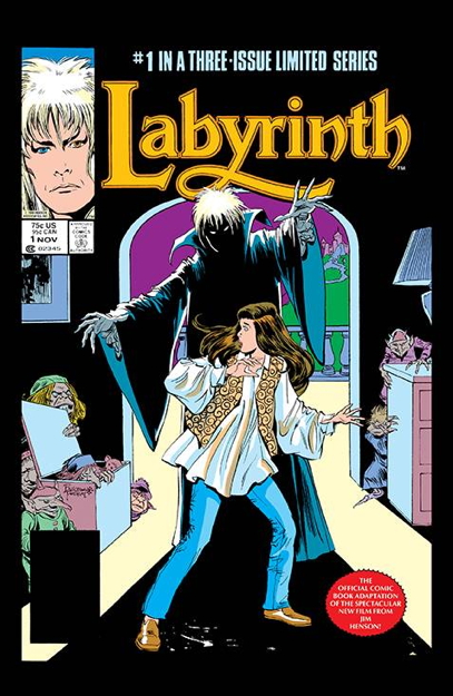
It does look nice, with the artwork by John Buscema and Romeo Tanghal appearing nice and crisp on the white paper. The paper stock used for the cover feels a little more fragile than I’d like, but that’s kinda par for the course in comics now, so I’ll live.
But one thing that does bug me is this little bit of business right here on the front cover:
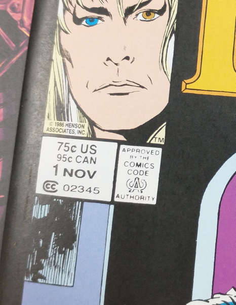
Yup, they reproduced the original cover down to the original prices. Before you ask, no, this comic is NOT selling for seventy-five cents, but rather for the $4.99 price indicated on the back cover. Which of course means I’m going to be asked “is this really $0.75?” all day.
Usually, when DC and Marvel do their facsimile editions, they either obscure/remove the original price, or change it “499¢” or whatever. Leaving the original price on the cover for a reprint like this always leads to customer confusion. Especially in recent years, when comics have been released with actual low gimmick prices, or seeing something supposedly selling for 75¢ would not be unheard of. It looks like this comic is getting a little sign under it on the shelf saying “REALLY IT’S $4.99.”
So anyway, publishers, don’t do this. It’s annoying for me as a comics retailer, and it’s frustrating for customers, some of whom will think someone’s pulling a fast one.
I did see some wondering online about why this is being reprinted in the first place, and I think the obvious answer is, like I said above, Boom!/Archaia have been doing Henson comics for a while now. This is just another one, only a reprint instead of new material. Hopefully they’ll get around to reprinting Dark Crystal next.
* I mean, they took the time to edit the Marvel logo out of the corner box, right?
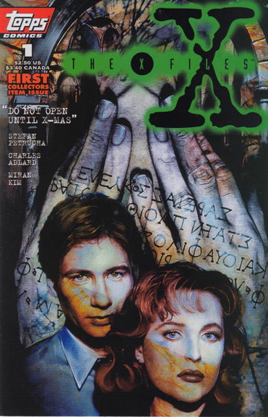
So Thom H. and Chris V brought up the X-Files comics in my movie adaptation post from a week or so ago. Okay, X-Files comics are technically a TV show adaptation, though it would get a couple of movies eventually.
I’ve written about the X-Files comic before, a whole ten years ago (and it’s weird to read about me processing a collection of old comics for the previous place of employment and not my own store). Anyway, way back then I wrote about how when that first issue (picured above) originally came out in the mid-1990s, the crash still affecting the market, we were caught off-guard by how much demand we had for it.
So much demand, in fact, that a second printing was rushed out, with the added bonus of individual serial numbers appended to the covers:
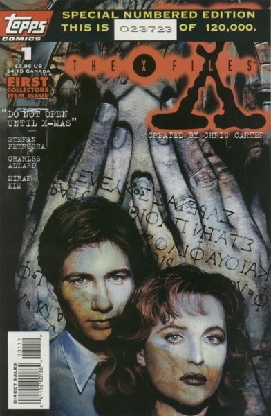
Serial numbers were cropping up a bit on comics around this time, as you can read here. A print run of 120,000 seems mindboggling today, though I suppose Marvel’s new Ultimate books may be approaching those numbers. The intent of the serial number was to boost the “collectability of the reprint in the collectors market, though they needn’t had bothered given the demand from the unconverted who couldn’t care less about printings and whatnot.
The X-Files comics sold relatively well for its short run, ending with the demise of publisher Topps Comics in 1998, more or less. Now at this point in history, I don’t recall if those comics were nearing their natural end sales wise after the initial faddishness had worn off, or if they were cut down in their prime by the publisher going under, but my guess is that they were still doing okay overall.
There were a number of spin-offs and one-shots and repackagings of the material and whathaveyou which either tells me demand was still high, or they were making up for slumping sales with volume, volume, VOLUME. One of those series, X-Files: Season One:
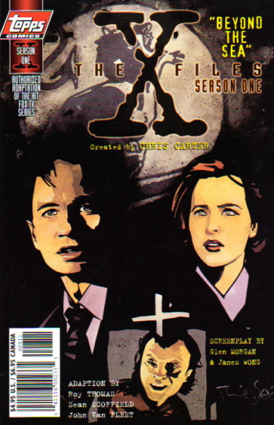
…gets back to the initial discussion point I was having here about comic book adaptations of other media. As the title suggests, they were adapting the first season’s episodes into funnybook form, so this was a somewhat rare case of a direct comic book adaptations of specific television show episodes, versus just doing movies. There was a lot of material doing new stories based on TV shows, but not so much translating broadcast episodes into comics (though, as mentioned, a couple current/forthcoming Star Wars comics are doing just that).
How did it sell? Again, my memories of the period aren’t as sharp as I’d like, but I feel fairly safe in saying the TV-based comics didn’t sell as well the ones with original stories. They were still picked up by the X-Files diehards,
And how were they? Couldn’t tell you. They were likely competent at worst, and likely visually interesting, given the creative teams. But here they were, Topps Comics generating essentially souvenirs of TV episodes for for the fans. (Though as has been pointed out, maybe some fans first encountered these specific stories this way, perhaps not even realizing they were retellings of TV shows.)
Some additional info you might find interesting regarding these: the Wikipedia entry for “Topps Comics” has an excerpt from an interview with Tony Isabella, talking about the apparently grueling approval process they had to go through for each X-Files comic.
A couple more follow-ups on the movie adaptations post:
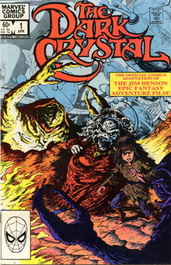 Cassandra Miller mentions the adaptations for Dark Crystal and Raiders of the Lost Ark, of which I’d only ever read the former. I remember being very impressed by the detailed art in that comic, though I can’t remember who did it at the moment. Hang on a sec.
[TEMPUS FUGIT]
Ah, ’twas Bret Blevins that did the deed, with inking by Vince Colletta, Rick Bryant and Richard Howell. It was an appealingly done adaptation as I recall, fitting the story into about 50 pages over two standard comic books (or in one Marvel Super Special magazine. Alas, those comics departed my collection in a long-ago purge and I can’t present panels from them for you, but I’m sure they’re out there somewhere. But I think I’m assured enough in my memory of them to tell folks to seek ’em out.
Speaking of the Marvel Super Specials…I kind of have a small nostalgic feeling for those, featuring the adaptation in full in one issue, along with supporting articles about the making of the movie or whatever. And then splitting up the adaptation over two or three issues of a regular comic book mini-series. It was a clever ploy, getting their coveted space on magazine stands where comics weren’t necessarily offered, but repurposing that same material for the comic book market.
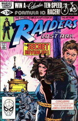 As for Raiders…I don’t know, I just never bothered with the comic book versions. I came to the movie slightly later, seeing it in a military base theater some time after its regular release, so I may have missed the initial heyday of the comic book adaptations. And I didn’t even do much more than glance at Marvel’s later Further Adventures of Indiana Jones, the first couple of issues featuring some lesser John Byrne work.
But back to Raiders…oh, it’s by Walt Simonson, John Buscema, and Klaus Janson! Look, why didn’t anyone tell me about this, that sounds great. I honestly just didn’t have time for Indy comics for whatever reason. I just wasn’t all that interested in The Adventures of Indiana Jones outside of the films themselves, oh, and video games like Fate of Atlantis, the Atari 2600 cart, and the arcade machine. I’ve poked through a couple or three of them over the years, even picking up a mini-series or two from Dark Horse. Nothin’ stuck. Just not for me I guess. Not even the Young Indiana Jones TV show got much viewing.
But hearing about the creative team on he Raiders adapataion makes me more interested to take a look now. Pretty sure I have a couple of them in the back issue bins at th shop, so I’ll make sure to take a glance.
And Aaron G. notes the Bill Sienkiewicz-illustrated adaptation of Dune, the 1980s film by David Lynch, based on the book by Frank Herbert. I’m a real Dune neophyte, having only seen parts of the movie, and have never even read the book (much to pal Tegan‘s chagrin). All I can tell you from a retailer’s perspective is that the issues command some higher prices nowadays, and are in great demand. I even had a really beat-up copy of the Marvel Super Special version that blew out the door almost as soon as I priced it.
The comics do have striking Sienkiewicz covers:
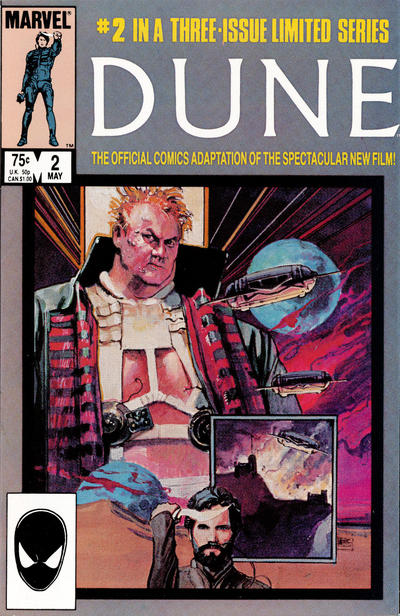
Maybe I should read these instead of seeing the movie or reading the book. Then I can fake it and join in on all those Dune discussion groups that pop up in coffee shops all across our great country and sound like I know what I’m talking about.
“Yes, of course, I like how Sting was drawn in this one pan–”
[EVERYONE STARES]
“UM I MEAN how his face was framed onscreen. Yeah, that’s what I meant.”
You all left a lot of great responses to Wednesday’s post about comic book adaptations of movies and TV shows, and they deserve responses from me…but I’m going to just do a couple today and I’ll get to more next week.
First off, Adam Farrar leans in close to say
“My favorite comic adaptation are the three issues of Dick Tracy by Kyle Baker and John Moore. The third issue is a adaptation of the movie but the first two issues are essentially prequels establishing the backstories of the main characters in the movie. I only had the third issue for many years and loved it. Getting the first two issues years later was a revelation.”
Oooooh, those are good’uns:
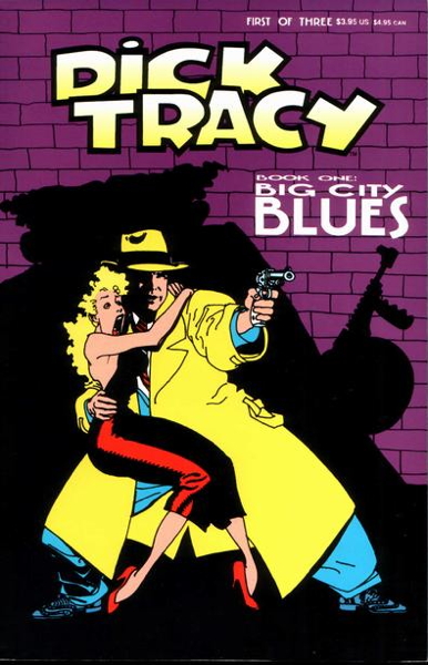
It was as Adam said…two “prequel” issues with an adaptation of the film in the final installment. They were available in a deluxe squarebound format and a staplebound “newsstand” format, but either version was nicely printed, showcasing Kyle Baker’s beautiful art. If I recall interviews with Mr. Baker correctly, the art initially featured a more-faithful-to-the-strips Tracy, but someone higher up, I can’t imagine who, wanted Warren Beatty’s likeness inserted in there instead. It all looks great anyway, even if that unnecessary change dates it a bit, which I emphasise is not Baker’s fault.
There is a trade paperback collecting the series out there, long out of print like the comics of course. But I think the comics should be relatively easy enough to find. And you should find them.
Next up is Snark Shark, who toothily reminds me
“Someone (I think DC?) did an adaptation of the FIRST [Bill and Ted] movie, and it was as bland as possible.”
And yes indeedy, in 1989 there was this oddball thingie:
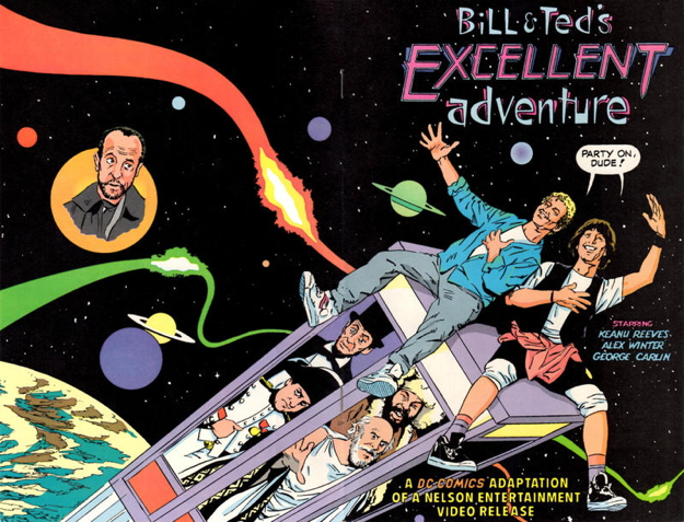
Titled Bill and Ted’s Excellent Adventure Movie Adaptaion, it was a 36-page mostly-adless retelling of the film, adapted by Bob Rozakis and MAD‘s Angelo Torres. According to the Grand Comics Database, it was a cereal giveaway, though I always assumed it was distributed in video stores. (I got my copy in a dollar box somewhere.)
It’s funny this came up as I was talking to my pal Brook (the same Brook who inspired me to buy this and these) about this very comic book, as he’s a big fan of Mr. Torres (and also owns some art from one of his MAD paperbacks). I’ve been wanting to find my copy of this in my currently-in-disarray vast Mikester comic archives so Brook can check it out.
Now I was going to counter Mr. Shark’s dismissal of the comic, but it turns out I talked about this comic way back in 2005, when there was still joy and hope in the world, but it looks like I kinda agree with him. To wit, here’s what slightly-less-old me had to say:
“…It’s a straightforward adaptation of the first film. It hits all the beats of the movie, but doesn’t really add anything to the material…of course, it really suffers in comparison to Dorkin’s fabulously-nutty adaptation of Bogus Journey. In addition, the art seems scratchy and rushed…Torres’ caricatures are usually right on, but as a whole the production seems very rough.”
In retrospect, it’s very possible this was a rush job, crankin’ out these pages in time to meet a rapidly-closing deadline, so maybe there’s that. But yeah, it’s a little lackluster, but given it was distributed as a cereal box mail-away premium, this wasn’t the place for edgy or challenging art. The wraparound cover based on the movie’s one-sheet is good, though.
Thanks for reading, pals, and we’ll get to more movie comics next time!
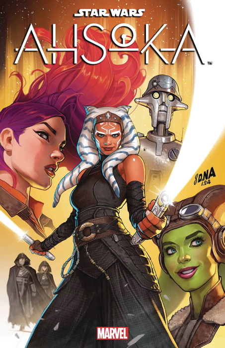
So I spotted on the back of the newest Marvel Previews an add for the forthcoming Star Wars comic book Ahsoka, starring the character who came to prominence in animation and recently jumped into live action portrayed by Rosario Dawson. A “fan-favorite” in the classic sense, as folks do seem to genuinely like the character, and at least at my shop toys and comics based on her usually do quite well.
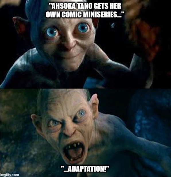
The text of the ad reads “Ahsoka Tano gets her her own miniseries adaptation” and I groaned a little bit, as I realized it’s not new stories, but comic book retellings of the story from the recent Disney+ TV show. Now my immediate response was of course mature and reasoned…posting a meme to Bluesky:
…and informing said response was the rather lackluster response I’ve had at the shop to other recent Star Wars comic book adaptations of other media. The recent Obi-Wan barely sells for me, I’ve had folks drop Thrawn because it’s adapting a novel, even The Mandalorian, the strongest selling of the bunch, has begun to flag. I’ve had multiple folks express their disappointment that they were just getting retellings of stories they’ve already enjoyed.
Way back in Ye Olden Tymes, before VCRs and various forms of disc players, a comic book adaptation of a movie was one of the few ways to relive the experience at your convenience. And TV shows…well, there weren’t many direct adaptations of TV episodes in comics, mostly focusing on new stories, but it was still a way to relive a program outside of its normal broadcast times, back in the days before you could pick up (or download) complete season sets.
While some of these were…utilitarian, shall we say, several did have some artistic merit and were completely enjoyable on their own terms. I still think Marvel’s Time Bandits comic is a classic, for example, and I enjoy looking at it even though I have the Criterion Blu-ray of the film just on the shelf over there. Evan Dorkin’s version of Bill and Ted’s Bogus Journey is another great movie-to-comic translation, with Dorkin’s wild cartooning creating an adaptation that arguably surpasses the source material.
Archie Goodwin and Walt Simonson’s Close Encounters of the Third Kind and Alien. Hook, featuring work by Charles Vess and Gray Morrow, among many others. The absolute infamous madness of the adaptation of Steven Spielberg’s 1941 by Steve Bissette and Rick Veitch. The beautiful Jerry Ordway art on the comic for the first Tim Burton Batman film.
I could keep going. I have a soft spot for many of the Star Trek movie comics DC produced (even with the occasional storytelling glitch).
But in this modern age, where everything is just a click away (legally or otherwise), the desire to relive cinematic experiences in funnybook form just isn’t there like it used to be. Even doing new stories based on films and TV isn’t quite the draw it used to be…but it seems for folks attracted to certain properties, if they had a choice, they’d want their comics to be new material rather than rehashing stories they’ve already experienced.
I’m not saying there isn’t an audience now for comics like Obi-Wan and Ahsoka. In fact, I expect Ahsoka #1 to sell quite well, just by virtue of being a Big First Issue for the popular character. I’m expecting a big dropoff on #2, however, as readers realize it’s just stories from the TV show, and as speculators stick with thier #1s and eschew later installments.
In addition, there will be the folks who don’t care it’s an adaptation, and want to enjoy a comic book version of the show. And there’s the simple fact that not everyone has Disney+, and this is their access to these particular adventures.
Now, I realize Marvel may have its hands tied in regards to what they can and can’t do with their licensed properties. I have no idea. All I know is the majority of my customers, when they hear “adaptation,” decide the comic is not for them, no matter how expertly it is artistically executed. While I’ll still sell copies, the number I’ll sell has been capped off.
I really do wish the. best for the creative team on this new Ahsoka comic. I hope it does well, not just for their sakes, but for my own store as well. Selling more comics is preferable to selling fewer, after all. And if Ahsoka does well, enough, maybe a follow-up with all-new stories will be in the offing. One can only hope.
Thanks for your patience over the last couple of weeks, as personal stuff and medical stuff (which I suppose is also personal stuff) got in the way of my doing important things, like posting to my comic book weblog. So it’s been sorta thin content around here lately, but I should be fattening it up again next week!
In the meantime, let me cover a couple of things:
Sean asked in my last post:
“Do the modern fans still go ape for gorilla covers or is it all too much monkey business…?
“Also, any chance this will lead to an Angel and the Ape spin-off series?”
First, nice use of primate references in your initial question. But what Sean is referring to is legendary artist and former DC Comics head honcho Carmine Infantino’s instructions for what makes a comic book cover sell. You can see a pic of the list of those elements that’s been going around here, which I’ll transcribe in case, like many other sites I’ve linked to over the decades, that site disappears forever.
Gorillas
Dinosaurs
Motorcycles
A purple background
The city in flames
The hero crying
A direction question to the reader
These items were all semi-famously used on this Bill Wray cover for Secret Origins #40 (1989):
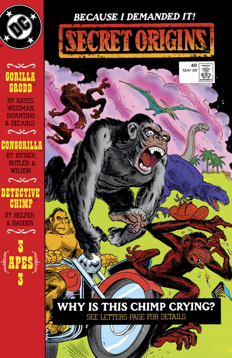
…though “the city on fire” is represented simply as “fire” here:
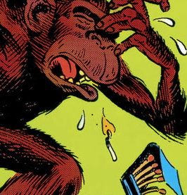
…and I’ve heard that particular element as both just “fire” and “city on fire” in discussions of Infantino’s list. (Speaking of which, I’m not sure the origins of that piece of paper that I’ve linked to on Reddit, and have seen posted elsewhere. It even looks like that paper’s been around a bit what with the folds and creases.)
Anyway, back to Sean’s question. The monkeys, do they help comic sales? Well, judging by the performance of DC’s Ape-Ril Special this week at my shop, I gotta say, “well, no, not really.” I sold a LOT of new comics this week, more than normal in fact, but only moved a couple of DC’s latest swing at comics starring our furry cousins. Now, I picked it up, primariy because I saw Monsier Mallah, the French mercenary ape (don’t look at me like that) for the Doom Patrol connection, and Detective Chimp (who is great) and I’m hoping Angel and the Ape turn up in there as well. No, I haven’t had a chance to read it yet, but it’s next on this toppling pile of comics and graphic novels I’m slowly working through.
Do any of those elements still work in general? I haven’t really gathered enough evidence on my own to say if there is an overall positive influence on sales by any of those items just on their own. I feel like the only common denominator to high sales being generated solely by a comic’s cover (excluding things like “speculators”) is striking cover designs. One example I can think of it Calexit #1 from 2017:
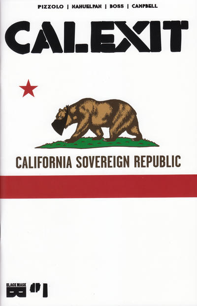
…which I just kept selling and selling and reordering and selling. Now granted, I’m in California, so maybe that helped it along too, but that cover grabbed eyes and there’s hardly a monkey or anything on fire in sight. (There is a bear, which would make Gail Simone happy.)
Onto Sean’s second comment…friends, I am an unabashed Angel and the Ape fan:
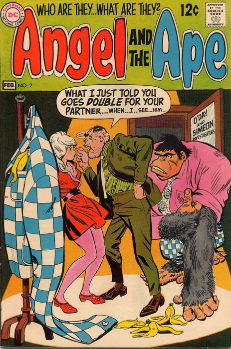
…having a complete collection of their all-too-few appearances. As such, I would totally buy a new series. Look, we all know the greatest high concept for a comic book is “Native Americans Vs. Dinosaurs,” as embodied by Turok: Son of Stone. But a close second is “Pretty Girl and Gorilla: They’re Detectives” and I’m ready for it. I’ll even write it for them if they’d like, if they won’t mind the occasional Swamp Thing cameo.
Bryan says in response to my assertion that Venom made his first “on-panel” appearance in Amazing Spider-Man #300:
“I’m too lazy to go look, but doesn’t ASM 299 end with a splash page of Venom?”
Bryan is indeed correct, and in issue #298 we get this bit of business at the end of the issue:
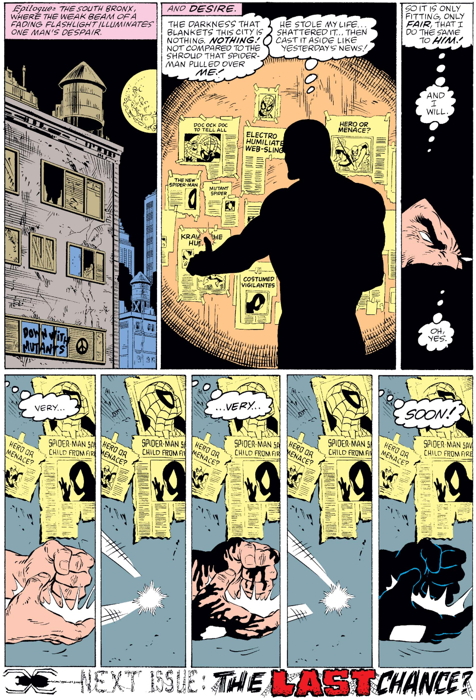
…and then in #299 we get this page and a half leading directly into the shocking events of the extra-sized next issue:
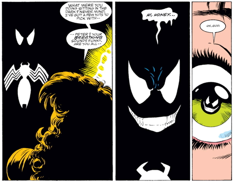
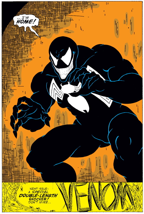
Now to be honest, in my mind I’d remembered Venom’s pre-300 appearance as being restricted to his face popping up in the bottom-of-the-page next issue blurb. I’d forgotten that his cameos in these previous two issues amounted to quite this much.
The Overstreet Price Guide refers to #298 as “1st app. Eddie Brock who becomes Venom, #299 notes “1st brief app. Venom with costume,” and #300 gets “1st full Venom app.” I mean, I guess getting Venom’s gloves in #298 isn’t enough for the “1st in costume” honor, but you can kinda see what sort of splitting of hairs is going on here. To be entirely strict about it, #299 should get the “first Venom” since it’s our first look at him in toto. But #300 is an anniversary issue, and it has that striking cover, and yes it is a full issue featuring Venom in action, and thus it’s the one that gets the most attention from collectors.
There’s precedent, of course, with Wolverine’s first appearances in Incredible Hulk issues in 1974. Issue #180 is the actual first appearance, with the ol’ Canucklehead popping up on the last page in this two-panel sequence:
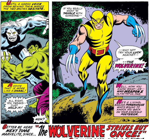
But again, #181 was the full-length in-story appearance of Wolvie, and had a kick-ass cover showing him in action, thus making this the most in-demand issue of the run. (Wolverine also appears in the opening pages of #182, and as we all know, was never seen again.)
So, yes, my statement of “first on-panel appearance” for Venom was incorrect, as he clearly shows up “on-panel” prior to #300. But like I said, I thought his only visual representation was in a blurb, not in-story, so I genuinely remembered #300 as The First One. And as far as collectibility and value goes, #300 is the most important one selling for many times the cost of the other two comics, with “first full issue appearance” and “first full appearance” being usually just shortened to “first apperance.” And those other two comics are generally just “cameo appearances” as far as the back issue market goes.
And the people pushing the house ads for Incredible Hulk #181 that were in earlier Marvel comics as the actual first appearance? GET OUTTA HERE WITH THAT NONSENSE
Legendary comics artist Ramona Fradon passed away this week at the age of 97, having only retired from her popular commissions practice a month or two ago. If you’ve seen any of those commissions, you know her illustrative skill hadn’t lost a step. (The official gallery of art appears to have been taken down, but Google up some of her art…you won’t be disappointed.)
Above is a great shot from Super Friends #28 from 1980, a comic I picked up ages ago as it’s nominally a Swamp Thing appearance. As you can probably infer from the dialogue (by E. Nelson Bridwell), those characters aren’t the real, but rather folks in costumes magically transformed into the beings they were dressed as. But, eh, close enough for horseshoes. It’s a fun story, featuring the various superhero stars of the TV cartoon fighting weird creatures, some of whom likely wouldn’t make it past the network’s Standards and Practices. (“Who’s this?” “Oh, that’s the Demon, he–” [giant DENIED stamp pounded on the script])
She was a great talent, and you can read Mark Evanier’s obituary (and follow-up post) to get an idea of the breadth of her work and the regard in which she was held by her peers.
So long, Ramona.
• • •
Should also note the passing of Enrique Badia Romero, artist of
Modesty Blaise and
Axa. Sorry I don’t have as much to say about his art, other than that it was expertly crafted and beautiful linework, but
this overview should tell you all about him and present nice samples of his ability.
I mean, a long time ago I was selling some Axa books on eBay and they got bounced off for being “too adult” for the general listings. Meanwhile, plenty of Faust and Leather and Lace to be found there. Romero was just too sexy for eBay, I guess!
So long, Enrique.
• • •
So I posted links to my post on the EC Comics revival at Oni Comics on both Bluesky and Xwitter a few days back, It’s pretty unusual for me to use Xwitter now, but I still check in from time to time to say “hello” and of course shill for myself. But this time there was a nice payoff as the literal President and Publisher of Oni Press responded to my tweet:
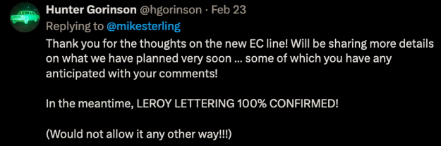
So there you go, straight from the horse’s mouth, we’re getting the original Leroy-style mechanical lettering in the new EC books. Maybe this may sound odd to anyone not familiar with the original ECs, but that lettering will go a long way to selling this revival to me.
Now he also mentions that other comments I’ve made presaged some of their other plans for the books, and if you read the original post there’s not a whole lot I said that would sort of fit into that category. I’m guessing we’ll be seeing semi-consistent creative teams on some of these books. I don’t know, we’ll see, and I’m looking forward to finding out.
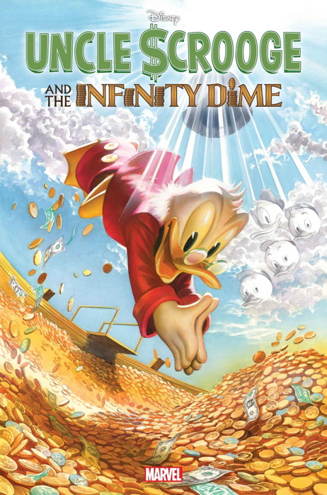
Just been a week for surprise comics news, I guess, as Marvel has finally announced that they’ll be doing an Uncle Scrooge McDuck comic: Uncle Scrooge and the Infinity Dime. Multiple covers, natch, with the “main” cover as such:
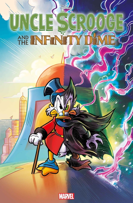
…and feast your eyes on the Alex Ross variant cover:
Now, if you read the description of the comic at the link, it certainly sounds like the most Marvel-type comic they could be doing with this Disney property. Is there a multiverse involved? Of course there is.
Speaking with a pal of mine, he asked “just who is the audience for this?” And ideally it should be children, and at my shop I get enough children passing through that children’s comics are a viable product line for me. I know this may not be the case at some shops, either by accident or design, but I think overall the target audience for this book may not getting exposed to it.
However, ain’t nuthin’ wrong with getting some of those Marvel readers to try out Uncle Scrooge too, either through some of that DuckTales nostalgia, or the fact that it’s being written by noted comics scribe Jason Aaron, or that Alex Ross cover, or that it’s being sold as a (quoting from the press release) “time-honored Marvel adventure,” and so on. Just getting the big push from Marvel may get more people to try it out aside from the usual Disney fans.
It looks like it’ll be fun, and. it’ll be a welcome return of Scrooge and Donald and the nephews to comic book stands. I hope it’s successful enough to generate follow-up comics, and that it creates new fans, especially young ones, for Disney comics.
I’ve seen several comments online hoping this means actual team-ups between Marvel’s heroes and the Disney gang. I would prefer this wouldn’t happen, but I can’t deny that they’d likely sell well until Marvel does too many of them. But I’ll tell you what, Donald Duck Vs. Howard the Duck: Battle for The Pants — Marvel/Disney, I would write that for (almost) free.
And the comics retailer in me has a wish or two of his own, like trade editions of Marvel’s previous forays into adapting Disney’s animation, like their Aladdin or Beauty and the Beast series. Or Marvel’s two Roger Rabbit graphic novels…people still like Roger Rabbit, they’d sell!
• • •
In even yet more news,
DC Comics is returning to Wednesday on-sale dates for their new comics, starting this July. Just as well, since hardly anyone noticed the change to Tuesdays in the first place. I mean, there were a few early birds, but otherwise folks just waited ’til Wednesdays.
DC should do their own version of these Marvel variants from around the time DC originally made the move in 2020.
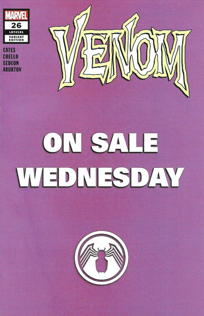
“DCs Back on Sale Wednesdays!” variants would be all the rage, I just know it.
So some surprising comic news this week, with Oni Press announcing their revival of the EC Comics brand. By which I mean the brand that brought us Vault of Horror and Weird Science, and not, say, anything along the lines of Lucky Fights It Through.
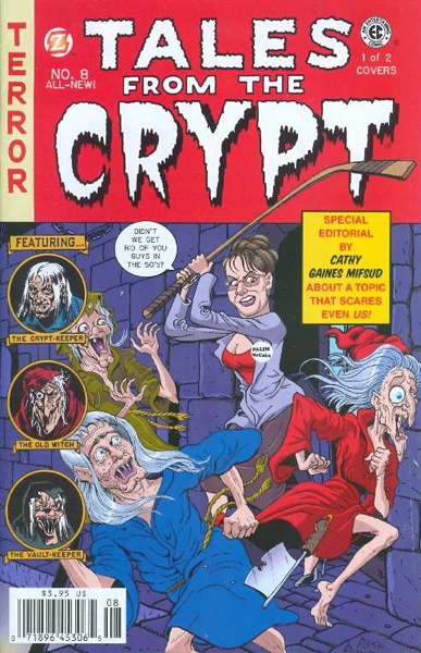
This isn’t the first time that there’s been an attempt at bringing back EC Comics, specifically with new material and not just reprints of the originals. Usually it’s been a revival of the best-known of the ECs, Tales from the Crypt, which has been disinterred at least a couple of times in the last few years with new stories “in the EC tradition” under the familiar TFTC logo. For example, here’s issue #8 of the Papercutz-published version from 2008:
What’s interesting about Oni’s use of the EC brand is that it’s not starting off with yet another Tales from the Crypt series, or a revival of any of the other original titles. Instead, they’re doing brand new series, leaning on the EC brand itself to establish themselves, rather than depending on the name recognition of the title made part of pop culture for modern audiences primarily thanks to a TV show.
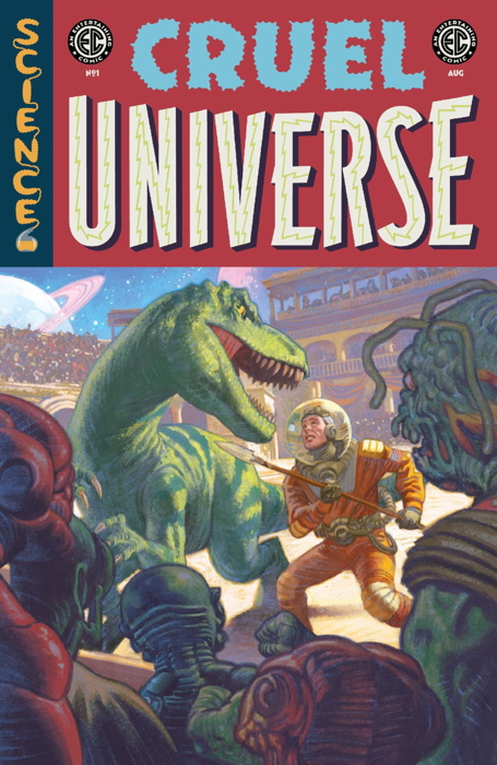
As such, they’ve tried to come up with new series names that evoke the EC experience…one working maybe a little better than the other. The first is the wonderfully-titled Cruel Universe:
…and the other is…well, Epitaphs from the Abyss:
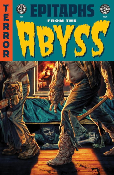
…which gets points for trying, I suppose. It’s better than just swapping out synonyms for “tales” or “vault” or “horror” or “fear” I guess, but actually saying the name out loud (as I had occasion to do the other day) it doesn’t exactly trip off the tongue.
That said, the covers look swell, and I like the classic “SCIENCE” and “TERROR” banners in the corners. And they’ve got a pretty solid collection of creators to work on these books to start off, with folks like Jason Aaron, Cecil Castellucci, Peter Krause, Kano, Stephanie Phillips, Malachi Ward, Cullen Bunn, and Jay Stephens, among many others. One hopes that they retain use of the Leroy lettering of the originals, which is as much a part of the look ‘n’ feel of EC as any of its artists.
Another part of what made EC “EC” was its relatively small-ish and consistent roster of artists. Not saying these new ones won’t have great work in them, judging by the creatives announced, but part of the appeal of the originals was knowing you’d get new stories from the regulars. You crack open a Crypt, you expect a Jack Davis story and a Graham Ingels story, and so on. Sure, it wasn’t the same artists in every issue every time, but there was enough consistency that each title, or each genre of title, had its EC “house style,” that you knew what to expect. It’s too early to say what the Oni-era EC is going to do, but are we going to get, say, a Peter Krause story in every issue? Are the majority of the stories going to be written by Cullen Bunn and Jason Aaron in every release?
That’s not how modern anthology books work, and we’re likely to see a much wider range of stories and artwork from far more people than had worked on the originals. More dependence on freelancers than a bullpen (did EC have a literal bullpen?), which isn’t necessarily a comment on resultant quality. But it’ll certainly result in a different feel in the type of books these new releases will be. Beyond the fact that there’ll be about seven decades between the two versions of EC, of course. And there ain’t nuthin’ wrong with more points of view and life experiences informing the stories. (Cue the complaints of “wokeness” from the Usual Suspects, who obviously had never read an EC comic before.)
Trying to capture that EC style has been a continual windmill tilted at by the comic publishers over those decades. Outside of DC and Marvel’s Comics Code-approved “mystery” titles like House of Secrets, which followed in the short story anthology format (and featured plenty of good work of their own), one of the primary spiritual successors to EC is the output of Warren Publishing:
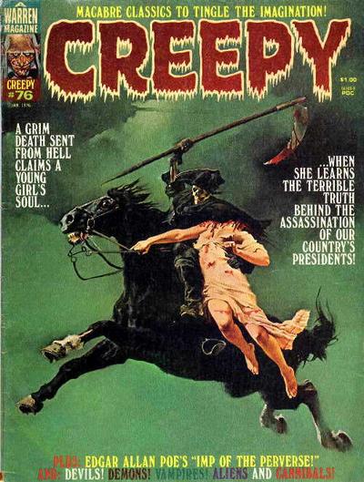
…especially with its own artistic excellence and its willingness to, shall we say, skirt the boundaries of taste in an occasionally tongue in cheek manner.
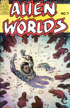
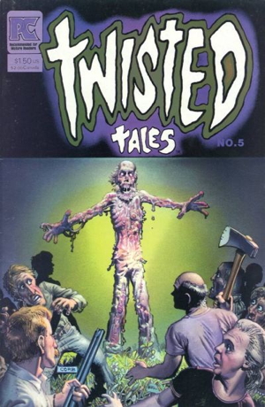
And one would be remiss to not mention the oeuvre of writer Bruce Jones, responsible for various 1980s EC-type indies like the following:
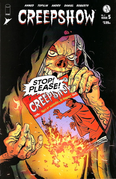
And even now, Image Comics is publishing Creepshow, a comic inspired by the Stephen King movie that was itself inspired by EC Comics:
This is hardly a comprehensive list, as the original ECs cast a long shadow and many, many publishers and creators have tried to follow in its footsteps. Given the creators involved, the publishing strategy taken with new and not revived titles, and the involvement of original publisher William M. Gaines’ daughter and grandson in this effort, I am at least cautiously optimistic. The immense regard in which EC Comics are held must surely be somewhat daunting to any new folks working on these books, but I am hoping what we get approaches the high precedent set by the originals.
Just don’t forget that Leroy lettering! I MEAN C’MON
« Older Entries


