To be fair, a superhero fight scene would probably have a pretty strong smell.
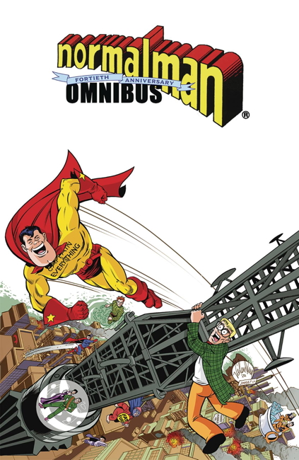
So I picked up a copy of the normalman 40th Anniversary Omnibus, reprinting in full Jim Valentino’s mid-1980s parody comic series from the mid-1980s. I believe this is the first color reprinting of the introductory back-up stories from Cerebus, as well as the story from A-V in 3-D, presented in color and non-3D. I also believe this is the first color reprinting of the concluding chapter, normalman 3-D in a non-3D format. I appreciate that, given it’s a little harder for my eyes to do 3D in print properly anymore. (These 3D stories have been reprinted in non-3D in previous black and white collections, from Slave Labor and from Image.)
Also featured is the crossover story from Journey #13 by William Messner-Loebs (presented in the original black and white by Messner-Loebs’ request). Other material, such as the later normalman specials from Image, ads, strips produced for conventions, unused pages, and the like round out the book. Sadly not included is 1997’s Max the Magnificent:
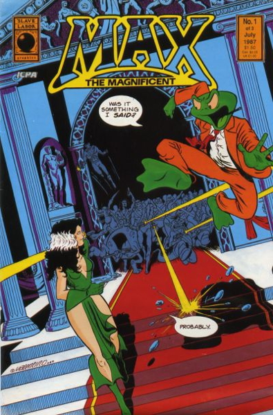
…a spin-off starring a character normalman runs into during the course of his adventures. The comic also features an appearance by normalman‘s Captain Everything, which makes it especially odd that it doesn’t make the cut.
Now for the most part, this is a nicely done book…the reproduction of the art is very sharp and clear. The original mini-series and 3D special, however, have been relettered, which…frankly, isn’t an improvement on the original lettering. Maybe in the earlier issues, where the lettering is a little less polished, it is a step up, but in these cases I would always prefer the original, with the lumpier handdrawn word balloons and occasionally funkier typography. However, it wasn’t that distracting, and especially for my eyes it made for an easier reading experience.
Except.
I understand there may be production issues where the art just has to be relettered. It happens, I get it. But it seems like every time relettering like this is done for reprint works such as this, misspellings and such slip in that weren’t in the original printing. As I recall, this happened with Image’s initial reprintings of Matt Wagner’s Mage: The Hero Discovered, and with those strange black and white collections of Jim Starlin’s Metamorphosis Odyssey from Slave Labor Graphics.
And it happens here, in this delxue volume of normalman I’d been wanting to see for years. Granted, for a several hundred page book, it’s not a whole lot, maybe a half-dozen or so errors that I’ve noticed, but they are still pretty distracting.
For example, from issue #1, here’s the original word balloon:
And here it is with an inexplicable word change:
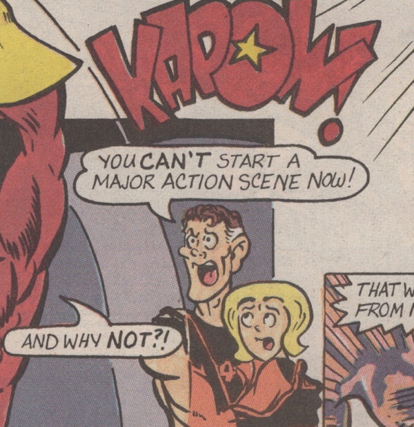
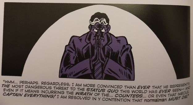
From issue #10, the original panel:
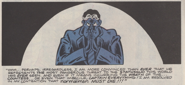
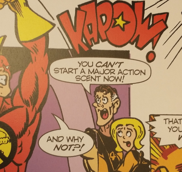
And how it appears in the omnibus, with a couple of extra typos (for “imbecile” and “my”):
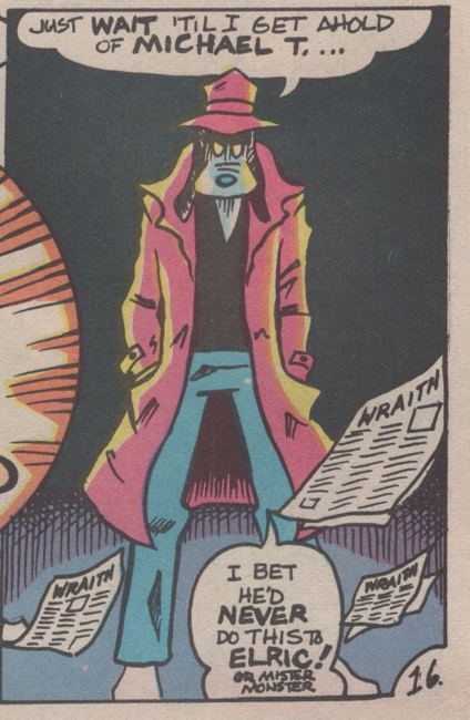
And here’s the one that really stood out to me, for what should be obvious reasons…from issue #4:
And here is it in the omnibus:
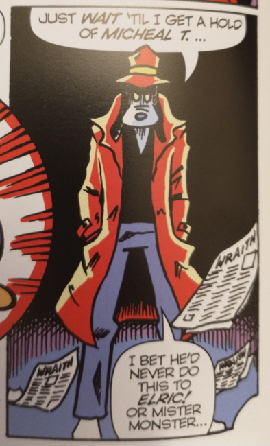
(Also, making “Or Mister Monster” the same size lettering does alter the gag a little.)
There are more examples (including at least one word balloon in the omnibus that I think has either misspelled a word or left a word out entirely, I haven’t checked yet).
This is just in the original normalman story, which is all I’ve read of this omnibus thus far. I don’t believe the other material has been rejiggered in this fashion. Plus, as I’ve said, it’s only a few of these errors that I’ve noticed, and I’m hoping they’ll be fixed in later reprintings. I should note that the Journey issue reprinted here has not been relettered.
As soon as I saw these, I did pull out my copies of the original series, actually kind of hoping the mistakes were in those. Somehow it would have been slightly less annoying if these were faithful reproductions of original errors, though undoubtedly I would then be complaining about “why didn’t they fix that?”
I am glad I have this book. I mean, mistakes happen — What Can You Do?™ — and given this hardcover was solicited with a first print run of only 1,500 copies, maybe like I said they can quickly fix these issues for new printings. It’s a classic and funny work that deserves to be in print, and I just want it to be in the best possible presentation.


I keep seeing more and more typos and incorrect words slipping in all the time-and I’m certain it’s a direct result of people not actually looking at the autocorrect or suggested words. they see a red line underneath it, they choose the first option, and call it a day. it also proves quite effectively that no one is proofreading anymore. I see this most with image books. nearly never with dark horse, marvel. i don’t read enough dc anymore to know the frequency there. it’s really damned annoying.
Ha, I see it in the Washington Post. So it’s not just comics! I don’t remember ever seeing such errors, or very rarely, when I first moved to the DC area 25 years ago. Nowadays, I catch one every week or two. And there are undoubtedly more, it’s not like I read every article.
Weird that they corrected “irregardless” and “statusquo” in your second example, but then dropped letters in two other words. It makes me think someone edited the original copy but didn’t proofread the new lettering.
Not to mention all the typos in tv closed captioning. Seems to be the fault of AI where the computer mis-hears words in dialog and turns them into something else entirely.
aj – Used to be you could always depend on Valiant to screw up “it’s/its.” And DC has had a couple of groaners in recent memory…using “vial” in place of “vile” in (I think) a Superman book, and Dark Nights: Metal‘s infamous “HERE, HERE.”
Thom H. – In fairness I should have noted the occasional correction.
“my eyes to do 3D in print”
Honestly, it’s a dumb gimmick, and it always has been! Even when my eyes were better, it was a mess! Just makes the comic harder to read.
“Journey”
Decent book! Great band!
” Max the Magnificent”
He looks familiar! Did he appear in an issue of Nexus?
“lettering”
I’v enever read Normalman, but that original lettering does have some character! Certainly doesn’t need re-doing, uless all the original lettering has been lost.
“What Can You Do?™”
Complain on the internet! That’s WHY we have it!
” tv closed captioning”
That’s where I see errors, except it’s Youtube. Presumably an AI program does it.