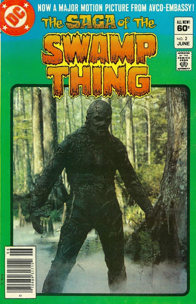
Don’t get me wrong, the fact that I could regularly read stories where Swamp Thing pals around with Detective Chimp is awesome.

So I realize I’m probably expected to do a little something about the Swamp Thing anniversary this year (having debuted in House of Secrets #92 50 years ago as of about April). It’s also Man-Thing’s 50th, debuting in 1971’s Savage Tales #1, so overall it’s a good year for swamp monsters.

I expect I’ll get around to something eventually…or maybe this will the only acknowledgement. I honestly don’t know. I can’t say with all honesty “it’s been a great 50 years, here’s to 50 more!” because frankly things have kinda sorta fallen apart in regards to the Swamp Thing comics over the last ten years. Lemme ‘splain.

Well, actually, there’s not much ‘splaining to do. The New 52 relaunch sort of “broke the chain” of continuity between the Swamp Thing we had before and the later Swamp Thing. Part of the character’s appeal to me was its history, the sense that all of the events that happened to the character in its past have remained so, and continue to inform its future. Okay, granted, one or two things have been sorta kicked under the bed and not brought up again, but by and large I could (to use a phrase I’ve probably overused on this site) draw a line from the character’s 1970s comics all the way through to the end of Brightest Day. It was with the Brighest Day follow-up The Search for Swamp Thing and the New 52 relaunch that stuff went astray.

I won’t go into excruciating detail (again) but character elements were changed, Alec and Abby’s backstory changed, Arcane was an almost entirely different kind of creep, etc. Then with the advent of both creator Len Wein’s 2016 mini-series (which seemingly nullifies a significant part of the Alan Moore arc), and the digital-first stories where full-on Plant Elemental Swamp Thing is going up against…General Sunderland!? Well, that undoes another fairly significant part of Moore’s run. It literally plays havoc with the circumstances surrounding Swamp Thing’s evolution into the kind of character he is now.

Look, all the New 52 and later era work is fine on its own. Well, okay, not all, but most of it is perfectly serviceable. But for someone who’s followed the character for as long I have…not since the very beginning, but close…there’s a level of detachment. What I know of the character is not fitting with what they’re telling me about the character now, and it’s distracting. There are a number of stories that don’t require dependence on past continuity, of course, but once you remind me “Matt Cable is alive and he was never possessed by Arcane,” that throws me just a little. I feel…detached from what’s happening to the character.

Some of it is on me…given the vision troubles I’ve had over the last few years, I’m way behind on my comic reading. And some of the comics I haven’t read yet are Swamp Thing-related, such as the Walmart Giant issues (collected in a book that I have in place of said Giants, which I never found in the wild). My enthusiasm for the character having waned, I never made it a priority to catch up on those particular stories. I’m sure they’re perfectly good, but with everything else happening to Swamp Thing, I was in no rush to read more stories set in the same post-New 52 milieu.

Plus, on top of all that, there was my decision to not acquire every single appearance of the character, spurred on by this nonsense. I also stopped pulling both covers of Justice League Dark for myself if each had Swamp Thing on it. Being as behind as I am, the last thing I needed was more comic books floatin’ around the house. And besides, who am I trying to impress with A Complete Swamp Thing Comic Book Collection? It’s not like God won’t let me through the Pearly Gates when I die if I don’t have one. (Unless of course Wein and Wrightson are at his side, waiting for me, their arms crossed and shaking their heads in disappointment.)

Like I said in this post, I, The Guy What’s Read Swamp Thing Comics for the Last Several Decades, was not the target audience for these rejiggered relaunches. This rethinking of ol’ Swampy was designed to get newer readers ensnared, who likely hadn’t read all that early stuff.

Not to say everything is terrible, of course: Swamp Thing’s appearances in Justice League Dark gave me the month-to-month adventures that didn’t dwell a whole lot on his new backstory and almost felt “normal,” you know, more or less, guest-starring with Detective Chimp and everything. And the new mini, bringing in a new person as Swamp Thing with the Alec Holland Swampy primarily there to pass the torch…this may be the solution to finally getting past the character’s shattered history, and it helps that the comic is really good, too.

But anyway, in short, Swamp Thing is still my favorite comic character despite everything. I get that expecting editorial consistency on a comic book character in a shared universe in stories created by Many Diverse Hands is a bit of an ask. I mean, the Superman we got with the John Byrne reboot in 1986 is technically the same Superman we have now, though many of the details have changed over the decades. But I kind of expect that from superhero comics. I felt like Swamp Thing was different, like maybe folks were putting a little more effort into internal consistency over the years. That’s why just changing things for the sake of change (an endemic problem to the New 52 as a whole) was so disappointing.

• • •

On a related note, just recently we had a spate of “give me your controversial take on [comic character]” tweets on the Twitters (here’s my favorite iteration and my response). So of course I jumped in with “give me your controversial takes on Swamp Thing”. Got some good response, and some jokey ones, too, but c’mon, we’re all comedians on Twitter. But I plan on responding to some of those “takes” here in the near future.

Thanks for reading, pals, and keep in mind, despite all that stuff I said…I ain’t giving up my Swamp Thing slippers.
Too Much Variants Man.

So BrianF said in the comments to my last post

“Love what yer doing but I’m surprised there’s been no mention of the ‘comics shot by a bullet’ variant”

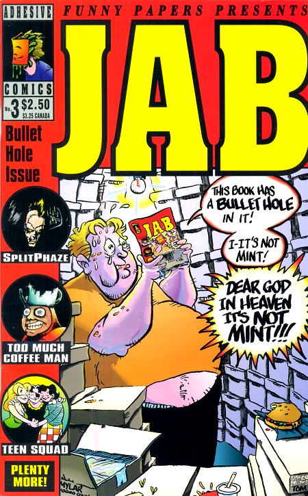
I’m glad you’re enjoying this series, BrianF…I’ve been having a lot of fun writing it! But as to the “shot with a bullet” “variant,” I am presuming you mean Jab #3, published by Adhesive Comics in 1993 (featuring a Too Much Coffee Man story by Shannon Wheeler, hence the title of this post).

I’ve actually posted about this comic here on the site a long time ago, back in 2005, and you can see that entry right here. However, I went ahead and pulled my copy of the comic out of the What’s Left of the Vast Mikester Comics Archive to rescan for today’s post:

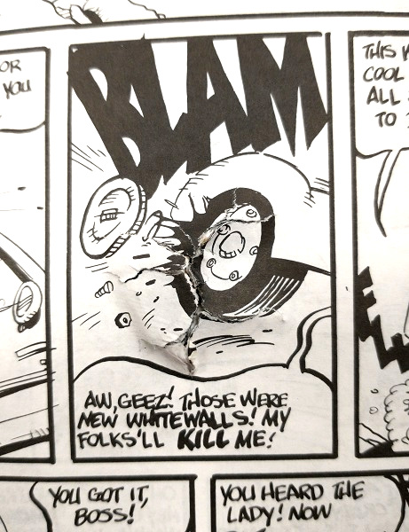
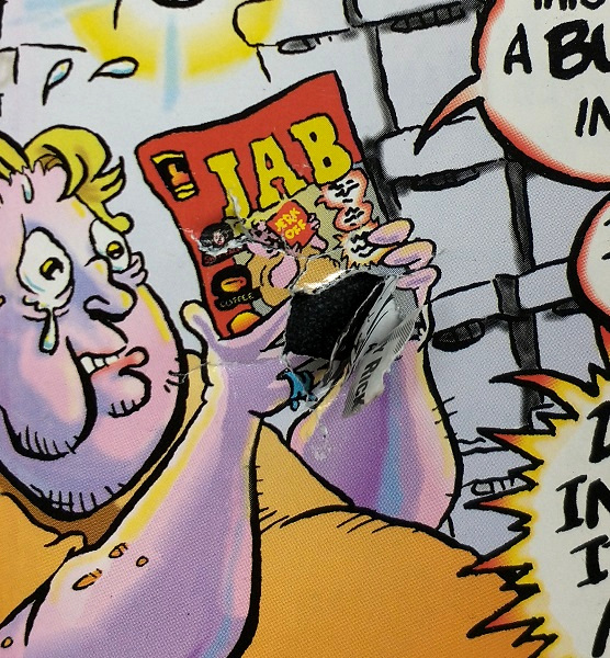
Here’s a close up of the bullet hole (I laid the cover out on the counter of my shop and pushed the paper aside a little so that you could see, yes indeedy, there is a hole there):

And as I noted last time, the bullet hole itself was incorporated into several of the story pages in this anthology:

(An aside: the example I used last time for an interior shot was by a cartoonist named Tom King…presumably not the same Tom King writing today about how superheroes are sad and/or possibly up to something.)

To BrianF’s point, I was going to respond “this isn’t really a ‘variant’ cover as such, but a ‘gimmick’ cover, in that the only available version you could get was the one with the gimmick, much like the only version of Shadowhawk II #3 you could buy was the one with the perforated fold-out cover. Not to say there can’t be overlap between a gimmick and a variant, such as having a standard cover and a deluxe fancy cover, like WildC.A.T.s #2. But in this case Jab #3 were all distributed with bullet holes, and didn’t have variants as such.”

That’s what I was going to say. But hold onto your shorts, BrianF, as I was wrong!

Let me repeat that, in larger, redder letters, given my being wrong is such an infrequent occurrence:

I WAS WRONG

Okay, before you wags say anything, yes, every bullet hole is going to be different and thus every copy is technically a variant. But c’mon, that’s not what I’m talking about here. I decided to check if perhaps this book was offered in an “un-bulleted” edition, given as I haven’t looked inside it probably since I last posted about it in 2005.

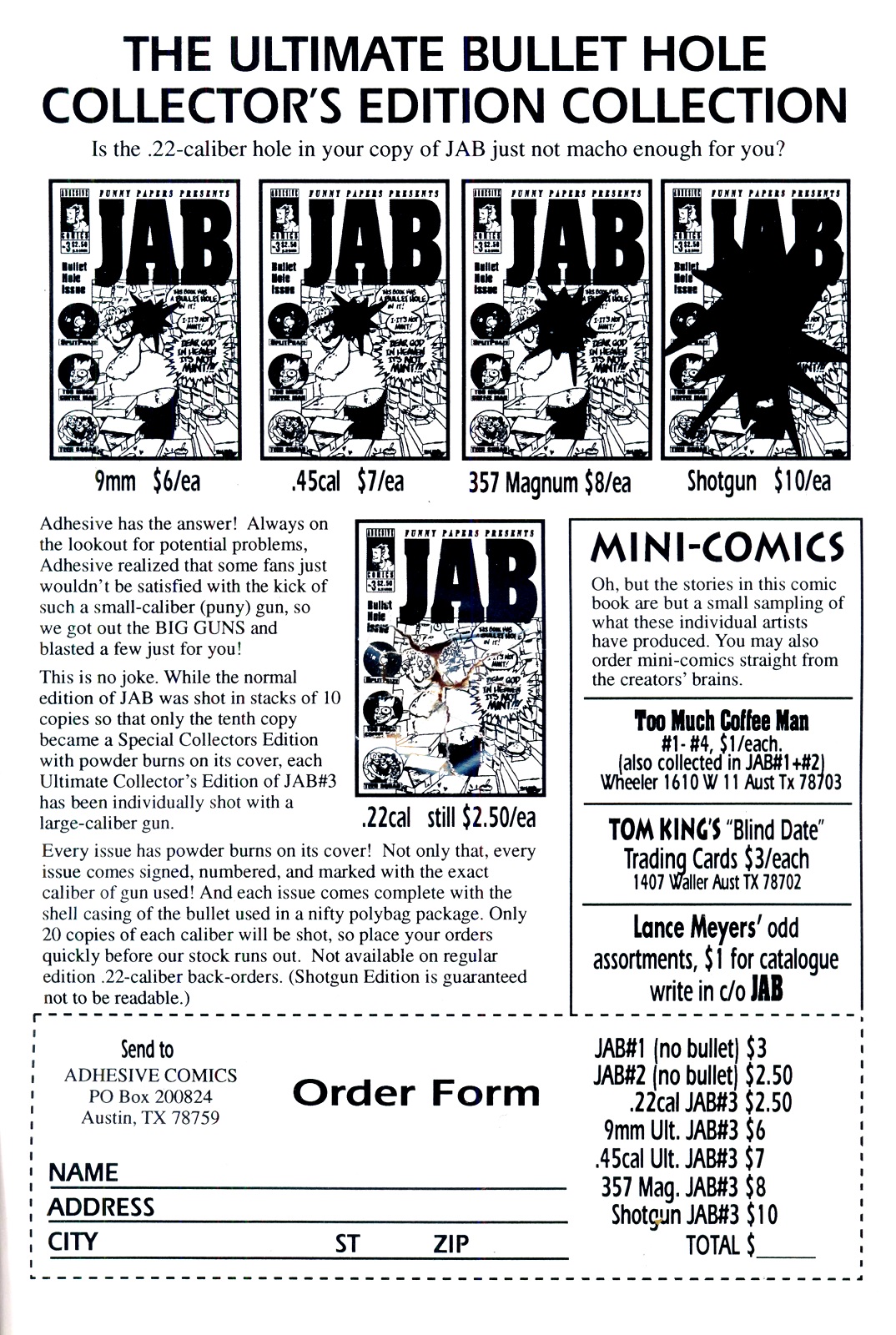
And lo, feast your eyes upon this order page from the inside back cover (click the image to increase the caliber):

Holy crow. Okay, before I get to the obvious stuff, let’s look at the part where the publisher sez:

“…The normal edition of JAB was shot in stacks of 10 copies so that only the tenth copy became a Special Collectors Edition with powder burns on the cover.”

There was a 1-in-10 variant of the regular in-store edition that had powder burns. BrianF, I acknowledge your initial assertion…the “shot with a bullet” comic was indeed released with variants.

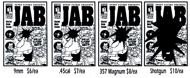
But as you all can see for yourselves in the ad, that wasn’t all! Four other editions, with holes caused by increasingly larger and more destructive ammunition, were offerred via mail order only:

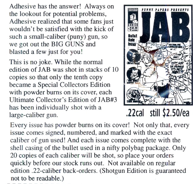
I’ll go ahead and post the relevant text from the ad here:

In addition to that 1/10 powder burn variant, there were supposedly 20 copies apiece of each of these other variants. And in case you couldn’t tell from the image:

Powder burns and the shell for the used ammo included! All signed and numbered! And I salute the fact that the more money you get charged, the apparently less comic book you receive.

I looked…I didn’t see any copies of the larger-caliber versions up for sale or even display anywhere, but it’s a large internet and I’m sure I missed it. But apparently they do exist, as per these comments from Jab contributor Shannon Wheeler his own self (via Brian Cronin’s article on this very topic from 10 years ago!).

Therefore, BrianF, if I may reiterate: the Bullet-Shot Comic is a variant comic, with multiple versions once available. Um, good luck finding those now, I guess, but look out for counterfeiters making “fake” Jab #3 variants by reshooting the regular edition with their own shotguns. Surely the most rampant of funnybook crimes.

NOTE: found at least one online retailer that had a placeholder listing for this issue, with theoretical prices in grades running from “Fair” all the way to “Near Mint.” Um, yeah, hey, let me know wnen you get a near mint copy of this, I’d like to see it.

EDIT: Follow-up posts here and here!

Variant Comics! (You know, like “Valiant Comics,” only with “Variant” — okay, fine.)

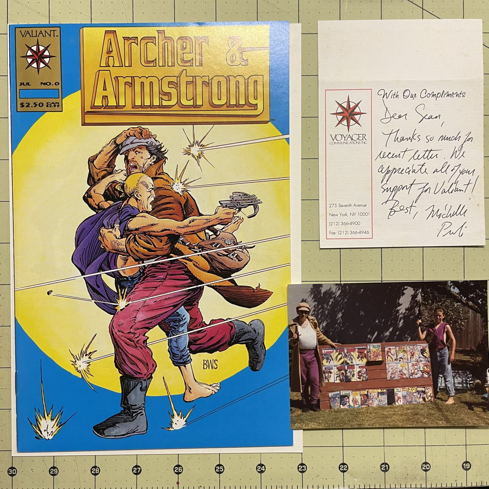
So I contacted old, old customer Sean (not the Sean who’s been giving me Golden Age content lately, but another Sean, who by the way is actually still quite young, frustratingly enough) to verify a particular memory I had regarding him.

Specifically, I asked if he, along with pal Victor, were the ones who, in the early 1990s, dressed up as Valiant Comics characters Archer and Armstrong, sent in a photo of themselves to Valiant, and received a Gold variant of an issue of Archer and Armstrong as a special prize from the publisher? Or, you know, have I dropped too many boxes of Ultraverse backstock on my head over the years and I just made the whole thing up?

Thankfully, Sean verified that I was not in fact suffering from brain misfires and that the events transpired as I recalled. He was even kind enough to dig out the materials from the collection and take a photo of them to send my way, and he graciously allowed me to share it here:


You can click on the pic to Armstrong-size it. That’s Sean on the left there in the photo, beneath all that padding.

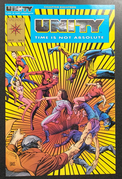
What brought this on was, well, my series here about variant comics combined with a recent acquisition of a Gold Unity #1 in one of what feels like a dozen collections of comics I’ve purchased in the last week or so. Here’s my slightly askew photo of it:


Currently priced at the shop for $12, if anyone’s interested! Anyway, that also reminded me that not long ago I had written a bit about the Gold Valiant books, and by “not long ago” I mean “9 years ago,” which you can read here (BONUS: includes a link to a Fake AP Stylebook gag I wrote). (EXTRA BONUS: the very Customer Sean I was talking about here shows up in the comments…he’s like the one guy to actually comment about the post instead of going on about Swamp Thing.) Before you ask, no, I didn’t keep the Gold Turok and I can’t remember what we sold it for.

Anyway, to repeat some of what I’d said then, I can’t recall the exact circumstances of distribution of these, though I know at least some were just straight up sent to shops in the mail directly by Valiant as promos or “thank-yous” or stuff like that.

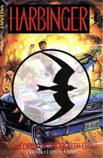
I first planned this post to emphasize the fact that, as comic publishers in the 1990s went, Valiant didn’t do a whole lot of variants, focusing mostly on gimmick covers (like chromium covers or this dumb thing). In fact, aside from the Gold variants, the only ones that immediately came to mind were the Harbinger trade paperbacks, with most having the black bird logo:


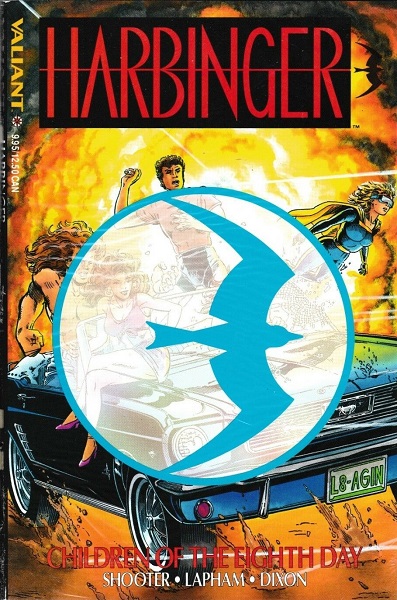
…and some (apparently exclusive to Diamond) with the blue logo:


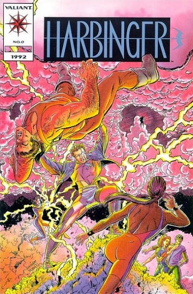
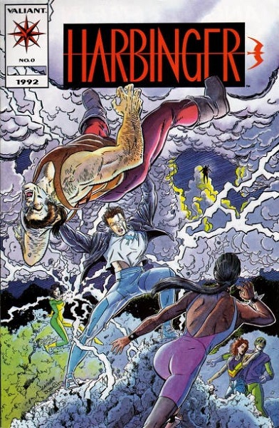
And the other one I remembered was the Harbinger #0, the comic you got when you mailed in all the coupons from the early issues of the series:


But you could get this blue-ish variant packaged with the self-same Harbinger trade:


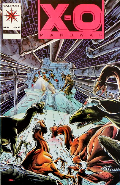
Save your cards and letters, Valiant Fans, because I know I was wrong! This list here includes the variants Valiant had put out over its lifespan, as well as noting prints runs. (This is an archived page, and you can visit the current site.) I’m especially embarrassed that I’d forgotten about the pink-logoed variant for X-O Manowar #15:


…because those came packaged with a certain brand of comic supplies which we sold a ton of as singles, which meant opening box upon box of these things and we were swimming in copies. They were so common that even the hardcore Valiant collectors were like “nah, I’m good.” And of course I haven’t seen a copy of this particular variant show up in a collection in…well, forever. Another example of a once-common thing becoming harder to track down now that a lot of the stores that originally carried them are gone? Could be.

Another variant listed there was the Predator Vs. Magnus Robot Fighter Platinum Edition #1, which meant they used a silver-ish ink on parts of the cover instead of whatever the regular colors were. This was another one I recall floating around the previous place of employment for quite some time. I think we had one early one when the series was new that sold right away, and then received a copy in a collection long after the 1990s market crash when Valiant was no longer in collectable favor.

While I do recall some of the other variants listed on the site, the only other one about which I have a specific memory is the Deathmate Yellow Gold variant. Which, for the life of me, I couldn’t tell apart from the regular Yellow cover. I mean, sure, looking at the scans at that link they seem like they look different enough, but honestly, looking at them in real life I kept having trouble. Look, Deathmate Black Gold Edition was pretty easy to pick out. I just kept getting fouled up on this one.

And that’s what I gots to say about variant Valiant comics. Even since the 1990s market crash there’s been this quiet background demand for Valiant comics, particularly the rare-ish ones like these variants and the latter issues of some of the ongoing with the smaller print runs. Some of the pricing I see there on the ValiantFan.com site doesn’t surprise me. I know I’ve made a pretty penny off the oddball Valiant book over the years.

Now later iterations of the Valiant Comics publishing concern have had variants of their own, especially the current company which issues probably three or four variant covers for every comic they produce. But then, many companies do that nowadays to help drive up initial orders from retailers, so I guess I can’t really single them out for that. However, they did release this “talking” X-O Manowar variant:


…which I’m pretty sure was produced by Satan, so there you go.

Okay, the variant cover-age continues next week, with…gah, I haven’t decided yet. Wait, hold on, something just occurred to me as I typed that, a publisher I was just reminded about by one of my customers a couple of days ago, but it may be too horrible. We’ll see if I’m brave enough to tackle it next Monday. As always, thanks for reading, pals.

Try this at home, kids!

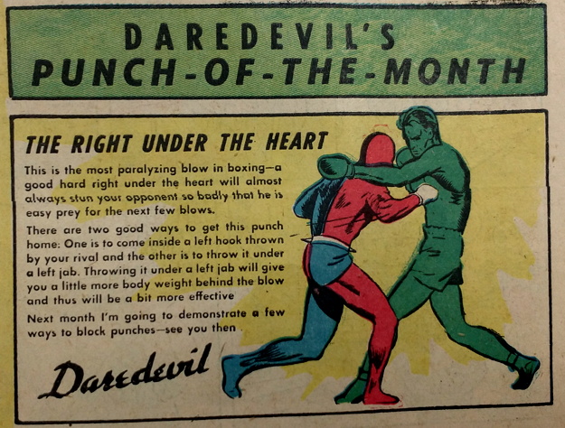
Sure, your superhero comic may be tough, but is it “showing kids how to throw a punch monthly” tough, like Lev Gleason’s Daredevil?


Oh ho, I say not, my friends. Anyway, I hope ol’ DD wins his match with grown-up Beast Boy.


Image courtesy a stack of some great beat-up Golden Age books customer Sean brought in to show me the other day. Sorry, forgot to note which Daredevil comic this was from. UPDATE: Sean informs me it’s from Daredevil Comics #5 (November 1941).

Remember that trend of naming characters “[Something] The [Something Else] Man?” They should bring that back.

Jay from Tennessee volunteers the following

“What was it that you liked most about Firestorm?”

Let’s borrow Mr. Peabody’s WayBack Machine and travel back to the joyous, nigh-utopian days of 2007 when I wrote a bit about my Firestorm fandom:

Me: “You know what I like about Firestorm?”

Employee Aaron: “No, what?”

Me: “Well, Ron Raymond [Firestorm’s secret identity — well, one of them] is on the school’s basketball team, and he’s always getting picked on by the school brain, Cliff Carmichael. It’s some kind of weird parallel universe high school where the jocks get bullied by the smart guys.”

Aaron: “So what parallel Earth would that be?”

Me: “I’d call it ‘Earth-Remarkably-Improbable.’”

Okay, that’s a little facetious (what, on this blog? NOOOOO) but…you know, I was trying to think if I’d encountered Firestorm much prior to the launch of the 1982 series. I’ve read some Justice League of America before that, so I definitely c him there, and there were a handful of back-ups in Flash that I know I read. But at this point in time, I can’t recall if the character really grabbed my attention or if he just happened to be a dude in a comic I was reading for other reasons.

I suppose I must have liked him well enough to drop my two quarters and a dime on the first issue when it was released. I think a lot of it had to do with being an excited 11 to 13-year-old getting in on the ground floor of all these new comics that were popping up (like Saga of the Swamp Thing, natch, and All-Star Squadron, just to name a couple).

And like I said in my 2007 excerpt up there, I liked the weird premise of Firestorm actually being two people who would merge together into one shared-body superhero, with the impulsive teen (Ronnie) controlling the body and the older scientist (Martin) as the voice in his head. The additional twist of that “voice” being represented by Martin’s ghostly “head” that only we, the readers, and Ronnie could see was a clever one.

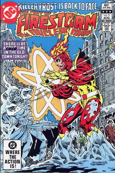
Another plus was the artwork, which remains my favorite example of Pat Broderick’s work to this day:


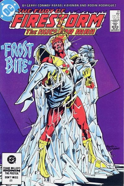
Even after doing this blog for nearly two decades I’m still not any better at describing art much beyond “pictures good,” but, hey, you know, pictures good. There was a detail, a graininess, to his work that felt…unusual to me at the time, which you didn’t see much in the usually much slicker superhero comics. Even when Broderick left regular penciling duties and was replaced by Rafael Kayanan:


…the artwork was still somewhat Of A Kind with what had come before. A little slicker, maybe, but still evoked Broderick’s influence in a way that later artists on the title would leave behind.

I enjoyed the stories as well, particularly the difficulties superhero-ing placed on Ronnie and Martin’s personal lives (especially Martin, who initially didn’t retain memory of his time as half of Firestorm). And of course the whole business with Ronnie’s rivalry with Cliff Carmichael, as mentioned above. It was all presented with just the right mix of humor, melodrama, and action, and always felt like I got my money’s worth out of each issue. I realize in hindsight it’s all very Spider-Man, almost certainly intentionally, but for a kid who hadn’t read many of those Spideys, and certainly not from the beginning, this all seemed fresh and enthralling to me.

Okay, with all this “from the beginning” talk I should note that I was aware at the time there was a previous Firestorm series in the ’70s. Certainly that they named the title Fury of Firestorm to differentiate itself from the previous Firestorm I do remember noting back then (in the same way Saga of the Swamp Thing was so named as to avoid confusion with Swamp Thing.) This, amongst other quests, is what would eventually lead me to comic shops looking for back issues. I eventually got that first series, though oddly I never sought out the Flash back-ups I didn’t have. Ah well, I eventually bought the book, so that’s moot now.

Once or twice on this site I believe I’ve mentioned that I really enjoyed the beginning of Fury of Firestorm and the end of it, while kinda coasting along through the middle which wasn’t…well, let’s say it was a little more inconsistent. Not necessarily bad, but not always to my taste either. However, I was still invested in the characters and wanted to see what happened with them. Yes, even Cliff Carmichael.

This is, unsurprisingly, going on forever, so let me try to wrap things up a bit. I did like how they changed things up and did things like replace Martin with another guy in the Firestorm merger, and went through a period where Firestorm himself had his own personality separate from the two men who’d form him.

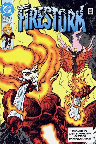
Most notably, there was that business where, “inspired” by Swamp Thing’s journey into discovering he was a Plant Elemental, formed by Earth to be its champion, so was Firestorm sent on his own journey to become a Fire Elemental in much the same way. Oh, and said journey came with his own knock-off of John Constantine. Yeah, I know. But this all brought us to a new, relatively short-lived redesign for the character and some dynamic artwork from Tom Mandrake:


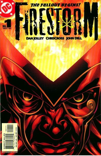
And then after this there were additional revivals/revamps of the character, specifically with new kid Jason taking over the role:


…in a fun series that provided a new take on the premise, while still following up on characters and events from the previous series. Of note: the end of DC’s Brightest Day event included an epilogue that threatened a dire fate for Firestorm that clearly was going to lead into…something, but that (and other set-ups from the end of this series) were cut down a’bornin’ with the advent of the New 52 publishing initiative. That to me was a major clue (along with what appeared to be poor, rushed planning overall) the New 52 was as much a surprise to DC as it was to the rest of us.

Anyway, Jay, I realize a lot of that was more “here’s a history of Firestorm” more than “what I liked about Firestorm,” but all these twists and turns in the character’s timeline always kept me interested. Until the cut-off and relaunch with the New 52, you could drawn a line from those beginnings as a 1970s series canceled early due to the DC Implosion, to all those Brightest Day shenanigans. I enjoyed being able to follow the lives of these characters for so long, and though their original story didn’t end so much as stop, as is often the case in superhero comics, the ride was of course all the fun.

I will say that the reveal of Martin Stein as a bad guy in Doomsday Clock was not my favorite thing. Who knows if DC’s “Infinite Frontier” initiative takes care of that or not. IT BETTER.

Able to leap tall variants in a single bound.

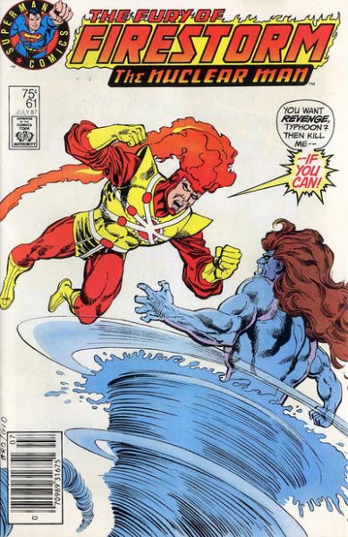
So I bought that Fury of Firestorm series all the way through, beginning with #1 in 1982, and then every month (more or less…there was a bit of an extra gap between 18 and 19) ’til the end at #100 in 1990. But one day in March 1987, right around my birthday in fact, I went into the local newsstand in Oxnard where I’d buy my comics when I couldn’t make it up to the shop in Ventura (said shop becoming my place of employment the following year) and saw this on the spinner rack:


“Huh, that looks different,” thinks I, and I picked it up along with whatever else I was buying at the time and didn’t think much of it…

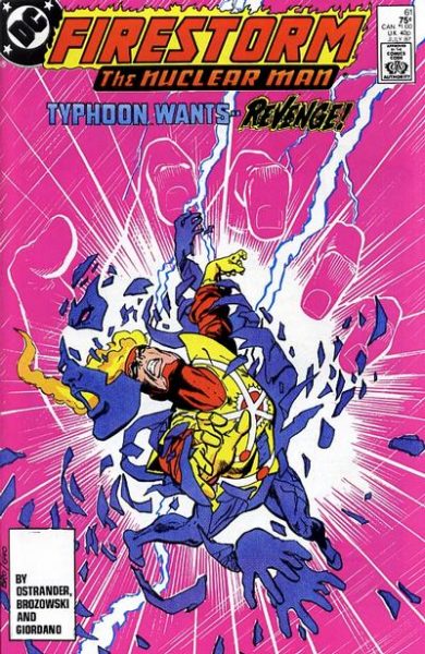
…until sometime later in the month I spotted this on a shelf:


I almost picked it up to buy, as I didn’t recognize the cover, but a quick glance within revealed I had already read this comic.

At that point I was aware that variant covers could be a thing, since we just went through the whole Man of Steel event and its different covers the previous year. Plus I was familiar with DC’s “hardcover/softcover” plan, which isn’t quite the same as the idea of “variants,” but it did represent the strategy of differing editions for the direct comic shop market and the regular newsstand market.

But this was different. We heard all about the different covers for Man of Steel, but I don’t recall any hype at all for this different Firestorm cover. Maybe there was a blurb somewhere, possibly a news item in Amazing Heroes or The Comics Journal that I missed, but variants like this were still unusual enough that one would have expected some major advance warning that these were happening. In addition, I never saw these on the shelves at the comic shop. Given that the store carried both the direct and newsstand versions of Man of Steel #1, I figured the same would have occurred for this Firestorm issue.

As I would eventually find out (and how I found out I’m not sure…a notation in the price guide, maybe, or an inquiry at the comic shop, or just general knowledge I picked up off the mean comic streets) that this weird Firestorm cover was part of some test marketing on DC’s part. Some simplified imagery, a company logo emphasizing Superman (I mean, literally “Superman Comics”), and the use of word balloons (even then becoming increasingly scarce on your standard superhero funnybook), all designed hopefully to appeal to younger readers who might encounter the comic in their local Stop ‘n’ Eleven convenience store, or wherever.

And by “test marketing,” I mean just released to certain areas. Not every newsstand outlet received copies of these, making them somewhat rare-ish and, naturally, acquiring bit of a premium price in the secondary back issue market. (And a quick glance at the eBays shows this to still be the case.)

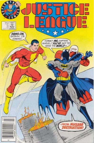
Some time later, after getting my job at the Ventura comic shop, I would learn a little something more about the Firestorm variant, and the similar variant for Justice League #3.

Oh, did I not mention that Justice League #3 variant? The one that looks like this?


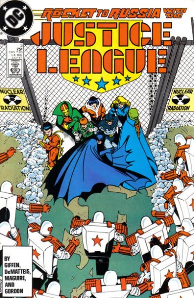
And here’s the regular version for comparison:


Now, this far removed I don’t remember if I learned about this other instance while working at the shop, or sometime prior. But I did learn that of the two, the Justice League #3 was far more common in our area. I personally never saw it in the wild, though in ’87 I was no longer making the rounds of all the various outlets that carried comics and just buying mainly from the two mentioned sources, and thus could easily have missed it. Anyway, we would eventually acquire quite the stack of Justice League #3s in our back issue bins, as they slowly accumulated from multiple collections.

On the other hand, Firestorm #61 we never saw. Maybe one or two would creep in here and there, but we never had it in any sort of quantity. I even sold my copy to the store and picked up a regular copy for cheap, since I neither cared which cover I had nor realized that 30 years on I’d wish I still had it for blogging material. At any rate, via purely anecdotal evidence, I concluded that the Firestorm 61 variant had very limited circulation in my area, versus the more readily-available Justice League #3 variant.

The reason is obvious…Justice League was the better seller of the two, so of course more copies would be out there for the taking. Meanwhile, poor Firestorm was getting a bit long in the tooth, still some months away from some creative rejiggering to boost sales, and was probably only still being read by the diehard weirdo fans like me. Plus, which was more likely to be picked up off a newsstand rack by a casual reader? Something with Batman on the cover, or that comic where the guy’s head is on fire? …Well, actually, that might be too close to call when I put it like that.

Looking at Comichron‘s June 1987 sales through Diamond (no March sales info, but close enough for horseshoes), Justice League clocks in a #6, while Firestorm is at #83. That’s probably explanation enough for why we were swimming in the Justice League variant and didn’t even have enough Firestorm variants to get our tootsies wet.

In the end, however, I think the test results were ultimately “this didn’t help sales,” given that no more of these ever turned up, and we didn’t see that “Superman Comics” logo at the beginning of the Zack Snyder Justice League cut. They are kind of neat covers, looking back on them now. A little…plain, maybe (Firestorm and Typhoon apparently fighting in that one all-white “Duck Amuck” background) but at least you can tell what’s going on quickly and easily and they actually represent what’s happening in the comic. (That regular Firestorm cover requires a tiny bit of concentration, frankly.) Oh, if only some comics did that today. Plus, I loves me a good word balloon on a cover. C’MON BABY GIVE ME MORE OF THESE:


If you want to Read More About It, here’s an informative and much more concise article on the topic over at CBR. And if you have more information, or if you have to take issue with any of my drawn conclusions (as someone almost inevitably does) just leave it in the comments and I’ll run a later update/correction as necessary.

What’s up next in the variant cover-age? I don’t know, I haven’t decided! You’ll find out when I do next week! Thanks for reading, pals! Exclamation point!

P.S. Oh hey, I just noticed they used “Captain Marvel” on the cover of that Justice League! I don’t think it was explicitly verboten on DC’s covers (so long as it wasn’t, you know, the actual name of the magazine) but it’s still weird to see it there.

Oddly, no Amazing Spider-Man covers featuring photos of Steve Ditko.

So y’all had some good suggestions for nice photo covers in the comments for Wednesday’s post, which I appreciate. I especially appreciate Rob Staeger’s reminder that Sandman Mystery Theatre had photo covers for its entire long-ish run, certainly an unusual accomplishment in modern comics. Or this cover noted by BobH with Joe Simon and Jack Kirby.

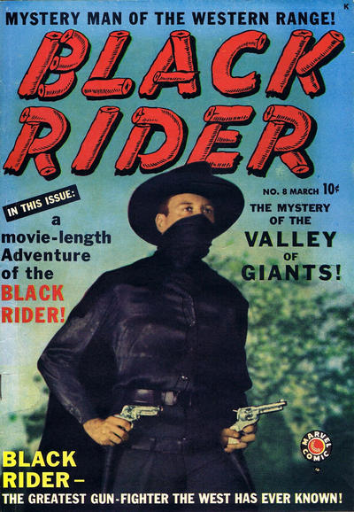
But here comes customer Sean with a comic I wasn’t aware of…Stan Lee cosplaying as the Black Rider on issue #8 of that title from 1950:


You can Read More About It here on this Stan Lee site.

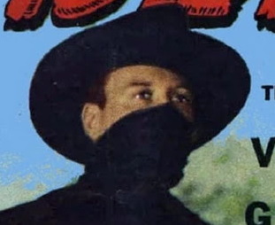
I mean, just gaze helplessly into the steely stare of Stan the Man, all masked up before it was cool:

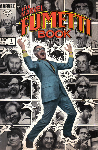
Speaking of ol’ Stan, Eric brings up the Marvel Fumetti Book from 1984 that has him on the cover:


Thanks to the Bullpen Bulletins in every Marvel mag, plus stuff like the in-house news/previews ‘zine Marvel Age, and just the general editorial shenanigans at Marvel since the get-go, the staff and creators at Marvel were more or less known personalities by the readers. Thus, a collection of photo gags starring the folks behind the comics was something they could probably pull off. I wonder if DC could have done something similar at the time? Maybe a bunch of photo-gags starring Wolfman and Perez, or Curt Swan hanging out with Superman (I mean, in “real life,” not in the story in that last panel here), or Alan Moore terrifying the suits around the DC offices…that sort of thing.
Of course prior to that was Fandom Confidential, a photo strip that ran in The Comic Reader and Comic Buyer’s Guide. But perhaps we’re going a little astray from the simple pleasures of just plain ol’ comic book photo covers. Like this one, which isn’t weird at all.
• • •

Also wanted to note the passing of David Anthony Kraft, publisher of the wonderful Comics Interview magazine, as well as the writer of several swell comics (including, very briefly, some of the original ’70s Swamp Thing). Mark Evanier has some nice words to say here. My condolences, of course, to his family, friends, and fans.
This is all somehow Nicéphore Niépce’s fault.
So in the comments section for my Gen 13 post, folks started talking about photo covers on comics. I don’t have anything in particular to say about photo covers, though I suppose I could note how of all the too-many variants for Dynamite Entertainment’s Vampirella, Bettie Page, and Red Sonja, it’s the “cosplay” photo covers that move the most for me. (And no, not just for prurient reasons, I promise.)

I can’t think of a whole lot of other photo covers of late, but I have the memory of a goldfish who has pretty bad memory even for a goldfish, so don’t depend on me. I can think of some of Marvel’s movie tie-ins and variants with movie stills.

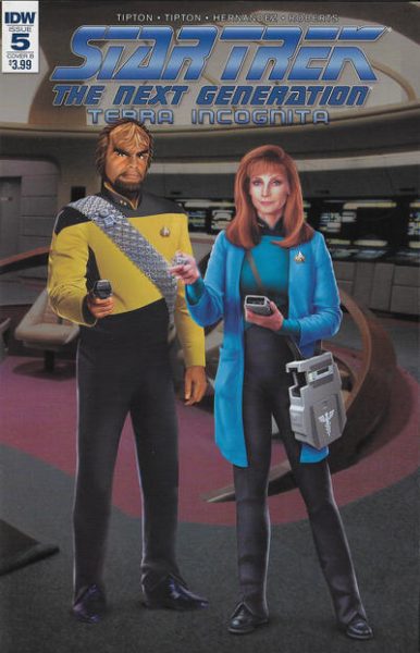
Oh, wait, I forgot about IDW, which uses photo covers all the time, especially for Doctor Who and Star Trek. Why, way back in 2007 I complained about making the photo cover the ratio variant instead of the regular cover. Why use a drawing of Young William Shatner when you can slap that handsome mug on all your covers and make a mint. Ah well, What Can You Do? In later years a lot of those photo covers from IDW have been freely orderable, some nice, some, um, a little awkward:

Now there’s no way I’m going to do a comprehensive history of photo covers just off the cuff right this moment…I mean, Turan says this is (maybe) the first superhero photo cover:


…and sure, I don’t doubt it. Looks like they did a good job on the costume. But I was trying to picture DC doing photo covers from, like, the Batman movie serial and how amazing that would’ve been.

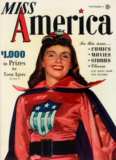
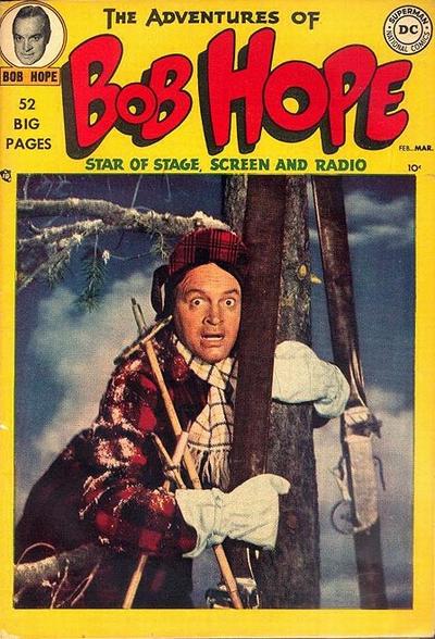
But there were plenty of photo covers to be had in the 1940s and 1950s,especially when celebrities were involved:


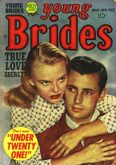
I think my favorites, though, and I don’t see enough of them passing through my store, are the romance comics with photo covers:


I would love (appropriately enough) to be able to put together a collection of these for myself. Especially Young Brides…there’s Jack Kirby in them there hills, friends!

I’m sure the photo covers (particularly for the romance comics) were there to make the comics look like their slightly more respectable magazine cousins. And the ones with celebrity photos would of course attract fans. Plus there’s the simple matter of photo covers just standing out on the rack…when you’re looking at that beautiful gory layout and see line drawing after line drawing, the sudden appearance of an actual picture of a real human is going to grab your eye. Photo covers were the foil/foldout/hologram gimmick variants of the mid-20th century. Why, if Death’s Head II & The Origin of Die-Cut came out in 1951, I’m sure the cover would featured models in some elaborate costuming!

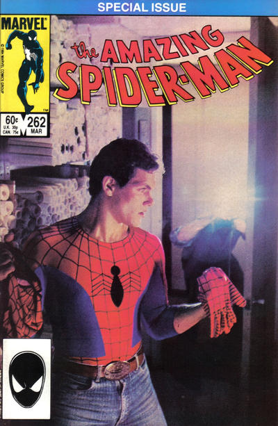
Anyway, I should note the one cover that seems to come up a lot, one that seems to be fairly common and that even some of you cited at me: 1985’s Amazing Spider-Man #262:


I always thought the cover design was funny, in that it’s got that “SPECIAL ISSUE” blurb across the top, and literally the only thing “special” about this comic was the cover itself. Not slamming the comic or anything (I mean, it’s Bob Layton, it’s fine), but as I recall (and yes, I bought this off the stands at the time because of that cover) it was just a typical Spider-Man story. Not like Aunt May joined with the Venom symbiote, or that Mary Jane pulled off her red wig and revealed she was Gwen Stacy. That cover did its job…it got you to pick up that comic. It sounds like it worked on a lot of you out there as well. Marvel did several photo covers in the ’70s and ’80s (the Dazzler and Spider-Woman are stand-outs, but I have a personal favorite).

Let me wrap this up with possibly the greatest photo cover of all time:


Just your reminder that DC’s Vertigo imprint at least partially owes its existence to Wes Craven and that movie. Far as I’m concerned, that’s a celebrity photo cover for all us Dick Durock fans.

So let me ask you…what are your favorite photo covers?

Variant-active.

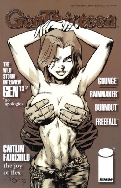
So Gen 13, when it made its debut in 1994, seemed like a younger, hipper take on the teen superteam formula that did so well for Marvel and DC. But Gen 13 was Young Comics by Young People for Young People, as compared to the relatively staid X-Men and New Teen Titans. That’s basically Image as a whole: “here are comics by the hep and with-it and not by those squares at the Big Two.”

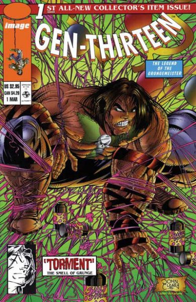
Anyway, that first mini did well, and so in 1995 an ongoing Gen 13 series was launched, and lo, if you thought the whole Robin II thing was too much, look out because here come thirteen variant covers!


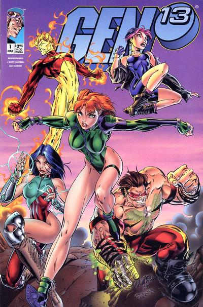
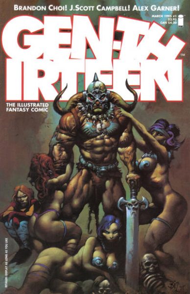
Okay, it’s closer to, like, 14 different images (once you include the chromium cover, more on that in a second) and 15 different variants (when you count in the chromium cover and the “main” cover, pictured above, had a newsstand edition with a UPC code). I’m not putting every cover in this post, but you can see them all here.


I like how this cover references the Spider-Man #1 (which in turn referenced the Legends of the Dark Knight #1…it’s variants all the way down).

The one thing I’m wondering about, and just can’t remember for the life of me, was how the variants were ordered. Looking at this sales chart which just has “Gen 13 #1″ all lumped together as the #5 top seller. That implies to me that the comic was simply ordered as a single line item and the variants were distributed (more or less) equally. That is my vague recollection, and as I’ve said before, had I known I’d be writing a blog post about this a quarter of a century later, I’d have kept better notes. Also, I would have wondered what a “blog” was.


I also would have kept better notes as to which one sold better, though my gut instinct is that the “sexier” ones were preferred by the consumer. Like this take-off on the Janet Jackson Rolling Stone cover.

Many of the variants did quite well in the secondary back issue market for a time…the ones that were pop culture parodies attracted the most accrued value, and I recall having several of these in our glass cases. The main two covers (the one pictured above and a second one, both just featuring the team posing an’ such) were in somewhat lesser demand, and did not command as large a price. But, y’know, still sold fine.


Looking now, just peeking on the eBays, that there haven’t been a lot of sales of this issue in any variation over the last few months. Plus, the ones that do sell are for comparatively slighter prices. The Heavy Metal parody, pictured above, had sold for a significant amount (about $30), which have more to do with the Simon Bisley art and the cover’s Heavy Metal-ish subject matter. And I did find at least one copy of the Janet Jackson cover sold for $40 a couple of days ago.

Of course, the reason is that Gen 13 is currently a moribund property. Even during the run of this first ongoing the series took some hits, particularly after the popular artist J. Scott Campbell left the book early on. There were some attempted relaunches, but ultimately the last issue of a comic called Gen 13 came out a little over a decade ago. The characters themselves have popped up here and there since, including a cameo appearance of the team in the New 52’s Supergirl #33. And apparently some reissuing of old material is planned eventually.


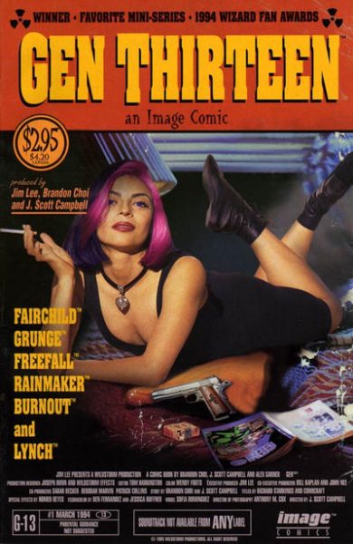
This cover, inspired by the film Pulp Fiction, was another of the more popular variants. Don’t have a lot to say about it, aside from that it’s the one cover to not feature hand-drawn artwork, but instead, a photo. I seem to remember that one not staying in stock long whenever we got it back in.


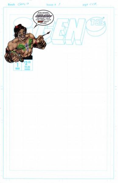
And I had several folks on the Twitters single out this comic as a precursor to the “blank sketch variants” that are so prevalent today. The big difference is that this is a standard slick cover, and not the “art board” covers of the later blanks that would seem to me be easier to draw on. I wonder if anyone actually did take a pen or pencil to this cover. Surely fans brought up copies of this to Campbell (or whoever) to draw upon at some convention.


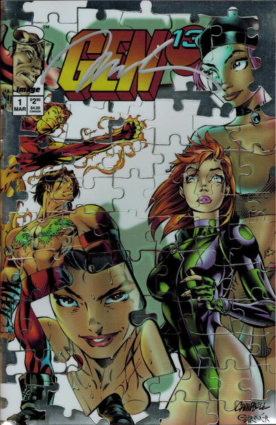
Oh, and here’s that chromium cover. Not part of the regular distribution, but rather only found in a boxed set of all the variants, featuring a signature of one of the creative team. As you might imagine, it sold quite well when we could get our hand son one. Was it…$100, maybe? Again, too long ago, no notes, but that feels like the right price point.

So Gen 13…paving the way for Marvel to put out too many variant covers on too many of their books. (Hello like 30+ covers on Eternals #1)

Oh, and did I mention all the variants had cute names (like “GEN-et Jackson” and “Picto-Fiction”) Don’t recall anyone using these “official” names in the wild…but then, I heard someone ask for “copper age X-Men” the other day, so I guess anything’s possible.

Clearly I held the camera with my third hand.

A little follow-up on the Robin discussion from Monday…turns out I did have a copy of #2 floating around the shop, still sealed in its original bag. Wasn’t the greatest shape, so I performed the not-quite-ultimate sacrifice by popping the bag to present all the goodies within right here! I’M OUT LIKE A BUCK FIFTY FOR THIS POST, PEOPLE.

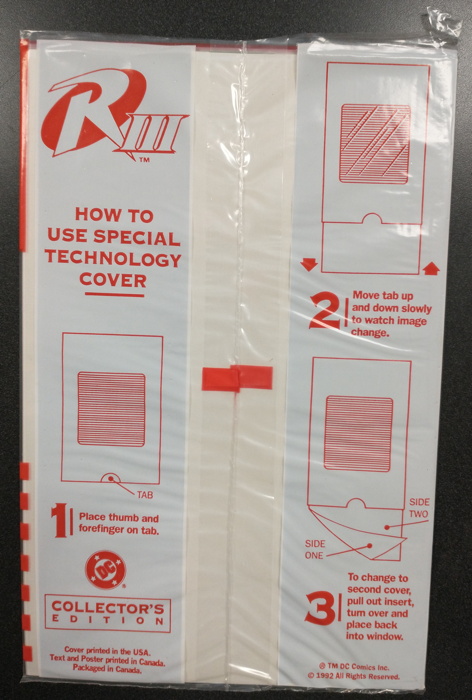
You saw what the front of the bag looked like last time, so here’s the back with all the poop on properly operating your Special Technology Cover™:

What they don’t tell you is that the insert you’re supposed to be pulling through the cover is…a bit flimsy and can be tricky to push back in after pulling it through. It’s definitely a two-hand operation.

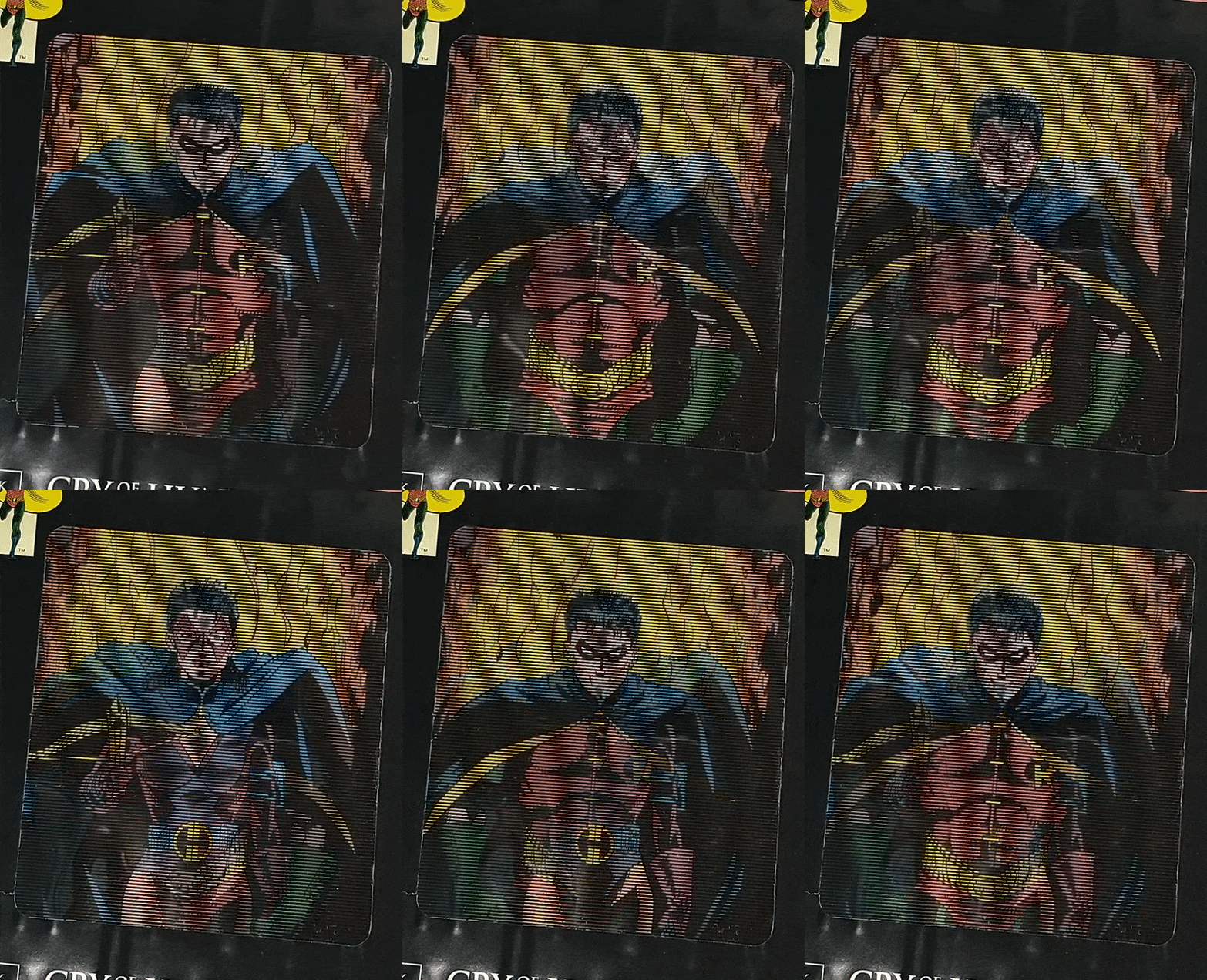
And once again, like last time, I made a GIF so you can get an idea of what’s going on here:

If it’s hard to tell, it’s a pic of Robin that changes into the Huntress, or vice versa.

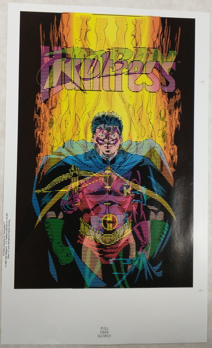
This is what that insert looks like removed from the cover:

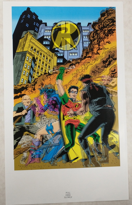
And here’s side two:

And BEHOLD, the jaggiest of Robins (with the Huntress Professor X-ing it out of his forehead):

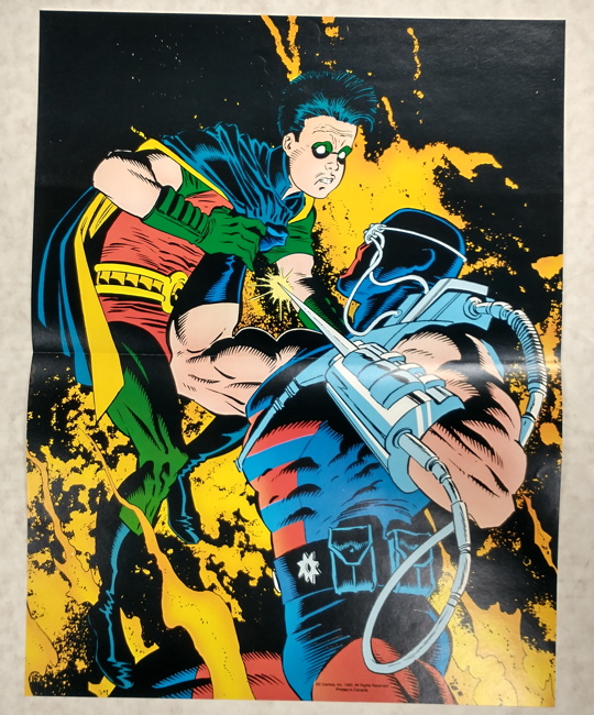
And just for the sake of completeness, here’s the included poster featuring the image from the “regular” version of this issue:

And there you go, friends…the 1990s. You never knew what wild cover gimmick was coming next, and this one was definitely in the upper echelon of “…what?”

More variant cover discussion coming Monday! And remember, if you have any suggestions as to where this terrible path should lead us, feel free to let me know!