Able to leap tall variants in a single bound.
So I bought that Fury of Firestorm series all the way through, beginning with #1 in 1982, and then every month (more or less…there was a bit of an extra gap between 18 and 19) ’til the end at #100 in 1990. But one day in March 1987, right around my birthday in fact, I went into the local newsstand in Oxnard where I’d buy my comics when I couldn’t make it up to the shop in Ventura (said shop becoming my place of employment the following year) and saw this on the spinner rack:
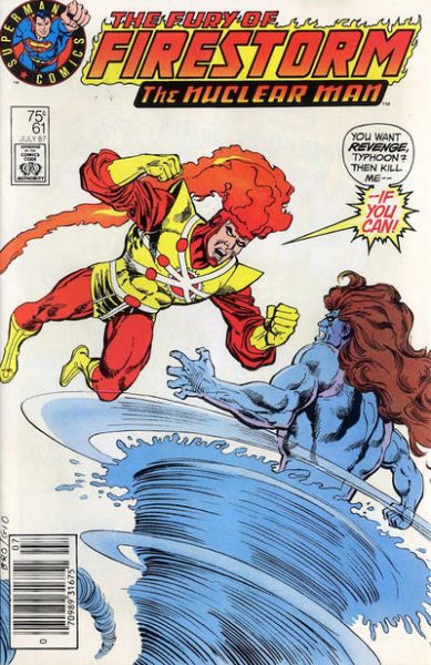
“Huh, that looks different,” thinks I, and I picked it up along with whatever else I was buying at the time and didn’t think much of it…
…until sometime later in the month I spotted this on a shelf:
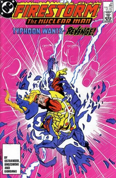
I almost picked it up to buy, as I didn’t recognize the cover, but a quick glance within revealed I had already read this comic.
At that point I was aware that variant covers could be a thing, since we just went through the whole Man of Steel event and its different covers the previous year. Plus I was familiar with DC’s “hardcover/softcover” plan, which isn’t quite the same as the idea of “variants,” but it did represent the strategy of differing editions for the direct comic shop market and the regular newsstand market.
But this was different. We heard all about the different covers for Man of Steel, but I don’t recall any hype at all for this different Firestorm cover. Maybe there was a blurb somewhere, possibly a news item in Amazing Heroes or The Comics Journal that I missed, but variants like this were still unusual enough that one would have expected some major advance warning that these were happening. In addition, I never saw these on the shelves at the comic shop. Given that the store carried both the direct and newsstand versions of Man of Steel #1, I figured the same would have occurred for this Firestorm issue.
As I would eventually find out (and how I found out I’m not sure…a notation in the price guide, maybe, or an inquiry at the comic shop, or just general knowledge I picked up off the mean comic streets) that this weird Firestorm cover was part of some test marketing on DC’s part. Some simplified imagery, a company logo emphasizing Superman (I mean, literally “Superman Comics”), and the use of word balloons (even then becoming increasingly scarce on your standard superhero funnybook), all designed hopefully to appeal to younger readers who might encounter the comic in their local Stop ‘n’ Eleven convenience store, or wherever.
And by “test marketing,” I mean just released to certain areas. Not every newsstand outlet received copies of these, making them somewhat rare-ish and, naturally, acquiring bit of a premium price in the secondary back issue market. (And a quick glance at the eBays shows this to still be the case.)
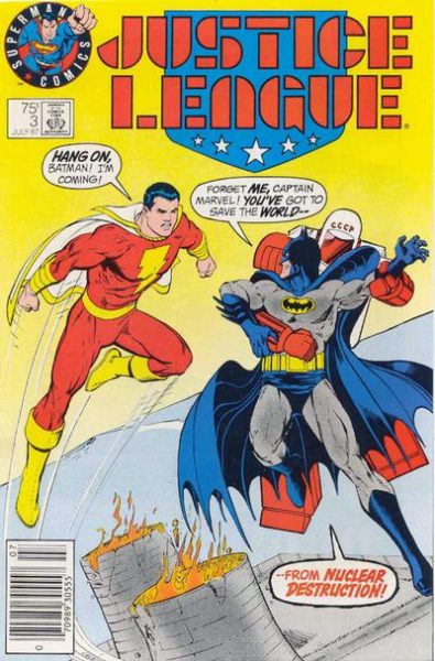
Some time later, after getting my job at the Ventura comic shop, I would learn a little something more about the Firestorm variant, and the similar variant for Justice League #3.
Oh, did I not mention that Justice League #3 variant? The one that looks like this?
And here’s the regular version for comparison:
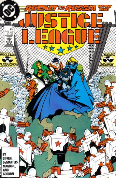
Now, this far removed I don’t remember if I learned about this other instance while working at the shop, or sometime prior. But I did learn that of the two, the Justice League #3 was far more common in our area. I personally never saw it in the wild, though in ’87 I was no longer making the rounds of all the various outlets that carried comics and just buying mainly from the two mentioned sources, and thus could easily have missed it. Anyway, we would eventually acquire quite the stack of Justice League #3s in our back issue bins, as they slowly accumulated from multiple collections.
On the other hand, Firestorm #61 we never saw. Maybe one or two would creep in here and there, but we never had it in any sort of quantity. I even sold my copy to the store and picked up a regular copy for cheap, since I neither cared which cover I had nor realized that 30 years on I’d wish I still had it for blogging material. At any rate, via purely anecdotal evidence, I concluded that the Firestorm 61 variant had very limited circulation in my area, versus the more readily-available Justice League #3 variant.
The reason is obvious…Justice League was the better seller of the two, so of course more copies would be out there for the taking. Meanwhile, poor Firestorm was getting a bit long in the tooth, still some months away from some creative rejiggering to boost sales, and was probably only still being read by the diehard weirdo fans like me. Plus, which was more likely to be picked up off a newsstand rack by a casual reader? Something with Batman on the cover, or that comic where the guy’s head is on fire? …Well, actually, that might be too close to call when I put it like that.
Looking at Comichron‘s June 1987 sales through Diamond (no March sales info, but close enough for horseshoes), Justice League clocks in a #6, while Firestorm is at #83. That’s probably explanation enough for why we were swimming in the Justice League variant and didn’t even have enough Firestorm variants to get our tootsies wet.
In the end, however, I think the test results were ultimately “this didn’t help sales,” given that no more of these ever turned up, and we didn’t see that “Superman Comics” logo at the beginning of the Zack Snyder Justice League cut. They are kind of neat covers, looking back on them now. A little…plain, maybe (Firestorm and Typhoon apparently fighting in that one all-white “Duck Amuck” background) but at least you can tell what’s going on quickly and easily and they actually represent what’s happening in the comic. (That regular Firestorm cover requires a tiny bit of concentration, frankly.) Oh, if only some comics did that today. Plus, I loves me a good word balloon on a cover. C’MON BABY GIVE ME MORE OF THESE:

If you want to Read More About It, here’s an informative and much more concise article on the topic over at CBR. And if you have more information, or if you have to take issue with any of my drawn conclusions (as someone almost inevitably does) just leave it in the comments and I’ll run a later update/correction as necessary.
What’s up next in the variant cover-age? I don’t know, I haven’t decided! You’ll find out when I do next week! Thanks for reading, pals! Exclamation point!




That final JLA cover with all the word balloons was one I remember buying off a spinner rack. . .didn’t they poll readers and the readers selected Zatanna as the hero they most wanted to join the JLA?
I too was a Firestorm fan, but had stopped reading comics mostly by the time Fury of Firestorm launched. He was a favorite during his initial five issue run, with the whole dual secret identity aspect really clicking with me. What was it that you liked most about Firestorm?
I remember seeing that JLA #3 variant at the time and liking it a lot. The design on both of those variants is SO MUCH better than the regular covers.
We might equate “simple” with “more appealing to children,” but simple design is much more eye-catching in general. It’s kind of hard to believe that Kevin Maguire is responsible for designing both Justice League images — the regular cover is so unnecessarily cluttered, even before you add the extra (distracting) text.
And if you keep the word balloons to a minimum (I’m looking at you JLA #161), they can really pull you into the story. You’re effectively already reading it, so may as well pick up the book to continue the experience. As opposed to other text blocks on the cover, which seem more like advertising and therefore aren’t as immersive.
MAYBE the true explanation for the variants is the one you give here. However, it seems to me far more likely, indeed obvious, is that actually there was a teleporter accident that caused some Earth-1 editions to be beamed into the Earth-Prime DC warehouse. (I know it was Earth-1 rather than Earth-2, because of Superman’s emblem.)
Ostrander’s Firestorm seems like an unusual series to attempt to appeal to younger readers.
I really enjoyed the Ostrander tenure on Firestorm.
I found the majority of his issues at an used book store which also sold comics at a dollar a book.
I can’t imagine what I would have made of the series if I were reading it as a kid.
@Thom H:
Funnily enough I was going to say the exact opposite. Those variant covers to me are much worse than the newsstand covers. I’m all for simple, direct design, but those covers just look dull and lifeless to me.
Actually the more I look at the newsstand JL#3 the more I like the sense of foreboding and menace the composition creates.
Oh well, variant opinions on variant covers seem appropriate! :)
Also: Never been a big fan of talky text covers, but I’d take those any day over the generic action shot covers where you have no idea what the story inside is about. Those are the worst!
I like all four of those covers- and the JLA one!
@LouReedRichards: I can’t find a place to rest my eye on the JL #3 cover, which annoys me. It didn’t occur to me to think of it as “foreboding,” but that’s interesting. Different strokes for different folks — especially in comics, right?
And I agree about generic covers. My least favorite are what I call “portrait” covers where one of the characters is just…there. Marvel did that all the time in the early 2000s. Sometimes the character didn’t even appear in the story!
I get a sense of foreboding reading Superman’s, “No one turns down the Justice League!”.
I fear Zatanna is going to get whacked.
Also a sense of somewhat fond foreboding that Gerry Conway’s cantankerous venal verbosity will soon overwhelm any overt obstructions my malleable mind may have against hyperkinetic hackneyed histrionics.
[…] Jay from Tennessee volunteers the following […]
@Thom H.
“I can’t find a place to rest my eye on the JL #3 cover, which annoys me.”
My eye keeps resting on the blue in Bat’s Cape, but I get what you’re saying. I agree with you about the need for some resting area. That was what drove me crazy about the Image guys back in the 90’s.
I’m a Toth guy, so negative space and making every line count are high on my list of artistic priorities.