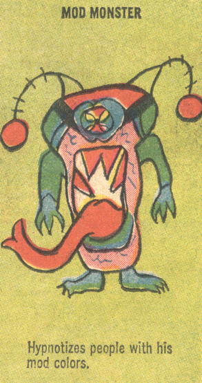
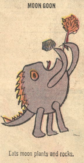
There’s nothing more mod than deely-bobbers.

It’s been a while since I’ve dipped into the Gold Key “Reader’s Page Monsters” well, but I’ll occasionally run across those pages, and they’re always fantastic. …A while back, after one of my previous postings, I had someone opine on another site that these drawings obviously weren’t actual submissions from children, since the line thickness on the drawings was more-or-less uniform and thus the monsters looked like they all came from the same hand. I suspect the answer to this is simple: that all the submitted drawings had to be traced or redrawn for the sake of reproduction. I’m sure many of the images arrived as light pencil drawings on lined paper, or crayon on construction paper, despite the instructions to readers to “draw in black ink on white paper.” And even if they did follow instructions, that probably didn’t mean the pictures were ready for reproduction straight out of the envelope.

Or maybe these were all drawn by some Gold Key intern or bored staffer and I’m fulla crap. It’s totally possible.

Anyway, I promised monsters, so here they are:


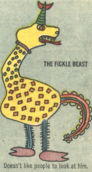
Yes, the big yellow critter with green and red spots and an overly elaborate tail doesn’t want to attract attention. Got it.


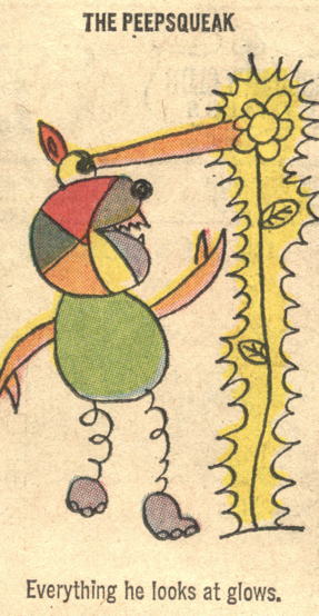
So his vision makes things…radioactive, I guess? This monster is more dangerous than one might think at first glance. Though admittedly, having legs like stretched-out Slinkies would possibly impair his mobility, so perhaps the danger is minimized.


I am willing to believe that being hypnotized by mod colors was a widespread problem in the 1960s.


Reminds me a bit of Superman’s greatest nemesis, the Iron Eater (as seen here). Also, the Moon Goons apparently don’t believe in crop replacement, given the notable lack of “moon plants” on our satellite. …Then again, they never say it’s our moon. Maybe these guys are over on Endor terrorizing Ewoks. …It’s fun to imagine things, isn’t it, kids?

images from Ripley’s Believe It or Not! #14 (June 1969)

Speaking of bookmarks….


1987 bookmark, found in a book purchased at a garage sale. The Bat-ears are a little worn, but still, woe betide any master criminal who dares try to lose someone’s place!

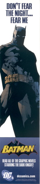
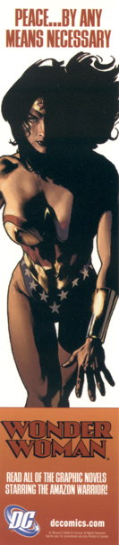
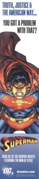
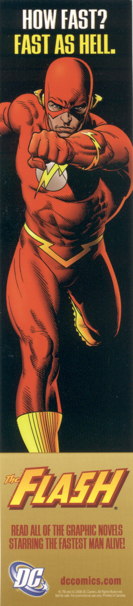
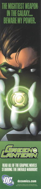
Let’s all enjoy some aggressive marketing via DC Comics bookmarks from 2006.

Well, sure, Batman’s isn’t too far off the mark:


And Wonder Woman’s is…well, okay, she is a warrior, so I guess this one can slide:


…but this one doesn’t feel very…Superman-y, you’d have to admit:


And this one makes me laugh, because I’m a bad person:


In comparison, the Green Lantern one felt a bit tame:


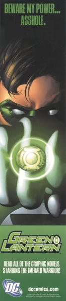
…so I decided to do a little copy editing:


And yet, strangely, still in character!

Frankly, I just did this so I could draw the smiley face.

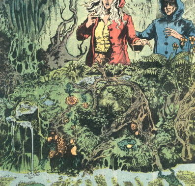
A couple of you expressed difficulty in spotting the overgrown Swamp Thing in that splash page from Saga of the Swamp Thing #22 I posted yesterday:


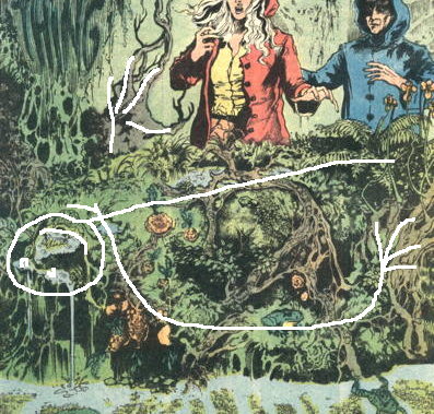
…so I thought I’d help you along with a minor visual aid:


You can see Swampy’s head in the lower left corner, his right arm across the image underneath, and his left hand sort of sticking out above him, there. Hope that helps!

Anyway, we have some interesting submissions in the “iconic Swamp Thing panel” discussion going on in the comments to yesterday’s post, so feel free to chime in, if you’d like.

In other news:

  • Kevin Church, Max Riffner, and Rick Hiltbrunner just started up a new strip (a spinoff from Lydia, itself a spinoff from The Rack) called Signs and Meanings, so go on over there and enjoy yourself some free webcomicking.

    Okay, that was a lot of links all thrown together there. Lemme try again.

    New free webcomic, Signs and Meanings. Church ‘n’ Riffner ‘n’ Hiltbrunner. Go read it.

  • So our partner business is participating in this Mission: Small Business program via Chase Bank, in which 12 businesses will receive a fairly sizable chunk o’change. We need to get 250 votes to be put into the consideration pool for this grant, so if you could go here and vote for “Seth’s Games and Anime” I would appreciate it, since both our businesses would benefit. Plus, I could finally build that rocket car to…um, help me deliver comics more quickly. Yeah, that’s it. …Thanks, pals! (NOTE: Facebook account required to vote. Yeah, I know, sorry.)

“Swamp Thing! / You are amazing!”

So Tom Spurgeon had a Five-for-Friday call for entries recently, asking folks to “Name A Character Or Characters Or Title And Then Name Four Iconic Visually-Driven Single Moments For Your Choice.” I saw that in my feed-reader and was well on my way to gathering some choice Swamp Thing panels, when I realized I’d missed the deadline. Ah, well…you can read other folks’ entries over at Tom’s site (which as I write this is experiencing some technical difficulties, but should be up again soon), but I thought I’d share a few of the panels I was thinking about.

First one that came to mind was this one from Swamp Thing #1 (1972), which I’ve featured on the site before:
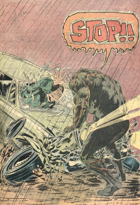

…And then there’s this, though there are lots of versions of that panel to choose from!

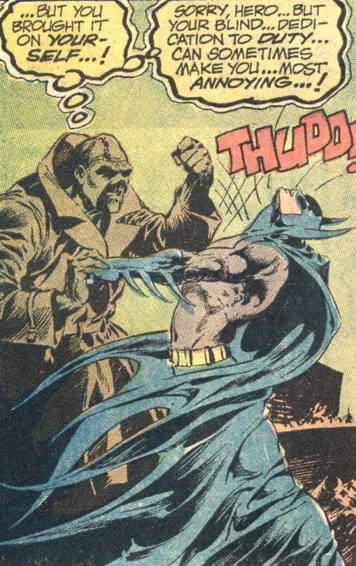
And there was this panel from issue #7 from that first series, which maybe isn’t an “iconic” pic that immediately comes to mind when one thinks about “Swamp Thing,” but it’s Swampy in an overcoat slapping Batman around, and that’s always great:

The next panels I thought of were a pair of splashes that are in fact connected plot-wise. In Alan Moore’s first story arc, Swamp Thing finds out he was never actually a human being, but a plant “infected” by Alec Holland’s memories. Traumatized by the revelation, he collapses in some Louisiana marshland and lets himself take root, resulting in this startling image from Swamp Thing #22 (1984):
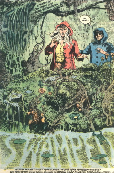

I remember showing this page to…hmm, someone, can’t recall who, but that person couldn’t tell that was Swamp Thing beneath all that overgrowth. I had to sort of trace my hand along the image…”there’s his head…see his arm, there?” …

The follow-up to this in the next issue, when Swamp Thing finally snaps out of it and uproots himself in time to come to Abby’s rescue:


Such a great, detailed image by Steve Bissette and John Totleben. When Bissette and Totleben first came onto the book a few months prior, Swamp Thing began his visual transition from a generally smooth-ish skinned monster with his plant-like nature represented by twisted roots covering his body, into a creature that actually sort of looked like it was comprised of plantlife. It was this particular storyline, though, that finally brought us a Swamp Thing that really looked like a big ol’ walking swamp.

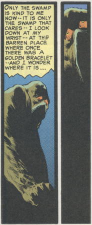
Another panel I considered was this one, from the very first Swamp Thing story in House of Secrets #92 (1971), where the Swamp Thing stares sorrowfully down at his wrist, wondering if his golden bracelet is still buried there:
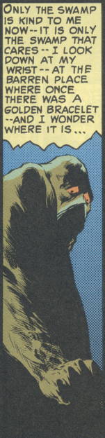

…but I decided I would more likely go with the wordless panel immediately following, which feels much more despairing:


Here are the two panels, together as printed:

…And I could keep going even farther beyond Tom’s four-panel limit, but I’m sure he’s not quite ready to start curating “Fifty for Friday” posts. A few years back, I made a list of my favorite Scary Swamp Thing Moments, and I’m sure there’s more than one iconic Swampy image located therein.

However, I’m pretty sure this remains the definitive image of Swamp Thing for most people in the world.

This is obviously not comprehensive, and I suppose if I’d been able to meet the deadline, I would have pondered it a little longer and thinned down the selection to an actual four-image submission, but I wanted to pass along the first few candidates that popped into my head. I’m sure some of you out there have a specific single Swamp Thing panel that sums up the character for you, and please feel free to share in the comments.

images from Millennium Edition: House of Secrets #92 (May 2000), reprinted from, House of Secrets #92 (June/July 1971) by Len Wein and Bernie Wrightson; Swamp Thing #1 (October/November 1972) by Wein and Wrightson; Swamp Thing #7 (November/December 1973) by Wein and Wrightson; Saga of the Swamp Thing #22 (March 1984) by Alan Moore, Steve Bissette and John Totleben; Saga of the Swamp Thing #23 (April 1984) by Moore, Bissette and Totleben
“Scratching off” is a terrible euphemism.

Michael G. suggests:

“How about a comic where crucial story-event panels are hidden behind a scratch-off coating like that used on lottery tickets? In fact I can’t believe they didn’t already try that in the early 90′s.”

You know, this idea sounds so probable, especially in the gimmick-laden comics industry of the 1990s, that I think my brain actually tricked itself into believing such a thing actually happened. …It didn’t, at least not that I’m aware of, though if I’m wrong, I’m sure someone will correct and / or remind me. But I swear, I’m sitting here thinking “I know I scratched off something in a comic book…but what? WHAT?” and I’m hoping the answer isn’t “eyes from every character’s face” because that would be a bit weird. But…I don’t know. Was there maybe some kind of contest insert that needed scratching? I have no idea, but Michael G. bringing that up really triggered a very vague sense that such a thing has happened within recent memory.

Anyway, such a coating would have to be on a thicker paper to resist tearing, like maybe on a stiff paper centerfold or, perhaps, on the inside back cover, given that the cover was sturdy enough. How much more awesome, would, say, Wild Dog (already an awesome comic) have been, had the reveal been concealed by scratchable coating? “WHO IS…WILD DOG? Scratch here with a coin or key to find out!”

It did remind me of a particular…adult entertainment card set that we carried, way back in the wild ‘n’ wooly days of the trading card boom, and well out of the reach of young’uns, in which some of the special randomly-packed insert cards did indeed feature this scratch-off technology. I Googled shameful things to bring you hyperlinked, certainly Not-Safe-for-Work proof of these cards’ existence, and here you go. …It’s about as classy as you’re expecting.

And before you mention it, no, I’m not confusing scratching off these cards for my vague memory of scratching off something comic-related. I never once applied coin-to-cardboard on those trading cards, NOT ONCE well maybe once NO I DIDN’T SHUT UP

But anyway, if DC Comics is looking for a way to make that cover for Catwoman #0 even sexier…well, you folks there can have this idea for free.

EDIT 6/15/12: Corey (Ottawa) reminds us of this G.I. Joe cover from late last year!

This is all assuming there’ll eventually be a back issue market for anything coming out right now.

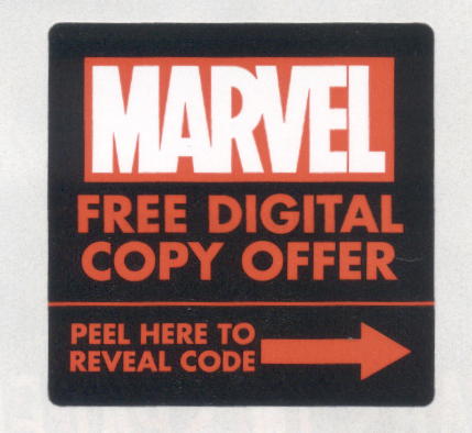
So this week is the first time one of those digital download codes turned up in a Marvel comic I follow (Incredible Hulk, in case you were wondering), which got me to wondering about something.

The Marvels that have a digital download code printed inside protect the code from being stolen in-store by hooligans and ne’er-do-wells by covering it with a black label, which looks a little something…like this:


Of course, it’s not as if someone couldn’t just peel it off and jot down the code anyway, but as I haven’t yet experienced a floor littered with these little black labels, I think that hasn’t become a real problem yet.

One thing I’ve been thinking about, from the “dude what sells the old comics in a collectors’ market” point of view, is this: remember Marvel Value Stamps? Those little stamp drawings that appeared on editorial pages/letter pages/etc. in ’70s Marvels that you would clip and save for…well, something or another, I guess. Anyway, for folks like me who, as I said, deal in back issue sales, those things are the bane of my existence, as you really need to go through and check that the particular comics that had said Value Stamps in them weren’t clipped out. Because, if that stamp is clipped, suddenly that Wolverine appearance in Incredible Hulk #181, normally worth exactly one billion dollars, is now only worth about five or ten cents, max. (NOTE: pricing approximate.) So, yes, a missing stamp does negatively affect the value of the comic.

So now there’s this thing, the little black sticker covering the code. I suppose technically if the sticker is missing, the comic would be incomplete (or at least, altered from its original condition as released) and therefore probably shouldn’t be sold as a mint or near mint copy. Which means, if I start dealing in used copies of these (and I really haven’t, as of yet), I’m going to have to start checking to make sure that sticker is still intact. (I should note that I haven’t experimented with the sticker in my Hulk comic yet, so I don’t know if the sticker can be reattached…I’m guessing “no.”)

Before you say anything…yes, this is a dumb thing to be thinking about. But I guarantee you, this situation is going to come up and I’m going to have to deal with it at some point. …Not that I’m looking forward to that buyer/seller interaction:

“Well, this copy of Avengers Vs. X-Men II: The X-Avengening #3 would normally be worth about ten bucks….”

“Yeah?”

“…Except the digital code sticker has been removed. Sorry, this is only about a four dollar book now.”

“…What. Seriously?”

“Yeah, really. …This isn’t my proudest moment.”

Or maybe I can go the “professional grading” route, where some of those companies squirm out of pinning a book down to a specific condition by giving it a “qualified” grade based on its apparent appearance, instead of the grade that actually should be applied based on the damage you don’t immediately see. (You know, “Qualified Near Mint, loose centerfold” — that’s probably a “VG” to you and me.) …Of course, if I ever actually write “Qualified Near Mint, missing digital code sticker” on a book I’m trying to sell at the shop, I do welcome any of you to come put me out of my misery.

(By the way, I’m totally pulling that sticker off my Incredible Hulk comic…I want to see what all this digital comic hoohar is about.)

Slightly after Before Watchmen.

So, when we were last talking about Before Watchmen, I posted a poll asking what some of you folks were planning to regarding the series…avoid it, try it out, steal it, whatever. Thus far, three-fifths of the respondents indicated that they would not buy it.

Now, that poll may not be entirely balanced…an online fandom interested enough in the matter to 1) read comic blogs and 2) vote in an online poll may be a little more aware of the situation and thus more inclined to skew negatively. But even those in-store customers of mine who don’t pay any attention to comics news outside of whatever happens to be in Comic Shop News that week (I assure you, such customers exist) are voting the way comic readers usually vote: with their wallets.

Now that I’ve had a few days of sales to see how things go, I can report that Before Watchmen: Minutemen #1 has sold…okay. Not flying off the shelves in a Superman #75-esque frenzy of consumer demand, but moving along at a steady pace. From previous experience, I’m relatively certain once Minutemen #2 comes out, or even when the next series or two start up, we’ll get further requests for the initial releases. However, like I’d said before, we’ll see how it goes in the long run, if we’ll get consumer resistance once the series and issues start piling on.

I’ve only had a handful of customers at the shop bring up Alan Moore’s disdain for this project, and it was about 50/50 whether those particular folks picked up the book or not. And there are other reasons outside of creators’ rights issues why some customers may not be picking up the book: didn’t like the movie, didn’t care for the original comic, it’s been just plain too long since the original to care about prequels, still burnt out on Watchmen after the media saturation surrounding the film, or simply aren’t interested in a Watchmen comic not by Moore and Gibbons. But, like I said, it’s not like it’s not selling…it seems to be selling fine. It’s not a monster smash like Avengers Vs. X-Men, but I would have been surprised if it were.

I’m almost tempted to put up another poll, “Of those of you who said you wouldn’t buy Before Watchmen, how many of you bought it anyway” because c’mon, I know somebody did. And this is interesting: I usually get my share of Google referrals to my site from people looking to mooch uploaded scans of current comics, generally a few a day. But in the last week or so, I have been bombarded with searches from people looking for scans of Before Watchmen. Apparently, the demand is there to read it, just not pay for it.

Like the presumably-pseudonymous Interstate Shogun said in the comments, I’m also surprised it took DC this long to do more Watchmen comics. A few years back I swore up and down that if DC was going to do it, they’d do it when the movie came out just so they’d have more product to sell during the peak of interest in the property (aside from the misguided After Watchmen promotion, which tried to get Watchmen fans to sample similar books, such as…um, Identity Crisis and Batman: Hush). I wonder how Before Watchmen would have sold had it come out then? (I was a bit disappointed that there wasn’t a brand new one-shot comic adaptation of the film, distilling the movie, itself a paring/dumbing down of the original material, down to 64 pages or so.)

Now, about Before Watchmen: Minutemen #1 itself…it wasn’t bad. Darwyn Cooke’s art is, as always, beautiful. The story is…well, if you wanted more action from the Golden Age characters in Watchmen, here you go. It all looks relatively surface-level, expanding on material already covered in necessary depth in the original book. Not terribly deep in the metacommentary department, as most of the points made about the genre are, again, repeated from the original, aside from the very opening pages of the comic, a seeming reaction to trying to tell this story under these particular circumstances. Alan Moore as the “guy [who] throws a wrench in the gears,” taking “away your understanding of the world you live in” — the superhero comics genre — and the folks who “search for the things that brought [them] happiness in the past” — the way superhero comics were before everyone thought imitating Watchmen was the way to go. And of course there’s Mason’s (Cooke’s) own reaction to trying to duplicate Moore and Gibbon’s style from the original.

…And this has been “Mike Overanalyzes A Dumb Ol’ Comic Book at Stupid O’Clock in the Morning.” Thanks for putting up with these rambling thoughts on the topic, folks, and I’ll see you again in a day or two.

And then there was that time I found out someone wrote a book about my girlfriend.

Well, actually, about my girlfriend and her teammates, too, as the book is about her high school volleyball team taking the California State Championship in 1986. (Here’s a contemporary report about the event from the Los Angeles Times that singles (“twinsles?”) out my girlfriend and her twin sister for their efforts.)

My girlfriend found out about this book during a visit to our former high school, and I promptly went into a search for the darned thing, which took me a bit…it’s a self-published tome, and was in seemingly short supply less than two years after its release. I managed to find one seller in Philadelphia who had a copy, and just yesterday it arrived in the mail.

I knew I was in for a good time when I read the first part of the opening line:

“A yellow 1975 Toyota sedan stealth along Oxnard street….”

Yup, that’s “stealth” as a verb, and not a usage with which I am familiar. Also, later on the page the authors make it clear that by “Oxnard street” (capitalization as in the original) they actually meant “Oxnard Boulevard.” BONUS: on the same page a car has a “stirring wheel,” which I guess you use in case you need to do a little cooking on the way to your destination.

So, yeah, this is some book. All the place names remain more or less the same (names of cities, the schools involved, etc.) with the exception of the aforementioned Oxnard Boulevard, while the people all get pseudonyms. The name of our high school’s volleyball coach is so barely changed I wonder why they bothered, and my girlfriend Nora and her sister Maria become “Rosalu” and “Rosalie,” respectively, I think. And before you ask, no, I’m not going to start calling Nora “Rosalu” because she’ll put me in the hospital.

Now I haven’t done more than sort of flip through the book, read a passage or two, and identify a pseudonymous volleyball player here and there (“Oh, ‘Delia’ — that’s Della!”), but Nora’s already endured the whole thing. She informs me there are more typos and instances of questionable continuity to be enjoyed therein, and her response to reading passages about her and her sister’s fictional counterparts was a fairly even mix of bemusement and irritation.

The story of our high school taking the championship that year is a good one, I think, and I can understand the appeal of wanting to tell it. Like the L.A. Times article says, the girls on the team were relatively undersized compared to their much-taller competitors, and their team’s victory was very much Underdogs Achieving Success Against Overwhelming Odds, i.e. Sports Narrative Cliché #1. It doesn’t seem as if this book is the definitive telling of that story, however.

Ah, well. Now, I was actually there for that final game back in ’86, when our high school took that championship. And I attended most of the games leading up to it. And I was friends (or at least acquaintances) with a number of people on the team. And I felt the excitement when our school took the victory. So, maybe, I already have my own definitive telling of this story. And Nora, of course, has her own. How could this book ever compete?