I was in my early 20s when I sold the original…sigh.

So I briefly mentioned the release of the Death of Superman 30th anniversary comics last week, and wanted to dive into the topic just a tad bit more now that I’ve actually read the thing. “What, Mike talking about the Death of Superman? The devil you say!”

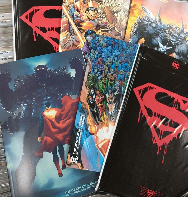
As I’d noted, I picked up the bagged version of the book, which featured this cover inside:
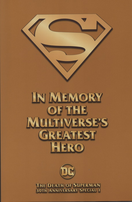

Boy, really pushing that “multiverse” thing. “Hey Marvel, we were here first!” Also, the back cover features the full image that’s on the foldout-cover variant of this comic. And yes, there is indeed a black armband inside, so you can…mourn the death of a fictional character who didn’t really die 30 years and had come back immediately anyway.

The lead story is by Dan Jurgens and Brett Breeding, and pretty much retells the events of the original story, mixed in with a l”current time” plot involving the return of Doomsday…or is it? It’s…fine, perfunctory and polished and giving you pretty much what you’d want from a “30th Anniversary of the Death of Superman” story.

A few things of note:

One, Superman’s cuffs, a design leftover from all the misguided fiddling with the man’s costume over the last decade, and left off more often than not in recent comics, are totally back with a vengeance:
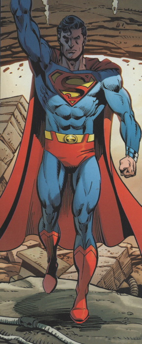
Given we get an editorial note that the story takes place in “the not-too distant past” maybe this is just during a period before Supes dumped the cuffs (or at least stopped wearing them as often). In conclusion, they still look terrible. Thank you for coming to my TED talk.

Two, it takes place before Jon Kent was aged into young adulthood, so a lot of this story is in the context of telling Young Jon all about this event in his parents’ lives that apparently he’d somehow never heard of ’til today. Which seems…unlikely. I mean, I get Supes and Lois not wanting to tell him about it ’til he was older, but, like, Superman is the most famous hero in the DCU, and Jon almost certainly looked up his dad on Lexipedia to see what it said about him. And you think Lexipedia isn’t going to have a long, lurid and loving description of Superman’s apparent death at the hands of Doomsday? C’mon, son.

Three, there sure is a lot of dialogue being shouted at Superman from the sidelines during his big battle. I mean, I guess that’s realistic an’ all, but all I could think of was “all these dummies are in huge danger.”

Four, speaking of the fight, like in the original ’90s comics, the number of panels per page during the fight decreases as it moves long, ending in a series of splash pages. Nice callback.

Five, it’s also an appreciated throwback to How Superman Comics Used to Be. I miss seeing these particular versions of the characters, with their specific personalities, and using supporting characters (like Terrible Turpin) that we hadn’t seen in a bit. Post-Crisis/Early ’90s Superman had a specific look to them, and it’s hard not to contrast them with the Superman books DC is currently producing.

And I’ll drop the numbered item conceit here and note that one of the things I’ve wondered about re: Superman continuity, given the reboots and revamps we’ve had over the last decade or so, was the canonicity of the Death of Superman. I mean, there were references here and there and then eventually a confirmation that it did happen, but never did find out the exact details. Like, was Australian Son of Luthor But Actually Luthor’s Brain in a Younger Body a thing that happened in the New 52 universe, y’know, like that.

Well, this special pretty much establishes that the Death of Superman happened more or less as seen in the comics from 30 years ago, in whatever passes for current DC continuity nowadays. There are other stories in this special that are set in the Superman milieu circa the early ’90s, like a Steel story by Louise Simonson and Jon Bogdanove. And we get some Ma and Pa Kent, though I think the “current” versions of them are portrayed a bit younger than the grandparent-ish types we got when Byrne rebooted everything. I don’t know, maybe something like what happened in this comic also happened to them. (Or maybe Dr. Manhattan did something when they came back in Doomsday Clock, but don’t get me started.)

I’m sure there’s more to say, but I’ll probably get to it when I address some of your comments from the last post (and probably this post) in my next entry. Oh, did I mention that the bagged version has a white backing board inserted inside that makes the package too big to fit on anything but the top shelf of my new comic racks? That’s annoying.

• • •

There are two voices for Batman that I hear in my head when reading the comics. There’s Adam West, who tends to pop into my head when I’m looking at some of the Silver Age stuff. And then there’s Kevin Conroy, the man who became the Batman to generations of fans. No offense to other great voice artists who’ve taken on the role, but whenever I’d watch one of those direct-to-DVD DC cartoons and it wasn’t Conroy in the Batman role, it just sounded…off to me. He embodied the character in a way so few others have.

We lost him too soon, dying recently at the age of 66. A tragic loss, and my condolences to his family, his friends, and his nearly-endless array of fans. So long, Kevin..
The Redeath of Superman.


“Death of Superman” nostalgia seems primarily focused around “I used to have one of those black-bagged comics, what’re they worth?” and not so much “I want to read more stories about the Death of Superman,” it seems. I’m selling…okay on this new 30th Anniversary DoS special, particularly, and surprisingly given the price point, on the bagged edition. But, even though I have no reason to think this, and I know it’s not something that was going to happen, I can’t help but compare to when I sold the original version and we had a line down the block of people waiting to get into the shop.

Anyway, haven’t had a chance to read it yet myself (and yes, I got the bagged one), but I’ll have a more extensive report on it shortly. At least I get to extend the life of this ol’ blog category a bit longer.

Kevin O’Neill (1953 – 2022).


Legendary omics artist Kevin O’Neill has passed away, leaving behind beautiful work like Nemesis the Warlock, The League of Extraordinary Gentlemen, Marshal Law, and much more. Of special note is, of course, the artwork he provided for The Sinister Ducks.

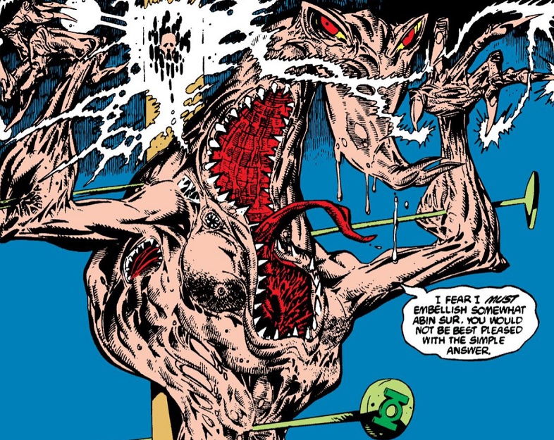
And as I love reminding folks, his artwork — not just what he drew, but his actual style — was rejected by the Comics Code Authority when they saw his contribution to Tales of the Green Lantern Corps Annual #2 (sample of which may be found above). DC published it away without the Code because screw the CCA, the art’s great.

So long, Kevin.

ON VACATION sort of.

I’ve found myself in need to recharge the ol’ blogging batteries, so it’s Low Content Mode this week as I spend my free time doing things like “getting enough sleep” and “spending a few hours a day not thinking about comics,” you know, novel experiences like that. Gimme a week, and I’ll be back in fightin’ trim on this site in no time. Or a week.

I’ll be around for email contact and whatever’s going on in social media, which is a good time to remind you that I’ve updated MikeSterling.com for all your Mike Sterling needs. There you can find links to my store (eight year anniversary this past weekend!) and its related online endeavors, my current personal links and social media-type stuff, as well as links to some on-hold or otherwise defunct projects.

Speaking of defunct projects, you may have heard Twitter is undergoing some…upheaval with its new management. I’m still there, and I’ll be riding that train right off whatever cliff it’s heading for. Given its ubiquity in online discourse and just society in general, one hopes it survives current issues — I know it’s a good communication tool with pals, and I’ve certainly done a ton of business there — but we’re all looking for alternatives Just In Case.

As such, you can find me on Mastodon (which appears to be bolthole of choice), but I’m on Cohost too, which is a contender.

Anyway, I’m around, I’m ALWAYS WATCHING, and I’ll probably pop in here once or twice during the week with some short form stuff, but I will be resting these weary blogging bones for a bit. Thanks for reading, and thanks for all your comments of late, and I’ll return in short order.

There’s gold in them there variants.

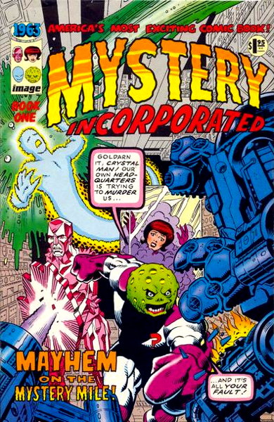
So I’m sure most of you recall the 1993 series 1963, an homage by Alan Moore ‘n’ pals to Marvel’s Silver Age, littering bargain boxes everywhere due to being forever uncompleted:

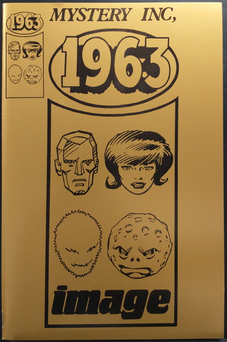
Well, I picked up a collection the other day that contained the following unusual item…a retailer exclusive edition of 1963 #1 with a gold wraparound cover:


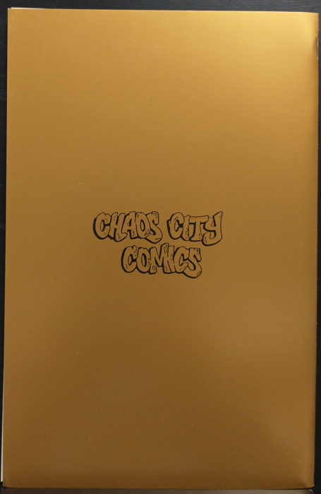
And here’s the back, showing the name of the comic shop for which this edition was produced:


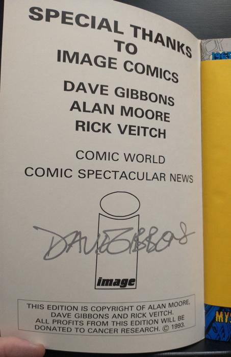
Inside the gold cover, we find…the signature of Dave Gibbons, famously the inker for this comic and also apparently the artist of the prequel to Doomsday Clock:


Oh, hello, cameo from Mike’s finger.

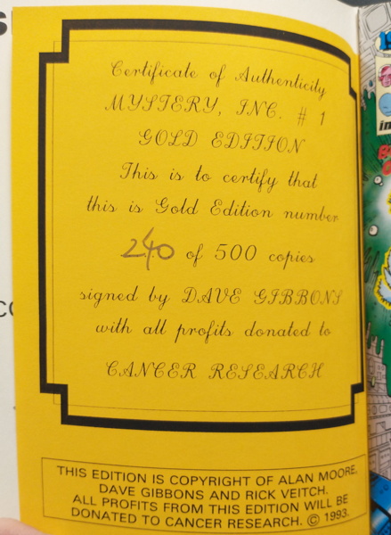
And bound between the gold cover and the comic’s regular cover is a numbered Certificate of Authenticity:


As you saw in the last couple of scans, this edition was produced to raise money for cancer research, which is a good cause, of course.

According to this article I found Googling around, this was produced by a UK comic shop for a charity there actually just straight-up called “Cancer Research.” Which, honestly, not to make fun, that reminds me of a Bill Hicks routine in which he was asked to do a commercial in England for “Orange Drink.”

Anyway, there were only 500 of these things printed (and only 125 of the Platinum Edition), so it’s no wonder this is the first one of these that I’ve seen. I presume it’s slightly more common in the UK, but maybe my readers from Over There can let me know. But, somehow, one made its way over to Southern California, and before you ask, it’s already on its way to somewhere else — I work fast, friends — though it was nice to have it make a brief stopover so that I could enjoy it for even this brief period of time.

Mixed Pickles.

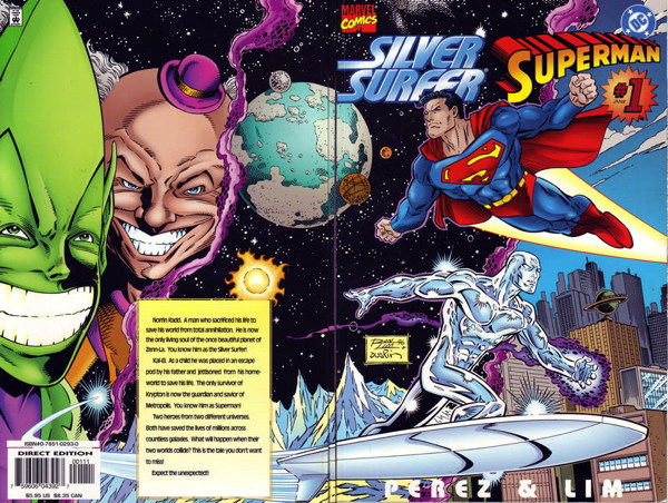
So I forget where I saw it referenced, but somewhere out there someone had mentioned the 1996 Silver Surfer/Superman one-shot, which got me to wondering if I still had it. I had bought nearly all of the Marvel/DC crossover comics that were cranked out during that period of the 1990s when both companies were desperate to attract sales by doing pretty much anything, and that included joining forces to publish things like this.

Anyway, when I opened the shop, I pulled a boatload of comics out of my own collection to populate the back issue bins, and that included a lot of the attention-grabbing intercompany crossovers between DC and Marvel, once ubiquitous but now getting more and more difficult to find in the wild. I did give up my Superman/Fantastic Four treasury edition, foolishly, and I’ll need to replace that, but I did keep my other Superman-related Marvel crossovers, including that Silver Surfer/Superman comic by George Perez and Ron Lim:


Like how the “Death of Superman” story is Of Its Time, featuring the now-headscratching-to-newcomers elements of Red-Haired-And-Bearded Australian Son of Lex Luthor along with Artifical Glob-Life-Form Thingie Supergirl, Silver Surfer/Superman involves, for at least part of the book, the Contessa. Yeah, I know, “Who?” I’d completely forgotten about her, though once she popped up in the story I was all “oh yeah, that lady.”

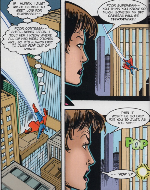
She basically usurped Luthor’s position as the head of his company Lexcorp after…well, read this if you need to know her deal, and how she was sorta unceremoniously removed from the book. Anyway, she’s here in this SS/S funnybook for about the first half, and this sequence of panels features what I’m pretty sure is a writing/editing mistake EDIT: I’m wrong, I misread it:


Superman thinks the phrase “just pop out of range,” and the Contessa, just a couple of panels later, starts to mockingly quote what he thought, only to be interrupted before she could say “pop” by an actual “POP!” by the teleported entrance of the Impossible Man. And how did the Contessa hear what Superman was thinking? Did she have mind-reading powers that I forgot about? EDIT 2: Somehow I missed the “I told her” part. Ah well.

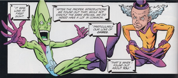
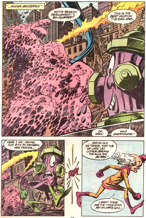
But speaking of Impossible Man, having him and Mr. Mxyzptlk as the antagonists of this story was a nice touch. The temptation of having the two heroes face off against Luthor and, say, Mephisto in a more serious conflict was likely strong.


The plot involves Mxyzptlk and Impossible Man swapping “universes” and heroes, pitting Mxyzptlk against the Surfer and so on. Which of course brings to mind Superman #50 from 1990, where it is implied heavily that Mxyzptlk travels to the Marvel Universe and torments the Fantastic Four as the Impossible Man, establishing the two characters are one and the same.


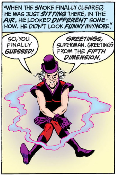
I don’t particularly like this early post-Crisis/early Byrne’s Superman run version of Mxyzptlk where he was a little nastier, a little more malevolent. I guess it was fine for one or two appearances, but I like Funny, Wacky Mxyzptlk, which he eventually evolved back into in the comics, more or less. Although I was okay with Goth Mxyzptlk from Alan Moore/Curt Swan/Kurt Schaffenberger in their “Whatever Happened to the Man of Tomorrow” final pre-Crisis Supes story:


Mentioned in the story is the character Access, the Marvel/DC co-owned character whose ability was to cross characters over from either universe, and I’m presuming hasn’t been used much lately. And there’s also some track-covering with the idea that both Superman and Silver Surfer will forget this encounter, allowing it to kinda-sorta stay in regular continuity and explaining why, like, Superman won’t reference the event in a non-crossover-sanctions issue of Action or wherever.

I sort of miss those days where it seemed like every week we got a new crossover between different comic book publishers. They still happen today, of course, but not nearly as often. There’s a new Batman and Spawn book coming soon, for example. But back in the ’90s, I had that brief glimmer of hope we’d get that Swamp Thing/Man-Thing team-up the world deserved. Well, I deserved, I don’t know about you guys.

And I just go ahead and relitigate anyway.

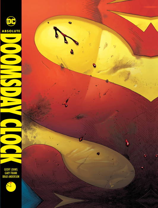
So, being the proud owner of the “Absolute Edition” of Watchmen, the oversized hardcover reprinting the series and included the production notes and back matter from the earlier Graphitti Designs hardcover I didn’t buy when I had the chance and regretted for years, I of course had to have the accompanying Absolute Edition of Doomsday Clock.

Now I don’t know if I need to relitigate this series yet again (you can read my initial reaction to the series’ conclusion right here), but it was interesting to 1) read the whole story in relatively short order instead of the couple of years it originally took, and 2) read it with mostly-functional eyes, versus having to use, like, magnifying glasses and trying to look at it with blood-blurred vision during its run. Doomsday Clock was, for a period of about a year and a half, literally the only comic book I’d read as my eye problems made it too difficult to do any reading. But I had to see what they were doing with the Watchmen characters in the DC Universe.

What I found with the reread was…I didn’t miss much in my initial pass. I did forget that the character of Nostalgia, who hilariously appears at the end of the recently-concluded Flashpoint Beyond, was introduced in the final pages of Doomsday Clock. But otherwise, no, I retained nearly all the major plot points and actions. There was no “oh, I missed this nuance the first time but caught it on the revisit,” as there is no nuance. It’s all surface level. It has the appearance of depth, but it’s all…well, I’ve called this a “cargo cult” comic, superficially mimicking the original in the hopes of attracting the same attention and acclaim.

The comic is at its best when dealing with Superman. If Geoff Johns has an affinity for writing anything, it’s ol’ Supes. And the best bit is the tying of Superman to the evolution of the DCU, though as I said before, it would have been nice if they could have done this without involving the Watchmen characters, but then they wouldn’t have pulled in the readers. And this series did sell well.

I should also note that the art by Gary Frank is absolutely gorgeous, and the Absolute format showcases it wonderfully. In all, it’s not like I hate this comic or anything. It’s certainly questionable that it should have been done at all, and it’s filled with bits that are especially weird and not in a good way. But it’s competently done and keeps your interest up, even as its explicitly stated purpose (“sorry about the New 52, everyone”) becomes increasingly obvious. Every change to DC’s fictional milieu apparently requires convoluted explanations, and devoting Moore and Gibbons’ Watchmen to yet another one of those said explanations seems like a bit of overkill.

Anyway, that’s not what I came here to tell you about. I wanted to point out a special unsung extra in the Absolute Edition. There are a few dozen pages of material in the back, mostly showing off covers and promo posters. There are character sketches and designs, other production work, plenty of notes, etc. Makes for an entertaining perusal.

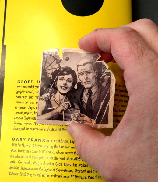
As I got to the last page of the book, however, I was literally startled to find this stuck in-between the credits page and the endpaper — a coated cardboard reproduction of the photo of Jon and Janey, taken just prior to Jon’s accident that transforms him into Dr. Manhattan:


And it’s inscribed with their names on the back of the “photo” as well. I was not expecting to see that, and I definitely gave out a little “whoa!” of surprise when I happened upon it. It’s a neat little addition, and actually ties thematically to events in the book, just to find this photo where you least expect it.

That’s really all I wanted to mention, but I can’t bring up Doomsday Clock without pointing out the misguided-yet-complelling-at-least-to-me aspects of the series. It’s fascinating in its own way, in its disuse of Watchmen, and how its inspired further exploitation farther and farther away from the intentions of its creators. I suspect that last phrase would actually describe a lot of comics.

Size does matter, maybe a little.

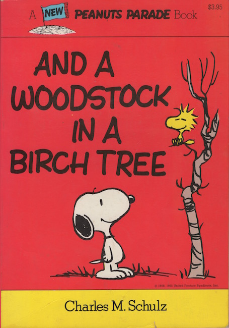
Was surprised slightly when opening up my Diamond Comics shipment this week (though I shouldn’t be too surprised since I’m the person ordering all this stuff) by the arrival of And A Woodstock in a Birch Tree from Titan Books:

This is, in fact, a facsimile reprint of the original Peanuts Parade book from 1979. Which, by the way, I just happened to have bought back then, having somehow scraped together the necessary $3.95 to acquire it. And as I still have it, here is a pic of that very book purchased by Grade School Mike in the rapidly-receding past:


Now I loved these Peanuts Parade books. I checked every available one out of the school library and the public library, often multiple times. I can still picture these well-worn volumes being held in my hands. I liked these much better than the standard Peanuts paperbacks because 1) they were thicker and had a lot more strips in them, and 2) they were physically bigger, measuring 7 by 10 inches in size.

Hence my surprise when I cracked open that Diamond box and saw the new edition, and its much smaller stature of 5 1/2 by 8 inches. I know you can’t really tell by looking at the scans above, so point your peepers at this pic I took especially for you comparing and contrasting the two editions:

(The back cover of the original features a Sunday strip in color, whereas the back cover of the Titan edition is mostly solid red with a publisher note about this being a facsimile and what strips are reprinted therein.)

Now I realize this, and similar volumes of Peanuts strips, are possibly made redundant by the Fantagraphics Complete Peanuts series. Those are extremely nice, don’t get me wrong, and I’m so glad to have ’em all, but there is a nostalgic value to simply holding a book like this in your hand, original or facsimile. The look and feel, the very format of the volumes, makes them distinct pleasures above and beyond the value of “completeness” that you could otherwise obtain. I have a handful of old oddball hardcover Peanuts strip reprints that I would never get rid of, simply because they’re aesthetically pleasing to me, even if the strips are better curated elsewhere.

But it’s hard to top having my old original and beat-up copy of Peanuts Parade in my hands, connecting me to the ten-year-old I used to be.

Or “Mxyztplk,” if they’re writing about the Golden Age version.

Okay, let’s see if I can run through a couple of more comments left back in Ye Olden Tymes (i.e. last August):

Wayne sallies…um, in a forward-moving direction with

“Mike, I will send you five dollars in cash if you write a post on the Heckler.”

I AM NOT ABOVE BRIBERY. However, I don’t think I’d read the Heckler since…well, probably when that series was released in the early ’90s. But I did buy every issue, though I’m reasonably certain I gave up my copies to my shop‘s back issue bins when I opened up in 2014. and I just checked, and The Heckler isn’t on the DC Universe app.

But never fear, as I think those comics may yet still linger in the bins awaiting my retrieval. Therefore, Wayne, I will attempt to read the series and see if I have anything to say here about it. A quick look at the Wiki entry reveals…nothing I can recall from the comic, save for his nemesis “John Doe,” but I might only remember him because he’s on one of the covers. Ah well, I guess it’ll be like reading brand new comics to me.

• • •

David Conner continues with

“The mention of Peter David’s Supergirl and Aquaman got me thinking, is there any other writer from the last 40-odd years who feels more ‘of his time’ than Peter David?

“I *loved* his stuff in the ’80s and ’90s, but looking back at it today, it’s more often than not cringe-inducing (using that term which I generally hate advisedly.)”

First off, let me just say it’s high time my browser’s spellchecker stops flagging words like “Supergirl” and “Aquaman.” I mean, I suppose I can add them to the dictionary myself, but whoever programs these things might as well just dump all the superhero names they can into whatever file they go into. Help the world spell “Mxyzptlk” correctly!

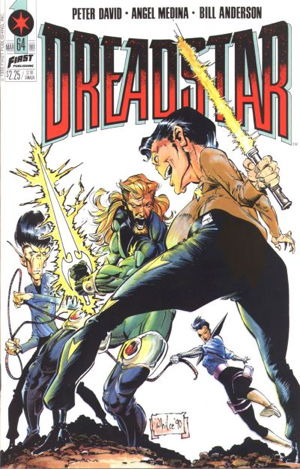
But to David’s actual point…yeah, I see where you’re getting at. I have to admit, I’m a bit more charitably inclined towards Mr. David’s writings than the opinions of some of my fellow comics-noscenti. I think his Hulk work still stands up, for example, and his Dreadstar was fun (save for that two-issue bit where he was parodying Trek…oof). And there is other stuff he’s written here and there that I’ve liked, such as Fallen Angel and, yes, Aquaman. Supergirl was a weirdie, mostly because of the premise, but I’d read and liked the whole run. His Star Trek was genuinely great, something of a miracle considering the editorial interference he often faced.
When I think of a certain comic creator being “of his time,” the one that comes to mind for me is Don McGregor, a writer who came to prominence in the ’70s and his very text-heavy work is what I picture when I think of “1970s comics.” Now that’s just a matter of my particular perception, as the man’s still working today, but I think of 1970s comics, in comparison to modern books, as having a lot more captions and dialogue, and I associate McGregor with that particular style.

Now David’s work…I think a primary criticism aimed at his comics is the level of self-aware, and of a certain measure self-satisfied, “cleverness” to his writing. Sometimes it can be subtle-ish (the “brush with Death” in Incredible Hulk), sometimes it can be laid on a bit thick (that Trek parody in Dreadstar I’d mentioned) and as with most humorous and/or clever writing, Your Mileage May Vary. It may be that this sort of thing didn’t age well, with it seeming New and Fresh at the time, but as the years have passed and writing styles and trends and tastes have changed in comics, looking back reveals the some of the obviousness of the artifice. Much in the same way we look back at Alan Moore’s early work and kinda wince a little at some of those scene transitions (which, to be fair, folks were kinda gripin’ about even back then — like in Killing Joke where we see a “Fat Lady” poster at the circus, and then we move to the Joker’s memory of his pregnant wife. Hoo boy).

I would say something like your reaction to David’s writing, David [Conner], is different from something like Stan Lee’s writing in the 1960s. That is Very Much of Its Time, but it may be more that Lee’s style defined that time and is considered perfectly acceptable, versus people trying to write “for the hip kids” back then whose writing did not age quite as well (cough cough 1960s Teen Titans cough). Before The World’s Biggest 1960s Teen Titans Fan gets mad at me, those are fine, the art’s beautiful, but you have to admit that DC’s “hello, fellow kids” scripting house style was clunky as all get out, rarely reaching the masterful level of smarm Lee was able to churn out.

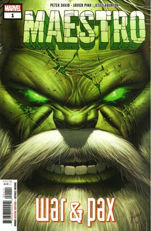
David’s work of late, revising the Maestro character from the Hulk, and Genis from his run of Captain Marvel, seem to have been reasonably well received. I didn’t read the Genis title, despite having read and enjoyed those CMs, only because I’m so backlogged with comics I try not to add more titles unless I absolutely have to. That said, having been a Hulk reader for decades, I of course picked up the Maestro titles, and I think they’re a perfectly fine extension of the character’s story. Nothing in there struck me as being overly…Peter David-y, in the sense of what people who don’t care for his previous work don’t care for.
Now New Fantastic Four maaay be a bit much for those same people, with the banter amongst the main characters and a particular gag involving another character’s name. I picked up this series too (what with the Hulk being in there, and the FF tie-in as well) but I’m only a couple of issues in, since it hasn’t felt quite as compelling a read as the Maestro books have been. Eh, what can you do.

I do still think David’s Hulk run remains a high point in that character’s history, and I still have fond memories of much of his other work. However, I do realize if I go back and reread some of it, I may find myself in a similar position of being more aware of the seams now that some time has passed. Or I may enjoy it just fine for what it is, even if it is an artifact of the period in which it was produced. (Remember “wilding?”)

But you know what? Peter David got this dirty joke into a Popeye comic and I can’t hate him for it.

It’s a good thing I didn’t go after all those Miracleman variant covers like I was planning.


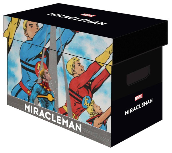
So I don’t have very many of those illustrated comic boxes for my personal use. I mean, I sell plenty of them at the shop (where I dubbed them “Fancy Boxes” on my signage for them, and the name seems to have stuck with my customers), but I haven’t much felt the need to grab too many for myself. I did make an exception for the Hellboy boxes, of which I bought three and immediately filled two, thinking the third would last me a whle. But, the joke’s on me as Dark Horse seems to have accelerated its Hellboy and Hellboy-adjacent funnybook output over the last year or three and now I’m wishing I’d picked up two or three more of those boxes.

Anyway, another design has come out that tempted me into owning, and as you may have guessed by the image leading this post, it’s that darn ol’ Miracleman what done the deed. It’s a nice pic they used, though I would have liked it they’d wrapped illos around the entire box and not just the two sides. Ah well. Despite that, I now have a fancy box of my own in which to stow my Miracleman goodies.

I haven’t yet gathered all my MM stuff together, as I’m currently in the midst of reorganizing my collection at home (“wait, didn’t I give up most of my stuff to the shop, how do I still have this much left”) and everything is still in the “total and utter disarray” part of the process. But I know I have the original 24 issues of the Eclipse run, plus the Apocrypha mini, the Miracleman Family mini and the 3-D special, plus all of the Marvel reprintings of same from a few years back. Not to mention that one-shot Marvel put out giving a history of the character, and all those black and white reprint comics (I passed on the hardcover archives).

And there’s the tangentially-related stuff, like the Total Eclipse mini. Plus, we’ve got new MM stuff on the way, starting with the refurbished Silver Age #1, leading into newly published Gaiman/Buckingham stories in a month or three. If that’s not all, there’s whatever Marvel is planning to do with the character (I predict the “Marvelman” version, versus the “Miracleman” version tied to that specific story) in the Marvel Universe itself, as hinted at by this one-shot from a few months back. Oh, and there’s the two new pages in, I think, Marvel #1000, right?

With new stuff on the way, I’m not sure how much more box space I’m going to need. Without having all the MM comics I own in front of me, I can only estimate that they would take up about…half a box, maybe? I don’t know how much more of the “Miracleman” story Gaiman and Buckingham have left to tell, and once Marvel starts doing separate Marvelman stories…who knows, maybe I’ll be wishing then I’d picked up more of the fancy boxes. God forbid I just put these in plain white boxes, what would the neighbors think?

Oh, you know, I forgot the oversized stuff I have, like that original UK Marvelman Special and Warrior #4 with the formerly-unreprinted MM story. And, ooh, wait, there’s the forthcoming Miracleman Omnibus, I’ll need room for that, too!

Almost forgot the Warpsmiths stories that popped up here and there, like in the A1 anthology! I’M GONNA NEED MORE BOXES

…

As a wise man once said, “it’s sort of an illness.”