You are currently browsing the Uncategorized category
SO CONTINUETH THE PARADE OF OLD PROMO GOODIES THAT MAY OR NOT BE ON MY EBAYS AS I WRITE THIS:
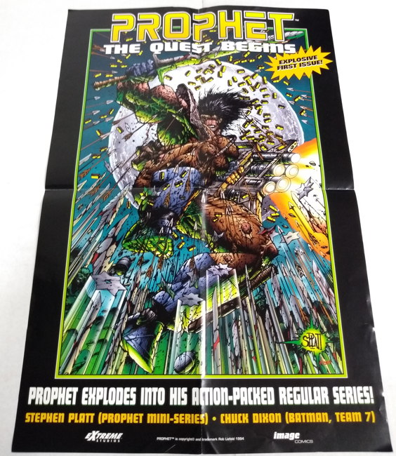
“Prophet: The Quest Begins” poster from 1994:

…featuring the artwork of the Wizard Top Ten Artist (I’m presuming) Stephen Platt. His work always kinda reminded me of a slightly less goofy (and I mean “goofy” in a 100% positive way) Sam Kieth. He also has the perfect pen name: “SPLATT.”
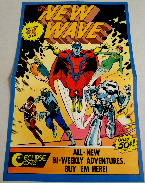
Straight outta 1986, becaues when else, is this promo poster for New Wave from Eclipse Comics:

…a short lived experiment in a cheaper comics format…16 pages for 50 cents. It was a buck and a half by the end of its 13 issue run, well, that still sounds like a pretty good price to me nowadays. Anyhoo, check out pal Andrew’s write-up no this book, if you dare.
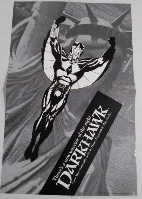
Here’s a particuilarly low-rent..er, I mean, “artistic” black and white poster for that new 1990 Marvel teen sensation, Darkhawk:

Well, okay, I shouldn’t tease. It’s actually a striking image, and really doesn’t need color, That logo could use a tad bit of work, however.
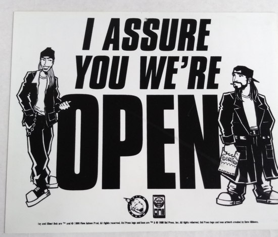
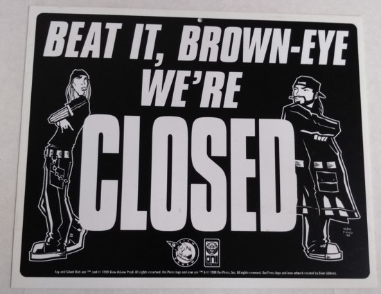
Now this next item isn’t a poster, but rather some store signage…an “OPEN/CLOSED” sign from Oni Press and View Askew (1999):

…with art by Michael Avon Oeming. Never did use it at the store…I mean, the “OPEN” part is okay, but the “CLOSED” part:

…seemed maybe just a tad too crass. Okay, look, that’s a feature, not a bug, I realize, but we weren’t sure how some of our clientele would take it seeing it in our front window.
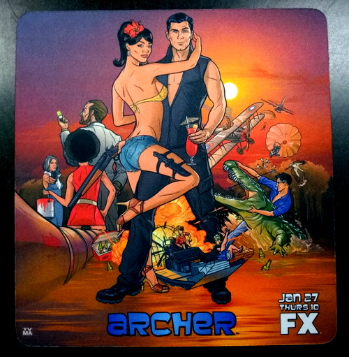
Oh hey, here’s an Archer mousepad promoting season 2 of that show from 2011:

Never seen a single second of this show, though I understand it’s funny. The mousepad is approximately 1 micron thick. Do people even use mousepads anymore? Sure, I do, because I’m an elder, But I feel like that’s one of those things that’s becoming increasing obsolete, like CDs, phone books, and comic blogs.
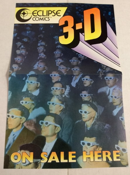
This Eclipse 3D comics poster is undated, but c’mon, it’s from the 1980s:

I wonder how many more people we would have had coming into the shop asking just to straight-up buy our 3D glasses, had we had that in the window? We didn’t sell the glasses separately, of course…we had just enough to cover our back issue stock of 3D comics, and God forbid we didn’t have a pair to go with that 3D copy of BraveStarr should it have sold.
Didn’t keep me from claiming a pair of 3D SCRATCH AND SNIFF GORILLA GLASSES for myelf, however:

So here’s the thing: I’m still planning on an End of Civilization post, but I just haven’t had the time to start putting it together yet. I’ve barely even cracked open the new Previews…I have no idea if that deluxe hardcover edition of Swamp Thing Meets Jesus is finally announced, or if the last issues of the Sonic Distruptors mini-series have finally been solicited. Could be in there, I have no idea.
But anyway…usually when I’m having a lunch break at work, I’ll buzz through the Previews and pick out some likely suspects for my EoC post, and then write up the “humorous” “gags” at home. Alas, this month my lunch breaks have been less leisurely and more “cram this food down my throat so I can get back to processing these huge collections I have to process” and “oh Lordy I gotta get all these things on eBay” and…well, you know, actual work. So, no Previews perusal has occurred as of yet. But soon…soooooooon. Hopefully before the DC Universe streaming service starts up next weekend and I suddenly disappar into binge-watching the Constantine series at long last.
Soooooo…let’s shoot for next Monday for the new End of Civilization. Agreed? Agreed! (I totally spoke for you there, I hope you don’t mind.)
In the meantime, let me tell you about some of the stuff I’ve been working on and processing (and may eventually get to my eBay store, if it’s not there already, and if it’s ite> already sold). Basically, former boss Ralph (I’m trying not to call him “old boss Ralph,” y’know) broght me more boxes of promotional funnybook items from the Good Ol’ Days, back when there was only one (or two) X-Men series, when many titles still had triple-digit numbering, when the only “-gate” we had to worry about had “Water” in front of it. I’ve been digging though them, and within I found:
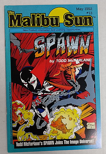
Malibu Sun #13 from 1992:

…featuring a preview of Spawn #1, back when Image and Malibu Comics were briefly iinked together. As others have commented when I posted a pic of this on the Twitters…”that’s some logo.” Anyway, there are some black and white pin-ups by McFarlane inside, and a short (very short, since it had barely existed at this point) history of Image Comics and where it came from and why, and boy howdy do these things go for a pretty penny on the eBay.
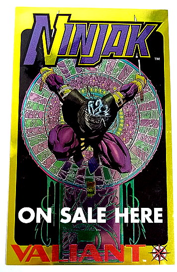
Valiant Comics loved its chromium, as evidenced by this wee little “Ninjak on Sale” display piece from 1994 (I presume):

Measures about 5 by 8 inches, and is basically just a miniature version of the cover to the first ossie drawm by future Marvel head honcho Joe Quesada.
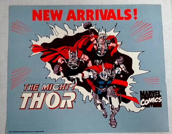
“Hey, where’s the new issue of Thor Corps?” “Why, right below the Thor Corps ‘New Arrivals’ sign, of course!”

Dated 1992. Odd choice to represent Marvel’s publishing line for All Time on a sign that’d be posted about the new comics and left there ’til it sunfaded into nothingness, but who am I to judge?
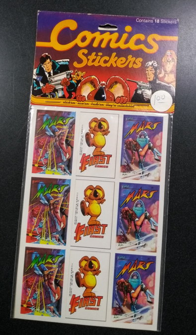
Speaking of odd choices, please enjoy this unopened pack of First Comics stickers from 1983:

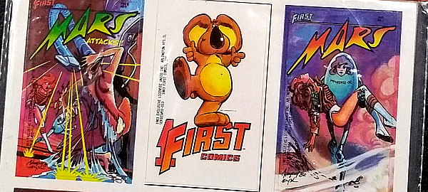
And a closer look at said stickers:

Now, I read and enjoyed Mars as it was coming out, but even I’m like “…what would I do with a bunch of Mars cover stickers?” But stickers featuring First Comics mascot Teddy Q — well, those have no end of uses!
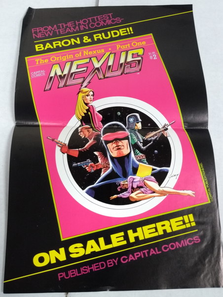
My favorite piece so far is the one that’s in the worst condition (a lot of dings and creases, but somehow never actually displayed!)…this promo poster for the second issue of the original magazine series of Nexus, from 1982:

Never did buy all those original mag-sized Nexus issues…got the third one for the flexidisc, but was otherwise satisfied with the trade collection First released years later. Also, that’s Paul Gulacy art on that nice-lookin’ cover, which I misidentified as “Steve Rude” in my rush to get this thing listed. Ah, well…fixed now.
You know, every time I’m reminded of Nexus, it makes me want to go back and reread all the comics. Man, I don’t have time for that…I’m behind on the new comics as it is. Anyway, Nexus is a good comic, is what I’m trying to say.
Next time…more stuff!
§ July 21st, 2012 § Filed under Uncategorized Comments Off on …
Our sorrow for the victims of the Aurora, Colorado theater shooting, and our sympathies for their family and friends.

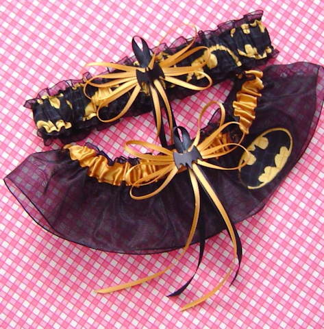
Had no idea such a thing existed:
“Batman Wedding Garter Set Black Bat with Gift Box”
…now, when they come up with the Swamp Thing garter belt (vines) or Sluggo garter belt (shoelaces) then we’ll have something.

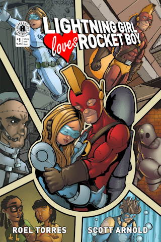
So regular commenter on the site, Roel Torres, and his drawin’ pal Scott Arnold have just unleashed their first comic book onto the world,
Lightning Girl Loves Rocket Boy, an essentially done-in-one graphic novel featuring the romantic travails between two young college students who are also, it just happens, superheroes.
Roel was nice enough to pass along a copy to me, and I quite enjoyed it. I liked how the superheroics were pretty much just in the story for the purposes of how it affected the romance, and not the be-all, end-all of the story with a romantic subplot squeezed in. The dialogue is light and humorous when it needs to be, and services the romantic melodrama without being overly melodramatic and goofy.
Though it took me a page or three to get used to it, Arnold does a good job on the art, handling both the character interaction and the superheroics with his particularly stylized cartooning. All the characters are distinct and consistently portrayed and instantly recognizable, which is a plus considering the emphasis is on what happens to the leads when they’re NOT out in their superhero work uniforms.
The story itself is 50 pages long, but there’s a lot packed into it. There’s no wasted space on the pages, and no wasted time moving the plot along. No decompressed storytelling here. Yes, it’s a “boy meets girl, boy loses girl, does boy get girl back, I ain’t tellin'” plot, only with superheroes, and even with that twist, I’m sure we’re all familiar with the tropes of the genre. Even so, it still moves along at a quick and entertaining clip, and the basic story thread is given enough unique embellishment to go down easy.
If I were to bust the guys’ chops about a thing or two on the comic…having “The Beginning” at the end of the story? Oh, Roel ‘n’ Scott, say it ain’t so. You know the Mystery Science Theater 3000 guys would totally rake you over the coals for that. Also, the computer lettering used in the book was…well, not terrible, but just slightly distracting, but I got used to it. And there’s a panel or two in the comic where the characters felt like they weren’t really integrated into their backgrounds, such as when they’re standing on a rooftop but it looks more like they’re hovering over it or pasted into the panel. But that’s just getting nitpicky, and any rough edges the comic may have is the sort of thing experience takes care of. (Plus, I like comics with a rough edge or two…I’d rather read a comic produced by amateur creators just starting out in the field, like this one, than a fifteenth Avengers ongoing.)
But, overall, a good first effort, and I’d like to see more from these fellas. Maybe not more of this specific story, as, even though there’s a “#1” on the cover (and, ahem, “The Beginning”), it feels like we reached a definitive ending with this story and it’d be a shame to undo that. It stands on its own as an enjoyable addition to the relatively-sparse “Superhero Romance” genre.
If you go to the official blog, you can read an extensive preview of the comic, and you can order your very own copy right here.
• • •
In other news:
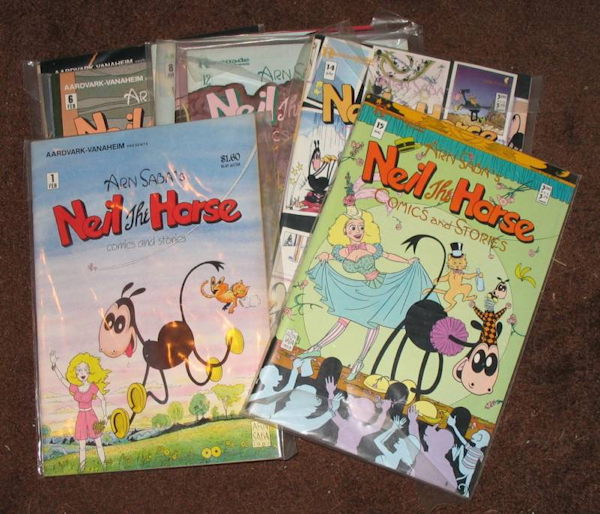
- I received my package of Neil the Horse comics yesterday, and they’re all in good shape, with only the first issue having a crease or two on the covers. Can’t really complain for a 99-cent bid, though I have to admit I’m not thrilled about paying a certain amount for shipping, and then seeing that the actual shipping cost was only about a third of that. But…full run of Neil the Horse, under nine bucks total, stop complaining, Mike.
- Hey, Superman: Secret Origin #6 is coming out today. Finally. Took ’em so long, it’s almost time to revise Superman’s origin again.
- Bully, America’s Greatest Little Stuffed Bull, presents to you Archie Comics Versus Kids’ Fads. It’s a battle Archie only rarely won, if ever. (Ignore the first reader comment, where someone proclaims Archie late to the party for featuring a Wii-type game on a cover. Um, the Wii is still selling, last I heard. DO NOT TEMPT THE BULL’S WRATH, COMMENTER.)

So Marvel and DC (well, mostly Marvel) regularly sends out packs of advertising postcards for shops to give away, usually listing all the tie-ins for a crossover series, or pushing some new title or storyline or what have you. They make for nice promotional items, and I’ve seen more than a few customers marking off titles they’ve picked up on the card’s checklists. And I’m sure a lot of them end up on display back at home somewhere…like, I’m not coming right out and
saying that I have the “Planet Hulk” postcard on my fridge door, but I
might.
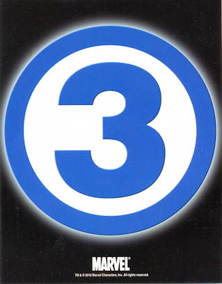
That one I scanned above has received more reaction from our customers than any other card released so far. Okay, mostly it’s “they’re getting rid of a member of the Fantastic Four? Again?” but nearly everyone who’s seen the stack of these cards on the counter has commented on it. And really, this is about as perfectly pure and simple a targeted advertisement as I’ve ever seen. Okay, your average non-fan off the street may not get it, but every comic fan 1) recognizes this as the FF logo, and 2) knows that, hey, that should be a “4” in there, not a “3,” therefore something’s happening to one of the characters. The information on the back of the card is almost redundant…everything you need to know is pretty much right there on the front. (But if you need to know…it’s a storyline starting in next month’s FF. And you should be reading FF right now anyway, because writer Jonathan Hickman has been doing a good job on it.)
Anyhoo, just wanted to give some appreciation to this promo item. Well done, Marvel’s marketing department…well done.
• • •
In other news:
If one were to listen to the one year anniversary installment of War Rocket Ajax, featuring those Clown Princes of Podcasting Chris Sims and Eugene Ahn, you may hear them answering a Listener Question from a certain M. Sterling, at about the 1:27:30 mark.
EDIT 8-29-10: Had to shut off comments, as this particular post was attracting a lot of comment spam, for some reason.
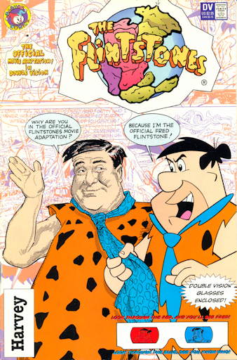
This is The Flintstones Double Vision (September 1994), a comic book adaptation of the live action feature film starring John Goodman as Fred:

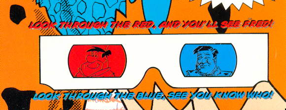
The “Double Vision” in the title refers, not to the Foreigner song, but to this comic’s particular format…while at first glance, it appears to be a 3D comic:

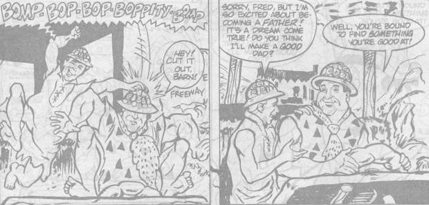
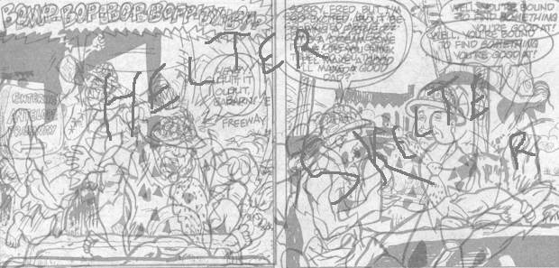
…in fact, it’s two different adaptations of the same story! Looking only through the blue lens, you’d see the story as drawn with the characters resembling their live action counterparts (scans grayscaled for clarity):

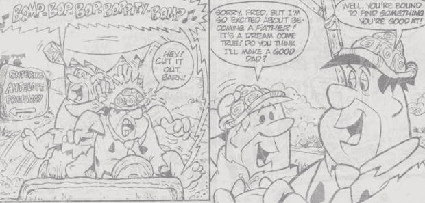
Looking through the red lens, you’d see the story with the characters in their traditional animated form:

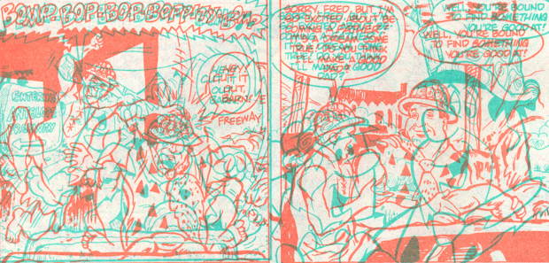
And if you were to look through both lenses:

OH GOODNESS DON’T DO THAT
Anyway, you don’t see anything in 3D, despite having to use 3D glasses for this particular gimmick. You do get to read a comic with one eye squeezed shut, and boy doesn’t that sound like fun.
An interesting thing on the cover:

They use “you know who” to make it rhyme, sure, but John Goodman’s name appears nowhere in or on the book, which I thought was odd since so much attention was paid to delineating the man’s features on the cover. But then, it’s not like actors get ballyhooed on comic book adaptations all the time as it is…you’re not getting the actor, anyway. You’re getting drawings of the actor. And there’s probably some additional licensing hoohar involved if you actually use the actor’s name, maybe…I really don’t know.
On the other hand, comic book adaptations of movies are kind of a moot point when you can own the actual movie about four or five months after seeing it in theatres, like I’ve written about before.
So, The Flintstones Double Vision…bit of an oddity, and a latter day example of a comic book genre that’s very nearly gone* nowadays. Also, it doesn’t appear to be in the Overstreet Price Guide, so I’m totally pricing this at $3000, and none of you can stop me.
* Yes, I know there’s a currently running adaptation of the Star Trek movie. That’s why I said “nearly gone.”
And now, a brief excerpt from


from Peter Porkchops #41 (Dec. 1955)

Not sure who did it…my name is spelled correctly, so that rules Employee Aaron out.
Also, minor correction to my headline here…this is actually the space to the left of my normal parking space, and you can see part of my truck on the right hand side of the picture, there.
…Yes, this is really what I’m posting today. Sorry, been a bit occupied with some some other things I need to deal with. Normal service should resume tomorrow, with any luck.
 Neil the Horse
 is one of those series I’d been meaning to acquire for a while now, having somehow missed it during its original 1980s run. However, we never had more than a few issues at the shop, and didn’t feel like trying to track down the missing ones because I’m old and tired and back issue hunting is a young man’s game. But when a full run of
Neil popped up on the eBay (and pictured above with the image from the actual auction) for an opening bid of ninety-nine cents…well, that was hard to resist. And I ended up winning the lot with that opening bid.
True, the shipping cost is seven and a half bucks, apparently for parcel post, which is…well, I’ll let this old post of mine explain, but even so that’s still a full run of Neil the Horse for under ten bucks, and therefore I won’t gripe too much.
There are other indie series from the early-to-mid ’80s that I missed that the store doesn’t have and I’m seriously thinking about picking up for cheap via the eBay, because clearly I don’t have enough comics already. And I’m still looking for the elusive Yummy Fur #9, which (if I recall correctly) was one of the issues of the series not carried by Diamond, making it a bit of a rare item. Well, sure, I at least have the lead story reprinted in one of the Ed the Happy Clown trade paperbacks, but the knowledge that I have issues #1 through #8 and #10 through #32 weighs upon me in a way that only fellow obsessive-compulsive funnybook readers can understand.
And by the way, I didn’t say anything about it at the time…but as only vaguely implied in that how to ship comics post, I’d bought a run of Minx on eBay, which is an eight issue series, and the seller wanted to charge me twelve bucks to ship ’em. Twelve. Dollars. That’s crazy talk, and I told him so. He eventually saw reason, but I guess that was my fault for not nailing down shipping ahead of my bidding.
« Older Entries
Newer Entries »
