A couple of quick things to cover before I get into the main course here. First, don’t forget to give me your 2024 comic industry predictions! I’ll start covering the 2023 predictions soon, so consider yourself forewarned.
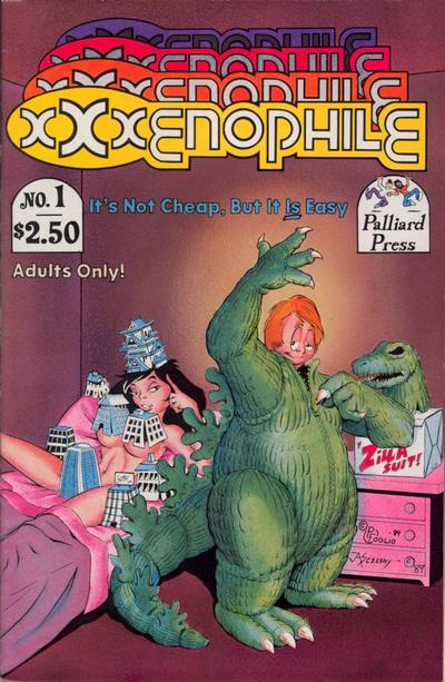
Second, JohnJ asks if I remember the adults-only comics anthology XXXenophile by Phil Foglio and a bunch of his pals. Yes, as a Foglio fan (wherefore art thou Buck Godot?) I certainly picked these up, though they tend to run a tad naughtier than the comics I prefer to peruse. But, it’s all in good fun, and it did have one of the greatest and possibly not-politically-correct covers of all time:
Anyway, I haven’t looked at these in a while, so maybe it’s time to let ’em go at the shop. (But you’ll have to pry my copies of the What’s New with Phil and Dixie collections from my cold, dead Bag of Holding.)
Anyway, let’s get jump back into your suggestions for Most 1990s Comics:
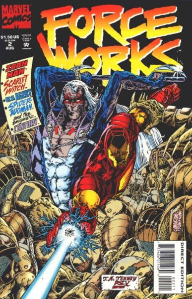
Existentialman brings up a title that’s near and dear to my heart, Force Works from 1994:
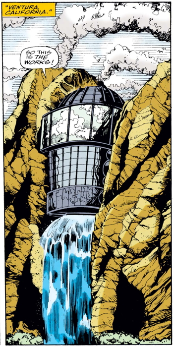
…featuring a superhero team based in my old stomping grounds of Ventura, CA:
Not sure where in Ventura you’d find the giant waterfall, but there you are. Of course the most notable thing about this series was the ungainly foldout pasted to the front cover of the first issue. Here, have a video showing you what we had to deal with:
Not sure how many “mint” copies exist, even if the fold-out remained intact, if only because gluing that thing to the front cover did it no favors.
I’ve read very little of the actual series, but a glance-through certainly has it look to me like being very much of its time, dark, gritty and serious, with that 1990s look that’s hard for me to describe, exactly, but you know it when you see it. Not sure which of my spurious “categories” I’d apply to this. Personally, I’d just put it under “Gimmick” because that first issue cover is all I really remember about this series (aside from the comic’s setting). Maaaaybe under “Kewl Style?” But I think a “Kewl Style” implies a measure of deliberate pandering via approximation of a modern style, and frankly I think this was entirely earnest. Maybe someone more familiar with the title can clue me in.
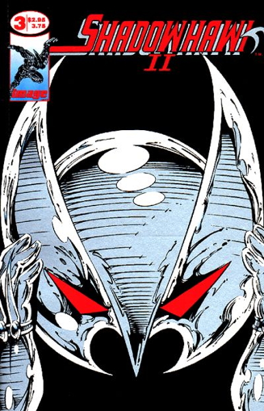
Next up is the infamous Snark Shark with his excellent suggestion of the equally infamous Shadowhawk.
Now, I will always love Jim Valentino because of normalman, which remains one my all-time favorite comics. In fact, I just picked up the normalman Omnibus to have all that stuff together (though Max the Magnificent still remains out in the cold).
That’s a long way of saying, because of normalman, I tried out his later material when he starting doing Guardians of the Galaxy for Marvel, and later his creator-owned Shadowhawk from Image. Aaaaand…it wasn’t for me, sorry. But Shadowhawk did seem very much a ’90s book, what with several issues of the first couple of mini-series featuring gimmick covers (the one pictured above had a perforated fold-out that could be popped open to reveal Mr. S. Hawk’s secret identity).
It was topical (the main character had AIDS), it was (as I recall) very violent, and it had those gimmick covers. And being written and drawn by a founder of Image Comics just by default gives it that extra bit of ’90s ooomph. I’m not sure what “category” it would fall under…I don’t want to hit the “Gimmick” one too often, but I’m not sure “Topical” exactly fits either. Maybe just being “First Wave Image” is enough.
• • •
Okay, we’re almost done here. Thanks for reading, and I’ll see you on Friday!
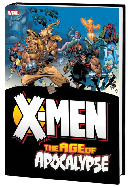
Back to the Most 1990s Comic discussion…as a reminder, my personal pick for the title is X-Force #1 for both artistic and marketing reasons. But, you folks have brought up some good contenders, so let us continue with Tom W and Marvel’s The Age of Apocalypse event (1995):
In my very long-ago pre-internet days, I did a little write-up on the announcement of this event for one of the BBSes I frequented. I can’t recall exactly what I said, all these years later, but I vaguely recall saying something along the lines that this was a drastic attention-getting stunt to grab the readers they could during what was a very apparent industry downturn from the salad days of just a couple years prior. Or if I didn’t say that, I should have.
This was one of those “alternative timeline” stories, where via some time-traveling shenanigans the Marvel Universe finds itself drastically changed, and all the regular X-titles were replaced for a few months by mini-series set in this milieu. For example, Wolverine became Weapon X, Generation X became Generation Next, and I’m not sure what was turned into Gambit and the X-ternals but that series was there too.
Tom describes the comics as containing “characters that are naught but grimaces and cool, endless splash pages of distorted, indecipherable anatomy [and] barely-there plotting” which may be the case, but it certainly sold well at the time and sold out of the back issue bins for quite a while thereafter. They don’t move quite as much now, but the chromium-covered X-Men: Alpha and, to a lesser extent, X-Men: Omega, which bookended the event, still sell fairly well.
As an embodiment of 1990s Comic Sins, I’m not sure how to categorize this. It is, as Tom noted, an attempt to latch onto then-current trends of comic book storytelling popularized by Image and its other imitators. My initial sarcastic idea was to put it in the “Hello, Fellow Kids” category, but to be honest, Marvel’s own form of 1990s excess was at this point well into its own unique style. And, y’know, it wasn’t all completely terrible, to be fair (here’s Chris B for the defense). So maybe let’s file this under “Forget Everything You Know” for its parallel universe stuff. But I’m open to suggestions.
• • •
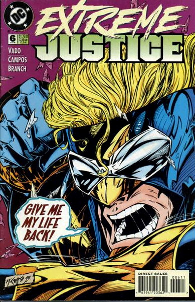
Roel notes a few contenders, but let’s go with the one he specifically emphasized, and that’s the slightly infamous Extreme Justice (DC, 1995-6)…also noted by Rob S farther down in the comments:
As Roel says, “it looks like DC Comics badly cosplaying Image Comics,” which makes me want to place it in the aforementioned “Hello, Fellow Kids” category. More so than pretty much any other Marvel or DC book I’ve seen, Extreme Justice tried to emulate the, as it says on the tin, “extreme” art style that all of Today’s 1990s Youth were into, and cargo cult-style hoping that would draw in the big numbers that Image was, or at least had been, receiving. It only lasted a year and a half, so clearly it didn’t.
I’d only read a couple of issues of this series myself, and that was more than plenty. The most egregious of this title’s transgressions was its reworking of Booster Gold, who’d been generally a genial and occasionally goofy character, into whatever that is pictured on the cover I posted above. He was refitted with an armored costume, which I remember had one reviewer asking “if you’re going to be armored, why would you leave the top of your head exposed” which seemed like a good question to me.
This was a real try-hard of a book, and I’m not going to blame the creative team as they were likely following an editorial edict to “MAKE THIS COMIC KEWL.” In fact, the previously used “Kewl Style” category is probably where this should land, even if that doesn’t seem strong enough. The near-manic desperation of it probably overlaps with my somewhat facetious “Hello, Fellow Kids” category, so let’s give it that one too I mean, why not.
• • •
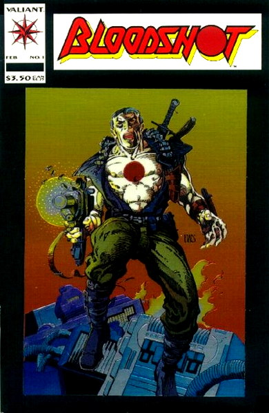
Joseph brings up Valiant’s Bloodshot #1 (Valiant 1993):
…which he compares to the slightly-fancier-covered (and already discussed) Turok Dinosaur Hunter #1 from the same company. This would probably just go into the general 1990s Sins “Gimmick” category, with its chromium card glued to the cover there. But as 1990s comics go, this isn’t…quite the offender as other titles have been, or at least it isn’t seen in quite the same like as that Turok first issue.
According to the Valiant Fans site, it had a print run of about 850,000 copies, which some publishers would push their favorite auntie into an industrial shredder to get those kind of numbers now. But that’s only about less than half of Turok #1, which feels slightly more ubiquitous. Not that Bloodshot #1s aren’t hard to come by (I think I have three in my store right now), but if I recall correctly sold quite well at the time and continued to sell as back issues afterward.
So I’ll probably stick with the “Gimmick” category for this one. As 1990s comics go, this wasn’t quite the burden on the marketplace as others have been.
• • •
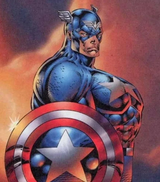
JohnJ brings up the dreaded “Chesty Cap” image drawn by Rob Liefeld:
JohnJ mentions not being able to find the cover this is from, but it’s actually from an ad if I recall correctly, that ran on some back covers here and there. An ad for what, exactly, I don’t know…a convention or a mail order house or some damned thing, I don’t particularly feel like delving too deep in Liefeldity right now. (But this cover is pretty close.) Also, apparently there’s a new explanation for why the drawing…looks like that going ’round, decades after the fact, but again don’t really want to entertain RL too much.
The actual Captain America comics Liefeld briefly worked on didn’t feature anything quite as extreme as the above image. Not saying they were good, but they at least weren’t as epically…let’s say “fanciful” as that pic.
Now in its own way this is about as iconic a representation of what 1990s comics were all about as any actual comic you can think of. It’s not a specific comic, though, so I should likely exclude it from categorization. I’m not even sure what category I’d put on it if I did. “The Rob Liefeldest,” perhaps?
Continuing the discussion of “Most 1990s Comic” with more of your nominees, starting with a couple of comics that, in fact, weren’t nominated but just mentioned by LouReedRichards:
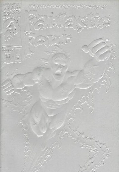
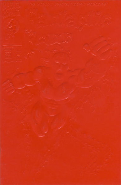
Well, okay, technically LRR only mentioned the second print of Fantastic Four #371 (Marvel 1992) with the red cover:
…which, yes, when photographed correctly, the details on the front cover do show up to some extent, like in the white cover. But under most practical circumstances the cover is unreadable, as LRR says. I mean, yes, if you pick it up in your hands and take a closer look, angling it in the light, you can make it out, sure. But as a cover, it fails in easily and quickly expressing information to anyone just looking across the rack. It does succeed in standing out (“oh hey what’s that big white square between Excaliber #58 and Fish Police #3?”) so it attracts attention by being an anomaly.
Anyway, I probably don’t need to tell you how covers work. I was trying to think of a “1990s Comics Sins” category for this one, beyond simply “Variant.” “Self-Defeating Variant” maybe in that you can’t read the cover…but like I said, it stands out regardless of anyone immediately knowing what it is (beyond awareness of any pre-publication hype) so it succeeds in that regard. Sigh. At least it’s not something they attempted very often (though the “gravestone” overlay on Amazing Spider-Man #400 deluxe edition would be of the same ilk).
• • •
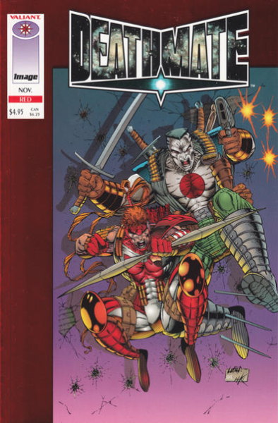
Brought up by Chris and a couple of other folks, Deathmate is certainly about as 1990s as it gets, teaming the characters of the immensely popular Valiant Comics with Image Comics. Ordered in droves, sold in dribbles, the series was an immense flop, leaving retailers who ordered huge numbers stuck with unsold stock.
Now in my mind when I asked “pick the most 1990s comic” I was thinking “single issue” more than “entire series,” but I see I didn’t make that explicit. But if we had to pick a single issue from the run, it’d be a no-brainer to single out Deathmate Red, from 1990s champ Rob Liefeld, which shipped months late and after the rest of the series, even the final “Epilogue” issue, was published.
• • •
DK sneaks in two picks, which I’ll allow because I like DK, starting with
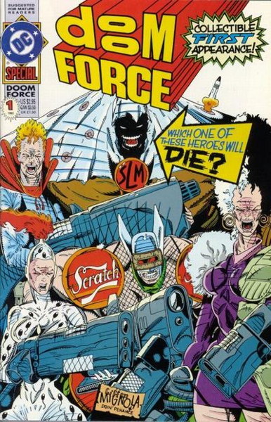
…Doom Force Special #1 (DC Comics 1992), by Grant Morrison and a host of artists, including Keith Giffen and Mike Mignola on that great cover with an all-timer of a gag. As a representative of the 1990s, I don’t know if it would be my go-to example, but it is directly addressing what was going on in the industry at the time, a not uncommon tack taken by other books of the era, so I suppose it can get its own 1990s Comics Sins category. “Parody” is a pretty wide net, including some publications of…varying quality, but I think it fits here.
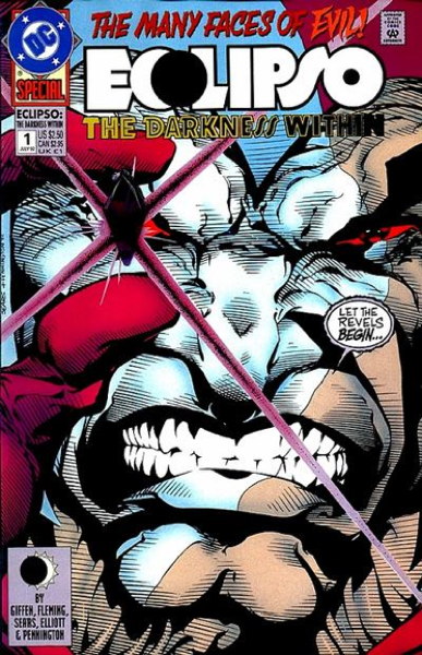
DK’s other “real” choice is Eclipso: The Darkness Within #1 (DC Comics 1992):
…part one of what would be a multi-part crossover event that runs through all of DC’s annuals for the year, ending in The Darkness Within #2. That would put this in the “Events” category, I suppose, but I think what stands out about this comic outs it more firmly in the “Cover Gimmick” section. It’s that twice-damned plastic jewel glued to the cover on the “direct market” edition, the thing that sticks out and puts a good diamond-shaped dent in the comic right before it in the storage box unless precautions are taken. (I think I put a backing board in front of my copy of this comic to ease said pokiness.)
As gimmicks go, this was…pretty out there, actually gluing a three-dimensional object to a cover. The only other comic I can think of that tried something like this was Sin #1 (Tragedy Strikes Press 1992) with its Band-Aids (or “Adhesive Bandage Strips”) but at least those are flatter than that gem. (Come to think of it, I should look at the condition of my copy of Sin to see if the glue has eaten through the paper yet.)
Anyway, that gem probably seemed like a good idea at the time. It is kind of neat, but still, what a thing to do.
• • •
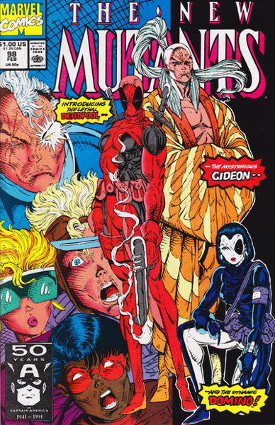
Okay, let’s wrap this up for today with Customer Sean, who submits
…New Mutants #98 (Marvel 1991), the introduction of Deadpool, drawn by the inimitable (or overly-imitable) Mr. Liefeld. That cover is certainly representative of a certain type of comic, a bunch of Kewl Characters standing around with Kewl Names.
For a 1990s Comics Sins category, maybe “Introducing a New Character,” perhaps? I mean, unlike other 1990s comics that would fit in this category (such as those series of annuals from both DC and Marvel introducing new folks) Deadpool actually caught on. Granted, it was more due to its handling by Other Hands than in its initial appearances, but still it’s not a bad visual, and the name “Deadpool” at least feels more like a name appropriate to the character.
Is it a Symbol of 1990s Comics like we’re talking about here? I feel as if its more recent position as a “hot” “collectible” comic that commands high prices is what I more immediately associate with this book. New Mutants #98 is absolutely Of Its Time, but it’s maybe evolved past that to be more representative of more recent industry shenanigans.
• • •
That’s plenty of my typing sticking into your eyes today. We’ll continue later in the week after a certain special something tomorrow. Thanks for reading, as always!
Well, I’m not sure how I’m going to do this. I don’t particularly want to start another series of posts in the middle of wrapping up the “Favorite ’80s Comics” thing and you know my Variant Cover-age is still technically unfinished. But what the heck, let’s at let’s look at what you’ve got to say about what single comic book is the most 1990s.
As a reminder, I’m starting with the idea that X-Force #1 as the most symbolic of the comics industry of the decade, with both its artistry and the cynical marketing ploys of the publisher. I’ve written about the title once or twice and you can read more about what I think of the title there, if you are so inclined.
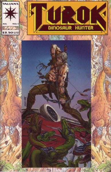
So let’s start off with none other than the dreaded, the infamous, the vastly-overordered Turok Dinosaur Hunter #1 (Valiant Comics, 1993) as first suggested by Matthew and seconded by several others:
Now have I talked about this comic before on this site? Friends, I have a category specifically for Turok. You can click that link and see what I’ve said in the past.
But, in short, Turok Dinosaur Hunter #1 is a very good example of retailers thinking past performance is indicative of future results. In this case, Valiant was a “hot” company in the early ’90s, goosed along by Wizard Magazine, with demand being high for both new and back issues, sometimes commanding huge prices. When it came time to place orders for Turok #1, it seemed like ordering high was a safe bet, not only because it was a new Valiant first issue and sure to sell, but because it was another revival of an older popular comic book character
And lots were ordered Lots of lots. I know at the shop where I worked at the time, we got an awfully robust pile of them. Again, in an effort to keep this reasonably succinct, I’ll just to the spoiler and tell you that this comic did not sell up to expectations. As I’ve said before, the comic actually sold pretty well in-store, at least for us, but just not anywhere near to what was ordered. A lot of retailers ended up dumping these in their bargain bins. Others…went to more extreme measures.
So let’s put this comic in the “Overordering” slot of 1990s Comics Sins, I suppose. It also had a gimmick cover (a chromium card attached to an embossed background) and while the gimmick was part of the problem, and perhaps fed into the hype that fed the orders in turn, “Overordering” is what this comic represents, at least to me.
• • •
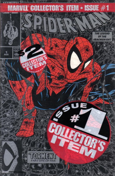
Next up is Todd McFarlane’s Spider-Man #1 (Marvel, 1990), as suggested by Chris B:
I wrote a lot about this comic in my Variant Cover-Age series, and let’s not beat around the bush: the 1990s Comics Sin here is clearly “Variants.” Particularly the entirely pointless “bagged” variants…bagged not because they contain a trading card or something, but simply bagged to have another version of the comic to sell. The one pictured above even cost a quarter more, because…they could? The green bagged one cost the same $1.75 as the unbagged copies, so the black one…had no cover price printed on the actual cover, so that cost 25 cents more, I guess.
There are sub-categories for this particular comic, such as “Comic Built Around Hot Artist” or “New #1 for Established Character” (distinct from “Relaunched with New #1,” if you’ll allow me to split hairs). But “Variant” I think fits the best, a cynical ploy by a publisher to get collectors to buy multiple copies of the same book, for (in the case of the bagged versions) the least of reasons.
• • •
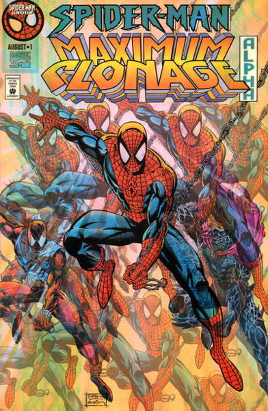
Here comes ScienceGiant with his excellent contribution of Spider-Man Maximum Clonage Alpha (Marvel, 1995) with its chromium cover:
My initial instinct was to put this in the category of “Gimmick Cover” (as opposed to “Variant”) since, I mean, look at it. Well, the pic above doesn’t really do it justice. You have to see it in its full shiny metallic glory for the full impact.
But it’s not just the fancy cover that makes it 1990s. It’s that it’s part of a “Big Event” (in this case, the ever continuing Spider-Clone Saga, that in some ways is still going on even now). I can see my category idea falling apart already, but “Gimmick Cover” and “Big Event” seem to be hand-in-hand here as far as 1990s Comics Sins go.
• • •
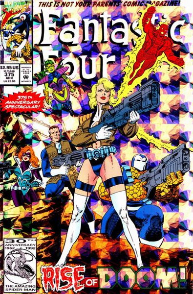
I think Thom H. has an interesting entry here that he explains quite well, Fantastic Four #375 (Marvel, 1993):
Again, the scan doesn’t quite get across the shiny foil-y bits of the cover, but I think you get the important points. To wit, per Thom H.:
“A lesser-known but equally offensive example of ’90s excess: Fantastic Four #375 (prism foil cover featuring shoulder armor, giant guns, an unnecessarily ‘sexy’ costume, and multi-pocket jackets).
“Once ‘kewl’ ’90s style has infected comic book’s first family, I feel like it’s truly reached its zenith.”
Yeah, that about sums it up. (Though I have to point out “375th anniversary,” just to be pedantic.) I think the content here is more important than the gimmick (or is it variant…did the newsstand cover have the foil highlights too, I can’t tell from the scans), so this would probably go in the “Kewl Style” category.
To be fair, it’s more about the accoutrements and the clothing than the actual artwork, which is by Paul Ryan and is perfectly fine. We’ll be getting to another “Kewl Style” category member shortly where the art itself is the key to its submission.
• • •
But not too shortly because that’s it for today. We’ll continue back here on Monday. Thanks for reading and participating, pals!
So I related this story on my Bluesky account (follow me there if you can, and I have a couple of spare invite codes if anyone needs ’em) where a customer came in looking for a present for a friend of his. Said friend was described as a “big collector” of comics during the ’90s, and wanted to find a special comic that would essentially symbolize that time in this person’s life.
Well, of course the initial thought that ran through my head was to run to the dollar bins and pull out a full run of Brigade, but I couldn’t do that to a complete and presumably innocent stranger. Plus, of course this customer was looking for something “giftworthy,” so we’re probably looking at a single issue of a comic that was a tad more substantial (i.e. dollar-iffic) than some random ’90s thing that was better off as a tree fished out of the Boxes of Misfit Comics.
My next thought was something like Spawn or Youngblood, both titles that in their own different, yet surprisingly similar, ways were emblematic of the excesses of that particular partial decade prior to the market’s Big Crunch.
But before I could voice these suggestions, my customer spotted an item that fit the bill perfectly, a special comic that is near and dear to my heart. Yes, friends, it could only be one thing:
Yes ineedy, the Death of Superman, Superman #75, rears its head yet again. After a couple of questions from the customer (“Is it the original? Is the bag sealed?”) I had me a sale and he had him a piece of 1990s comics history.
Anyway, after telling this story (in a much-truncated less-that-300-characters fashion) I posed the following question to my Bluesky pals: “what would you pick to be THE most 1990s comic book?”
I had quite a few responses, including one or two for books like Starman, which, you know, while definitely good, I’m not sure that’s exactly what I was looking for here. I mean, yes, we shouldn’t ignore the fact that very nicely done, high quality comics were in fact published, but I tend to associate (as I said earlier) publishing excesses to the earlier part of the decade, and “the stink of desperation” to the latter. Perhaps unfortunately, for having lived through it as a funnybook seller, my perspective is a little more cynical. Which is on me, admittedly.
Perhaps my question is better phrased “what most exemplified the” (here’s that word again) “excesses of the era?” The “Death of Superman” issue is certainly one aspect of it, the immense hype and overwrought demand for a “collectible” item. Which would also apply to, say, Youngblood #1, where a talk show appearance the night before release drummed up business for a comic that…mmm. perhaps was not the medium putting its best foot forward for an audience that normally did not buy comics. (And I wonder how many of these new folks, if any of them even bothered to look inside, still picture that as what all comics are like.)
Now I had some good suggestions for other titles, like pal Ian dropping Darker Image #1 on us (a title that promised big things but ultimately never made it past that first issue). Or stuff like X-Men #1 or X-Force #1, selling millions of copies on the basis of multiple covers or card inserts, representing the gimmicky methods publishers used to push comic sales above and beyond and reasoable (or healthy) expectation. (And I don’t need to tell you the multiple cover strategy is still in play today, on much smaller scales but for basically the same reasons.)
Or titles like Alley Cat, part of that small trend of basing comics around models/actresses, who would often have their pictures featured on the covers. (A precursor to the modern trend of “cosplay” covers, I think.) No less a personage than Rusty Shackles brought up the comic based on the mostly-forgotten Barbi Twins, for which I owe him my revenge.
But I think, personally, it comes down to pretty much any comic by Rob Liefeld…Youngblood, or X-Force #1, or Deathmate Red (another suggestion), or titles like that. It’s what I picture in my head when I think of my 1990s toiling in the comics mines, in between slinging POGs and wondering what these new Magic: The Gathering cards were all about.
I’ll ask you the same question: what is the most 1990s comic? I don’t mean “what’s your favorite 1990s comic” — I’ll get to that question eventually, when I’m done with my ’80s countdown — but what comic do you look at and think “yeah, this is what the ’90s comic industry was like, for good or for ill.” Please let me know in the comments.
Meanwhile, please enjoy this 1993 cable access comic book show I found on the YouTubes. WARNING: the DC Comics commercial at 11:55 will give you an aneurysm.
e-mail me at
mikester @ this domain name
• • •
THIS IS A LINK TO THE WEBSITE
FOR THE COMIC SHOP THAT I OWN