Yes, I know a buck each for Brigade is too much.
So I related this story on my Bluesky account (follow me there if you can, and I have a couple of spare invite codes if anyone needs ’em) where a customer came in looking for a present for a friend of his. Said friend was described as a “big collector” of comics during the ’90s, and wanted to find a special comic that would essentially symbolize that time in this person’s life.
Well, of course the initial thought that ran through my head was to run to the dollar bins and pull out a full run of Brigade, but I couldn’t do that to a complete and presumably innocent stranger. Plus, of course this customer was looking for something “giftworthy,” so we’re probably looking at a single issue of a comic that was a tad more substantial (i.e. dollar-iffic) than some random ’90s thing that was better off as a tree fished out of the Boxes of Misfit Comics.
My next thought was something like Spawn or Youngblood, both titles that in their own different, yet surprisingly similar, ways were emblematic of the excesses of that particular partial decade prior to the market’s Big Crunch.
But before I could voice these suggestions, my customer spotted an item that fit the bill perfectly, a special comic that is near and dear to my heart. Yes, friends, it could only be one thing:
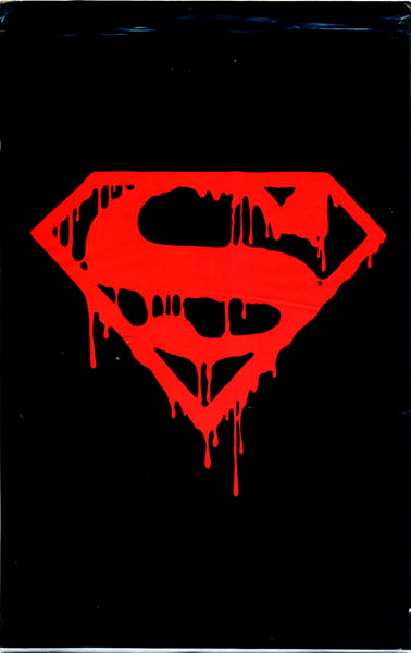
Yes ineedy, the Death of Superman, Superman #75, rears its head yet again. After a couple of questions from the customer (“Is it the original? Is the bag sealed?”) I had me a sale and he had him a piece of 1990s comics history.
Anyway, after telling this story (in a much-truncated less-that-300-characters fashion) I posed the following question to my Bluesky pals: “what would you pick to be THE most 1990s comic book?”
I had quite a few responses, including one or two for books like Starman, which, you know, while definitely good, I’m not sure that’s exactly what I was looking for here. I mean, yes, we shouldn’t ignore the fact that very nicely done, high quality comics were in fact published, but I tend to associate (as I said earlier) publishing excesses to the earlier part of the decade, and “the stink of desperation” to the latter. Perhaps unfortunately, for having lived through it as a funnybook seller, my perspective is a little more cynical. Which is on me, admittedly.
Perhaps my question is better phrased “what most exemplified the” (here’s that word again) “excesses of the era?” The “Death of Superman” issue is certainly one aspect of it, the immense hype and overwrought demand for a “collectible” item. Which would also apply to, say, Youngblood #1, where a talk show appearance the night before release drummed up business for a comic that…mmm. perhaps was not the medium putting its best foot forward for an audience that normally did not buy comics. (And I wonder how many of these new folks, if any of them even bothered to look inside, still picture that as what all comics are like.)
Now I had some good suggestions for other titles, like pal Ian dropping Darker Image #1 on us (a title that promised big things but ultimately never made it past that first issue). Or stuff like X-Men #1 or X-Force #1, selling millions of copies on the basis of multiple covers or card inserts, representing the gimmicky methods publishers used to push comic sales above and beyond and reasoable (or healthy) expectation. (And I don’t need to tell you the multiple cover strategy is still in play today, on much smaller scales but for basically the same reasons.)
Or titles like Alley Cat, part of that small trend of basing comics around models/actresses, who would often have their pictures featured on the covers. (A precursor to the modern trend of “cosplay” covers, I think.) No less a personage than Rusty Shackles brought up the comic based on the mostly-forgotten Barbi Twins, for which I owe him my revenge.
But I think, personally, it comes down to pretty much any comic by Rob Liefeld…Youngblood, or X-Force #1, or Deathmate Red (another suggestion), or titles like that. It’s what I picture in my head when I think of my 1990s toiling in the comics mines, in between slinging POGs and wondering what these new Magic: The Gathering cards were all about.
I’ll ask you the same question: what is the most 1990s comic? I don’t mean “what’s your favorite 1990s comic” — I’ll get to that question eventually, when I’m done with my ’80s countdown — but what comic do you look at and think “yeah, this is what the ’90s comic industry was like, for good or for ill.” Please let me know in the comments.
Meanwhile, please enjoy this 1993 cable access comic book show I found on the YouTubes. WARNING: the DC Comics commercial at 11:55 will give you an aneurysm.


First one that came to mind for me was Turok: Dinosaur Hunter #1
I would say Mcfarlanes Spider-Man 1 is a good early candidate.
There is but one correct answer: Spider-Man Maximum Clonage Alpha #1, chromium cover
A lesser-known but equally offensive example of ’90s excess: Fantastic Four #375 (prism foil cover featuring shoulder armor, giant guns, an unnecessarily “sexy” costume, and multi-pocket jackets).
Once “kewl” ’90s style has infected comic book’s first family, I feel like it’s truly reached its zenith.
Yeah, no big shocker, but X-Force #1 was the first thing that came to mind. The trading card/polybag gimmick is the epitome of the whole 90’s speculator mentality.
It’d be hard to disagree with any of the comics already listed in the comments.
@ Thom H. – I was out of mainstream collecting by the time FF 375 came around, so you can imagine my horror years later when I saw a picture of it on the internet.
Not long after that my sister, bless her heart, surprised me with a box of comics she bought at an auction. In the collection were two copies each of #375 AND #371 – with its nigh unreadable red plastic cover.
The comics may suck, but my sister’s act of kindness redeems them, at least a little.
Seriously though, the FF with guns and bomber jackets, Sue with a boob window?!?!?!
BTW: Anybody need a copy of FF#371, or 375?
My Answer is, of course, Turok #1.
Lots of good answers already, but when I think “Peak 90s” I always think DEATHMATE.
Doom Force #1.
Grant Morrison absolutely nails the 90’s excesses at the same time he rips them apart. If you have never seen it you are seriously missing out.
But the real answer is Eclipso #1, the comic that breaks the dimensional barrier and the villain actually destroys the other books in your longbox thanks to the most ill-advised gimmick cover of all time.
Perhaps New Mutants no. 98–first Deadpool, since he is one of the characters who is most emblematic of ’90s excess and Rob Liefeld co-created him.
I was a Serious Man of Comics through the 90s, reading Vertigo and its derivatives, ignorant of everything that later became Image. But… not long ago I was given a voucher and blew the lot on what I consider a perfect capsule of 90s excess, The Age Of Apocalypse Omnibus. It has everything; characters that are naught but grimaces and cool, endless splash pages of distorted, indecipherable anatomy, barely-there plotting – in the main title, with Magneto as leader of the X-Men, he does nothing but sit brooding self-importantly around the mansion waiting for Apocalypse before being captured in a six-page fight – and those turn-your-comic-sideways double-splashes that were absolutely thought to be a revolution in comics storytelling that would never fade. That’s what I love about it, the bulletproof confidence that this is how comics should be done and how they would forever be done hereafter, not realising they were part of a trash wave that had already broken and was falling back.
I never had a problem with Image producing those titles because it felt on-brand and genuine. But it was the comics from DC like Azrael, or Aquaman with a hook, or (most specifically) Extreme Justice that really signified 90s excess to me. Every time I see artwork from Extreme Justice, it looks like DC Comics badly cosplaying Image Comics. Stomach-churning.
And a link. I had to add the visual, just to complete the experience:
https://dc.fandom.com/wiki/Extreme_Justice_(New_Earth)
Bloodshot #1 immediately came to mind for me, thought Turok #1 is a good choice, too. You have Valiant, company that built it’s rep on excellent stories and hype from Wizard switching to a faux-image style, all under a hyped chromium cover that disappointed everyone when they actually saw it.
Can I trouble you for a Bluesky invite?
I bought the main Xmen title in Age of Apocalypse was actually pretty good Tom W – it’s about the last Xmen story I really enjoyed, the other x-titles I could give or take there, but at least it was a storyline that did something different and had some stakes involved. Really liked Blink and her interaction with Sabretooth, Morph was fun and that Sunfire costume design was great true, Magneto did a lot of brooding, but kudos for sidelining Wolverine, cyclops and Jean Grey from the team. I considered it a rare Marvel highlight at the time and an event that actually worked and had a purpose, and I hate pretty much all ‘event’ comics.
Thanks for the video. I’m glad I scooted ahead and found the 20 seconds of Harlan Ellison.
When you bring up Rob Leifeld, all I can think of is that cover with the gigantic chest on Captain America. I searched for it so I could quote an issue number but couldn’t find it. I can’t bring myself to look at his art anymore but I know they still talk about how he avoids drawing feet, which I used to think was Jim Lee’s failure also. Has Liefeld improved on drawing backgrounds?
For me, it’s probably DC’s Extreme Justice. I think the Liefeld Shouty Machismo Cheese style is probably the key to the decade, but what made it so prominent was the old guard’s willingness to chase that high, even when they should have known better. And books like Extreme Justice are top of the heap in that regard.
I’m here to back DK’s suggestion of Doom Force vol 1 number 1.
It is simultaneously ’90s comics, commentary on ’90s comics and commentary on the commentary on ’90s comics.
I’m not sure that Doom Force is any good, but I am certain that it’s perfect.
— MrJM
I bought Doom Force #1 when it was released and hated it so much. I know that I was supposed to hate it. And knowing that, I hate it slightly less. But I still get mad when I think about it.
Lot of great suggestions but I’m going with Force Works. It was Marvel trying to imitate Image with that godawful, muddy coloring palette they inherited after the Malibu purchase in ’94.
Just take a gander at this glorious, excessive, mess of a series:
https://www.marvel.com/comics/characters/1009307/force_works
Force Works is famous, of course, for having their headquarters in my old stomping grounds of Ventura, CA (right by the giant waterfall that I’ve somehow missed in my entire time there).
“Brigade”
I actually like Brigade (AFTER themini-series) (& Bloodstrike) in an 80’s cheesy action-movie sort-of way. Those are actually WORTH a buck a piece!
““what would you pick to be THE most 1990s comic book?””
probably Shadowhawk. Just terrible! Excessively Terrible! and Terribly Excessive!
“Anybody need a copy of FF#371, or 375?
Yes!
“all I can think of is that cover with the gigantic chest on Captain America.”
I think it’s the re-launched Cap #1. What an awful idea that was.
“Has Liefeld improved on drawing backgrounds”
In his 30 years of drawing comics, he’s made about 5 years worth of improvements to his art. His impersonators started doing better Leifield than Leifield at some point.
“Force Works”
Oh, yeah! Those covers look like Brigade/Bloodstrike, but with more capes!
Sandman. Technically began in the late 80s but really hit its stride in the early 90s and I would argue had the most long-lasting impact on comics as a whole since the Marvel books of the 60s. Then Bone, which likewise would have a long-lasting impact when it was collected by Scholastic in the following decade.
I’ve got to admit when I suggested Deathmate Red, it was a coin flip winner over Turok #1, lol.
Another vote for Deathmate here, with Spawn hot on it’s heels.
Snark Shark is not the only one who liked Brigade and Bloodstrike back in the day. Call me crazy bzt these books were… not as all over the place as the hard to follow Wetworks, Stormwatch or Cyberforce and I liked the sibling rivalry.
DOOM FORCE and the Ambush Bug Nothing Special. Accept no substitutes.
I don’t care if that’s two comics.
“Brigade and Bloodstrike”
Actually, it’s in the past few years I found out I liked those comics! And to a lesser extent, Team Youngblood.
“Deathmate”
Truly terrible! Plus, they were 5 bucks a piece (back in `94 or whenever) and it took, what, 6 months for it all to be published, with the massive lateness of Deathmate Black.
” Turok”
Not a bad book, just over-hyped. The writing got better when Tim Truman took over.
“Ambush Bug Nothing Special”
Now, THIS was a genuine great comic!
Bloodstrike 1 had a Liefeld cover, with layouts by Liefeld. It features characters with EXTREME! names jumping out of a vehicle and attacking a base, the Liefeldest way to open a series. Most ’90s of all, it had a gimmick cover: if you rubbed the cover, blood would appear. The ad even said, “Rub the Blood!” or something to that effect. It is, to me, the ’90s-est comic to ever ’90s.
“Rub the Blood!”
Man, that gimmick rubbed me the wrong way!