You’re going to see “Marvel” a lot in this post.
Well, I’m not sure how I’m going to do this. I don’t particularly want to start another series of posts in the middle of wrapping up the “Favorite ’80s Comics” thing and you know my Variant Cover-age is still technically unfinished. But what the heck, let’s at let’s look at what you’ve got to say about what single comic book is the most 1990s.
As a reminder, I’m starting with the idea that X-Force #1 as the most symbolic of the comics industry of the decade, with both its artistry and the cynical marketing ploys of the publisher. I’ve written about the title once or twice and you can read more about what I think of the title there, if you are so inclined.
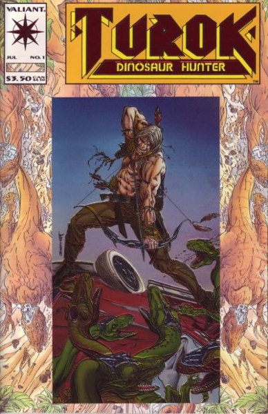
So let’s start off with none other than the dreaded, the infamous, the vastly-overordered Turok Dinosaur Hunter #1 (Valiant Comics, 1993) as first suggested by Matthew and seconded by several others:
Now have I talked about this comic before on this site? Friends, I have a category specifically for Turok. You can click that link and see what I’ve said in the past.
But, in short, Turok Dinosaur Hunter #1 is a very good example of retailers thinking past performance is indicative of future results. In this case, Valiant was a “hot” company in the early ’90s, goosed along by Wizard Magazine, with demand being high for both new and back issues, sometimes commanding huge prices. When it came time to place orders for Turok #1, it seemed like ordering high was a safe bet, not only because it was a new Valiant first issue and sure to sell, but because it was another revival of an older popular comic book character
And lots were ordered Lots of lots. I know at the shop where I worked at the time, we got an awfully robust pile of them. Again, in an effort to keep this reasonably succinct, I’ll just to the spoiler and tell you that this comic did not sell up to expectations. As I’ve said before, the comic actually sold pretty well in-store, at least for us, but just not anywhere near to what was ordered. A lot of retailers ended up dumping these in their bargain bins. Others…went to more extreme measures.
So let’s put this comic in the “Overordering” slot of 1990s Comics Sins, I suppose. It also had a gimmick cover (a chromium card attached to an embossed background) and while the gimmick was part of the problem, and perhaps fed into the hype that fed the orders in turn, “Overordering” is what this comic represents, at least to me.
Next up is Todd McFarlane’s Spider-Man #1 (Marvel, 1990), as suggested by Chris B:
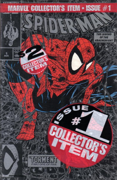
I wrote a lot about this comic in my Variant Cover-Age series, and let’s not beat around the bush: the 1990s Comics Sin here is clearly “Variants.” Particularly the entirely pointless “bagged” variants…bagged not because they contain a trading card or something, but simply bagged to have another version of the comic to sell. The one pictured above even cost a quarter more, because…they could? The green bagged one cost the same $1.75 as the unbagged copies, so the black one…had no cover price printed on the actual cover, so that cost 25 cents more, I guess.
There are sub-categories for this particular comic, such as “Comic Built Around Hot Artist” or “New #1 for Established Character” (distinct from “Relaunched with New #1,” if you’ll allow me to split hairs). But “Variant” I think fits the best, a cynical ploy by a publisher to get collectors to buy multiple copies of the same book, for (in the case of the bagged versions) the least of reasons.
Here comes ScienceGiant with his excellent contribution of Spider-Man Maximum Clonage Alpha (Marvel, 1995) with its chromium cover:
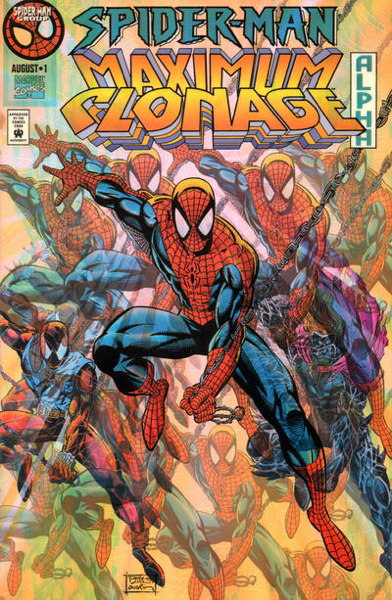
My initial instinct was to put this in the category of “Gimmick Cover” (as opposed to “Variant”) since, I mean, look at it. Well, the pic above doesn’t really do it justice. You have to see it in its full shiny metallic glory for the full impact.
But it’s not just the fancy cover that makes it 1990s. It’s that it’s part of a “Big Event” (in this case, the ever continuing Spider-Clone Saga, that in some ways is still going on even now). I can see my category idea falling apart already, but “Gimmick Cover” and “Big Event” seem to be hand-in-hand here as far as 1990s Comics Sins go.
I think Thom H. has an interesting entry here that he explains quite well, Fantastic Four #375 (Marvel, 1993):
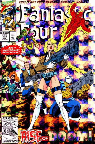
Again, the scan doesn’t quite get across the shiny foil-y bits of the cover, but I think you get the important points. To wit, per Thom H.:
“A lesser-known but equally offensive example of ’90s excess: Fantastic Four #375 (prism foil cover featuring shoulder armor, giant guns, an unnecessarily ‘sexy’ costume, and multi-pocket jackets).
“Once ‘kewl’ ’90s style has infected comic book’s first family, I feel like it’s truly reached its zenith.”
Yeah, that about sums it up. (Though I have to point out “375th anniversary,” just to be pedantic.) I think the content here is more important than the gimmick (or is it variant…did the newsstand cover have the foil highlights too, I can’t tell from the scans), so this would probably go in the “Kewl Style” category.
To be fair, it’s more about the accoutrements and the clothing than the actual artwork, which is by Paul Ryan and is perfectly fine. We’ll be getting to another “Kewl Style” category member shortly where the art itself is the key to its submission.
But not too shortly because that’s it for today. We’ll continue back here on Monday. Thanks for reading and participating, pals!


Wow — I didn’t even notice “375th Anniversary” because of all the distractions. Great minds at work in the ’90s.
I like the categories. I feel like it would be possible to give comics points based on how many different ’90s categories they fit into and then rank them from most offensive to least. But that would be a lot of work, so maybe just forget I said anything.
“but simply bagged to have another version of the comic to sell. The one pictured above even cost a quarter more”
Now, THAT was stupid AND greedy of marvel to do! HEY MARVEL! I COLLECT COMICS, NOT PLASTIC BAGS!
Old: “I ran across 14 long boxes of ONLY Turok #1. These were loose, and crammed as tight as they could get in there… to the recycle. ”
The chromium part was probably NOT recyclable.
I’ve recycled a massive amount of water damaged copies of Team Youngblood. (Got a long-box FULL of the exact same issue, along with some other stuff, for free).
YOU’RE WELCOME, EVERYONE!
Much to my surprise, I discovered today that there is still demand for Turok, just not in a place (m)any of us would think to look right away.
Just a couple of days ago (on November 30th), a remaster of Turok 3: Shadow of Oblivion (originally released in 2000 for the Nintendo 64) was released on Steam. It currently has 130 reviews and is rated “very positive” overall.
Link: https://store.steampowered.com/app/1996770/Turok_3_Shadow_of_Oblivion_Remastered/
Spider-Man #1 was my one and only dip into the speculator boom. Fortunately that was early in the boom and I felt burned enough by it to become inoculated to any of the polybagged/chromium/trading card/glow-in-the-dark/embedded jewel shenanigans that came later.
I think I paid* around $18 dollars for that silver cover a day or two after it came out. I pretty much instantly regretted it.
*Actually only a few bucks and in-store credit from trading in Faust #1 – so it was trash in/trash out.
I mean, I think it still has to be Superman (vol. 2) #75, which checks off almost every “sins of the 90s” box. And I don’t think there has ever been an actual bigger comicbook event (which transcended nerdom and had real-world worldwide pop cultural impact) than “The Death of Superman”…
But fort a deeper cut comic book that exemplifies the excess of the 90s, I would like to nominate Chaos Comics’ LADY DEATH BETWEEN HEAVEN AND HELL #1 from 1995. Chromium cover and variants. Cheesecake bad girl art from a “hot” 90s artist from a “kewl” indie publisher. Pushed heavily by Wizard with cross-promotional gimmicks like bagged magazines with collectible chromium cards. This is peak mid-90s comics.
I believe I got Spidey #1 (2nd print) for cover price.
MAN there was not much story involved.
“The Death of Superman”
The did have a big impact, though a temporary one. Not that there was ANY chance they’d keep Supes dead.