I’m just winging it with the category names, I hope you all realize that.
Continuing the discussion of “Most 1990s Comic” with more of your nominees, starting with a couple of comics that, in fact, weren’t nominated but just mentioned by LouReedRichards:
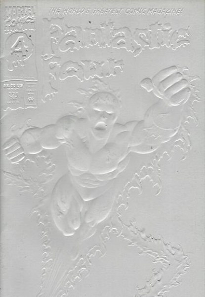
Well, okay, technically LRR only mentioned the second print of Fantastic Four #371 (Marvel 1992) with the red cover:
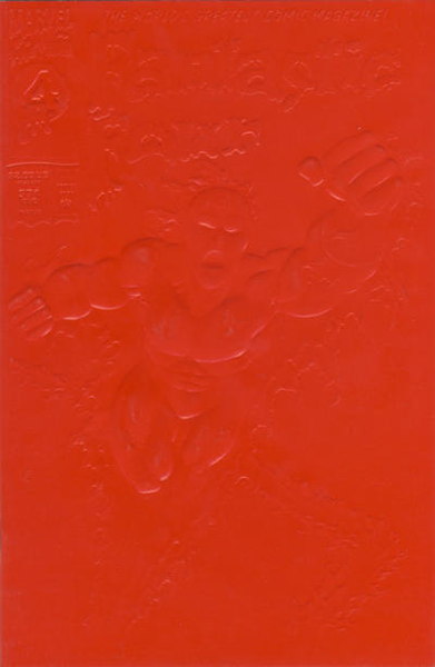
…which, yes, when photographed correctly, the details on the front cover do show up to some extent, like in the white cover. But under most practical circumstances the cover is unreadable, as LRR says. I mean, yes, if you pick it up in your hands and take a closer look, angling it in the light, you can make it out, sure. But as a cover, it fails in easily and quickly expressing information to anyone just looking across the rack. It does succeed in standing out (“oh hey what’s that big white square between Excaliber #58 and Fish Police #3?”) so it attracts attention by being an anomaly.
Anyway, I probably don’t need to tell you how covers work. I was trying to think of a “1990s Comics Sins” category for this one, beyond simply “Variant.” “Self-Defeating Variant” maybe in that you can’t read the cover…but like I said, it stands out regardless of anyone immediately knowing what it is (beyond awareness of any pre-publication hype) so it succeeds in that regard. Sigh. At least it’s not something they attempted very often (though the “gravestone” overlay on Amazing Spider-Man #400 deluxe edition would be of the same ilk).
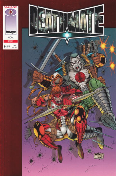
Brought up by Chris and a couple of other folks, Deathmate is certainly about as 1990s as it gets, teaming the characters of the immensely popular Valiant Comics with Image Comics. Ordered in droves, sold in dribbles, the series was an immense flop, leaving retailers who ordered huge numbers stuck with unsold stock.
Now in my mind when I asked “pick the most 1990s comic” I was thinking “single issue” more than “entire series,” but I see I didn’t make that explicit. But if we had to pick a single issue from the run, it’d be a no-brainer to single out Deathmate Red, from 1990s champ Rob Liefeld, which shipped months late and after the rest of the series, even the final “Epilogue” issue, was published.
DK sneaks in two picks, which I’ll allow because I like DK, starting with
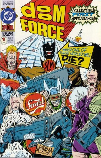
…Doom Force Special #1 (DC Comics 1992), by Grant Morrison and a host of artists, including Keith Giffen and Mike Mignola on that great cover with an all-timer of a gag. As a representative of the 1990s, I don’t know if it would be my go-to example, but it is directly addressing what was going on in the industry at the time, a not uncommon tack taken by other books of the era, so I suppose it can get its own 1990s Comics Sins category. “Parody” is a pretty wide net, including some publications of…varying quality, but I think it fits here.
DK’s other “real” choice is Eclipso: The Darkness Within #1 (DC Comics 1992):
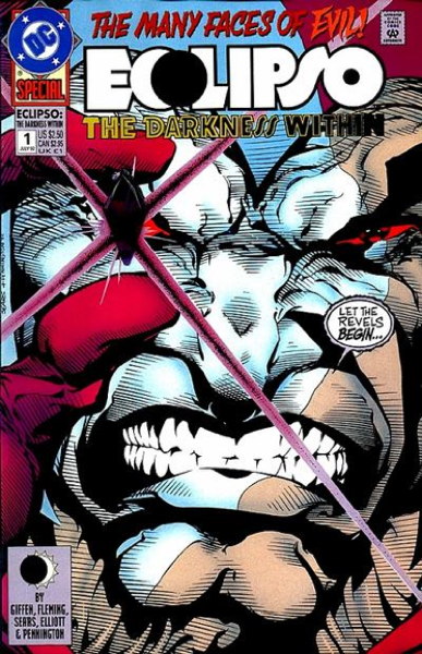
…part one of what would be a multi-part crossover event that runs through all of DC’s annuals for the year, ending in The Darkness Within #2. That would put this in the “Events” category, I suppose, but I think what stands out about this comic outs it more firmly in the “Cover Gimmick” section. It’s that twice-damned plastic jewel glued to the cover on the “direct market” edition, the thing that sticks out and puts a good diamond-shaped dent in the comic right before it in the storage box unless precautions are taken. (I think I put a backing board in front of my copy of this comic to ease said pokiness.)
As gimmicks go, this was…pretty out there, actually gluing a three-dimensional object to a cover. The only other comic I can think of that tried something like this was Sin #1 (Tragedy Strikes Press 1992) with its Band-Aids (or “Adhesive Bandage Strips”) but at least those are flatter than that gem. (Come to think of it, I should look at the condition of my copy of Sin to see if the glue has eaten through the paper yet.)
Anyway, that gem probably seemed like a good idea at the time. It is kind of neat, but still, what a thing to do.
Okay, let’s wrap this up for today with Customer Sean, who submits
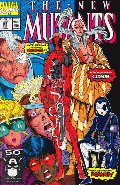
…New Mutants #98 (Marvel 1991), the introduction of Deadpool, drawn by the inimitable (or overly-imitable) Mr. Liefeld. That cover is certainly representative of a certain type of comic, a bunch of Kewl Characters standing around with Kewl Names.
For a 1990s Comics Sins category, maybe “Introducing a New Character,” perhaps? I mean, unlike other 1990s comics that would fit in this category (such as those series of annuals from both DC and Marvel introducing new folks) Deadpool actually caught on. Granted, it was more due to its handling by Other Hands than in its initial appearances, but still it’s not a bad visual, and the name “Deadpool” at least feels more like a name appropriate to the character.
Is it a Symbol of 1990s Comics like we’re talking about here? I feel as if its more recent position as a “hot” “collectible” comic that commands high prices is what I more immediately associate with this book. New Mutants #98 is absolutely Of Its Time, but it’s maybe evolved past that to be more representative of more recent industry shenanigans.
That’s plenty of my typing sticking into your eyes today. We’ll continue later in the week after a certain special something tomorrow. Thanks for reading, as always!


I know you don’t want to make this a series but I have to mention my most 90s comic. It’s Overkill number 1 from Marvel UK. I don’t know if you will even have come across the series but it’s emblematic of the 90s in so many ways.
Overkill was the weekly anthology that launched the shared universe line of Marvel UK characters like Warheads, Dark Angel, Motormouth & Killpower, Deaths Head II and many more. The concept was the material would be published in the anthology and then reprinted as standard Marvel Comics with added pages featuring team-ups with Marvel US characters. In one of the stupidest publishing decisions of all time these US editions came bagged with “Not For Sale in the UK” emblazoned on the bag. Effectively Marvel released a series of comics set in the UK featuring all the big Marvel characters that were not available in the UK. So we have a number of key 90s elememts coming together. Stupid publishing decisions, shared universe launches, constant hot guest stars, the most 90s title I could imagine (Overkill was also the name of the character created by Stan Lee, Rob Liefeld and Todd McFarlane in that VHS they were advertising in Marvel Comics of the 90s).
Stupid plastic jewel aside, that Eclipso cover by Bart Sears is actually pretty good. It also includes the very ’90s trope of “too many neck tendons.”
Speaking of ’90s art, the steaming gray breadstick in Deadpool’s hand is hysterical.
Overorders aside and the crash hitting I have standing beef with anyone who says the fans in early 90’s didn’t love the 90s stuff.
Pouches, big guns, X-Force, the whole new image lineup
Comics fans I was around loved all of it and that’s why it sold, blaming excesses and speculators be damned
Was there backlash? Yes. As always. Because the only surefire thing you can bet on in this world is regression to the mean.
But everything we mock now we loved and just won’t admit it
Damn, Thom H. beat me to it. I looked at the new Mutants cover and all I could think of was “why is Deadpool holding a moldy baguette?”
@King of the Moon. I’ve heard this point made by people over the years. I don’t dispute that obviously a huge number of comics fans of the 90’s loved this stuff, but I think it’s overstating it to to say we all loved it. I went along for a little while with McFarlane. His ASM run seemed fresh at the time. I even sported a McFarlane Spidey shirt for quite a while. I read his first year or so on the solo Spider-Man and read the very tail end of New Mutants, but I also worked in a bookstore and got a good discount on them, otherwise I doubt I’d have picked them up. Even at the time the storytelling seemed very weak and just an excuse for “badass” images.
I was fortunate to discover The Comics Journal and indie/underground cartoonists in the early 90’s. So while the larger comics world was going ape shit over Image, I was having my brain melted by Dan Clowes, Pete Bagge, Chester Brown, and others. I also came under the spell of Toth, Mignola, and Moebius, whose work while completely different from one another, was also a million mile away from the aesthetics of early 90’s comics.
From my vantage point, as well as the few comic’s friends I had, the 90’s were generally a dark time of watching style over substance infect every corner of the mainstream.
I’m pretty sure with out TCJ/Fantagraphics and a few other publishers, I would have left comics completely.
Age obviously has a lot to do with it. I turned 18 in the summer of ’90. If I had been just a few years younger I probably would have been all over the Image stuff.
@King of the Moon, @LouReedRichards,
You’re both right, according to my faulty memory. I turned 13 in 1990, and my friends and I went Gaga for Liefeld, Lee, McFarlane, and the like. Older fans (as in older than 15) were not shy in sharing their disdain, although I heard less about Clowes as a counterpoint than I did about Byrne. At least we could agree that BWS and Art Adams were cool.
As for enhanced covers that didn’t work- anyone remember the black varnish cover to Deathblow 1? Not only was the cover art hard to see, couldn’t touch it without leaving behind fingerprints!
King of the Moon – oh, I was there selling these to cuwstomers at the time. People loved their ’90s books. There’s more than one book I regularly read that in recent times I looked back on and thought “…why?”
I’ve got a Youngblood story along these lines that I’ll be related on this site soon.
“Fantastic Four #371”
STUPID!!! If I wanted to feel what I’m reading, I’d learn braille!
“Deathmate Red, from 1990s champ Rob Liefeld, which shipped months late and after the rest of the series, even the final “Epilogue” issue, was published.”
I forgot about the prologue & epilog! 2.95 each for that crap. And 4.95 for the rest. Wasn’t it like 6 months late?
” plastic jewel glued to the cover”
I think this one wins as THE STUPIDEST gimmick, as they NEVER did it again. I can’t imagine anyone liking it.
“Adhesive Bandage Strips”)… Sin”
I can’t imagine that NOT getting greasy/oily/gummy over time!
“New Mutants #98”
I can’t hate that one- or x-Force #2- I love Deadpool! Though he was INDEED used much better without Liefelds involvement.
“(Overkill was also the name of the character created by Stan Lee, Rob Liefeld and Todd McFarlane in that VHS they were advertising in Marvel Comics of the 90s).”
Also a Thrash Metal band from the 80’s!
“Bart Sears”
He can certainly draw! He just sometimes… OVERDRAWS.
“steaming gray breadstick in Deadpool’s hand”
Looks like an overly thick police baton!
Does Leifeild even know what real firearms look like?
“Byrne”
I never did read all of his Next Men series!
“I’ve got a Youngblood story along these lines that I’ll be related on this site soon”
Exxxxxxcellent!
Mike Loughlin And Mikester
I appreciate your insights and I think it is helping me Narrow down my thesis here: comics then were not written for the YOU now. They were written for the zeitgeist and age you were then.
A ton of books I loved as a kid don’t survive re-reading as blowing my mind the way they did when I was 12.
But neither does the A Team tv show or CHiPs
To be fair, some of the indie books from the 90’s (not by any of the creators I mentioned,) probably don’t hold up well either. TCJ while great, could also be completely insufferable, as I’m sure I was about comics, to anyone that would listen*. But, at the time, it really did feel like a battle for the soul of the medium.
Yes, the god awful television of our youth, The amount of time I spent with re-runs of Alice, The Jeffersons and Three’s Company makes me cringe.
@Mike Loughlin – EXACTLY! Just a few year earlier my walls were covered with Punisher (an Image character before Image) posters**, so I really believe it to be mostly an age specific thing, for the most part.
*Nobody was listening…
**Mike Zeck is still amazing though!
I was basically out of comics by 1990–except for Love and Rockets and the odd independent comic here and there like Dirty Plotte or Eight Ball.
But when I see 1990s comics–or even late ’80s comics–the “Rambo-ification” of the medium seems to have come into full effect. That’s why I will always prefer the Bronze Age as the zenith of well-crafted, thought-provoking comics which were illustrated by highly talented artists who were committed to advancing the medium aesthetically.
I was surprised that the ugly Eclipso cover was by Bart Sears–it looks more like Tom Mandrake’s style and seems off for Sears’ usually aesthetically pleasing work. By contrast, I recently found a low grade copy of an old Silver Age House of Secrets comic which featured the fourth Eclipso appearance–drawn by Alex Toth–and it was great!
It’s interesting to speculate to what extent different artists signaled a shifting in style for the big names that would emerge in the Copper/Dark Age. I think that Michael Golden and maybe Marshall Rogers, Art Adams, Pat Broderick, and Butch Guice were among the artists who shifted the aesthetic to a slightly more cartoony and “puffy” style that younger artists including Todd McFarlane and Rob Liefeld picked up on and made even more cartoony and “puffy” looking.
By contrast, most of the earlier big name Bronze Age artists like Byrne, Perez, Miller, etc. were building off of the aesthetics and styles of Kirby, Ditko, Gil Kane, Neal Adams, and Steranko and had solid looking figures that weren’t so cartoony or “puffy” looking (I guess Joe Station would be the exception, as he always had a cartoony style…but even so, his figures were drawn to appear angular and not “puffy”).
I tend to agree with King of the Monn…or should it be “Moon”?–about comics being written for the overall zeitgeist and age you were then…when I’m rereading Bronze Age or earlier comics, I try to go back and appreciate that work as much as possible from the perspective that I first enjoyed it from when I was a kid or a teenager. But I also think that the period from the end of the ’60s to about the mid ’80s was culturally more interesting and that a lot of the comic writers and artists were bringing more of an aspirational flavor to their work…which is why comics like the Uncanny X-Men and New Teen Titans became so popular. Also, the fact that there was an attempt at consistent continuity at Marvel and DC made a huge difference.
It seems that the ’90s was really the begining of the decline.
“Mike Zeck is still amazing though!”
Yes! His Punisher and Captain America will always stand out in my mind most, though.
“Silver Age House of Secrets comic which featured the fourth Eclipso appearance–drawn by Alex Toth”
Nice!
“Three’s Company”
I still love Three’s Company! “HERS AND HERS AND HIS! THREE’S COMANY, TOO!”
“TCJ while great, could also be completely insufferable”
True. I think my sensibilities lied most with Amazing Heroes.
@Snark Shark
Agreed that Amazing Heroes was a lot of fun… especially for teenage me that would have not been into slogging through some of TCJ’s overly analytical articles. Comics Interview was great as well.
I liked the Mike Zeck Captain America issues that featured Deathlok.
CHiPs and Battlestar Galactica were two of my favorite shows when I was a kid.
I forgot to mention this last time, but I actually prefer really early McFarlane art on Infinity Inc. and the the Scorpio Rose back ups in Coyote where he was generating interesting layouts and letting his graphic design skills shine.
By the time he went to Marvel, although he revolutionized Spidey’s “spaghetti webbing” and contorted poses, his depictions of Peter Parker and Mary Jane always looked off model. I never got into Spawn…but always thought the character looked like a Batman/Spider-Man/Ghost Rider mash-up.
I pretty much lost interest in the X-Men after the great Paul Smith left …John Romita Jr.’s art just seemed so removed from the likes of Dave Cockrum, John Byrne, and Paul Smith…it would have been cool if Michael Golden, Brent Anderson, or Butch Guice had landed the gig after Smith left.
“Battlestar Galactica”
Loved that and Buck Rogers reruns! They were in a 2 hour block every Saturday for YEARS.
“Peter Parker and Mary Jane always looked off model”
Yeah, too “cutsey” or anime for me. Spidey and the villains looked fine. I think his art looked better in ASM, rather than his run on “Spider-Man”. ASM also had a REAL writer on it, so the story was worthwhile, and he was probably being reigned in a bit, before he got to “Superstar” status.
” Spawn…but always thought the character looked like a Batman/Spider-Man/Ghost Rider”
Spawn is Zombie Batman!
“John Romita Jr.’s”
i like his art quite a bit, but he did go a bit too far with all the Spaghetti Hair later on.
I still liked that era, but by the Jim Lee era, Claremont’s writing was COMPLETELY off the rails.
@ Snark Shark
To be fair, John Romita Jr. has definitely put in the decades of hard work, but I have to say that stylistically I prefer his work from the late ’70s and ’80s and maybe some of the stuff I’ve seen from the early ’90s…like his first run on Spider-Man, and when Bob Layton was inking his work
on Iron Man…or when Al Williamson was inking him on Daredevil.
I think the whole “cutesy”/anime/puffy style just isn’t to my taste on American superhero comics. I can understand why it happened, but it seems like once the Image Comics artists embraced that aesthetic it was definitely a step down from the great draftsmanship that proceeded it by Bronze Age legends
including Neal Adams, Steranko, Gil Kane, Jim Starlin, George Perez, Paul Gulacy,
Dave Cockrum, John Byrne, etc.
I wish Marvel would just release facsimile copies of the Uncanny X-Men in sequential order from no. 94 up until John Byrne’s last issue. There are probably enough people who would buy them …but then I’m pretty cynical about the modern comics…I think both Marvel and DC should cut their present comic lines in half–at least–and just start printing a bunch of facsimile editions of cool series from the past…if they printed them on old school pulp paper it would be even cooler.
For me, the sweet spot for JRJR is late 80’s through the 90’s. By the 2000’s he seemed to lose some of the qualities that I most like in his art. I appreciate his desire to keep his evolving, even if it isn’t always in directions I personally enjoy. IMHO, his pencils on Daredevil with Williamson on inks is one of the great pairings in comics history. His second run on Iron Man with Wiacek on inks was also great!
@LouReedRichards
I’ll have to look for some of the JRJR/Bob Wiacek Iron Man issues…I always liked Wiacek’s inking over Dave Cockrum’s pencils during his second run on Uncanny X-Men. And just like with late period Jack Kirby, Neal Adams, Howard Chaykin or Frank Miller, JRJR has the right to evolve and/or simplify his style.
Speaking of pencilers and inkers, I just read a copy of the Silver Age Atom and the Hawkman no. 42, and it had three letters of comment by future comics industry legends Martin Pasko, Stephen Grant, and Klaus Janson on the topic of Joe Kubert’s pencils being inked by Murphy Anderson–Janson and Grant liked the combo, but Pasko thought Kubert and Anderson’s art styles didn’t mesh well.
“and when Bob Layton was inking his work
on Iron Man…or when Al Williamson was inking him on Daredevil.”
Yes, two of the best inkers in the business!
““cutesy”/anime/puffy style just isn’t to my taste on American superhero comics. I can understand why it happened”
Yeah, Anime itself was getting popular, and McFarlane had some cartoony qualities to his work. Business decision: lean in to what sells!
“Uncanny X-Men in sequential order from no. 94 up until John Byrne’s last issue.”
I would certainly buy that last one, it’s my favorite issue, w/Kitty Pryde vs. the Alien-look-alike creature! (I have the Classic X-Men version currently).