On Sunday I was speaking with a children’s librarian at the store, talking about comics and graphic novels that would be appropriate for the younger folk. As a former librarian myself, I’m always happy to speak to other librarians and further the comics cause, as it were. Anyway, we were talking about Jeff Smith’s Bone series and its recent reissuing in color from Scholastic Books, and whether or not is was okay for kids to read. I reassured her that Bone is in fact just fine for kids, with no sex or naughty language, and only some fantasy-style violence and the occasional scary monster.

She then mentioned that she was at some trade show/booksellers’ convention/something or other where a Scholastic representative told her that there had been some changes made to Bone‘s content for its color edition. Not that I’ve been on top of this story every second, but this is the first that I’ve heard of it. I know Smith made some changes to the original comics when they were initially reprinted in trade paperback form, but that was mostly just for storytelling clarity and similar reasons. The implication that I got from this rep, via the librarian, was that changes were made to make the material more appropriate for children. That seems hardly likely, since Bone was family-friendly from the get-go, unless Scholastic got nervous about upsetting some of the more hypersensitive parents and insisted changes be made. More likely is that Smith perhaps tweaked the artwork some more for the color edition, and the rep, hearing that changes were made, incorrectly assumed that these changes were made to make the material more kid-friendly.

Anyway, I don’t own the color editions so I can’t compare them to the black and white versions myself. Has anyone out there come across anything in the Scholastic Bone books that could be seen as a change made to remove so-calld “offensive” material, as opposed to just plain ol’ art tweaks?

Man, I do go on a bit, don’t I? If you actually read all that stuff I’ve written over the last couple weeks, you deserve a gold star, or a cookie, or something.

I’ve been in kind of a looking-backward mood lately, I guess, what with that clearing out the store’s back room project I’ve been working on. After seeing tons of forgotten Image titles, each with a handful of associated variant covers, the mind just wanders in that direction, you know?

On top of that, I’ve been poking through my fanzine collection, finding some choice old news bits. For example, here’s something from The Comic Reader #188 (May 1975):

“ABC has another pilot for Wonder Woman coming up — entitled ‘The New, Original Wonder Woman’ starring someone named Lynda Carter as the Amazon this time and Lyle Waggoner late of the CAROL BURNETT SHOW as Steve Trevor.”

Hard to imagine a time when Lynda Carter wasn’t the ’70s TV icon she is today, isn’t it?


This space left intentionally blank. Well, except for that sentence. And that last one. And…well, you know.


Two side effects from managing a comic shop:

1. Helping a customer with back issues, coming across some comics you personally own and enjoyed, and suddenly being filled with the urge to pull out your own copies and reread them. This just happened to me with Matt Wagner’s Mage series.

2. Having to manage comic stock at the store keeps one from wanting to deal with comic storage at home. I think I catalog and file the new acquisitions into the vast Mikester Comic Archives about, oh, once every two months. Imagine my surprise when I discoverd that I’m going to have to add a second box to the Hellblazer run, and add yet another box to the Legion of Super-Heroes run.

I’ve got too many gosh darn comics.


From a few days ago:

Me (noticing a song currently on the CD player): “Hey, what musical is this song from?”

Pal Dorian (completely disgusted with my ignorance): “It’s from Kiss Me Kate!”

Me: “Geez, you don’t need to bite my head off!”

Dor: “Well, look who you’re asking! If anyone was going to know….”

Me: “‘Oh, if only I worked with a gay man with an interest in musicals who could answer my question!'”


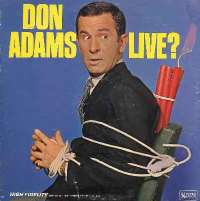
Also a few days ago, the topic came up at the store regarding some new Inspector Gadget animation project, and that the Gadget part was cast with a new voice actor. My response was basically along the lines of “man, they could have at least given Don Adams a break and let him reprise the part he originated.”

I had no idea he was in such poor health.

Sigh.

Rest easy, Mr. Adams.

Addendum.

I saw the additional responses to yesterday’s post this morning as I was putting up my latest entry, but had no time to respond as I was off to the dentist. So, I thought I’d try your patience with some additional responses.

Commenter Mark (of Chaosmonkey fame) asked about Marvel’s “deluxe/newsstand” editions of their X-Men line of comics from a few years back. Commenter Bob’s response is correct…the “deluxe” $1.95 edition, printed on the slick paper, was released about two weeks before the $1.50, printed on the non-slick paper, edition. I believe Marvel’s statement on the matter was that they were testing the market, to see which edition readers, and retailers, preferred. Unsurprisingly, the one that came out first sold the best, since most X-fans didn’t want to wait half a month to read the latest installment of their mutant adventures, and the $1.50 editions were done away with in short order.

Commenter Chris (from Matter Eater Blog) makes his attempt to break my brain by asking me to explain the whole Wasteland multiple-cover boondoggle. The Grand Comic Book Database has explanations in the entries for issue 5 and issue 6. Basically, #5 came out with the cover to #6 wrapped around it…it was reprinted with the correct cover, and the real #6 was released with a blank cover to (heh) avoid confusion. By the way, as a retailer, dealing with this sort of thing really sucks.

To pal Evilbeard…I haven’t responded to your e-mail because I’m not sure how any answer I can give you could improve on the question itself! (I believe Hawkgirl would indeed shout out “Caw! Caw! Caw!” at that, er, moment.)

And, to Chaz…yeah, that’s the problem with some of the really eye-catching covers, particularly in the case of Superman #204. The contents didn’t always live up to the cover. You see that dynamic Neal Adams cover, and inside…generic late-60s Superman art. Not terrible, really, but it just suffers in comparison to that fantastic cover.


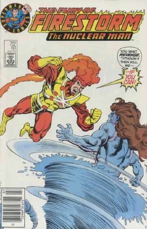
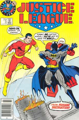
That is the corner company logo on the 1987 Justice League and Firestorm test-market variants I mentioned yesterday. More on that later.

I had some good comments on yesterday’s post, including commenter Joe, who wondered if both versions of that Amazing Spider-Man annual was in fact offered in comic shops. I’m fairly certain both were offered to retailers, but alas, I don’t have any of the invoicing material from that period readily available and it predates my funnybook-selling days, so I just don’t know.

As to Joe’s X-Men #1 comment, that reasonable people would have just bought the fifth variant that had the gatefold cover that featured the images from the other four covers…well, if memory serves, the covers were released one a week, so that if you wanted the gatefold cover, you had to wait over a month to get your hands on it. But if you were any kind of X-fan, well, you weren’t going to wait that long, were you? Especially for a new X-Men #1 written by Chris Claremont and drawn by Jim Lee? But, as Joe says, some people were indeed content to wait for the final version, and others just bought whatever cover was handy. And too many bought every single version.

Commenter Porkspam brings up a related subject…the difference between “newsstand” and “direct market” editions, which used to be that the newsstand comics had UPC codes and the ones in comic shops had a picture, or advertising, or the like in its place. (Or, as has been the case for the last few years, a different UPC code with a “DIRECT SALES” notation.) In general, the only difference between newsstand and direct market comics is just the UPC code, and the various price guides’ stand on the issue is that one version is not more “valuable” or “collectible” than the other. I should note, however, that it’s been my experience that there are a number of collectors out there who do in fact have a preference, who don’t want the newsstand edition of certain back issues in favor of the direct market version. If this becomes a common enough phenomenon, the price guides may have to reflect it.

FM Zombie made me slap my head and go “duh!” I completely forgot about DC’s Man of Steel mini-series from the mid-80s, the one that completely revamped Superman and established his new, permanent status quo…well, permanent at least until a couple years ago, but that’s another post entirely. There were two covers for the first issue…an extreme close-up of the Superman logo, as revealed beneath Clark Kent’s shirt, and another that matched the cover designs of the rest of the mini-series, with Superman standing to the right of the cover, with an action scene on the left-hand side. So, as far as I know, this is the earliest variant we’ve uncovered so far. (Though, as Martin says, I can’t help but think that there was something much earlier than this.)
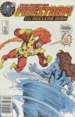

And now, to the test-market editions…Daniel wanted to know more about ’em, and Bob beat me to the punch by linking to scans of the variants in question (one of which, the Firestorm issue, I’ve, ahem, borrowed for this post…go to Bob’s links for much larger images).

I don’t know the background on these, but it seems pretty clear that DC was trying out a simpler cover design that would hopefully appeal to younger readers, a corner logo that emphasized that this comic was from the company that brought you Superman, and with that cover element that’s used all too infrequently nowadays, word balloons. As Eric L mentions, the west coast was one of the areas where these covers were distributed, and as a result, our store has a pile of the Justice League variants that have arrived in collections over the years. Although we have easy access to this particular variant, because we were a test market, demand is rather slim for these locally. By contrast, though the Firestorm was available in our area (I bought one from a local newsstand myself), it never turns up in collections. I think, counting the one I owned (I’ve since sold it), I’ve seen a total of two over the years. It’s almost certainly because there are a lot more issues ordered of the third issue of a high profile series like Justice League, than of the sixty-first issue of a second-stringer like Firestorm. But, for all I know, there’s some store out there with a pile of that Firestorm!
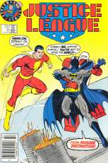
Since we never saw those particular cover designs (or that logo) ever again, I’m guessing that whatever DC was hoping would happen with these didn’t happen. But looking at these did make me wish for the days of word balloons and text-heavy covers that practically dared you to pick up the book and read it. I remember processing a large collection of Sgt. Rock comics that we’d purchased for the store, and having a really hard time not wanting to open every issue and see what the stories were behind the covers. And let’s not forget the two greatest “I gotta read that issue!” covers of all time…“Why do these initials mean death for the Man of Steel?” and “Stop! Don’t pass up this issue! My life depends on it!” Man, you had to read these!

I’m not saying that covers on today’s comics are bad, by any means. A lot of them are nicely done, and some are quite beautiful, but while the covers are striking, they’re not necessarily compelling. While those thirty covers in a row of Amazing Spider-Man, where Spidey is swinging on a web between buildings, may be drawn well, there’s nothing on the cover that would make a casual reader think “boy, I wonder why Spider-Man is swinging on his webline? I’d better grab that issue and find out!” Compare that to, for example, this. “Holy $#!*! Blackhawk’s fighting flying cavemen?!? The hell? I gotta read that!”

So it’s a shame that DC’s ’87 test-variants didn’t work out. Different newsstand covers designed to grab the attention of young readers with simpler, more compelling designs, with word balloons and other similar cover elements…those are variants I could get behind.

So a customer yesterday expressed shock and amazement that a particular issue of a comic book had two different covers.

Not shock and amazement that he now had two great covers to choose from. But shock and amazement at the very idea that a publisher would use two different covers on a comic, and, what’s this, what’s this, the content of the comics contained within these variant covers are exactly the same? What manner of sorcery is this?

Okay, now during the big comics boom from 10-15 years ago, when the “variant cover” was still a fairly new idea, I could understand the idea of “muliple covers for the same book” being a slightly perplexing one.

But at this point, with the variant-covers-for-the-same-book being a mainstreamed marketing gimmick — when TV Guide, one of the most widely read magazines in North America, uses the multi-cover gimmick for pretty much every other issue — the very concept really shouldn’t be too foreign.

That got me to thinking…what was the first “variant cover?” Or, if not the first, at least some of the earliest? I don’t mean cover variations between printings spread out over several months or years, as on several old underground comics. I mean, going to a comic store, seeing Unicycle Tragedy #17 on the “new arrivals” rack, and discovering that you have your choice of three different covers, by three artists, all released at the same time and on the stands all at once.

And I don’t think I’d count the Superman “test logo” variants of Justice League #3 and Firestorm #61 from ’87 – I’m fairly certain the markets these were sold in only had these covers, and not the others, so the customer wouldn’t have had the choice of which cover he or she wanted. (If I’m wrong, though, let me know…a newstand in our area had these covers, and I don’t remember seeing the regular ones on that newstand at the time.)

In comics, one of the earliest was Batman: Legends of the Dark Knight #1 from 1989, which had four cover variations (just overlays with four different colors). It’s not the first, but it’s the one that seemed to cause the biggest stink, with some fans complaining that they had to buy all four versions!

A couple years before that was Amazing Spider-Man Annual #21, where the newsstand edition had Peter in his Spidey costume, and the direct market edition had Peter in his civvies. Okay, it wasn’t really a simultaneous release of both covers to the newsstands, but comic shops had both covers so I’m counting it as a variant.

Is there anything earlier? I’m sure there is, but I’m having a brain freeze and can’t come up with any at the moment.

(Outside of comics, there was the original Raiders of the Lost Ark novelization in the early ’80s, which was my first encounter with this particular gimmick. There were several different foil covers to choose from…I remember having the silver foil cover, but it seems to me that there were red, yellow, and maybe blue covers as well. And I’m not 100% on this, but the novelization for E.T. may have done the same thing.)

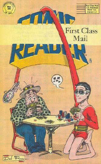
from the back cover of The Comic Reader #146 (August 1977) – art by Don Rosa

Conversations with Kid Chris Nathan

Nathan: “You know, if I read a comic I don’t like, I just put it down and don’t read it again. I’m not going to stand around complaining about it.”

Me: “You’ll never make it as a comics weblogger with an attitude like that!”

***

(Pal Dorian is sorting out some copies of Grips….)

N: “Hey, what’s Grips about?”

Me: “Violence.”


Speaking of Grips, in the ’80s, back when I still attended comic book conventions on a semi-regular basis, I remember hearing a lot of buzz about this hot new Grips comic book. It was the item to have, apparently, and I kept seeing teenagers going from table to table asking for these rare, in-demand issues.

It’s probably primarily of interest now since it features the early work of Tim Vigil, who would later do a more popular book on the subject of violence called Faust. But, honestly, Grips? No good. I have no idea why it got the “buzz” it did, other than “hey man, you think Wolverine is badass? Check out this Grips guy!”

I suppose I should have paid closer attention, and figured out what was driving that demand. Had someone told me back then that I’d have a comics weblog now, I’d have kept better notes. And wondered what a “weblog” was, but that’s beside the point.

Oh, and Dorian wanted me to note that the numbering on the subsequent Grips series don’t appear to make much sense. As in “two different issues with the same number that came out at the same time” kind of sense.


Yesterday, at the store, one of our customers said that I looked like George Perez.

Fan-tastic.

Not that I think I look anything like George Perez, but I’m accepting that compliment anyway.


Via Robot Wisdom: your latest comic book news headline inspired by a forty-year-old TV show: “Bang! Pow! Cash!”

Well, former employee Kid Chris may be off to UCLA for some of that book learnin’, but we have ourselves a new employee filling his shoes…Nathan, who as yet lacks a catchy nickname by which pal Dorian and I can refer to him. Hmmmm…”Big Nathan?” I don’t know…we’ll see.


Regarding some of the new comic day arrivals:

Dor noticed in Teen Titans/Outsiders Secret Files 2005 yet another reference to pre-reboot Doom Patrol continuity…specifically, to the Brotherhood of Dada from Grant Morrison’s run on the title. Once again…nobody is paying the slightest bit of attention to the team’s current “together again for the first time” status. Look for the next Doom Patrol incarnation to explain away this current series as some of kind of aberration. (EDIT: Just noticed Dorian made essentially the same comment…actually, I’m surprised we don’t overlap more often.)

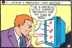
If you were wondering where this image from one of my corner pictures came from, the new issue of Archie Pals & Gals Double Digest (#97) reprints the story that features that particular panel. As Dor said to me when he spotted it…”someone at Archie is reading your site!” (Well, if someone at Archie was reading my site, I’m sure the cease-and-desist would have shown up long ago.)


My insane Lex Luthor post from yesterday got me thinking about that particular bit of business regarding Luthor’s current status in the DC Universe as compared to his status as of the mid-80s reboot. Particularly, the whole “coming back in a clone body and pretending to be his own 20-ish son” thing. Okay, that would work if only Luthor is about, say, twenty years older than Clark and Lois. Perhaps even ten. And, post the mid-80s reboot, Lex did appear to be significantly older.

That doesn’t seem compatible with the current Luthor status, where his Smallville TV show-mandated back story has him as a slightly older contemporary living in Smallville, and briefly attending Smallville High with a teenaged Clark Kent. If you were to open your copy of Superman/Batman Secret Files 2003 to the story “Young Luthor in Smallville,” Lex in the narrative is explicitly placed at age 18, and Clark in the story is in 9th grade, making the difference in age at about four or five years, tops.

So, in order for the “clone/son” ruse to work, assuming that Clark and Lois are in their early thirties, Lex would have had to father this alleged son while still a young teenager himself…technically possible, but not really fitting with the back story presented for “Lex Jr” (in which Lex was apparently already an established businessman).

Plus, don’t forget that the post-reboot continuity established that a young Lex and a young Perry White were contemporaries…so unless Perry is only about five years older than Clark and Lois, what we have here is one screwed-up timeline.

I suppose the way out of this is the events in the Underworld Unleashed crossover, where Lex cut a deal with the demon Neron to regain his health and vigor. Perhaps, at the same time, Neron also altered reality, retroactively remaking Lex’s history so that he was literally a younger man, and, um…

…okay, this is sad, even for me.


I am not Jack Klugman, nor am I Norman Fell. The jury is still out on whether or not I am Alan Thicke, Ted Koppel, or Cantinflas.

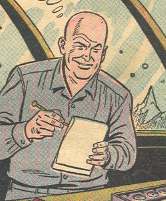
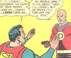
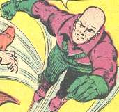
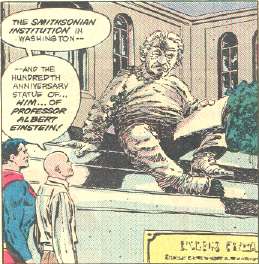
The many (and nowhere near complete) faces of Lex Luthor.


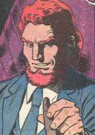
THE ORIGINAL HAIRY LUTHOR


THE PRISON-GREYS LUTHOR


THE HERO OF THE PLANET LEXOR LUTHOR


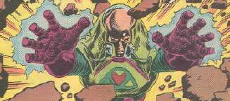
THE PURPLE ‘N’ GREEN FLYING JUMPSUIT WITH BANDOLIERS LUTHOR


THE ADMIRER OF ALBERT EINSTEIN LUTHOR


THE AVENGER OF THE DEAD PLANET LEXOR WHICH HE KINDA PRETTY MUCH DESTROYED BY ACCIDENT LUTHOR


THE CORRUPT BUSINESSMAN WITH HIS FINGERS IN CRIMINAL ACTIVITIES AND NOT AT ALL LIKE MARVEL COMICS’ KINGPIN LUTHOR


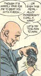
THE ROBOT HAND REPLACING THE HAND LOST TO RADIATION POISONING AFTER WEARING THAT RING WITH THE KRYPTONITE ROCK FOR TOO LONG LUTHOR


THE AUSTRALIAN SON OF LEX THAT WAS REALLY A CLONE INTO WHICH LEX HAD HIS BRAIN TRANSPLANTED AFTER DISCOVERING THE RADIATION THAT COST HIM HIS HAND WAS IN FACT KILLING HIM AND THUS FAKED HIS DEATH IN A PLANE CRASH IN ORDER TO SECRETLY HAVE SAID BRAIN TRANSPLANT PERFORMED LUTHOR


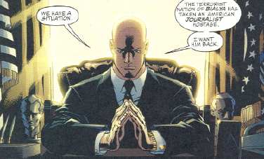
THE I CAN’T BELIEVE ACTUALLY WENT THROUGH WITH THIS STORYLINE BUT GOSH DARN IF THEY DIDN’T STICK TO THEIR GUNS AND KEEP HIM AS THE PRESIDENT OF THE UNITED STATES FOR PRETTY MUCH A FULL REAL-TIME TERM LUTHOR

Additional linkage:

Superman Through The Ages has a comprehensive overview of our favorite bald villain, as does Wikipedia (at least until Luthor complains and the entry is reduced to just his bibliography).

More “Many Faces of Lex Luthor,” this time from TV and movies. And here’s Kevin Spacey as Luthor from the forthcoming new movie.

DC Comics’ official Lex Takes the Presidency page, complete with Shockwave campaign ad.

Comparing and contrasting the comic book origins of Luthor with his counterpart on TV’s Smallville.

Who will win in the battle of the (previous) century? Khan versus Luthor, or Luthor versus Dr. Doom – you be the judge.

“Bin Laden as Lex Luthor.” Er, um….

Fred Hembeck presents: Brainiac and Lex Luthor!

This lucky fella has a “Baldy Award”autographed by Mr. Luthor himself!

The original Mego Luthor Pocket Super Hero from 1979. And here’s the Super Powers figure.

…And here are some custom figures, including probably the only Earth-3 Luthor figure you’ll ever see.

The Planet Lexor, where Luthor was a hero and Superman was the villain!

Information about the Silver Age Luthor’s estranged sister.

Luthor only made it to number 4 on this list of Evil Geniuses? Bah!

Luthor is also on the Forbes Fictional Fifteen richest characters list.

Here’s a biography that’s a couple years out of date, but gives you an idea of what the post-Crisis Luthor is all about.

The Luthor Hero Clix figure.

A thumbnailed overview of the Super Friends episode “Lex Luthor Strikes Back” (complete with Super Mobile cameo!). (warning: pop-ups)

Luthor as Capitalist Bogeyman. (warning: more pop-ups)

The absolutely genius Lex Luthor mini-bust.