I’m just about ready to move on from John Byrne’s 1981-1986 run on the Fantastic Four, but I wanted to touch upon this particular storyline because, among other things, it sets up a character that will return again and again in future creative teams’ efforts on the title.
I remember picking up issue #271 and being quite taken with the throwback cover to the 1950s/early ’60s Marvel monster comics, before Stan Lee, Jack Kirby and friends dived back into the superhero genre:

I’m not sure where I’d been exposed to that era of Marvel monster books initially…perhaps some of the reprints that popped up as filler material in some of the Giant-Sizes I’d collected, or a friend whose uncle had a handful of original copies of these books (before being all destroyed in a rainstorm, having left his box of them outside. But I was certainly familiar with them, and found them amusing and charming enough that I would eventually draw out my own spoof splash page of such a story (“FONDUU, THE CHEESE DISH THAT WALKED LIKE A MAN!”).
Byrne’s pastiche of the Marvel monster period (this time involving a pre-superpowered Reed and Sue as the intrepid humans against the alien menace) takes up the majority of this issue. It certainly succeeds in evoking the essence of that era, even if it suffers a little in retrospect as the bad guy is coincidentally defeated in pretty much the exact same way the bad guy is defeated in Avengers #250, released shortly afterward.
But of interest is the plot element that turns up in the “present day” section of the book…the fact that Reed is suffering memory loss, introduced in this dramatically effective panel:
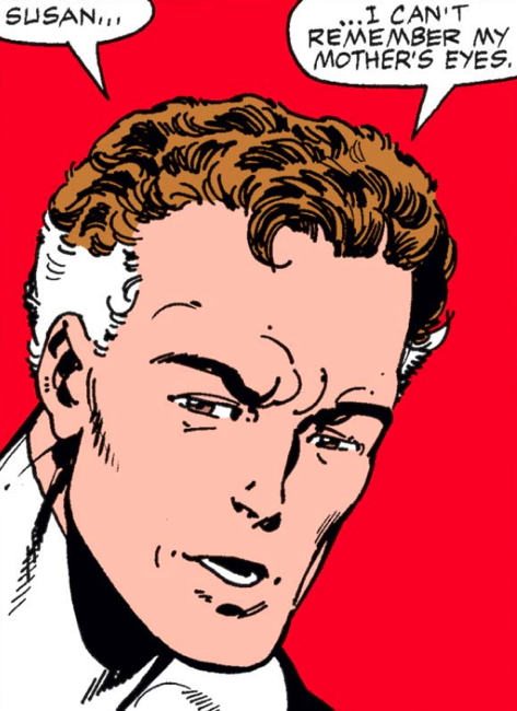
He continues to say that other memories of his younger years are lost, and attributes this to their recent adventures in the Negative Zone, where Reed’s brain was drained and blah blah I’m not going to get into it, but some alien critter messed with his head and left it Swiss-cheesed.
So it’s decided for some reason that escapes me even though I just reread these three issues right before reading this to go back to Reed’s father’s mansion in California…and I just reread that section of the story and I’m still not clear why they did. Anyway, we learn that Reed’s father, a scientist, had disappeared about ten years ago (“three years” before the team got their powers, leaning into Byrne’s “seven year” span that he assumes the FF had been active).
Eventually Reed discovered that his father had created a time machine that shunted him into an alternate timeline, and in #272:
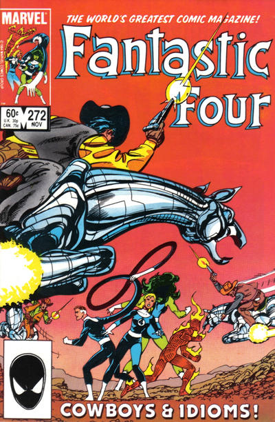
…the FF use Pops’ machine to follow him into the parallel universe. Look, okay, there are cowboys on flying horses on the cover, and we get some neat bits with a sci-fi tinged Old West in this other timeline, but the big story is that Reed’s father is apparently the hated Warlord, who rules over this world:

And that brings us to Part Three, #273:
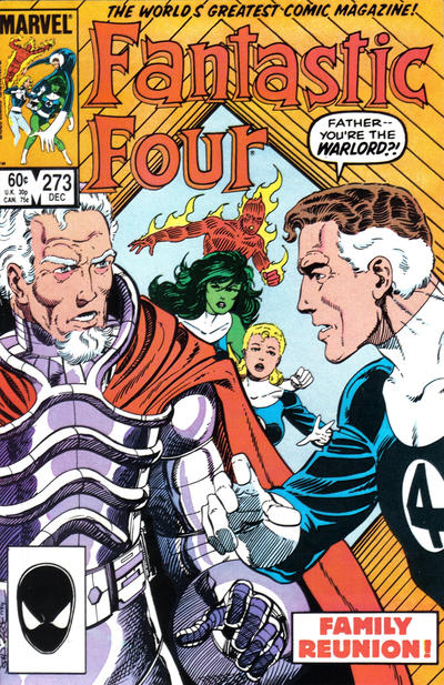
…where you can see on the cover there that Reed and his dad finally meet face to face, which is a neat moment, but boy, this issue is undermined by the fact that Byrne decided to not only write and draw this issue, as he had been on the FF for the previous few years, but letter it as well, and, um:

…the man’s no Gaspar Saladino. I think when I first read this issue, even then I was all “what’s up with the lettering” when I noticed that there was no lettering credit on the issue. Eventually I figured out Byrne did it his own self, which kinda blew my mind just a little. I mean, artists lettering their own work was not a new idea to me, as comic strip artists did it all the time, natuarlly. But in Marvel and DC Comic Books, it was always a separate job that you got someone specifically to do.
I should have realized it wasn’t unprecedented, but I don’t think I realized Jim Aparo often lettered his own work, and it was around this time that Todd Klein was lettering his own scripts on Omega Men. Of course in many independent books, this was often the case…the Hernandez Brothers lettered their own work, Dave Sim did some wild lettering in Cerebus, but that seemed different from the usual assembly-line nature of the Big Two.
Regardless, it did seem like A Step Too Far when Byrne picked up the lettering gig for this issue. He was already perceived as being stretched too thin writing and drawing the multiple books he worked on per month, and adding the not-insignificant task of lettering an entire issue felt like one burden too many. Especially when the result was aggressively Not Good. It looked awkward, the lettering was inconsistent, lines of text looked crooked, and even the word balloons themselves were pretty janky. Lettering can’t be distracting when reading a comic book, and this job was nothing but distracting.
Despite all that, the story continues, with Reed pleading his case to the Warlord (only it turned out (SPOILER) to be Reed’s stepmom, who was acting as the Warlord without Pops’ knowledge).
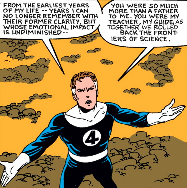
Note that we are here in the third and final part of this story, and Reed is still emphasizing his loss of memory. Which is interesting because ultimately, when the story is resolved and Reed and his dad have their peaceful reunion…the whole “lost memory” subplot is completely forgotten. The problem that launched this storyline remains unresolved. Far as I know, to this very day Reed still lacks all those memories, because at no point over these three issues does he ever get them back.
I remember noticing this at the etime, and wondering what exactly happened to let that plot element go astray. They didn’t forget it was such, and it was brought up in the concluding issue. Just when everything was said and done, the instigating action to drive the characters into this other world exists only as that: an instigating action. It is not a problem to be solved, but a…is Macguffin the right word here? I feel like that’s not exactly it but my English is failing me here.
But it’s ultimately pointless and I think that made me really wonder how such a gaffe could be made in a professionally published comic book. Yes, I knew about Marvel’s “No-Prizes” sent out for folks spotting (and explaining away!) continuity mistakes, but this seemed like a much bigger problem than that. A problem of a creator getting Too Big for an editor to successfully edit? I didn’t know then, and I’m certainly not sure now.
The lasting legacy of the introduction of Reed’s father in this storyline (beyond the “surprise twist ending” of the story connecting him to the time-traveling villain(s) Rama-Tut/Kang) is that Reed’s dad will return in Avengers: Doomsday in future FF storylines, with alternating personalities. While a seemingly benevolent and kind man at the end of Byrne’s issues, he returns in the Tom DeFalco/Paul Ryan issues as a untrustworthy and manipulative figure, then returns again as a somewhat more positive character. But, as I like to say when talking about future FF events, I’ll say more when I get there.
The other note I wanted to add is something I noticed on my most recent rereading…the attempts at pinning down Reed’s exact age. In this panel from #271, Johnny Storm congratulates Reed on hitting “The Big One” for this year’s birthday:
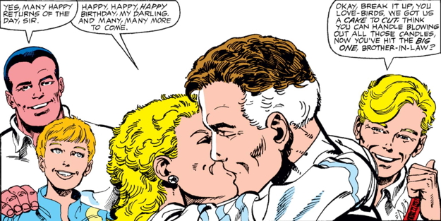
I interpret that as either 40s (most likely) or 50s (still plausible, given Reed’s slightly older status compared to the other 20/30-something superheros at Marvel.
Then Reed says this in #273:

…which still leaves things open a little bit. Reed’s dad vanished about a decade prior, but it’s very possible Reed hadn’t seen him for many years prior to said disappearance. However, if you look closely at the lettering in the second word balloon, the word “twenties” was obviously lettered in after the fact. Apparently someone didn’t want to accidentally “age up” the character by even implying Reed was in his 30s, or older, “10 years ago.”
This run of issues grabbed my attention way back when in good ways (Byrne’s generally fun art and storytelling) and bad (oy, that lettering, and the unresolved plot) that, had I had a blog back then, I almost certainly would have commented upon. It was an experience to get a story with a strong beginning and a clunker ending, leaving me wondering what fell down to allow this to happen. It was just another piece in the puzzle reminding me this comics were made by Human Beings, and sometimes we Human Beings drop the ball, even with the best of intentions.
Next time: the big transition from Byrne to Post-Byrne!
Isn’t Reed’s age indicated even more decisively by the opening splash page of FF #271? The birthday cake Sue holds in it has forty candles.
Reed looked like he was already in his forties all the way back in Fantastic Four no. 1. And, originally, he and Ben were WW II vets, just like Nick Fury and Dum Dum Dugan. Doctor Strange looked about forty when he made his debut as well.
Of course, Marvel always has that sliding timeline for most of its characters, except for Fury, Dugan, Steve Rogers, Bucky Barnes and a few others.
I’m curious as to if the FF no. 273 scans are from an original issue, or a reprinted edition, as the coloring looks really bland.
I did enjoy when Byrne brought Wyatt Wingfoot back to join in the FF’s adventures.
Chances are that John Byrne also did his own lettering on Doomsday + 1 back in the early days of his career over at Charlton Comics.
Also, if you want to continue on a Byrne line in a few months, Abrams will be releasing John Byrne’s “fanfic” “X-Men:Elsewhen” Volume One graphic novel this summer.
Dan – don’t know why it didn’t occur to me to actually count the candles, but that’s a good catch…which adds a little evidence that the changed word ballon probably read “thirties.”
Sean – these images are from the Marvel Unlimited digital comics service, which was easier and faster than scanning the comics myself. Some recoloring is likely, but it’s not much different from the originals. And yes, Byrne absolutely lettered himself on DOOMSDAY +1, and to better effect.
I almost mentioned Gormuu when you were talking about Byrne created villains vs. classic Kirby/Lee characters. I figured that’d be cheating a bit since it’s so obviously an homage.
I remember being a little confounded by the story & art change when I first read the comic. I was unaware of pre-Marvel Atlas history, so I had no context for it. Looking back at it now, I really like how well Byrne mimics the style and vibe of the period. He even manages to fit it into the 8 page format!
I hope there’s a little more coverage on the Byrne era before you move on. #272-#273 might be the low point of his entire run. Admittedly it’s been a long time since I reread those issues, but even at the height of my Byrne FF obsession I found these issue lacking. I didn’t even notice the sub-standard lettering at the time. Maybe that subconsciously added to my dislike of the story, well that AND Sue’s atrocious haircut.
As I noted in a previous post, Byrne had some amazing covers during his run, but #273 may be the worst of his tenure, though there are a few other contenders.
Hoping you touch on the resurrection of Jean Grey, Skrulls losing the ability to shape-shift, or even Nick Fury trying to kill Hitler, anything else just so the Warlord storyline isn’t the last Byrne-centric post before moving on.
Ooohh what about #263-264 with the Mole Man and the Hollow Earth Neal Adams analog. Those are FUN issues!
Sorry, I realize this post has a lot of griping in it.
I’m happy for any FF content, even if I sound cranky about it.
@William Carter
I’m glad to know that I’m not the only one who wasn’t a fan of Sue’s haircut.
Agreed that it would be interesting to go over some other story arcs in the Byrne run. Also, an analysis or ranking of Byrne’s inkers vs Byrne inking his own FF stories might be interesting; although Byrne’s own inking style shifted around quite a bit. Personally, I like Jerry Ordway and Al Gordon as inkers on Byrne’s FF run –but of course, Terry Austin is the ultimate Byrne inker on some of those FF covers.
Also, I commented so late on that Frankie Raye post a few days ago, but, I really do wonder if Byrne was influenced to turn Frankie into Nova based on Joe Staton’s character over at Charlton Comics, Nova Kane, who was E-Man’s girlfriend who became a superheroine. Their costumes are similar, they are both redheads, and Byrne came up in the comics industry at the same time as Joe Staton during the early ’70s over at Charlton Comics. Also, Byrne’s Rog-2000 was a backup feature in several issues of E-Man’s original run.
Also, Happy National Superhero Day!
They did explain the sliding timeline in Al Ewing’s run on THE ULTIMATES. I’ve always found him to write stories like Priest or Morrison.
It’s been a decade, but Al had some sort of contraption that had a blob appear and the assumption was that each blob represented a decade, and so everything happened, but Sue gave Reed that birthday cake in 2010? Any help on this? I know it happened. Adjust the wars and conflicts.When I read the Ewing’s run, I thought it was an easy thing to do. I just forget the outcome.
So not like MARVELS where everybody ages. The heroes are just shunted forward.
Did ANYBODY like Sue’s hair? I hated it as a teenager in the 80s when I didn’t really even think about such things. I don’t think I’ve ever seen a haircut like that in real life. Has Byrne ever addressed it?
@Daniel T
Perhaps Byrne was in a competition with Paul Smith to outdo Storm’s mohawk hairstyle and punk makeover?
Perhaps both John Byrne and Paul Smith were reading Love & Rockets and taking hairstyle inspiration from Los Bros. Hernandez?
All I know is that Johnny was similarly burdened by Byrne with a Flock of Seagulls-inspired New Wave hairstyle makeover, unfortunately.
And speaking of Johnny, the poor guy did suffer a lot of heartache during the ’70s and ’80s through losing both Crystal and Frankie Raye. Talk about Heartbreak City. I wonder what the total score is for “The Many Lost Loves of Johnny Storm.”
Also, RIP the late, great Gerry Conway–one of my favorite Bronze Age writers. JLA no. 200 will always hold a special place in my heart, and there are so many other entertaining and thought-provoking Conway stories in his long career in comics. Power Girl is probably my favorite Conway character; although Firestorm is also a top contender. I was able to meet him several times and have some Bronze Age comics that he wrote signed and he was a really nice guy.
Daniel T-It’s mullet Sue Storm. No, I’m pretty sure no one ever liked it. I’m surprised no one in universe ever addressed the fact that Sue once wore a mullet; although with the sliding timeline, it would mean that Sue decided to get a mullet in the 2010s. It’d be embarrassing enough for an adult woman getting one when they were kind of popular (with pro wrestlers and 5th graders, I think), but imagine that Sue decided to get a mullet haircut twelve years ago from 2026.
Sean–
I knew a guy in school who had hair kinda like Johnny’s, so that didn’t bother me as much.
But what I hate even more than Sue’s hair then is Johnny’s mustache now.
@ Sean
Sorry that was me earlier. William Carter = LouReedRichards. : )
I agree that Byrne’s inking changed over the course of his tenure on the FF. Thom and I discussed it a bit in previous posts. Heavier at the beginning and much “cleaner” towards the end, though I prefer the heavier style myself. While I think both Gordon and Ordway are A++ inkers, truly some of the best the business ever had, I find their work with Byrne goes a bit overboard and becomes a little distracting. #274 is a great example. Individual panels look great, but I find the whole gets bogged down in the inking. Just my personal opinion of course. As I said, Gordon is a top flight inker.
I DID have a haircut like Johnny’s (and Guy Gardner!) I think my sister talked me into it. Turned out to be one of the best things that could have happened to me. I got lumped in with skater/alternative crowd instead of just being a regular geek. Changed my social status and opened up the worlds of punk rock and alternative cuties! So there’s that at least.
@LouReedRichards
Great to hear that you were rocking a “Moe” back in the day and it got you play!
I just don’t prefer that hairstyle on Johnny Storm. I like his classic, Jack Kirby created hairstyle, which was only slightly modified and lengthened throughout the ’70s and early ’80s, until Byrne altered it. I would say that in the modern era Alex Ross draws the best interpretation of Johnny Storm for my money.
Maybe Byrne felt compelled to alter Sue and Johnny’s hairdos after Paul Smith altered Storm’s look– but at least Paul Smith made it look cool. Maybe both Byrne and Smith were influenced by the punk/alternative hairstyles that Los Bros. Hernandez drew in Love and Rockets.
@ Daniel T.
Agreed that Johnny sporting a mustache is not the ideal look for him. Didn’t Marvel even give him a goatee at one point during the Grunge-era ’90s… Nevermind!