I was going to make a “hey kids, Slaughterman!” joke but then I remembered how often I have children asking for Carnage comics.
Hi pals! Still looking for your single, ONE, UNO favorite title from the 1980s! Drop in your choice…and even if your pick’s been mentioned, drop it in anyway…I’ll be tallying “votes” and seeing which book came out on top!
I’ll probably start covering those next week, but let me continue going through some of your older comments and questions:
Cassandra Miller mentioned
“God, those years in the 1980s sure were a time…I recently (last year) uncovered some old obscure parody comics from then, ‘ElfTrek’ and ‘Secret Doors,’ and just had a blast reading ’em. Some of the jokes are seriously dated/would be impossible for anyone under 48 or so to get, the art is a bit crude, but they were just plain fun. The absolute freedom in so many of those b&w boom comics was so incredible.”
One thing I sort of miss from the old job is having access to the remnants of ’80s black and whites like, say, Elftrek:
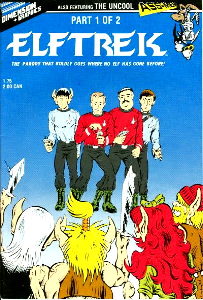
…where these things just sat in the back issue bins, unsold and unsought-after, and we just rolled our eyes at being burdened with these books and did not appreciate the bounty that existed at our fingertips. I touched a bit on this in the post about Az, in which I noted that I missed that period of time where just about anything could get published and put on a rack right there next to X-Men and Batman. Granted, a lot of it was…not of interest to me, to be nice, but there was so much imaginative fun getting out there.
Elftrek is a comic I came across occasionally at the old job, but never actually looked inside far as I can remember. You’d think, in those early blogging days, I’d at least have pulled a panel or three from a copy to throw on this site for the amusement of all. Only two issues (collect ’em all!) so I may have to keep an eye out for those.
One thing about being a comics dealer is that the excited frisson of discovered some new weird book on the shelf is muted by more commercial and economic concerns. But remembering weirdo comics that I missed the first time around, or even getting my hands on them in my own store…a nostalgic twinge reminiscent of that feeling does occur, putting me just slightly in mind of scouring the shelves looking for that oddball book to round out my handful of regular buys.
Donald G speaks clearly into the microphone, saying
“William Messner-Loebs, who wrote Comico’s JONNY QUEST adaptation back in the eighties, pronounces the company name ‘koh-MEE-koh.’
“While a lot of YouTube video essayists have some idiosyncratic pronunciation quirks when it comes to common, everyday English words and proper names, ‘koh-MEE-koh’ is not a YouTube invention.”
I have literally said it no other way in my entire time sellin’ funnybooks for a living. I don’t know if I ever heard anyone say it “kah-mek-OH” back in those pre-World Wide Web days. I’m not sure how the “koh-MEE-koh” pronunciation was passed down to me, either via something in one of the comics or maybe the news/reviews mags or fan press, or if that’s just how my old boss pronounced it. But that’s the way I’ve always said it, that’s the say I say it now, and that’s how I correct people on the rare occasion I hear someone say it the wrong way now. Yes, I correct people on how to say “Comico,” THAT’S THE HILL I’M DYING ON.
For anyone interested in some contemporary reporting on a seminal comics publisher, Customer Sean dropped this 1982 article into the comments regarding Pacific Comics.
On to the next post, where pal Nat sez
“One thing it’s hard to realize now is that Pacific was using a wider color palette then the other comic publishers at the time, and this made their issues just scream at you from the rack showing colors that you never really seen in a comic book before.”
I mean, not much to add to that. The covers on Pacific books were quite nice and distinctive, important in catching that customer eye from amongst all the other books on the rack.
I’m reminded someone of how early Marvel books had covers colored in relatively muted, dark tones, versus the brightly-colored images of their cross-town rivals.
Moving on the aforementioned Az post, a few folks noted another early Comico release Slaughterman:
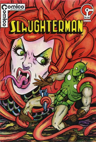
…And honestly, aside from the pretty name, I don’t remember really anything about the comic or the character. Customer Sean does bring up this good point about that period in Comico’s history:
“I would say that the very early Comico comics have a quasi-underground comix art aesthetic going on, which makes its first wave of characters–Az, Skrog, and Slaughterman, very bizarre and outlaw looking for early ’80s comics.”
…and I’d say that’s pretty spot-on. Even if the contents of the books could be amateurish and a little crude, the cover designs (and slightly larger dimensions) were on-target and definitely stood out as something different. “These Aren’t Your Daddy’s 1980s Comics!” they almost seem to shout.
I did own the three original Grendel issues which just had the most beautiful covers, and boy howdy these books were red hot at one point. They still command a pretty penny now, but back then the demand was constant and just slightly desperate, almost. I wish I’d kept them…I gave them up for sale some time ago, and was satisfied with owning the Dark Horse hardcover that reprinted all that early material along with the covers. It’s a nice book, but not the same as having those three issues which were attractive bits of artistic objects in and of themselves.
Okay, back Friday for more ’80s talk! Thanks for reading, gang!


Not wanting to break the rules of the previous post but wanting to note for the record: I really enjoyed reading Kitchen Sink’s monthly comics-sized black & white reprints of the post-war Spirit comics back then. The work is great, and Eisner’s stories and cnaracters definitely felt to me like precursors to Chaykin’s first two years of American Flagg. I had quite a few of those comics, but I don’t anymore and I wish I still did or that someone would make them available again. Definitely my favorite Eisner comics.
Interesting plot twist in Slaughterman – Slaughterman turns out to be actually…. A woman! I guess you have to read it
Never read Slaughterman before, but the title brings to mind a slasher movie killer or an Executioner-style anti-hero. It does not conjure up an image of “The Beetle, but if he were a He-Man character.”
Michael Grabowski:
Check with Mike Sterling, he may still have some of the Kitchen Sink Spirit run– he definitely had the Kitchen Sink Spirit magazines awhile back.
Mike Loughlin:
Everything you wrote about Love and Rockets as a seminal work of the ’80s rings true. I will say, however, that since I’ve been buying the latest iteration of Love and Rockets, although I’m still enjoying Jaime’s newest work, I feel that Beto’s ongoing Fritz and her progeny stories are tedious…but maybe I’m missing the point and it’s all about the vacuousness of American culture. I mean, I do see that, like Frank King’s Gasoline Alley, Beto is working on a multi-generational saga, but, boy, the Palomar stories were much more enriching and enjoyable to read…what with the Fellini-esque characterizations. I’d even live to see Errata Stigmata make a comeback!
Mike:
How about a poll in the ’70s independent comics, so people can vote for Elfquest, Cerebus, Captain Cannuck, First Kingdom, Wally Wood’s Wizard King, or whatever else came out in the ’70s.
Sean:
You’re right: Beto’s current Fritz work is VERY tedious and has been for a good while. There’s a reason he doesn’t have art books and such about him as his brother does.
Mike: I feel you about getting rid of the Grendels. When collected editions really starting becoming a thing I got rid of my singles when I had the stories in books. And now I wish I still had many of them (would LOVE to reread the Cerebus letters columns), even though I know when I wanted to read the stories I read the collections.
great point about the Pacific coloring. It was an interesting period of comics collecting when the coloring process used or the paper stock (this is Mando, but this is on Baxter paper) were discussion and selling points.
I realize it was mainly due to their terrible printing press, but Charlton tended to have a different feel to their coloring going back much longer than the indies. I’m sure it was just that their paper stock or less ink saturation were also part of it, given the notorious cheapness of the owner, but my memory is that Charlton colors tended to be more muted and washed out.
Jim Kosmicki:
I’ve been buying some of the old Gold Key Comics lately–Solar, Magnus, etc., and I’ve noticed that Gold Key Comics–despite having some very good art by Russ Manning, Frank Bolle, etc.– have some of the blandest coloring possible; even more so than Charlton. Of course, Gold Key does have finely painted covers.
Speaking of Charlton, how do people feel about the Charlton Comics iteration of E-Man vs the First Comics iteration of E-Man? Personally, I like the Charlton issues more.
Mike:
If you ever do a poll on peoples favorite independent comic of the 2010s, Ed Brubaker and Sean Phillips’ Fatale gets my vote!
Beto’s current work isn’t grabbing me either, but I like a lot of his post-Palomar output. Marble Season, Sloth, the B-movie comics, a few I’m forgetting- good stuff!
The Palomar stories, however, are in the running for my favorite comics of all time. Not only does Beto’s recent output not measure up to it, but almost nobody’s comics can. The scope, characters, little moments, and tone are on another level.
Re coloring: I have the first two issues of Ms. Mysric, which… aren’t great comics. The coloring is amazing, though-way better than concurrent Big 2 books but not as overdone as later Continuity comics. I think comic book coloring should complement the line art, not smother it. Pacific managed to walk that line, as did the Epic comics from around the same time.
Mike Loughlin:
There’s a topic for discussion…why were Continuity Comics generally well illustrated but very poorly written? I can see where Neal Adams basically had most of the artists or artists-in-training adopt the Neal Adams house style (unless they were already mega-stars like Michael Golden), but why didn’t he bother to hire top tier writers? Were Steve Gerber, Steve Englehart, Jim Starlin, Doug Moench, Len Wein, Gerry Conway, and so on not available (or were their fees too high?). I think I recall reading somewhere that Peter Stone–the main Continuity Comics writer–was Neal’s son-in-law.
Also, what ever happened to the Denny O’Neil/Neal Adams collaborative partnership? Did they have a falling out or something? Maybe If Denny had been the head writer or editor, Continuity Comics would have had some continuity–and decent stories. Oh well, at least Continuity had Mark Beachum drawing Samuree.
The B&W boom in the 80’s was insane. I completely forgot about ElfTrek. Seeing that cover set off a chain of memories. I remember when my college roommate at Ohio State bought a copy of Labor Force #1 by Blackthorne. The cover had the super-team racing toward the reader with a dialogue balloon that said, “Hurry it up, time is money”. He was a business major and thought it was the best comic ever made.
Mike: I’m going to keep pronouncing it “Comic Co.” –after all, the tag line on their early issues (like the Slaughterman issue which you are referencing in this post) literally reads: “COMICO the comic company” –so to me it makes sense to parse that as sounding like “Comic Co.–the comic company (that’s the pun–as I read it)” and not “koh-MEE-koh–the comic company.”
Now what about the people who always refer to Charlton Comics as “Charleston” Comics??? It makes me think of Flappers, dancing the Charleston while reading Charlton Comics!
Of course the real story behind the Charlton Comics name is: “The company was formed by John Santangelo Sr. and Ed Levy in 1940 as T.W.O. Charles Company, named after the co-founders’ two sons, both named Charles, and became Charlton Publications in 1945.”
“Slaughterman”
“SLAUGHTERMAN! SLAUGHTERMAN! SLAUGHTERS WHOMEVER A SLAUGHTERMAN CAN!”
TWITTER: “#32 THE COMICS JOURNAL/27 of THE NOSTALGIA JOURNAL”
Neat! I’ve never seen issues that early in the run.
“Kitchen Sink”
Speaking of Kitchen Sink, Death Rattle was pretty cool.
“Charlton tended to have a different feel to their coloring ”
and their paper looked like LITERAL newsprint, not the near-newsprint on all other comics of the time.
“Comic Co.”
Me too!! that’s how the English language works, gawddammit!
“Charleston” Comics?”
“PARDOM ME BOYS! IS THAT THE CHATANOOGA CHOO-CHOO!”
@Daniel T
“There’s a reason he doesn’t have art books and such about him as his brother does.”
My L&R knowledge is lacking. I’ve only read “the Reticent Heart” Palomar stories collection from the early days of L&R. I’ve been meaning to read the collections for years. It’s my single greatest shame as a comics reader.
Beto’s work on those stories is some of the single best cartooning I’ve EVER seen, just a marvel of expressive, fluid cartooning.
I really like Jaime’s artwork too, but it always feels a little more constipated, and too refined compared to Beto’s more organic, expressive line.
just my two cents.
BTW: L&R is daunting, with it’s long history.
Is there a good jumping on point, or should I just start from the very beginning?
Hi mike. Love & Rockets will always be my all time 80’s favorite, but I gotta say Strange Days was a game changer. This was my introduction to Milligan and McCarthy and their psychedelic work on Freak Wave; as well as Johnny Nemo, arguably a character years before his time deftly illustrated by Brett Ewins. Three issues that blew me away. I followed all the creators along their careers.
@LouReed Richards: the softcover collections (“Library Collections”) of L&R v1 are a great place to start. For Jaime’s Maggie & Hopey stories, volume 1 is Maggie the Mechanic. Jaime’s work gets better as it goes along, and the sci-if touches fade pretty early in the run. For Beto’s stellar Palomar stories, v1 is Heartbreak Soup. His work is great from jump. For early and miscellaneous Los Bros comics that don’t fit the larger narrative of the main stories, go with Amor y Cohetes. I wouldn’t bother with that volume until you’ve read at least the two vol 1s I mentioned above.
With the ’80s independent comics, I’m a bit surprised that no one mentioned Coyote, Aztec Ace, Sabre, The Silent Invasion, Wordsmith, or Kings in Disguise–I recall really enjoying all of those series when they were published. Did anyone vote for American Flagg!?? Also, no mention of Twilight Avenger, Epsilon Wave, Seadragon, Femforce, Miracle Squad, Alien Legion, The One, Video Jack, Last of The Viking Heroes, Megaton, Megaton Man, Border Worlds, Hero Alliance, New Wave, ESPers, Thunderbunny, Eternity Smith, or Black Zeppelin.
Snark Shark:
More songs!
Re: Charlton –the first time I saw a raggedy edged Charlton Comic it freaked me out–now I’ve come to expect it as a hallmark of Charlton’s cheap production values–and when I find a Charlton without a raggedy edge I’m disappointed!
Mike Loughlin:
Good Love and Rockets picks! I would agree that new readers should just start at the start of L & R –to see the evolution of the characters and concepts, and also because I really like Beto’s early sci-fi/Punk/surreal stuff with Bang and Inez, and Errata Stigmata. I’d love to see more of those characters. Or has Beto ever gone back to do a series of stories set in Palomar from the generation which preceded Luba, Carmen,Tonantzin, and everybody? Like Palomar from the 1890s to the 1940s?
Pal Cully:
Agreed that Strange Days was a great little anthology series! The Freak Wave one-shot that Vortex published was also cool.
[…] think I’ve caught up on responding to the comments for the last few posts. I’m down to this most recent one and re: the requests for favorite ’70s/2000s titles…oy, let me get through the […]
@ Mike Loughlin & Sean
Thanks! Appreciate the suggestions.
“Alien Legion”
OH I LOVE ALIEN LEGION! I have the reprint book from Dark Horse.
“Video Jack”
Liked it, but not a favorite. I like Keith Giffen being odd.
“raggedy edged Charlton Comic”
this! never saw any othe comics with that issue.