Low Contrast Mode.
So as many of you know (and I mostly can’t shut up about) I have had some eye trouble over the last couple of years, which has (among other things) interfered with my ability to read comics. Slowing me down at first, then, now and again, stopping me entirely.
While I’m still having the occasional bout of clouded vision, it’s a little less often, and my sight is pretty much as good as it’s going to be. My left eye is mostly good, my right eye is somewhat impaired, and my prescription glasses do help quite a bit, and I’m functioning more-or-less normally. I do have bit of a problem dealing with low contrast writing and images, but I’m adjusting best I can.
As my vision has stabilized, I’ve attempted to catch up on all those comics I’ve been accumulating but not reading. For example, I just finished reading something like 20 issues of the current run of Daredevil this past week. And I’ve done similar bulk-reads of titles trying to get current (and stay current as each new issue comes out).
One of the tools I’m using to read comics I’m behind on is the DC Universe digital library. While I do have print copies of the books I’m reading via this method, this actually makes it easier on the eyes to have larger (and sometimes clearer) panels that I can read a little more quickly than their on-paper counterparts. (And yes, I know I can get free digital copies of several Marvel titles, I’m just too lazy to go through the process of typing in the codes printed in the back of the books.)
Mostly I use my iPad mini to do the DC digital thing…my parents had ended up with a couple of free ones after buying a pair of iPhones, and gave one to me, which was nice. I have half-considered buying a larger iPad for my funnybook perusing, but that can wait for now. But I have used the DC Universe app via my television to read some material when certain troubles arose, in this case being the 2018 mini-series The Batman Who Laughs.
“Trouble you say?” I’m sure the three of you what still read the blogs are asking. Yes, the trouble is the very thing I’ve been having difficulty with ever since this particular evil Batman was introduced…his goldurned black-on-red word balloons:
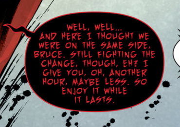
It’s…not easy for me to make out in print comics, and even reading it on my iPad, zoomed in as much as I’m able, was a pain in the rear. I made it through an issue on my pad, and then opted to try reading it through my television instead.
That did the trick…blowing it up nice ‘n’ big on a large flatscreen made the red-on-black balloons a tad easer to discern. But apparently this mini-series realized it was being far too lenient on me, and unleased its secret weapon: RED ON GREY TEXT:
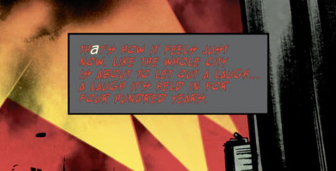
Man, there’s, like, almost no way I could have read this except for being blown up on a flatscreen, and even then it was a struggle. When I was doing screengrabs on my computer for this post, I found I couldn’t make them out, and I have a pretty good-sized monitor for my desktop computotron.
I eventually muddled through the series (I ended up enjoying it, despite everything), but man, I have a real distaste for these novelty-colored captions and word balloons. I think Swamp Thing’s black-on-orange dialogue is about as far as I’m willing to travel, and even that isn’t quite as legible to my peepers as it once was. If comics are going to continue to do that sort of thing, either bold the text more, or use higher contrast colors (the Batman Who Laughs seems to have white-on-black balloons in current appearances, which is a vast improvement).
And in short order DC Universe (when it becomes the digital comics only DC Univesre Infinite) is going strictly to tables/phones/computers, dropping TV support. I’m sure there are workarounds, but it won’t be as convenient as “selecting the app on my Roku” easy, so I may be losing that option for reading other comic lettering in this style.
Okay, okay, that’s enough waving my red-tipped cane at you publishers. I just hope they take things like “readability” into consideration when they do stuff like this.
I do have one more question arising from my Batman Who Laughs reading: what was the Gotham street planning commission meeting like that resulted in putting up an actual damn street sign that reads “Crime Alley?”
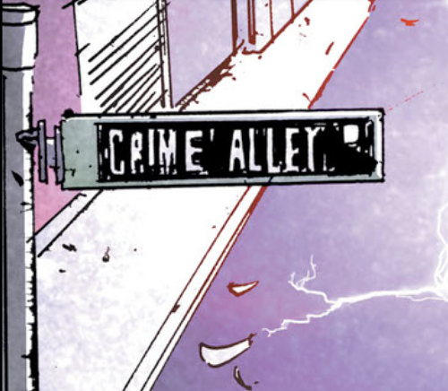
I mean, yeah, sure, it’s Gotham, this is probably the least crazy thing the city’s government has done. However, even assuming there are no businesses or residents on this particular stretch of road, surely anyone located nearby would be all “WHAT ARE YOU DOING TO OUR PROPERTY VALUES?”
I always figured “Crime Alley” was the nickname inhabitants of Gothan had for the road, I never realized it was an officially sanctioned street name. Though I suppose we’re lucky millionaire socialite Bruce Wayne didn’t insist that it be called “My Parents Are Deaaaaaad Way.”


Shame. I would never suspect *you* of being one of *those people* who claim that John Crime’s contribution to our fair city of Gotham was not worthy of naming the alley after him…
I have pretty good eyesight, and I can’t read that red-on-grey without squinting.
@rag: Plus, people always seem to forget that it’s pronounced “cree-mey”.
Also, that red on gray text is terrible.
That Crime Alley sign is there to make it easier for the tour buses.
“And now ladies and gentlemen if you look to your left ….”
It’s a shame that people forget the contributions of one of Gotham’s most prominent sons, Crimek Allen, a Dutch born immigrant who came to Gotham City with but the shirt on his back and a dream, a dream to build more amusement parks per square mile than any other city. Alas, those amusement parks are all abandoned now, their legacy in tatters from frequent use by murder clowns. And even the street named after Crimek Allen has eroded due to age, letters worn down to read “Crime Alley”, a further indignity foisted upon the legacy of Crimek Allen.
the red on grey is so hard to read why would they even do that.
For very long, “Crime Alley” was indeed just a nickname for a street called Park Row.
I guess one of the Batman Who Laughs’s many dastardly crimes was infecting the Gotham street planning commission with his magic mind-control juice so they’d do this.
I have to think red-on-grey isn’t a great combo for color blind folks. How hard is it to avoid decisions that make it difficult to read a text-heavy medium?
Crime Alley is misnomer, it is actually a thruhway that just lacks on street parking.
“Yeah, yeah, open til 6. We’re at 1343 Gotham Park Drive. Huh? Yeah, that’s between Crime Alley and Genocide Crescent.”
The town where I grew up has a famous street known as “Battle Alley”.
It’s commemorating a historical event that took place there.
It’s not really something you want to always remember either.
Basically, just a huge street fight between railroad workers and a travelling circus troupe, most likely involving large quantities of alcohol.
It’s a very small rural town, so not much to commemorate, I guess.
It was also famous for Carrie Nation paying a visit. Most likely due to aforesaid massive street fight.
So, yeah, maybe someone thought to commemorate the murder of Bruce Wayne’s parents by renaming the street to “Crime Alley”.
It’s not like anyone has to worry about the psyche of the poor child who survived after seeing his parents killed. He’s still be living that same moment over and over his entire life.
I can just about tell there are supposed to be words in that red-on-grey panel. That’s both kind of terrible and a really good argument for keeping text simple.
Meanwhile, since everyone else has made the obvious jokes, I saw that “Crime Alley” street sign and figured it was vandalism. Sort of like how, even 30 years later, signs on a certain street here in Portlandia get defaced to read “NEd Flanders”.
“VOYAGE TO THE BOTTOM OF THE SEA”
I Love that comic!
“RED ON GREY TEXT”
That’s one of the hardest to read captions I’ve ever seen!
“Crime Alley”
It’s next to Slaughter Ave and about 12 blocks away from Murder Street!
That red on gray is so difficult to read I have to think it was a coloring error. No way did an editor approve that.
Those word balloons suck! I recall Batman: Arkham Asylum having some horrible coloured word balloons, which is why I put it down after two pages when my eyes started to hurt. Never picked it up again afterwards. Horrible nonsense!