In which Mike goes on about this much longer than the, oh, 30 seconds he’ll need to fix the problem.
So New Avengers #2 is out this week:
…and apparently since it was decided the best way to encourage sales on a brand new series, aside from cranking out issue after issue on a biweekly or even weekly basis, was to make sure the logo is as small and unreadable as possible, I’m going to have to make a shelf sign that presents the “NEW AVENGERS” name at a legible size so that it won’t get lost among all the other comics on the shelves.
I guess the “A” alone should be clue enough that this is an Avengers title, with the assumption being that Avengers fans will buy anything that says “Avengers” on it, even though in reality that isn’t the case and people are picky about which Avengers title they’ll read. But honestly, the new New Avengers logo hasn’t been around long enough to be instantly recognizable regardless of size; the comic is going to be on a wall with a whole lot of other comics and running that small a logo is going to make it disappear; also, that’s dumb and I hate it, just to sum things up on a reasonable note. But regardless, that seems like an odd choice to make there. I’m sure, of course, that there is a dissenting opinion on this matter, that this cover is great and a real attention-grabber, but it seems to me this isn’t the way to promote sales, particularly in a market built upon relaunch after relaunch and readers are just looking for reasons to not follow yet another title. Accidentally missing issue #2 of something and realizing they can live without that particular comic is certainly reason enough.
Another comic for which I had to throw up a “THIS IS THE TITLE OF THE COMIC THAT’S RACKED RIGHT NEAR THIS SIGN ON THE SHELF” sign was Uncanny Avengers #2, which looks like it’d be easy to spot, right? Well, I don’t know if it’s because of some kind of neutralizing effect that all those red concentric lines had, clouding minds or somehow merging into the rack’s scenery, but boy did I have to point out that particular comic to people who looked on the shelves specifically for that issue and couldn’t spot it.
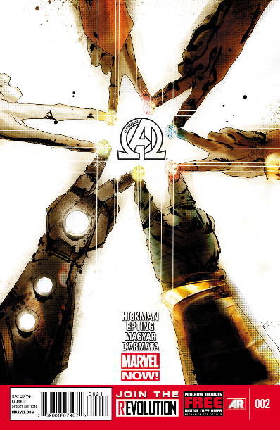
I realize I’m probably being a bit hard on these funnybooks. A whole slew of new releases hit the shelves each week, every week, month after month, year after year, and cover design home runs aren’t going to be hit every time. After all, not every comic can be as eyegrabbing as this.


Go Team Venture!
Sounds like a legit problem, albeit easily fixed, as you suggested in the title.
Is that Hulk cover really that great? On a spinner rack, where I’m certain I bought my copy, the interesting bottom two-thirds would be obscured by the comic racked below.
This last september I visited a bricks-and-morter comic shop for the first time in a few years, and was overloaded by the visuals. I had to be pointed to the Batman TPBs, feeling like 100+ years old.
Oh no, as an internet crazed person that cover coupled with the title above it instantly made me think goatse… :(
But after years of putting out a “slew of new releases…each week, every week, month after month, year after year,” I would think a company/editor/cover designer would know how to do their job well. That isn’t a job well done or thought out to it’s logical conclusion.
Missing an issue because I couldn’t find it or the store didn’t order enough, didn’t order at all, or couldn’t get more is why I switched to trades for the most part. And it’s lead to me buying less product as a result.
The “Uncanny Avengers” cover logo is white on red, which is difficult to read under the best of circumstances. Add to that the concentric circles and you get an image that’s eye grabbing but not too legible.
I know Marvel’s been taking a more “DESIGN”-oriented tack with their covers (especially since guys like JOCK and other “real-world” book designers are working on the titles), but to bury a logo is the height of folly when you realize how they are displayed in shoppes.
With only the top one-third of a cover sometimes being visible, that’s why comics (and magazines as a whole) have ALWAYS had the biggest, boldest logos they could – right up top.
As a COLLECTOR, there is another inherent problem – by putting the issue numbers at the BOTTOM it is MURDER to look for issues whilst thumbing thru a longbox.
As a tangent to that thought, it was one of the problems with Marvel’s recent-long-time decision to have “iconic” covers that had no representation on the events inside. For decades I’d easily be able to know at a glance which issues I had and which I needed (or what story was in which issue when rifling thru my boxes (or those at the back-issue bin).
It just seems that the thought-process of late is, “make it flashy and confusing so they might forget they already have this issue and buy it again” (as if 100 variant covers wasn’t enough).
Gah.
~P~
While I certainly understand a retailer’s frustration in the matter, it seems to me that Marvel’s philosophy in this regard might be something along the lines of, “the book is called NEW AVENGERS, we could wrap it in damp burlap and charge $29.99 per and it would still be a top five seller.”
Seems to me they should at least show some identifible characters if they’re going to minimize the logo.
Heck, I read the comic and I’m still trying to figure out the cover.
in the U.K., that cover is a bunch of superheroes FLIPPING YOU OFF!
Moon… star… POWER!