In which Mike complains about something that hasn’t really been an issue for a couple decades now.
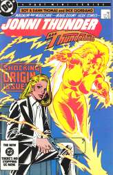
Along with the comic I discussed yesterday, I found a few other books in our Midnight Madness blow-out bins from a couple weeks ago. I happened across a full run of Jonni Thunder A.K.A. Thunderbolt, a mini-series by Roy & Dann Thomas and Dick Giordano. When I last talked about this series, I noted that copies, along with several hundred other comics, were cast off in The Great Comics Purge of ’94…and this series is one of the few I regretted losing. (I also shouldn’t have sold off my Roger Stern/John Buscema run of Avengers, but that’s another post.)
Haven’t had a chance to sit down and reread it yet, other than skimming it briefly before writing this entry, but I do want to note two things: first, in a good and decent world, the simple fact that Dick Giordano was drawing a comic book series starring a beautiful female detective would have been enough to get this mini on the stands, without having to throw “…and she turns into living lightning!” into it as well. Second, I said in my post from a year and a half ago that my memory was that the Flexographic printing process DC was using on some of their “special project” books at the time didn’t do the artwork justice. And boy, was I right. Everything’s too bright and garish, and there are several instances of off-register colors…here’s a sample:
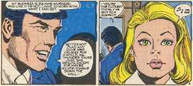
It looks like the line art printed well, but the coloring is so futzed up by the printing process, you can’t even look at the page at times.
Unfortunately, before DC abandoned this particular method of printing, they sullied some of their biggest books with it, such as the first issue of Crisis on Infinite Earths #1:
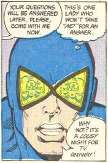
I don’t know if these coloring errors were any more or less frequent than in comics with the standard process, but they sure show up a lot more clearly with the brighter printing. The early Who’s Who issues got stuck with it as well.
Related…do you remember a time when comic fans were a lot more aware of the various paper stocks and printing processes? When we were all concerned about newsprint, and Mando paper, and Baxter paper, and whatever the paper stock was that Ronin was printed on? I’m sure it was because of the emphasis the publishers themselves put on the flashy new paper they were using for their books…and also because of the sheer novelty of having white paper after decades of newsprint. Nowadays paper stock is usually only brought up in discussions of how to drop comic book cover prices by printing everything on newsprint again, though as I recall it’s been explained that for a standard 32-page funnybook, the actual price difference would be negligible if they did so. And besides, I’m used to the whiter paper…I’m spoiled now.
A few more things I yanked out of the Midnight Madness boxes for myself:
- The first four issues of The Bozz Chronicles series from Marvel/Epic, by David Michelinie and Bret Blevins (with a guest art appearance by John Ridgeway). An alien (Bozz) stranded on Earth in Victorian England finds his suicide attempt interrupted by a lady of the evening…and one thing leads to another, as the two of them form a detective agency. Now that’s high concept. It’s a series I’ve been intrigued by since I first read about it in a long-ago Amazing Heroes, but never got around to buying it until now…and I’ve read the first issue, which was darn good. It’s been a long time since I’ve seen Bret Blevins’ art, and I’ve forgotten just how easy on the eyes it is.
- Comics Interview #66, featuring Keith Giffen and Andy Helfer talking about their work on Justice League International, Ty Templeton talking about his cartooning, and Roy Thomas talking. I have a lot of the earlier issues of this series, and if it’s one thing I need, it’s more fanzines.
- Random scattered issues of All-Star Squadron – When I was but a young Mikester, I was absolutely fascinated with Roy Thomas 1980s DC work, particularly with the Earth-2 material. However, I didn’t keep up with his All-Star Squadron run (there was some storyline early on that I didn’t care for, and I just stopped reading), so nowadays I just pick up the occasional issue when I can. A lot of it didn’t age terribly well, but every once in a while there’s a nice sequence, like in one of the issues I picked up, #31, where there are two two-page splash images presenting the entire team. And Uncle Sam is in the book…I’ve always liked that Uncle Sam character.
So, good, more comics to read. Exactly what I needed.
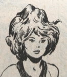




[…] (Here’s a brief appreciation of the Jonni Thunder AKA Thunderbolt series he drew, before I started complaining about how it was printed.) […]
[…] a Spanner’s Galaxy trade, with Tom Mandrake’s art recolored and safely away from the Flexographic printing process which afflicted it. But I’m not holding my […]