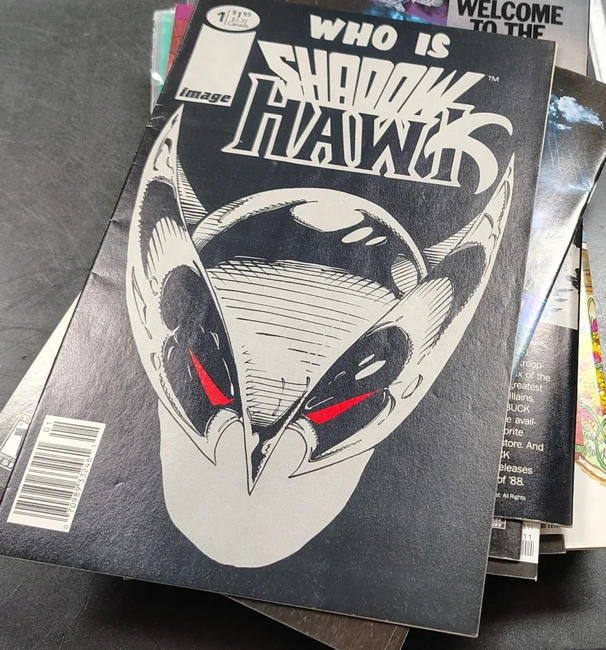
So, digging through some boxes in the backroom at the shop, I came across one of these. This is a newsstand edition of Jim Valentino’s Shadowhawk #1, which differs from the embossed silver foil stiff-covered one you could get in comic shops by having a floppy-covered version with a UPC code on the front. It still have a slight cover enhancement in that the mask is colored in silver ink.
Image had newsstand distribution on their initial releases, with the primary differences being the covers printed on a different paper stock than their direct-to-comic-shop cousins, plus the UPC code displayed on those ccovers somewhere. If there was some kind of fancy cover enhancement, it was generally removed, most notably on WildC.A.T.s #2. And of course, I talked about this during my variant cover-age posts from a while back.
I have noticed some back issue demand for these particular variations, as they tend to clear out of the shop soon as I get my hands on them. But I gotta be honest…not sure if that’s gonna extend to this Shadowhawk I have here. As I said on Bluesky regarding this comic, “on one hand is a relatively hard-to-find newsstand edition of Shadowhawk #1, but on the other hand it’s a Shadowhawk #1.”
Not to be overly harsh, but Shadowhawk, especially the various ’90s series, has been bargain box fodder for decades. Vastly overprinted during comics’ boom time, lacking any sort of back issue interest that Spawn or even Youngblood (main series only) has, I doubt if anyone’s actually ever paid full price for one since sometime around 1998.
As such, I’m not entirely sure what to do with this newsstand edition. I may very well decide to dump it into the bargain bins at the shop. But…it is a newsstand edition of an Image launch title, and may garner interest solely for that reason. I don’t know, I’ll decide when I get back to pricing more comics. Given the wear on the spine, it may only end up being a buck or so anyway even if I do grade and price it.
In totally unrelated news…there’s a crowdfunding campaign to make Justice Machine action figures! And since I figure my readership is probably right there in the main demographic of “people who remember and may have actually read Justice Machine,” I thought I’d let you know! Hasn’t launched as I type this, but it’s supposed to start within a day or thereabouts, so watch that space!
A Shadowhawk comic with wear on the spine? Ironic.
“Me in 1992: “You know, I really liked his normalman, I’ll give this a shot.””
Me too, Mike, me too.
I even bought #2 because I thought the first issue couldn’t possibly be representative of the series as a whole.
I recall picking up some Shadowhawk comics in dollar boxes about a decade back. I never got around to reading them, as they didn’t look very interesting or well drawn–just like the majority of the early Image stuff. I feel like Silvestri was the only early Image guy who actually knew how to draw figures well. Most of the work by the other artists was way too cartoonish looking.
However, that is great to hear about Justice Machine figures. I think Mike Gustovich shouldn’t have sold off the rights to his characters, but, irregardless, it would be cool if we ever got a Justice Machine streaming series, as the first few runs of the series by Novel, and Comic, were quite good.
Now we need some Elementals figures, and how about DNAgents, and Sabre figures? Anybody else have ’80s Independent Comics figures that they would like to see made?
* Autocorrect strikes again–Nobel and Comico–not “Novel” and “Comic.”
Tom W, you gave me the best laugh I will have today. Thank you!
@Sean: you read my mind on the Elementals. First time I heard of them was in a Justice Machine annual.
@ Wayne
What If Comico Comics and Continuity Comics had
co-published an Elementals vs The Urth 4 one-shot special?
@ Sean – While I largely had a negative impression of Image and its founders. I too thought Silvestri was the best of the bunch. His work on the X-Men had a kind of lyrical, effortless looseness (if that makes ANY sense) that I didn’t see in most other pencillers of the day. Of course he totally abandoned that when he adopted the Image style. Maybe it was the Dan Green inks?
I also thought Jim Lee and Eric Larsen were capable artists. I much preferred Larsen on Spider-Man to McFarlane. He seemed able to keep the energy and stylization of McFarlane, but also had a firmer grip on how to tell a sequential story.
“Anybody else have ’80s Independent Comics figures that they would like to see made?” – Forgive me if these have already been done in a kickstarter or something, I’m out of the loop. But a Nexus/Judah/Badger 3 pack combo would be AWESOME! also: GrimJack, Miracleman, Concrete, and of course Mr. X. I don’t think it totally counts as an indie, but a Video Jack figure would be great too.
Honestly I’d be probably happier with a mash-up figure of GrimVideo Jack!
@LouReedRichards
Some good points about Image. And to try to be fair, I had already stopped by comics, except for Love & Rockets, by the time that Image was a thing. So, it is great for those popular artists/creators that they were able to form their own company and retain their creator rights. It’s just a matter of that most of their characters and concepts don’t appeal to me. For people who love Spawn or Savage Dragon–more power to you, but I don’t find them very interesting. And didn’t Rob Liefeld cobble together one or two teams comprised primarily of rip-offs of Marvel and DC characters? Because when I have flipped through dollar bin issues of Young Blood or Bloodstrike or whatever, I see characters who look like mash ups of Timber Wolf/Wolverine, Speedy/Hawkeye, Blok/The Thing/, and so on…like a veritable “New Legion of Fantastic X-Men.”
I think if I was going to take the time to read any of the early Image stuff I have bought from dollar bins, I would probably go with CyberForce or WildC.A.T.S. first. I have read and enjoyed some issues of Gen 13 acquired in dollar bins, but that seems like it had a lot of momentum from the start as it was a New Teen Titans/New Mutants/DNAgents knock off book marketed to Gen X youth in the ’90s.
But to your point, I do stand corrected in that Jim Lee and Eric Larsen are capable artists (I’m just not into Savage Dragon), although Larsen does tend towards the cartoonisness. And, yes, Larsen and McFarlane did good work on Spider-Man, although I have pointed out before that McFarlane’s version of Batman has an absurdly long cape! But I did enjoy early McFarlane panel layouts and compositions in Infinity, Inc.
Part of my not being sold on early Image is probably that I am just not a big fan of the ’90s “grim and gritty” aesthetic which took over the industry after Miller and Moore changed everything. And while it is great for the Image founders that they achieved what they did, it is a bit bittersweet to think about the true maverick creators–Wally Wood, Jack Kirby, Steve Ditko, etc.–who were never able to form a successful independent company that allowed them to reap the rewards of their immense talent and creativity.
I think a Nexus figure was made at some point in the recent past through a kickstarter campaign, but I could be wrong. But a Nexus/Badger/Whisper three-pack could be cool. Or a GrimJack/Scout two-pack. Or a Miracleman Family pack? Although, good luck sorting out who owns the rights to make Miracleman/Marvelman toys! Maybe we could get a “V” for Vendetta figure? Or has it been done?
I would be down for a Mr. Monster figure. Or Airboy and Valkyrie –which, being in the public domain, I guess anyone could make.
Of the founding ‘Image 6’ — Larsen, Lee, Liefeld, McFarlane, Silvestri and Valentino — I’d argue that Larsen is the best artist, his cartoonishness having a distinctive style beyond realism, as well as the one most willing to experiment and develop.
@Oliver
You may have a point, and I was out of reading and collecting comics –with the exception of Love & Rockets–by the time Image rolled around. I do recall Larsen primarily from when I bought the Megaton black and white independent comic, as he drew one of the characters in there; I think an iteration of Savage Dragon popped up in there as well. But I also recall that it was quite jarring, after the beautifully rendered art of Steve Lightle on Doom Patrol, to have Larsen as the very cartoon-style new artist on the series. I think a character like Plastic Man, or maybe the Inferior Five, would have been a better fit for his style.
It might also be true that Larsen has been the Image guy most willing to experiment and develop, and when I have flipped through random copies of Savage Dragon, I have seen nice panel layouts, the interesting use of public domain characters (including the Golden Age Daredevil), fan servicing, etc., but as someone who was raised on great Bronze Age comics (which I feel was the Renaissance of great comic book artists), I would have to say that Silvestri and Lee had the best overall artistic sensibilities. But in the end, one of the biggest problems with early Image books was the subpar writing–a problem which Neal Adams’s Continuity Comics also faced. Eventually, Alan Moore, Steve Gerber, and other great Bronze Age writers were hired to write runs of some of the early Image titles, thankfully.
“And didn’t Rob Liefeld cobble together one or two teams comprised primarily of rip-offs of Marvel and DC characters? ”
Yeah, that was his thing! Youngblood, Team Youngblood, Brigade, Bloodstrike, Prophet, Supreme.