The Final ’80s Countdown, Part Fourteen.
So here we are, finally up to the two-vote getters in my little survey from a while back re: Your Favorite ’80s Indies That Aren’t Actually Comics Like Elfquest and Cerebus That Started in the ’70s.
And today’s entry features a couple of heavy-hitters from the period, so this post may get a little more attention than normal. As such, let me point out to anyone new that the dates presented represent the length of the initial run of the subject’s first primary series, so it may skip earlier appearances as back-ups or anthology entries an’ such. (I fudge this a little in the Nexus entry.) Admittedly, I should have just noted “year of first appearance” or something, but no,I had to be more difficult about it. Anyway, I do at least try to mention those earlier appearances.
Got it? Good! Confused? Probably also good! So here we go….
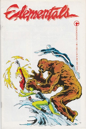
Elementals (Comico 1984-1988)
 I recently had…not a full set of all the Elementals (at least, the “good” ones, more on that in a moment), but pretty close, and a friend who had an interest in reading those but missed ’em the first time around expressed interest. After taking them home and reading them, he reported back “…um, yeah, not for me.”
Here’s the thing, I’m still interested in reading these all in sequence someday. I’ve read scattered issues here and there, I’ve glanced through them at the shop, I generally like Bill Willingham’s work from this period (fresh from the TSR ads). Thus, I have at least a passing familiarity with the books.
First appearing in Texas Comics’ Justice Machine Annual #1 in 1983, they got their first ongoing series from Comico the following year when the previous company went other. The comic, about four people who had died but were revived with power over the element that caused their demise (the woman who drowned getting water-based powers, for example) ran 29 issues. Willingham wrote and drew most issues through 23, with occasional guest stints from other artists. Jill Thompson is probably the most notable, and she draws the remainder of the series through to 29 after Willingham’s departure. There was also an Elementals Special published in ’86, drawn by Willingham and written by Jack Herman.
Willingham returns to script the second series, and provide covers, which starts in 1989. Mike Leeke is the main artist for this run, aside from the occasional assist from guest-artists like Chuck Austen and Adam Hughes. With #23 Willingham is gone again, and other hands bring this series to its conclusion in 1993 with #26. (Willingham did write and draw a second special in 1989.)
There was also the Elementals Sex Special, an adults-only series that ran 4 issues from 1991-3, with Willingham involved only in #1. Another two-issue run under this title was issued in 1997. If that’s not enough, there was the Sexy Lingerie Special, a 1996 Swimsuit Special, and well, you can see what the new owners of this property, having acquired it from Willingham, think of the whole thing. There were a couple of attempts at actual narrative for these characters in the mid-late-ish ’90s but that was pretty much that. And Willingham’s out so he’s not going to revive the property (but he was credited on something called Ghost of a Chance as writer, Tony Akins on art, in 1995 that I thought was reprints but is maybe new? If someone out there knows for sure, please drop me a line (or a comment).
Oh, and I should note the early crossover mini Justice Machine featuring the Elementals from 1986, script by Willingham.
So, that’s a lot of stuff, and aside from maybe a trade paperback or two, there’s never been a comprehensive reprinting of this material, nor is there likely to be one. Fortunately, the once relatively sky-high prices on that Justice Machine Annual and the first Comico issue have come way, way down, and everything else should be cheap cheap cheap. You can probably get by without anything published after the end of the second series (except maybe that Ghost of a Chance book, depending if it’s new stuff by Willingham or not). I like the concept of the series, and it’s a shame it got out of the control of its creator.
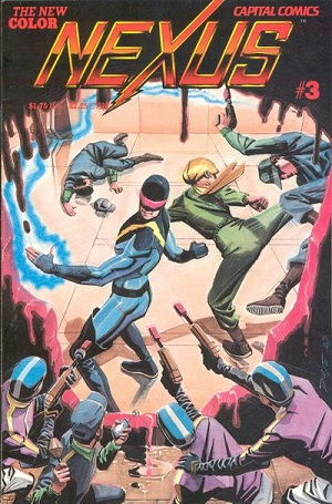
Nexus (Capital/First 1981-1991)
 I wrote about Nexus a few months back, on the occasion of a new (and, um, pretty overpriced for what you got) graphic novel. Despite that, the series has featured some remarkable and memorable work over the decades, primarily the the comic’s creators Mike Baron and Steve Rude.
Beginning with a three-issue run of a black and white magazine in 1981-2, Nexus continued as a color comic (with a new #1) in ’83. This was under the Capital Comics banner, but the series ended with #6 in 1984, moving to First Comics in ’85 and running ’til issue 80 in 1991. Mike Baron wrote pretty much everything, Rude drew primarily in the first half of the series, with an array of usually top-flight artists (like Paul Smith!) doing the rest of the work. Given the premise of the series (Nexus is compelled by dreams to find and execute mass-murderers) it seems like it would just wallow in darkness, but it remains energetic and fun and inventive pretty much through its entire existence.
Following First’s demise, Dark Horse picked up the property and issued a whole slew of mini-series, several by Baron and Rude, some by other creators (like 1992’s Nexus the Liberator). The ’90s also brought us intercompany crossovers teaming Nexus with Madman (and The Jam) and Magnus Robot Fighter.
There were also plenty of tie-in minis and one-shots featuring Nexus’s pals and gals, both from First and Dark Horse. Most notable were Next Nexus from First, the handful of Hammer of God minis from both companies (starring best pal Judah), Mezz: Galactic Tour 2494, and, of course, the Clonezone Special (issued by Dark Horse whilst Nexus was still at First, curiously enough — one can only presume First was too chicken to publish it).
Post-Dark Horse, there was a short run in the mid-2000s from “Rude Dude Productions,” reteaming Baron and Rude on the character. Also released was a collection of “Newspaper Strips” (which I think were a Kickstarter or subscription thing?). The 2010s version of Dark Horse Presents had some serialized stories. And then there was that recent graphic novel I linked to above.
If you’re trying to catch up on Nexus now, well, good luck friend as I think a lot of the books are out of print, but Wikipedia has a list of what’s been reprinted and how. Looks like the Omnibii are the way to go, all you have to do is find the darned things.
The first three magazine-sized issues were reprinted in a nice trade by First (sans the flexidisc from the third issue) at their original size, so I think that likely looks better than being shrunk down to comic-sized pages in the Archives/Omnibus books. But that’s just me, the guy with crummy eyes who wants larger pages to look at. There was also a standalone trade of Next Nexus, and there was a reprint series called Nexus Legends that presented the early color issues.
This was a good series, with a fleshed-out universe and interesting and unusual characters (and the occasional guest-appearance of that other Mike Baron character the Badger), and I sorta miss having a new issue of this to look forward to every month. Rude apparently has a new Nexus graphic novel on the way, and supposedly he’s also split with Baron, so…we’ll have two competing Nexus continuities, I guess? Well, I guess we’ll see what actually comes out.
If I were to recommend any Nexus, I’d say “start with the early stuff” and so long as Rude is drawing, you’re in for a good time. The first dozen or so color issues are, like, Peak Nexus, but there’s lots of good stuff elsewhere in the run. Ah heck, just read ’em all. Get those ominuses as you can!
Only two this time? Yes, sorry, the mind is able, but the flesh is…sleepy. Well, so’s my mind, while I’m thinking about it. Anyway, got to give it a rest tonight, and I’ll see you guys back here soon.


Another 2 titles I’m surprised only got 1 vote.
I recall enjoying The Elementals immensely when the series debuted… I don’t recall if I bought the complete run, of volume I however. I do know I never bought any issues after Volume I. At the time Willingham’s art seemed to be descended from the Michael Golden school of comic drawing (as did Butch Guice’s art early on). I wonder if Neal Adams was bummed out when Willingham’s series got published, as he had debuted the Urth 4 in Ms. Mystic
no. 2 a year or two prior to The Elementals, and it was basically the same concept–although, arguably, the Fantastic Four is fairly elemental based as well, what with The Thing (earth), and the Human Torch (fire)–and the Invisible Woman’s power set and lack of visibility makes her somewhat analogous to the element of air.
The Justice Machine was another really interesting series that had a lot of potential–it’s too bad that Mike Gustovich sold the rights.
I recently found Nexus no. 4 from the Capital Comics color run in a dollar box and really enjoyed it. It makes me want to track down as many of the Capital Comics issues as I can and maybe the early First Comics issues as well.
Oliver – look again at the first paragraph! These are the two-vote getters! Still not enough votes, frankly, but we’re workin’ on a small scale here!
NEXUS ONLY GOT 2 VOTES?
“and the Invisible Woman’s power set and lack of visibility makes her somewhat analogous to the element of air”
And Mr. Fantastic is the last element, rubber!
Wait a minute…
Actually, someone once explained how he IS one of the elements, but I can’t remember which one.
Snark Shark:
Well, if Stan Lee had used Namor instead of ripping off Plastic Man, the FF could have been The Elementals…or, Stan Lee could have just recycled Bill Everett’s other Golden Age character, Hydro Man, who could turn in to water and was probably in the public domain by 1961–as it is I think Marvel eventually did rip off the Hydro Man concept and name for a Spider-Man villain. Anyway, by stretching our imaginations, we can pretend that Reed Richards represented the element of water…at least in the Bruce Lee philosophical sense…
I know this is late, but a zero vote getter (plus me) should be BATS, AND CATS, and CADILLACS. Why did this exist? Did it? Always first on the independent comics inventory sheet.
I hope Great Mike will do a post on books he was surprised to get NO votes that should have. Wasn’t there a book called CODENAME: DANGER stamped over ACTION? (I never use the Google machine because I’m old and can get my say.)
Wayne Allen Sallee:
I agree with your proposal and would slightly modify it…I think Mike should let anybody who voted the first time be allowed to vote in a second round for any ’80s book that didn’t make the cut in round one. Again, one vote per person, but then we can really get into more obscure stuff and it could be a lot of fun.
And yes, there was a book called Codename: Danger. It lasted for about 4 issues and featured some Rich Buckler and Paul Smith art. It was published by David Singer, now deceased. He was the guy who was working for John Carbonaro, also now deceased. In a nutshell, Carbonaro had purchased the rights to the T.H.U.N.D.E.R. Agents from Tower Comics, which has gone defunct. Carbonaro had contact with Archie Comics and helped them get their Red Circle line up and running again in the early ‘8Os to bring back some of the classic Mighty Crusaders characters from the Silver Age and some MLJ characters from the ’40s that were a bit more obscure–to cash in in the ’80s independent comics wave. Rich Buckler was also part of this. Anyway, in exchange for Carbonaro doing some editing, Archie Comics agreed to publish some new T-Agents comics. Carbonaro hired David Singer, who apparently had gone to law school, as an assistant. After Archie Comics helped publish a handful of new T-Agents as well as reprint Hall of Fame T-Agents comics under the “JC Comics” banner (John Carbonaro Comics), Archie pulled the plug on superhero books, as they always do. Singer noticed that the first issue of T.H.U.N.D.E.R Agents published by Tower Comics in the ’60s wasn’t properly registered or copyrighted, so he figured he could pull a fast one and basically betrayed Carbonaro and began his own imprint, Deluxe Comics, and published Wally Wood’s T.H.U.N.D.E.R. Agents (presumably he also didn’t get permission from Wally Wood’s estate to use Wood’s name). At the time those comics were kind of a big deal as Singer paid top dollar to get George Perez, Dave Cockrum, Keith Giffen, Murphy Anderson, Steve Englehart, Steve Ditko, Jerry Ordway, Rich Buckler, and other creators to produce the books, and they were quite good. The series last for five issues, and ended in a cliffhanger where the T-Agents were going to fight the Codename: Action characters. Since Singer probably knew he would be sued by Carbonaro–and he was, and the litigation dragged on for years, but Carbonaro finally won and also acquired the rights to any T-Agents material that Singer had paid Perez et al to produce–Singer has a second comic imprint happening concurrently with Deluxe Comics, this imprint was called Lodestone Comics. Lodestone Comics managed to release a few titles in addition to Codename: Danger. There was a licensed Honeymooners one-shot, a Keith Giffen comic worth tracking down called The March Hare, I think it was a one shot as well. However, the best and most important comic that Lodestone released was Dave Cockrum’s Futurians, which lasted for three color and one black and white issue. That was a really fun comic. I can only guess that Singer offered Cockrum a really good deal early on, but it is too bad Cockrum didn’t go with Epic, Eclipse, or First Comics so that The Futurians would have had a better chance at higher distribution. Also a bit if a mystery as The Futurians made its debut as a Marvel Graphic Novel.
Sean: thanks for that info dump. Of course it was Buckler art, that’s why I liked it. Another book I could only get in Streator when we visited. I thought it was a cool book, but I think I only had three of the issues.
The Bookshelf in Streator had everything, the last block of Main Street. I bought those weird Frankenstein novels there, but the big deal was an entire wall of comics. All the Atlas books. (Well, of course, but I mean they bought enough to cover sales.) The b&w magazines, the first Giant-Size books from Marvel.
I went to the town with a friend a few years back and Main Street was bordered up for the most part.
Wayne Allen Sallee:
I think Rich Buckler is way underrated. Sure, he copied Jack Kirby and Neal Adams’ styles, but so what. He was versatile, and most of the comics he drew and the covers he designed looked good. I especially love the covers Buckler drew for DC Comics in the late ’70s. And his work on the Red Circle Archie superheroes was excellent.
As to a wall if Atlas books, I take it you mean Atlas Seaboard Comics from the mid-’70s?
That could be a whole new contest…we could each vote for our favorite Atlas Seaboard comic!
Sean: Remember Buckler on that Atlas comic where when they folded, he just renamed him and used him at Marvel? And I do think Buckler was underrated. If he had a specific writer on many projects (like Morrison/Quitely) maybe that would have helped. But that wasn’t the 80s. Did he work on Deathlok, some of the Marvel Team-Ups (where the hell is Woodgod?).
I have a friend who loves George Tuska. Mike sold me a copy of a digest-size Adventure comics that I gave to him. I’ll there are Buckler guys, too.
And, yes. Atlas/Seaboard. I was too young to notice the full title. But I loved that they ordered a lot and the owner had a tiny, tiny pull list (for people in Bloomington or Ottawa) and the owner just kept all the titlesagainst a wall. The place was octagon like in areas, so the comics were visible in back even from outside.
The only other place to buy comics/magazines/ etc., was the pool hall. You might recall my saying how, at the age of 15, I bought a copy of GIANT-SIzE THOR and it was next to the Penthouse books. The guy who ran the place even sold Cokes. Streator was where the relatives met up, 90 miles down I-55. We were poor they were poor and it was a meeting place. No one cared when I walked a mile down Illinois Street, ten bucks from an uncle kept me out of their hair all weekend.
YAY! Nexus – probably not the best indie comic of the decade, but my favorite!
As to Mister Fantastic:
Firstly – Mr. Fantastic/Reed is the element of AWESOME!
He’s not a rip off of Plastic Man, or Elongated Man. He is the perfection of the concept! Brains and elasticity – the perfect combo! :P
Secondly – How dare anyone suggest that Namor should have been his replacement!!!
Mrs. LouReedRichards has recently taken a liking to Namor, partly because she is gaga over Tenoch Huerta, and partly to irritate me. That fish faced f*ck has been trying to cuckold Reed for 61 years!!!
LouReedRichards:
Oh, boy! What wrath did I unleash! LOL!
I agree that Reed Richards is actually an awesome character…and I get the coolness of his stretch power being the equivalent of his formidable intellect…but, calling a spade a spade, Stan and Jack recycled Plastic Man + the Professor from Challengers of the Unknown to create Reed Richards. And don’t get me wrong, I enjoy Stan Lee’s writing, especially during the Silver Age of Marvel, but the vast majority of classic Marvel characters were really Jack Kirby and Steve Ditko’s creations…at least visually…and Stan recycled a hell of a lot of other people’s ideas and character concepts and character names which had fallen into the public domain or which had been Timely Comics characters from the ’40s that other people including Bill Everett, Carl Burgos, Paul Gustavson, and Simon & Kirby had created.
F.F. is a good case in point: Challengers of the Unknown + Plastic Man + Invisible Scarlet O’Neil (a 194Os syndicated newspaper comic strip) + Human Torch (recycled from Burgos’ original android creation) + Atlas Comics monster of the week for The Thing (although I think even Timely Comics had a character called Rock Man during the Golden Age). Notice that Stan did not bring back his Golden Age creation The Destroyer (although Roy Thomas eventually did). If we look at original X-Men, there’s some Doom Patrol DNA there… freaks vs. Mutants, The Chief vs. Professor X. Also, the Beast was in many ways Stan recycling the character Monk from Doc Savage’s crew–a hirsute, ape-looking genius; Cyclops’ power set and visor were a recycling of Jack Cole’s Golden Age character for MLJ/Archie Comics, The Comet; Angel is a recycling of the name of Paul Gustavson’s Golden Age Timely Comics character + Hawkman; Marvel Girl is pretty much similar to Saturn Girl from the Legion of Super Heroes; only Iceman is Stan actually recycling one of his own creations from the ’40s–Jack Frost. Spider-Man was based on Archie Comics’ character The Fly, which Simon and Kirby created, plus a pitch Jack had for a character he and Simon never used called The Silver Spider…and then Ditko created the amazing costume.
Anyway, I agree that it is better that Namor was not used as a FF member by Stan and Jack. As to the MCU Namor, I have not seen the film yet, but I am disappointed that they didn’t stick with Bill Everett’s original Namor origin and concept.
Wayne Allen Sallee:
Cool stories from your comic buying youth!
Yes, Rich Buckler created Demon Hunter–an interesting character which, unfortunately, only lasted for one issue at Atlas Seaboard…then Buckler recycled the character at Marvel as Devil-Slayer, and he recycled the character again as Bloodwing for his self-published one-shot Galaxia Magazine.
And yes, Buckler also created Deathlok, a great character. I agree that if Buckler had had a writer like Chris Claremont or Bill Mantlo to work with on an ongoing basis, he would probably be more appreciated these days. I think that he, and Dan Adkins (and later on Keith Giffen), got some flack for panel swiping in the ’70s… especially when he was the regular artist on Fantastic Four, and was imitating Kirby’s style.
When I interviewed Howard Chaykin some years back he said something to the effect of he thought in the early ’70s Buckler was one of the most talented artists of his generation, but I sensed an undercurrent that there was a feeling that Buckler had become an imitationist, and that had lowered his standing among his peers, perhaps. But I believe Buckler also brought a lot of other talented artists into the field, including George Perez, Denys Cowan, etc.
Anyway, The early issues of All-Star Squadron drawn by Buckler and inked by Jerry Ordway look gorgeous. Same thing for the first few Mighty Crusaders issues from the ’80s where Buckler is inked by Frank Giacoia…maybe he’s swiping some Neal Adams and Gil Kane poses, but the whole package looks great!
As to Atlas Seaboard, I recall that Martin Goodman’s grandson tried to revive the line a decade or so ago and released an issue or two of Wulf, Iron Jaw, Phoenix, and the Grim Ghost…but mist if then had really shoddy art…except I think Kelly Jones might had done a Grim Ghost cover. I think the smart play would have been to go for the nostalgia of the original line, print the stories on newsprint, like Alterna Comics does, and get Chaykin, Buckler (who was still alive then), Larry Hamma, Pat Broderick, etc. to come back and work on their characters.
Here’s a link all about Demon Hunter and his clones:
https://tombrevoort.com/2020/12/31/brand-echh-demon-hunter-1/
Sean: cool link, thanks. I’ll read it while I stay inside because of the Canadian wildfires. The sun in Burbank is pink and cars just disappear into the mist. The air is like sewage, not the usual wet hobo socks. But I still Covid masks. A lot of people do.
The Demon Hunter clones should all have been different in a subtle way. Scar over one eye, then a different scar on his chin when he was Devil-Slayer, and so forth.
At one of my book signings about five years back, I walked around a few dealer tables, and found a hardcover print novel of the Invisible Scarlet O’Neil. There are a few illustrations. Got it for $4.00 and the person who owned it at some point lived in Port Huron MI.
Did everyone call it Atlas Seaboard or am I the only dummy that just says Atlas?
“I think Marvel eventually did rip off the Hydro Man concept and name for a Spider-Man villain.”
Yes! He could turn into water!
Evntually he and Sandman got mixed up and created a big Mud-Monster.
“Demon Hunter”
Great cover! The interior art looks rushed.
“our favorite Atlas Seaboard comic”
The Destructor! He’s essentially a combo of Spider-Man & Daredevil, w/ the healing powers of Wolverine.
“I the only dummy that just says Atlas?”
I say Atlas, it’s just easier.
Wayne Allen Sallee:
A lot of people say Atlas, but because Martin Goodman had also changed Timely Comics to Atlas Comics by the 1950s, until it got rebranded yet again as Marvel Comics, it just avoids confusion to call Goodman’s 1970s imprint Atlas Seaboard…which only came about because once Goodman sold Marvel, Stan Lee got promoted while Martin’s son Chip did not.
Snark Shark:
Yes, The Destructor was one of Atlas Seaboard Comics better characters …the Steve Ditko and Wally Wood art was cool, too!
Re: Hydro Man, yes the original Golden Age Hydro Man created by Bill Everett could also turn to water…as could Fluidman from The Impossibles cartoons.
I read a G.A. Hydro Man story in a low grade Heroic Comics I bought a few years back …it was pretty good. The other feature was Man O’Connor Metal, who was basically Colossus thirty years before Colossus was created.
Anyway, whether it was due to Stan Lee or Martin Goodman or both, Silver and Bronze Age Marvel Comics was constantly recycling old public domain comics characters power sets and names…I wonder if Len Wein was aware of Man O’ Metal before he created Colossus?
@Sean
Ha! Yeah, all in good fun. I get that Reed started as pastiche. Like you said, so many of the great concepts are built off of previous material. I’ve always liked the elastic characters, it’s such a goofy power, but so much fun!
Namor was pretty cool* in Wakanda forever. Yeah, they didn’t go with the classic silver age interpretation, but they DID keep, and even play up the ankle wings. I thought for sure it’d be some magic shoe tech or something, but no, flappy little angel wings on his ankles – movie MAGIC. The film was…fine, just fine. The best part was seeing so many women of color in leading, heroic roles.
*If pressed, I’ll deny the comment. I’ll never understand what Sue sees in that guy. He doesn’t even have gray at his temples, and has probably never even smoked a pipe!
I too just call it Atlas. Atlas Seaboard sounds too much like a railroad company.
Buckler is a mixed bag for me. Some good stuff, some bad – mostly the Kirby rip-offs. He seemed better at drawing ordinary people and situations than a lot of other comics artists.
He had some good Solson comics about actually making comics, and drawing anatomy that were quite good. Certainly much better than the Burne Hogarth anatomy books which came at the perfect time in my life to screw me up for a good while.
LouReedRichards: Atlas Seaboard reminds me more of a surfing product, but now I’m waiting for AGENTS OF ATLAS SEABOARD. Run by David Hasselhoff.
With Buckler, its more like I’d like the good but realize he needed a consistent inker, as best Marvel could handle that back then. And I was in my teens and early 20s, I don’t know if I knew bad from really bad.
Not naming names, but how about that Tony Tallarico?
Wayne Allen Sallee:
It would actually be cool to see some of the Atlas Seaboard Comics characters in a team book…but it would be an offbeat team!
Marvel already has “Agents of Atlas” trademarked, though.
I think Buckler looked good inked by Joe Sinnott, Dan Adkins, Frank Giacoia, Joe Rubenstein Dick Giordano, Jerry Ordway, etc. Probably my all time favorite Buckler cover is (Bronze Age) Teen Titans no. 5O, when Titans East met Titans West.
Don’t hassle the Hoff!
@ Wayne Allen Sallee
I’d add John Tartagilone or “Tartag”*,and Mike Esposito as well. They were all pro’s no doubt, and they don’t need me taking cheap shots at them almost 50 years later, but I’ve never warmed to their inking style.
They may not have fit well with Marvel’s 70’s house style. Esposito’s inks over Andru on 60’s DC stuff is so much better than when they were on Spider-Man (IMHO).
Looking up Tartagilone, he did nice romance work in the 50’s and probably like Don Heck, was much better suited to a comics field not dominated by superheroes.
Oh, and OF COURSE Colletta, but that probably goes without saying.
* The Mikester made Joke about Tartag – the inker with a Klingon name! I think of that every time I see his name now. :)
@ LouReedRichards and Wayne Allen Sallee
I actually got a Charlton Blue Beetle comic in trade A few months back…I think it was no. 35…a wild story where Dan Garrett Blue Beetle is fighting sine preying mantis dude. Anyway, Tony Tallarico either drew it or inked it, and his art is very Atomic Age or early Silver Age …kinda an acquired taste.. just like Paul Reinman on Mighty Crusaders or Manny Stallman on Raven (of the T.H.U.N.D.E.R. Agents) stories.
As to underrated inkers, I like Dave Hunt, Bob Smith, Larry Mahlstadt, Bruce Patterson, Sam Grainger, Al Gordon, Steve Leialoha, and Willie Blyberg’s inking styles quite a bit.
And top tier inkers would include Joe Sinnott, Mike Royer, Wally Wood, Dick Giordano, Tom Palmer, Frank Giacoia, Terry Austin, Klaus Janson, and Bob Layton.
Re: MCU Namor, I should reserve judgement until I see the film, and I agree that it is cool that it was a female-lead cast with great roles for the Wakandan women, it’s just that I would have liked Namor to be more comic accurate, as Namor McKenzie, a half-Atlantean and half-human antihero dating back to the late 1930s. Also, I don’t recall the actor’s name, but I believe he was Japanese-American, and before Namor was finally cast, this actor’s face was on various fan casting sights…anyway,except for the ears, this guy really looked amazingly like Silver Age/Bronze Age comics-accurate Namor, with arched eyebrows, high cheekbones, the whole nine yards.
Maybe at some point the MCU will do an alternate Earth take on the Invaders set during WWII, with Cap, the Torch, Namor, Ms. America, The Whizzer, Union Jack, Spitfire, Bucky, Toro, etc. That’s a film I’d like to see.
Lastly, LouReedRichards, would your rock ‘n’ roll superteam be called The Fantastic Underground or The Velvet Four…?
Sean: I was thinking more on Tallarico working on the Dell Draculas an Frankensteins.
Yea, the preying mantis guy. It saddens me that the last “villain” Dan Garrett fought was The Living Mummy Who Would Not Stay Dead.
@Wayne Allen Sallee
I looked it up, he’s called “Praying Mantis-Man” …he looks a lot like a Space Ghost villain.
Do you have a complete run of the 1964-65 Dan Garrett Blue Beetle comics that Charlton published?
Are you planning on seeing the Blue Beetle movie in case there are any Dan Garrett or Ted Kord cameos? The trailer looks pretty decent.
I’ve never read the Dell Frankenstein or Dracula comics…I should probably track them down.
Have you heard that Don Simpson is doing his own self-published comic using public domain Golden Age characters, mainly from Victor Fox Publications? It’s called “Victory Folks.”
Sean:yep, can’t forget that hyphen, considering the craziness of the mummy title. Never understood that as a kid. Maybe he was Charlton’s version of Hellgrammite.
I have all the Dan Garret appearances, and a few of the Ted Kords, Mysterious Suspense, Captain Atoms and others. (I bought both Charlton Action Heroes archives at a garage sale for ten bucks each. Biting my tongue to not blurt out that I wanted to pay more.)
Those Dell books are crazy. WEREWOLF was a secret agent…with a wolf! FRANK N. STONE was related to someone in the family and when he fought, only his head was green, he had a white beach bum haircut, and wore a red jumpsuit. Interestingly, both titles started with really decent adaptations of THE WOLF MAN and FRANKENSTEIN. No Dracula but CRATURE FROM THE BLACK LAGOON.
You’ll love DRACULA. It ran seven issues, but 5, 6, and 7 were reprints of 1, 2, and 3. Cream-colored backgrounds on the reprints. #4 introduced Bat-Girl (or close). Yes, he wore a purple onesie in true-Tallarico way (throwing him love) with a sort of wrap around thing covering his pointy ears, red covering the purple. These were comics I got from the “Machine” where you put in your 12 cents and hoped more than one comic would slide out. Someone old like Mike would know about these. We had them in Fairway and Zayre.
Send me an email so I’ll have yours. I’m jonalgiers@att.net, anyone can find it on my website so I’m not worried about stalkers. I’ll line up a few books at a time and attach photos. I’ll do the same with the Golden Age BBs. I might take them out and reread them (the Dells) once our air quality improves.
Put something in the subject like KOOOOOOBA!
Confusion. There was a CREATURE adaptation but NOT one for Dracula. Victory Folks sounds neat. There was a comic in the 90s, MONGREL, that disappeared on a cliffhanger. The original artist, Andrew Kudelka, lives near me. They had put together a Kickstarter page and I wrote a short story, they finished the comic, and then there were special covers, some hardback, some with a glow in the dark moon.
I’d forgotten about that. Maybe this would be a good way to get Public Domain Team-Up finally in print.
And I’ll say it, again .Why GA BB I’ll never know. My tombstone.
“Yes, The Destructor was one of Atlas Seaboard Comics better characters …the Steve Ditko and Wally Wood art was cool, too!”
Very much so! With writing from the great Archie Goodwin.
“and before Namor was finally cast, this actor’s face was on various fan casting sights…anyway, except for the ears, this guy really looked amazingly like Silver Age/Bronze Age comics-accurate Namor, with arched eyebrows, high cheekbones,”
So Leonard Nimoy when he was young would have been perfect casting!
@Snark Shark
Yeah, Nimoy might have been a decent Namor in the ’60s…just modify the hairstyle a bit and give him ankle wings…and Shatner as Reed Richards…?
And, yes, Archie Goodwin was a top writer!
@ Wayne Allen Sallee
Interesting, I had never heard of comics vending machines before, but I guess it makes sense, as long as the person getting the comic doesn’t care about dented corners, spine ticks, and whatnot.
The Dell monster superheroes comics sound like a hoot. I did pick up through Mike about a month ago a copy of the Dell Super-Heroes comic from the ’60s featuring The Fab 4 (not The Beatles)…kinda generic Teen Titans and X-Men-knock off characters, but a fun read.
Pretty cool to have a good run of Charlton Dan Garrett Blue Beetle books, even if the art and writing are borderline absurd…even still those are getting more difficult to find.
I’m a fan of most of those you mentioned as underrated. Esp. Gordon and Leialoha.
I’m one of the few who just does’t care for Janson’s work. I like the first few years at Marvel working over Kane and Colan quite a bit, but after that, not so much.
I think “The Velvet Four” has a nice ring to it. Thanks for the suggestion!
I can understand that Janson’s inking style isn’t for everybody, as he tends to “Jansonize” the penciller’s drawings…kinda like how Alfredo Alcala and Tony DeZuniga as inkers will really make the penciller’s drawings look like Alcala and DeZuniga’s styles, respectively. But, yeah, Janson gave a look of continuity to Daredevil for a long time during the late Bronze Age as he inked over Gil Kane, Carmine Infantino, and, of course, Frank Miller’s pencils.
I think it was interesting to see Janson transition to penciller and inker and liked his capacity on both duties on Daredevil…there was also a DC Comics Presents that Janson did the art on, featuring Superman and Adam Strange, that I quite enjoyed. Then there is his Punisher stint…and St. George…
Sean: Follow up Kooba email later. Find a vending machine on Google images. Ours were blue.I have cerebral palsy, as you know, so those books had Wayne Wear-N-Tear TM right away. The cool thing was that sometims tow (or even three!) books would fall out, if it was three you might have to nudge it.
But it was all randomness. Three books, but Spider-Man Little Lotta and some other late 60s book.
Then the Blackest Night day when it wasn’t a dime and two pennies, it was a dime and a nickel! First issue of Adventure with Supergirl after the LSH ended.
I still say we can do a Public Domain Team-Up. Have any of you guys seen the Super-Team Family blog? Great teams and some good puns for titles.
@Wayne
Yes, I have seen the Super-Team Family Blog. There are definitely some clever imaginary team ups there.
Have you seen SHAM comics from Source Point Press? The guy that does that essentially “remixes” Golden Age Public Domain comics art with new word bubbles filled with ironic and snarky comments…it is pretty fun.
I think it could be cool to do a similar idea of crossing over Golden Age Public Domain characters with a cut and paste approach, where The Flame could meet the Black Terror, or whoever, by actually lifting panels from various comics, maybe doing a bit of lightboxing, and changing the contents of the word bubbles…but trying to make the art look authentically 1940s…not too slick or modern. If you wanted to use Blue Beetle, I’d switch out the name so there aren’t hassles with DC.
“I can understand that Janson’s inking style isn’t for everybody, as he tends to “Jansonize” the penciller’s drawings…kinda like how Alfredo Alcala and Tony DeZuniga as inkers will really make the penciller’s drawings look like Alcala and DeZuniga’s styles, respectively.”
Janson fits GREAT with other artists hwho have a “squared-off style”, like Miller. i don’t think he’d work so well for those who draw more “rounded-off”, like Kevin Maguire & John Bryne.
@Snark Shark
Agreed that Janson’s inking wouldn’t complement the drawing style of Byrne or Maguire all that well. I think it was interesting to see Janson inking Giffen on some old Defenders comics…although Mike Royer was a better inking fit for Giffen’s Kirbyesque style at that time. It was also interesting to see how different Sal Buscema’s art looked when Janson inked it.