Just a random Groo quote in the middle of this post about a Fantastic Four comic.
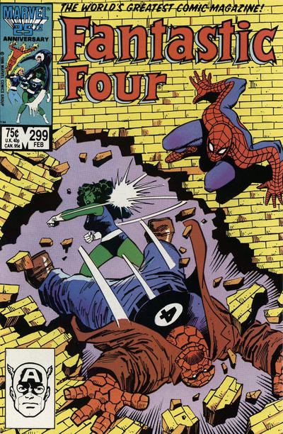
So as huge Fantastic Four fans, as I’m certain most of you are, you’re probably familiar with this cover for issue #299 from 1987, with cover art by John and Sal Bucsema:
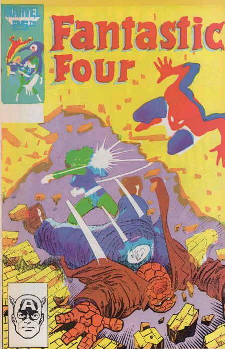
Well, imagine my surprise when former boss Ralph turned up this copy from parts unknown:
And here’s the back cover:
As any fool can plainly see (“I can plainly see that!”) at some point during the printing process whatever applies the black ink to the cover went awry, leaving this odd coloring on the covers (though some black ink did make it onto the bottom quarter of the front). I’ve never really looked into the actual printing process involves lots of big and heavy machinery, very fast-moving parts, and probably elves, so I’m not sure what exactly happened to cause this. I mean, “the black plate was jostled” is probably the best you’ll get out of me, and I don’t even know exactly what that means or even if I’m saying it right. Anyway, I need to look into that side of things a little more deeply, is what I’m saying.
Regardless of my printing ignorance, this is a weird example of this particular comic, one that neither Ralph nor I had seen before. I imagine it probably had to survive quality control at the printer, not being spotted as “defective” at the distribution level, somehow getting past the Direct Market retailer and not getting tagged as a damage to be reported, and actually selling to someone who didn’t care that the cover was misprinted. That’s assuming the retailer didn’t pull it out of the stack and mark it “RARE HOT VARIANT” and sell it at a premium from the get-go.
But here it is, existing in my shop (and already spoken for, so no offers please!), an apparently unique item. I’m sure it can’t be the only one who made it out of the printers/etc. alive…but there’s a chance it could be. Isn’t that neat?
I’ve added this entry to my “variants” category as part of the long-running (though recently resting) series of posts I’ve been calling “Variant Cover-Age” because I think I’m clever. And it is, technically, a variant, in that it differs in a significant visual fashion from the other copies of the same book. Sort of like these error variants of the first Venom mini-series. But it’s not a purposeful one, like Marvel sent someone to the printer and had him kick out the giant Black Ink tube at an opportune time.
But it’s neat, I don’t think there’s any confusion on that point. Let’s take a look at some details from this cover, such as the corner box with the creepy Faceless Four:
I’m sure someone at some point did a She-Hulk image that looked like this on purpose…it’s pretty cool, actually:

And introducing Spidey’s new costume! Artists everywhere rejoice over not having to draw those damn webs:
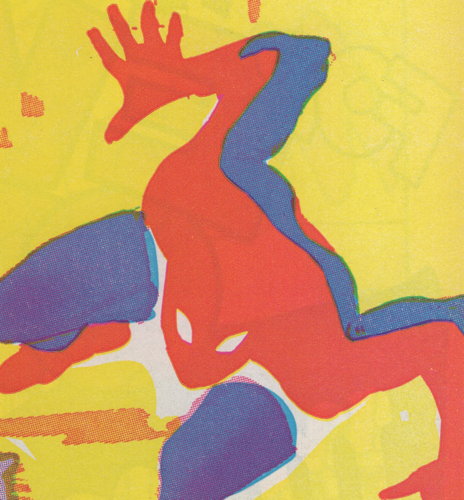
Also, that’s totally a diaper.
So, my ProgRuin Army, if you spot another of these out the wild, or a similarly-afflicted comic, please let me know! I’m sort of interested as to how many just outright obviously-misprinted-like-this-FF comics are out there. …Oh, wait, I just thought of Superboy #0 from the 1990s. I’ll get into that hopefully soon!


There’s a bit in Scott McCloud’s Understanding Comics where he talks about the way Marvel used colour as visual shorthand so purple-and-green equals the Hulk, for instance. This cover sums that up remarkably: Spidey’s just red-and-blue shapes, but it couldn’t be anyone else.
Wow! Cool find!
That Fantastic Four error cover makes me think of some of the early Pop Art paintings–like Andy Warhol’s Popeye (1961) screenprint where part of the image is purposefully dropped out –but you still know it’s Popeye, just like you know it’s Spidey on the FF cover.
(see link below):
https://www.artimage.org.uk/6128/andy-warhol/popeye–1961
The purple and green color scheme was generally used as a visual shorthand for villains: Green Goblin, Skrulls, Diablo, Mysterio, Lex Luthor, The Joker, etc. –maybe for anti-heroes as well in The Hulk’s case.
That’s really cool!
I own a similarly misprinted comic from around the sane time. I have one of the Bill Mantlo / Jim Lee issues of Alpha Flight where 4 of the interior pages have the black ink run out in the center of the page, so that the left side is full line-art-with color like normal; in the center, the linework and lettering fades out to a ghostly grey; and the right hand side are just free-floating blobs of color with no text. It’s… really kind of beautiful.
One of the 4 pages is the letter column, which is mostly black ink / text, so it has the effect of fanboys chattering and someone turning the volume down on them to mute.
I’d have to dig the comic out (and I don’t have a lot of free time at the moment), but when I get a chance I’ll take some pics and figure out a way to share them.
She-Hulk looks like The Leader on that error cover.
https://recalledcomics.com/Spawn1Error.php
https://www.ebay.com/itm/394131085982
Mike, have you or Ralph ever encountered a printing error copy of Fantastic Four no. 110?
With purple outfits–and a green Thing– the team looks like an evil version of the FF from another Earth…or…”The Challengers of the Fantastic”!
https://recalledcomics.com/FantasticFour110GreenPrintingError.php
I love that Shulkie is knocking Ben into a world of sharper definition.
Neat!
That FF #110 misprint reminds me (in a good way) of the coloring in the groovy new Alex Ross FF hardcover.
Chris G. —
I see what you mean…the coloring is kind of psychedelic or like a blacklight poster. I need to check out that Alex Ross FF graphic novel.
This was my first real attempt at reading Fantastic Four. And yet, I kind of feel like I know the characters, at least on a basic, shallow level.