If only it were cheap enough to put logos/UPCs/prices on an acetate overlay and leave the artwork alone for every comic.
So I’ve been processing a lot of back issues lately, as I’ve had several collections (or several boxes from the same collection, in some cases) showing up at the shop. And as I do so, I’m flipping through books and checking conditions and making sure there are no missing pages and such, where occasionally I’ll find an image that amuses me. Out comes the phone, a picture is snapped, and I’ll throw it on Twitter or Instagram or whathaveyou.
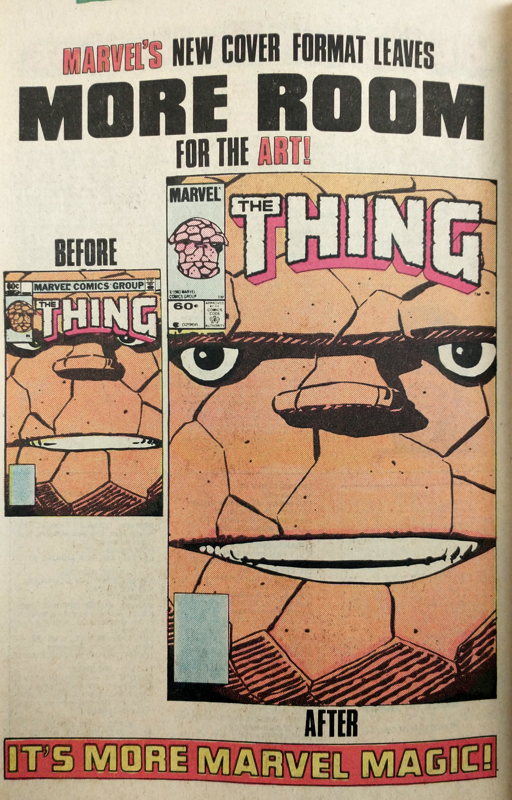
Above is one of the pics that struck me, mostly in the ol’ nostalgia bone as I remember seeing that particular house ad in comics I was reading in the early 1980s. Specially 1983, and I think I saw it in the actual Thing series, and I presume the ad ran elsewhere but it was in The Thing where I’ve only seen it. I’m sure one of you kind folks out there will more early ’80s Marvels under your belt will let me know.
As I said when I posted this pic on Twitter, I was amused by the crosseyed, slightly-annoyed Blushin’ Ben Grimm in the smaller cover on the left, logo pushed down low on his brow. Also I wanted to note that it was a shame the actual image in the larger “more room” design was never used for a real cover. What a cheery face to have starring back at you from the racks.
Of course over the years Marvel found new ways to encroach on the available cover image space:
…including going back to the retro banner briefly in the late-ish ’90s:
But for the most part nothing was as bad as this early ’80s favorite:

I’m sure worst examples can be pulled from comics history, but boy that bicycle ad sure annoyed me as a kid.
Worse still is
…but I’ve already gone on about that.


Shouldn’t his eyes be blue! Outrageous!!!!
I remember seeing that Thing ad as a kid and thinking, “Why weren’t they doing that all along?” And yes, the bicycle ads in the most inappropriate possible place galled me to no end (and kind of still do). Look how smooshed poor Kitty is!
There’s a comment on that linked Action Comics post that predicted the end of the New 52 with Justice League 52, which I believe was in fact the last of the New 52 issues. Johns always has trouble with deadlines, plus there was some issue that resulted In the stories that were solicited for JL 51 & 52 being switched which resulted in these being delayed.
Mike, do your memories match mine on this?
The cover encroachment that bothered me the most was on X-Men #137.
The cover of such a heartbreaking comic is no place for a weird sweepstakes banner.
— MrJM
I have to say that I thought the X-Men 151 cover was planned for use with that banner – which doesnt mean I think ads should be on covers, just that they knew it was coming and the art works well.
Of course we’ve also moved from buyers only seeing the top third of a cover (without pulling it out to look at it) to most buyers buying in advance without seeing the real cover at all.
John Maurer: You recollections are correct; Justice League #51 & #52 came out in June 2016—the same month that Rebirth was starting in other titles—due to lateness, and did indeed have their contents switched from their original solicitations. I detailed this somewhat at https://www.comicsbeat.com/dc-comics-month-to-month-sales-june-2016-this-comics-publisher-relaunches-their-super-hero-line-for-the-second-time-in-just-five-years-you-wont-believe-what-happens-next/
I assume the “bikes at the top” cover ads were a trial of some sort. Maybe to see what advertisers would pay and/or what readers would put up with?
In any case, I agree it’s too bad one of them marred the cover of Uncanny #137. I have to think it cost a pretty penny, though.
One cover ad I remember was the banner for the Green Lantern movie splashed over the top of the Vertigo one-shot Strange Adventures #1. I know it was on other Vertigo series like House of Mystery and iZombie, but I remember Strange Adventures because I specifically avoided buying the comic because of the banner. Nobody buying Vertigo Comics that didn’t know about the Green Lantern movie was going to go see it because of that banner.
In general, I think the biggest cover error recent series have done is putting the logo on the bottom (especially when they haven’t told the artist they plan on doing that…)