Look, I did my best to avoid spoilers.
So there I was, reading Saga of the Swamp Thing #21 via the DC Universe streaming service app, as one does. And I gotta say, those pages look pretty good on a 50-inch hi-def TV…the colors really pop, the linework is nice and clear, it looks great even to my aging eyes.
But as previously established, there I was, reading that issue, when I noticed something a little unusual about this panel:
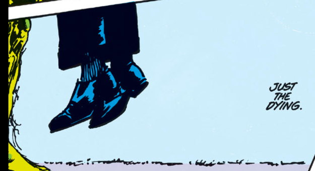
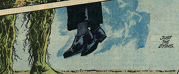
“Hold on,” I said to myself, out loud, like a character in a comic book,”those feet are missing the ‘color hold’ images representing the kicking of the feet as [REDACTED] suffocates in [ALSO REDACTED]’s mossy chest,” which you can see here in the printed original:from late ’83/early ’84:
I noticed another color-held image earlier in the book made it through to the digital version fine, but just thought this was a Thing of Note™. Still, nice to see the art all blown up big ‘n’ stuff.
EDIT: As per BobH’s comment…yes, the online version of #24 does leave out the last line from the last page.


Also, why are [ALSO REDACTED]’s legs yellow?
So did the trade paperback editions include the color hold images? I recall they redid and updated the color on a lot of TPB reprints.
I’d check my own copies, but they’re in storage.
The prospect of reading comics on my TV is quite appealing. Looks like I’ll be subscribing once the Fire TV app is up and running.
While the novelty of being able to read a comic on your TV is great, the original – with its grain, mood and detail – looks so much better to my eyes.
I assume the final line of script from #24 is still missing as well?
Any bets on if the Absolute edition next year will fix these mistakes and finally put out an edition with all the words and all the artwork in the correct order?
The Absolute Edition in the December solicits notes that it’s going to be “completely recolored.” Which makes me nervous, in particular since they haven’t said who would be doing those colors. Though I’m not as attached to these comics as the rest of you I thought Tatjana Wood was a crucial contributor and don’t like the idea of erasing her.
Yeah, this is the reason I used to study everything page by page for Marvel’s trade department before they even mocked up the book – I would inform them in advance which pages needed colour holds.
@Hugh: Same here. I much prefer a dotty background to a solid color background. It gives off more of a mood. Also, the reprinted version should be darker.
@Thom H. and Hugh Sheridan:
I completely agree. It also looks like the recolored version has a lot of drop out of the thinner lines, it’s looks a lot “chunkier”.
The original looks so much better.