I’ve been thinking about these panels ever since I first came across them a few days ago.
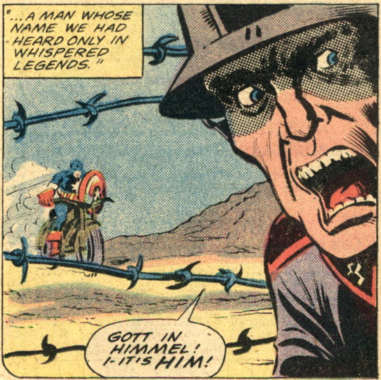
From Captain America #237 (December 1979) by Chris Claremont, Roger McKenzie, Sal Buscema, and Don Perlin…here’s a great panel transition aided by some timely (heh) and gratuitous logo insertion:
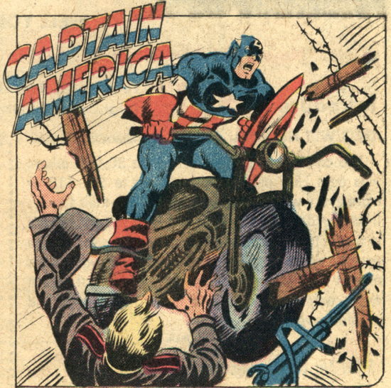
Nazis…YOU’VE JUST BEEN CAPTAIN AMERICA-ED.
Seems like we don’t see the ol’ “character logo inserted into dialogue/captions” as much as we used to. Yeah, the recent issue of Action has the Superman “S” as a graphic element in Clark’s caption boxes, but that’s not the same as him shouting “THIS IS A JOB FOR SUPERMAN” and the “Superman” in the word balloon is represented by the actual Superman logo.
Then again, maybe I’m just not reading the right comics. Anyone else spotted any in-dialogue use of superhero logo iconography lately? …There’s a question you probably don’t get asked often enough.


Did anyone ever show a motorcyle going over (or through) barbed wire before Steve McQueen did it in The Great Escape?
Odd coincidence.
I’ve lately been seeing more logo-in-text placement in books recently (but I honestly don’t recall where… DEADPOOL stuff?) And I keep thinking that while it’s a neat bit of fun, that it tears me out of the book ok reading.
Sounds effect graphic lettering too.
I like then well enough; especially if well handled, but they are a comic trope that simply remind me that the story & world in which I am immersing myself is, yup, just a comic book.
I’m no fun.
But Damn…looking at those panels…This is a nice usage of the technique.
The Cap logo is breaking the panel borders and makes him larger than life and the fence-breaking, Nazi-plowing entrance more dynamic.
Maybe because it’s more of a heralding announcement and clever graphic design usage and less logo-in-word-bubble?
Damn, comics…why are you so able to make me feel contradictory to myself.
Then…
KOREA!
In addition to the fun/funny logo stuff you noted, that’s also just a great issue, too. The flashback to WWII is handled really well and has weight beyond the fun of seeing Cap smack around Nazis. In the present-day section, it sets up the Steve-Rogers-as-artist narrative that will be in place for several years (until the Gruenwald run inexplicably jettisons it in favor of having Cap drive around the country in a van). It’s the first appearance of a lot of great supporting characters, too, who will become important in J.M. DeMatteis’s great run on the character (including landlord Anna Kappelbaum and eventual Steve Rogers girlfriend Bernie Rosenthal).
Good stuff, is what I’m saying.
I think the barbed wire would just tangle up, rather than get smashed right through!