Sometimes you just need to appreciate a nice West Coast Avengers cover.
Like this one:
Whenever I come across it, it certainly stands out from the other covers in the series around it, most of which (at least early in the run) are very much in the “let’s cram in everybody however we can” style.
While the crowd-scene covers from West Coast Avengers seemed to be more…utilitarian than artistic, some covers could have benefited from a little more artsiness:
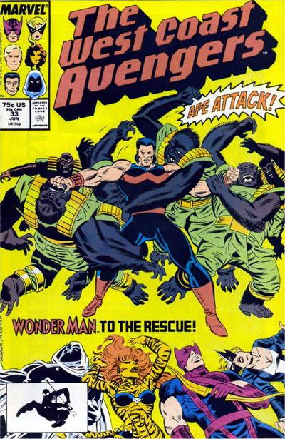
…especially if you’ve got gorillas in the midst of your funnybook image. Wonder Man fighting an ape army totally should have been the full cover image, particularly as the fallen West Coasters just look like they’re floating in the aether, there. The bright-yellow aether, as, you know, aether tends to be. But regardless, the “bodies” are a big distraction and take space away from apes, and when you got apes on your cover, you want to take full advantage of them.
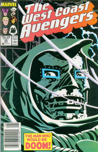
And then there’s this cover:
GAH.


That was the problem with WCA for far too long, the decidedly pedestrian art of Al Milgrom, who as an artist made a good editor…
Doom with a poo-eatin’ grin is always a terrifying thing.
“How did he get that mask to…smile?”
“Don’t ask! RUN!”
I like that Doctor Doom cover a lot. It looks like those old-timey Halloween decorations. Nice!
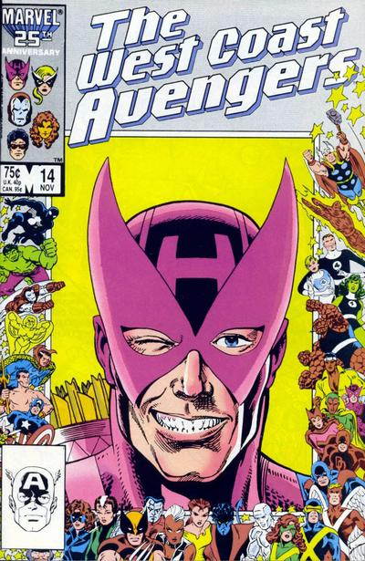
That Hawkeye cover needs the caption, “Ladies…”
The Doom cover, strangely, needs the same caption.
Man, this makes me want an Essential West Coast Avengers volume real bad! Living Lightning is the Eternal Flame of Superhero B-Teams everywhere.
I’ve always liked Milgrom’s art but unfortunately Mike Machlan wasn’t the best inker for him. My favorite “bad” cover from this period had to be issue #25 with this ludicrous Wonder Man & Abomination fight scene. Do we all agree that Wondy’s green, yellow & red costume was the worst design ever?