Look what I smurfed.
It’s only fair that, since I slagged the typeface in the new Smurfs books so hard, I point out when they did something with the lettering that made me laugh.
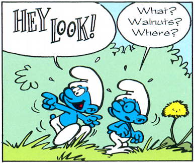
So here’s this, from The Purple Smurfs:
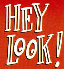
And let’s compare that “Hey Look!” to the logo on this collection of Harvey Kurtzman’s classic comic strip of the same name:
A closer look at the logo:
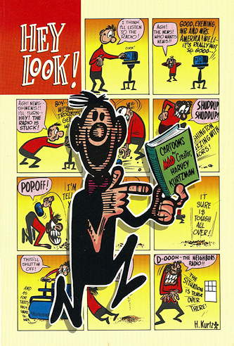
And just for the heck of it, here are a couple of samples of the Kurtzman strip, with some variations on that logo.
Now, I have no idea if this little tribute to Kurtzman is new to this volume, and/or if it’s something that everyone knows about and I, Captain Obvious, am pointing out (which I have a history of doing), but I’m putting it out there anyway. So there. Plus, I Googled it and didn’t see anything about it. Well, sorta Googled it. Skimmed a couple of pages of results, anyway.
In conclusion: Smurfs – I have, won’t you?
Speaking of the Googling, in regards to the title of a post of mine from a couple of days ago…I appear to be the #2 Google result for Teaser and the Blacksmith (if the search terms are enclosed in quotes, that is).
And folks thought I’d never amount to anything.


Smurfs – I have, won’t you?
No. No I won’t.
Interesting that you pointed out the similarity in the two fonts. I was paying too much attention to the font that was MISSING. There was a curious absence of noise in the second book The Magic Flute where Oily knocked on Peewit’s door, and all we saw were lines, and no “Nok, Nok”s.
I’ll probably do a post about them once my sister returns them, and I can find the French originals for comparision.