Or maybe I worry too much.
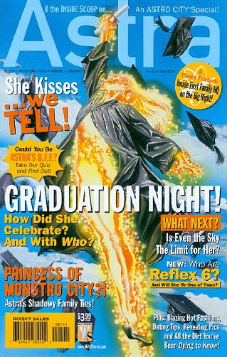
Now I really do enjoy this series, but for a title with a reputation of sporadic publishing, and whose fans therefore don’t expect to see it on the rack on a regular basis, having the cover of your book look like this:

…is just making it more difficult for readers to spot that this is the Astro City funnybook they like so much when scanning the rack. We corrected for this at the shop by putting a sign on shelf identifying the comic, which seemed to help. But placing the title on the cover in small print in the upper right hand corner, among a bunch of blurbs of various typefaces and sizes…well, the “Where’s Waldo” approach to logo recognition is not one I’d recommend.
At least the title still begins with “ASTR” so that, for stores racking their books alphabetically, it’s in the same place in relation to other titles. And it’s really not that big of a deal. But even so, the fewer barriers between a book and a reader picking it up, the better.
In other news:
- When pal Dana isn’t terrifying me with links to appalling cosplay outfits, she’s updating her site with new content, finally. Here’s a post about her fellow college students reacting to comics in class, and here she is taking on Marvel Halloween costumes for the ladies.
- Kevin Church has been a busy chap lately, what with a new strip for She Died in Terrebonne (with artist T.J. Kirsch) and the launch of The Loneliest Astronauts (with Ming Doyle). The man writes good comics, and gets good artists to draw ’em. (And of course, don’t forget The Rack, inflicted upon the world with his pal Benjamin Birdie.)
- Polite Scott has the most horrifying image in the history of comics.
- …Though these panels posted by pal Andrew are pretty close.
And speaking of pal Andrew, he’s beginning his Halloween countdown, so keep that link bookmarked!


