"Look out, world!"
So for whatever reason, we were discussing at work the point in Wonder Woman’s history when her chest emblem changed from the eagle’s wings to the more marketable and copyrightable double-W design. That happened here, in issue #288 of Wonder Woman (Feb 1982)…well, actually, it happens in a preview insert in DC Comics Presents #41 and continues into this issue of the Wonder Woman series proper:
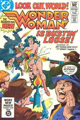
“Wonder Woman is bustin’ loose!” is sorta unfortunate phrasing, given the part of the costume that’s changed. And it seems odd that the new costume’s introduction occured in a preview insert in a Superman team-up book….well, except for the fact that the team-up book’s sales probably were much higher than the then-traditionally poor-selling Wonder Woman.
The panel of the actual hand-off of the new costume, though a bit more sizable in the preview, is squeezed into the bottom corner of one of the pages:
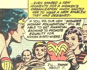
The Wonder Woman Foundation, as most of you already know but I mention here since the person I was talking about this with at the shop didn’t, was a real world charitable organization backed by DC and its parent company Warner Brothers. I tried to find some info online through a little Googling, but mostly found just brief references to it. Pro comics letterer Todd Klein mentioned that the Foundation was very shortlived, and this cataloging of Gloria Steinem’s papers features a brief description of the Foundation near the bottom of the page, noting that the few papers Steinem had relating to the Foundation mostly related to awards ceremonies. (Also noted is that this college also has more Foundation paperwork, but it’s not available for examination at this time.)
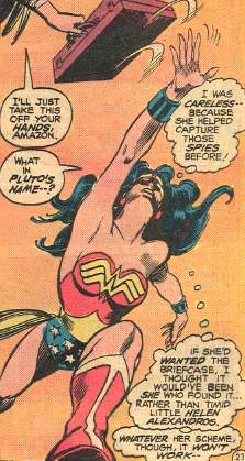
As to the comic itself…Gene Colan was the artist for this issue, and he struck me as an odd choice for the Wonder Woman book…he tends to strike me as an odd choice for a superhero book, given his style is more suited to dark, moody, and mysterious settings and characters, rather than slick, streamlined superbeings in skintight suits. And yes, I’m aware he’s done some classic superhero work…I did recently note my appreciation of this series, after all. And he was a good match for Batman. But Wonder Woman? Feels like an odd choice, with the occasional strange-looking panel:
But I do still love Colan’s art, as occasionally quirky as it may be, and as occasionally oddly suited it may be for a particular assignment. As noted in Les Daniels’ book Wonder Woman: The Complete History, then-WW writer Roy Thomas recalled that Colan had to remember to draw full, clearly visible shots of Wonder Woman to show off the new logo, rather than leaving her or her costume obscured in shadow. But shadowy art or not, Colan still did a nice art job on Wonder Woman, if not in a style one would normally expect for this title.
And Wonder Woman may be all about female power, there’s still a little something for the lads in this issue…by which I mean “shower scene:”
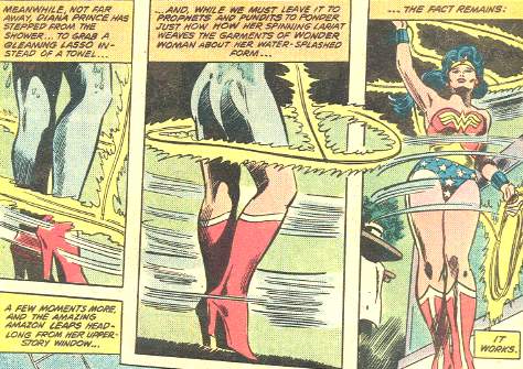
I do like that Thomas goes out of his way to explain that, hey, it’s magic, that’s how Wonder Woman’s costume just appears. I think the phrase “we must leave it to prophets and pundits to ponder just how how [sic] her spinning lariat weaves the garments” is overstating it a little. “Prophets?”
And in conclusion, I love this guy from the cover:
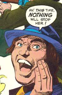
Now that’s a face with character. No one does ’em like Mr. Colan.
By the way, that Todd Klein link includes further discussion of the WW emblem transition, including a page from DCCP #41 with the logo handoff.


