FRECKLE WATCH 2007.
- Death of the New Gods #1 sold remarkably well, selling through all our copies by Thursday afternoon. I haven’t been looking ’round the internet at reactions to the series, but I imagine folks aren’t responding well to Off-Model Jimmy Olsen:
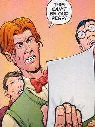
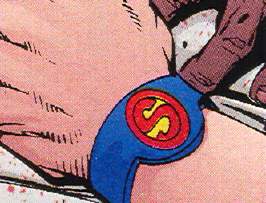
WHERE ARE THE FRECKLES, MAN?And is this really what Jimmy’s Superman Signal Watch looks like? C’mon:
Actually, none of this bothers me…well, maybe the freckles thing…as I’m just glad we’ve got Jim Starlin writing and drawing the New Gods. If I can’t have Kirby, and I can’t have Simonson, this’ll do. It’s a little odd, in that off-kilter Starlin manner, but entertaining.Oh, and the “retailer incentive” variant covers we received all have heavy dirt scuffs along the spine. Swell.
- Superman: Bottle City of Kandor trade paperback – cover by DC Direct merchandise, apparently. Soon as Employee Aaron saw this cover, he pointed it out to me and said “Is…is that an action figure in the background?” And, yea, verily it was.
Cover aside, this is another great collection of Silver Age ‘n’ ’70s Superman weirdness, culminating in the story with one of the greatest titles for a Superman story ever: “Let My People Grow!”
And, if I may self-link, I addressed not long ago the questions about Kandor that DC Comics DARE NOT ANSWER.
- Clean Cartoonists, Dirty Drawings was a hoot to flip through. Some of the illustrations came as no surprise…yeah, Wally Wood drew all kinds of filth (and his “Disneyland Memorial Orgy” is included) and Steve Ditko’s fetish stuff is represented, but Superman co-creator Joe Shuster? Charles Schulz? And Jack Kirby? Though Kirby’s pages are more “upsetting” than “dirty,” like walking in on your grandfather while he’s putting on his ballgag.
There is a generous preview of the book on the official site allowing you to flip through a large number of the pages at reduced size.
Oh, and Not Safe for Work, in case you couldn’t guess.
- Archaic #10 – actually came in last week, but we got in a reorder because it was drawn by one of our customers, Weshoyot, and we all like Weshoyot.
- Marvel Zombies 2 #1 – I’ve no beef with the Marvel Zombies comic in and of itself. That’s fine…it’s dark-humored and fairly clever. I’m just hoping that Marvel’s usual business practice of “find something popular and drive it into the ground as quickly as possible” with their onslaught of “zombie variant covers” hasn’t hurt the sales potential of this title. “Giving the customer what they want until they’re sick of it” rarely works as well as “leave the customer wanting more.”
So far, the comic seems to be selling okay for us. Once you’ve got the customers buying the first issue, unless things go horribly awry most of them should stick through ’til the end. But Marvel probably shouldn’t press its luck with a Marvel Zombies 3, or, God help us, a regular series.
Joking around the store, we were trying to come up with variant cover ideas for Marvel Zombies 2, playing off the “zombie variants” for the rest of the Marvel Universe. Employee Aaron’s idea would be just featuring all the heroes in their normal, non-zombified state. My idea was that they would all be actually dead, slumped to the ground, unmoving. Logo at the top, lots of white space, and then just a pile of superhero bodies and parts of bodies at the bottom.
- So pal Dorian asked me to order for him a copy of Lio: Happiness Is A Squishy Cephalopod, which was a reprint volume of a comic strip I hadn’t heard of.
It came in this week…I flipped though the book before putting it in Dor’s box…and then I placed an order for a copy of my own. What a wonderful and beautifully drawn strip, cheerfully morbid in a way that reminds me a smidgen of Gahan Wilson. And, like most comic strips that commit the crime of not being blandly unamusing, it has its share of humorless detractors who proclaim it unfit for children.
Here, have a handy Amazon link:
Buy two! Buy a dozen! Give ’em away for Halloween! - Pretty much all the posters we get nowadays have some pixelation, but you have to get your nose pretty close to the surface of the paper to notice. For example, if you look at the straight red line in the background of this Black Canary poster (in person, not just in the scan at the link), you can see what I’m talking about. But again, like I said, you’ve got to get pretty close to notice.
But on this Batman poster, the pixelation is quite a bit more noticeable. This was the cover of issue #655, and I don’t think it was quite meant to be blown up to this size. If you see it in person, get a look at the bats, and at Andy Kubert’s signature. You don’t have to get too close to see the pixels, so hang this sucker high on the wall.
Perhaps I exaggerate slightly, and it’s not really that distracting on the Batman poster. It’s just, compared to the others, the image in this Batman poster seemed less suited to being blown up to poster size.
A side note: Employee Aaron noted that, if you didn’t know who Black Canary was, the poster makes her look like a crazed killer, with the blood of her victims splattered around her.
- That the cover of the Army @ Love trade paperback is covered with pull-quotes from many, many reviews, I found very amusing, and very appropriate, given the nature of the book.
So buy lots of copies of this book, and of the series itself, so that it’ll keep going and I can keep reading it. Thank you.
- When we cracked open the shipment boxes on Wednesday morning, Employee Jeff grabbed the Transformers: Beast Wars comics and wouldn’t let me see them. I can’t imagine why.


