So it’s come to this…some of Mike’s favorite covers.
So I was inspired, in part by my usual missing-out on Tom Spurgeon’s Five for Friday question on the topic, in part by the regular feature in Comic Buyers’ Guide, and in part by not really having anything else planned, to come up with a list of some of my favorite comic book covers. This isn’t a final, comprehensive list of my Top Ten Favorites of All Time, by any means…simply a cobbled-together package of images that, when I come across them at home or at the shop, make me stop and think “man, do I like that cover.”
And before you say anything, yes, I know this list is Marvel/DC/superhero-heavy. I plan on doing this again, perhaps next Monday, so I may do an indie-only list next time. Watch this space for further details.
I should also note that the scans all come from the Grand Comic Book Database, though resized for bandwidth purposes. I suggest visiting that site if you want to see higher quality images of any of these covers…and lots more covers besides!
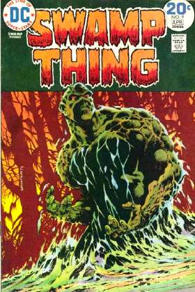 Swamp Thing #9 (March/April 1974) – art by Berni(e) Wrightson
And of course you knew I’d be starting off the list with a Swamp Thing cover, right? This, I think, is probably the quintessential image of the character, rising up out of the swamp, a look of menace on his face. Unusually for the title (and most comic titles in general at the time), the cover doesn’t really tell you anything about the contents, aside from the fact that there might be some kind of swamp creature involved. You couldn’t tell that the story for this issue involves an extraterrestrial encounter, could you? I think Marvel may have learned from this example, with its endless stream of indistinguishable “Spider-Man swinging through the city” covers it’s had over the last few years. But perhaps I digress.
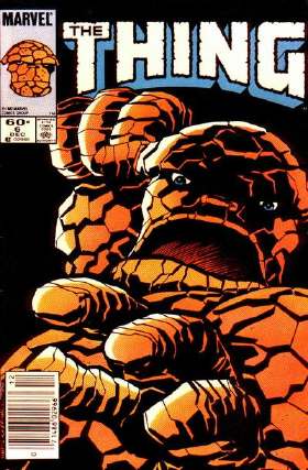 The Thing #6 (December 1983) – art by Ron Wilson & Brent Anderson
This striking cover (har har) is unusually somber for a Thing comic, with the stark black background, though it matches the story within (as the Thing, trapped within the confines of his own mind, wanders through darkness). There is a slight element of humor to it as well, I think, as you’re given a villain’s eye-view of what it looks like to be on the receiving end of one of Mr. Grimm’s clobbering times.
And, apparently, I’m not the only one who liked this cover.
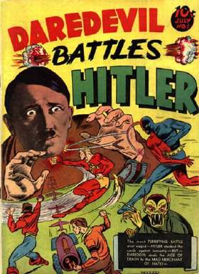 Daredevil Battles Hitler #1 (July 1941) – art by Charles Biro
You usually can’t go wrong with a wartime Hitler cover, but this one is the standard by which all other anti-Hitler comics are judged. The look of terror in the Fuhrer’s eyes is really what sells it.
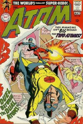 The Atom #36 (April/May 1968) – art by Gil Kane
This cover contains three elements that I always enjoy on my superhero covers. 1. Two different versions of the same hero (in this case, the Silver Age and the Golden Age Atoms) fighting each other. 2. Design elements that play on the fact that this is a cover on a comic book (the G.A. Atom being punched “through” the cover). 3. A near-perfect example of one of Gil Kane’s patented “body thrown backwards by a haymaking punch” poses. Absolutely beautiful.
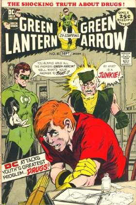 Green Lantern #85 (August/September 1971) – art by Neal Adams
If I may quote:
“You always have all the answers, Green Arrow! Well, what’s your answer to that–?”
“My ward is a JUNKIE!”
This cover is the very definition of the “relevance” fad that ran through comics in the ’70s. And also started off a lot of jokes about Green Arrow’s sidekick being named “Speedy,” but I won’t go into that here.
And I’ll quote that heart-stopping dialogue, from memory, at the shop given even the slightest provocation. It’s sad, really.
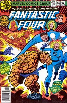 Fantastic Four #203 (February 1979) – art by Dave Cockrum & Joe Sinnott
Okay, some covers are my favorite because of some of the questions they raise. In this case, apparently the Fantastic Four “becoming monsters” involves, in at least in the case of the more human-formed members of the team, getting bad hair (or long, flaming eyebrows). Now the Thing, it could be argued, already has a monstrous form. But to make him even more monstrous, he gets…bigger eyebrows. Ooh, scary.
 Man-Thing #1 (January 1974) – art by Frank Brunner
Like the Swamp Thing image above, this cover features the image I think of when I think of Man-Thing. (And there’s a sentence that could be taken out of context.) This image of the inhuman, misshapen Man-Thing, shambling out of the swamp, really instills in you the idea that this creature is not something you’d want to come across in the dark. Swamp Thing at least occasionally looked friendly and inviting and like everybody’s favorite special swamp-buddy. Man-Thing, with its vacant red orbs for eyes, its completely unrelatable facial features…it never looks anything less than menacing. Unless you think his nose looks like a green carrot, in which case, I don’t know what to tell you.
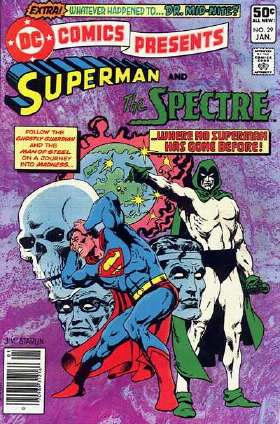 DC Comics Presents #29 (January 1981) – art by Jim Starlin
Here’s a case where the text cluttering up the cover darn near ruined the impact of the image. But, in this case, Starlin’s illustration of a suffering Superman, faced with the horrific images of his past conjured up by the Spectre, still manages to engage, despite the multiple logos and typefaces and the wholly-unnecessary cover copy.
 Brave and the Bold #177 (August 1981) – art by Jim Aparo
Well, aside from being another excellent piece of work by the late Jim Aparo, I’m not sure what attracts me to this particular cover, exactly. Well, aside from the fact that it’s something you don’t exact see every day on a comic book cover…one hero being used as a noose to kill another. The whole concept is just completely preposterous, but still…it makes you want to pick up the comic and check it out: “How the heck did Batman and Elongated Man find themselves in this pickle?” You don’t see enough bizarre and compelling covers that practically force you to pick up the comic anymore…and that’s a shame.
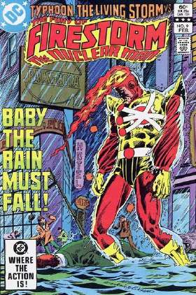 Fury of Firestorm #9 (February 1983) – art by Pat Broderick & Dick Giordano
This cover has stuck in my brain since I first bought it off the newsstand nearly a quarter of a century ago. I think it’s the incongruous mix of the dramatic mood and setting (a hero stands defeated, as the uncaring elements pour down upon him) combined with the sheer goofiness of Firestorm (the World’s Loudest Costume, not to mention his flaming head), and, for additional emotional impact, “BABY THE RAIN MUST FALL” in GIANT LETTERING. This cover is superhero melodrama in a nutshell, and I love it for that.
And that’s it for now. I apologize for any odd formatting that may occur above…I was kind of winging it, and it looks okay in my browsers, but your mileage may vary, as they say.
And, like I said, I’ll probably do another list soon enough…but if you have any favorites of your own you’d like to point out, please feel free to mention them in the comments section. I’d love to hear about them.


