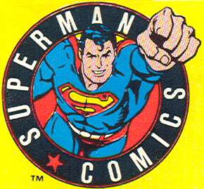
That is the corner company logo on the 1987 Justice League and Firestorm test-market variants I mentioned yesterday. More on that later.
I had some good comments on yesterday’s post, including commenter Joe, who wondered if both versions of that Amazing Spider-Man annual was in fact offered in comic shops. I’m fairly certain both were offered to retailers, but alas, I don’t have any of the invoicing material from that period readily available and it predates my funnybook-selling days, so I just don’t know.
As to Joe’s X-Men #1 comment, that reasonable people would have just bought the fifth variant that had the gatefold cover that featured the images from the other four covers…well, if memory serves, the covers were released one a week, so that if you wanted the gatefold cover, you had to wait over a month to get your hands on it. But if you were any kind of X-fan, well, you weren’t going to wait that long, were you? Especially for a new X-Men #1 written by Chris Claremont and drawn by Jim Lee? But, as Joe says, some people were indeed content to wait for the final version, and others just bought whatever cover was handy. And too many bought every single version.
Commenter Porkspam brings up a related subject…the difference between “newsstand” and “direct market” editions, which used to be that the newsstand comics had UPC codes and the ones in comic shops had a picture, or advertising, or the like in its place. (Or, as has been the case for the last few years, a different UPC code with a “DIRECT SALES” notation.) In general, the only difference between newsstand and direct market comics is just the UPC code, and the various price guides’ stand on the issue is that one version is not more “valuable” or “collectible” than the other. I should note, however, that it’s been my experience that there are a number of collectors out there who do in fact have a preference, who don’t want the newsstand edition of certain back issues in favor of the direct market version. If this becomes a common enough phenomenon, the price guides may have to reflect it.
FM Zombie made me slap my head and go “duh!” I completely forgot about DC’s Man of Steel mini-series from the mid-80s, the one that completely revamped Superman and established his new, permanent status quo…well, permanent at least until a couple years ago, but that’s another post entirely. There were two covers for the first issue…an extreme close-up of the Superman logo, as revealed beneath Clark Kent’s shirt, and another that matched the cover designs of the rest of the mini-series, with Superman standing to the right of the cover, with an action scene on the left-hand side. So, as far as I know, this is the earliest variant we’ve uncovered so far. (Though, as Martin says, I can’t help but think that there was something much earlier than this.)
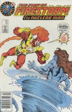
And now, to the test-market editions…Daniel wanted to know more about ’em, and Bob beat me to the punch by linking to scans of the variants in question (one of which, the Firestorm issue, I’ve, ahem, borrowed for this post…go to Bob’s links for much larger images).
I don’t know the background on these, but it seems pretty clear that DC was trying out a simpler cover design that would hopefully appeal to younger readers, a corner logo that emphasized that this comic was from the company that brought you Superman, and with that cover element that’s used all too infrequently nowadays, word balloons. 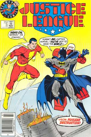 As Eric L mentions, the west coast was one of the areas where these covers were distributed, and as a result, our store has a pile of the Justice League variants that have arrived in collections over the years. Although we have easy access to this particular variant, because we were a test market, demand is rather slim for these locally. By contrast, though the Firestorm was available in our area (I bought one from a local newsstand myself), it never turns up in collections. I think, counting the one I owned (I’ve since sold it), I’ve seen a total of two over the years. It’s almost certainly because there are a lot more issues ordered of the third issue of a high profile series like Justice League, than of the sixty-first issue of a second-stringer like Firestorm. But, for all I know, there’s some store out there with a pile of that Firestorm!
Since we never saw those particular cover designs (or that logo) ever again, I’m guessing that whatever DC was hoping would happen with these didn’t happen. But looking at these did make me wish for the days of word balloons and text-heavy covers that practically dared you to pick up the book and read it. I remember processing a large collection of Sgt. Rock comics that we’d purchased for the store, and having a really hard time not wanting to open every issue and see what the stories were behind the covers. And let’s not forget the two greatest “I gotta read that issue!” covers of all time…“Why do these initials mean death for the Man of Steel?” and “Stop! Don’t pass up this issue! My life depends on it!” Man, you had to read these!
I’m not saying that covers on today’s comics are bad, by any means. A lot of them are nicely done, and some are quite beautiful, but while the covers are striking, they’re not necessarily compelling. While those thirty covers in a row of Amazing Spider-Man, where Spidey is swinging on a web between buildings, may be drawn well, there’s nothing on the cover that would make a casual reader think “boy, I wonder why Spider-Man is swinging on his webline? I’d better grab that issue and find out!” Compare that to, for example, this. “Holy $#!*! Blackhawk’s fighting flying cavemen?!? The hell? I gotta read that!”
So it’s a shame that DC’s ’87 test-variants didn’t work out. Different newsstand covers designed to grab the attention of young readers with simpler, more compelling designs, with word balloons and other similar cover elements…those are variants I could get behind.


