So in response to my brief mention of DC’s new logo yesterday, commenter Jim expressed his personal fondness for this rather Spartan variation of the DC logo:

It’s plain, but it’s bold, and it certainly stands out.
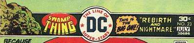
Commenter Cole’s favorite is the “DC Line of Super-Stars” logo, which I also like…

…though DC didn’t do it any favors when, for a time, it was squeezed into the center of a really busy banner at the top of the cover:
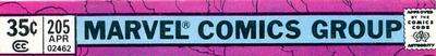
Most of Marvel Comics’ company logos never really did anything for me, though I will admit a certain nostalgic feeling for the “Marvel Comics Group” banner:
But, honestly, Marvel has yet to top this:
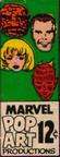
I wish they’d start using that again.


