We interrupt our series of Death of Superman posts to talk about one of the artists of Death of Superman.
Going back to Monday’s post, the amazingly-handled LouReedRichards has this to say in the comments:
“You mentioned Jon Bogdanove, which made me think of something I’ve wondered about for quite awhile.
“His art seems to be disliked by a large number of fans, at least that’s the impression I’ve always gotten from responses I’ve seen online.
“I’ve always enjoyed his work, it has a life and vitality to it that many artist seem incapable of achieving.
“I never followed him on a monthly series, but I’m always happily surprised when I run across his work.
“His work seems criminally underrated. Is this a misconception on my part?”
As some of you may recall from around this period of Superman comics, there were three (later four, with the additional of Man of Steel) monthly titles coming out, effectively making the Superman books a weekly, with a new issue every seven days. (A fifth quarterly title, Man of Tomorrow, was added to fill the occasional fifth week in a month that would sometimes pop up.)
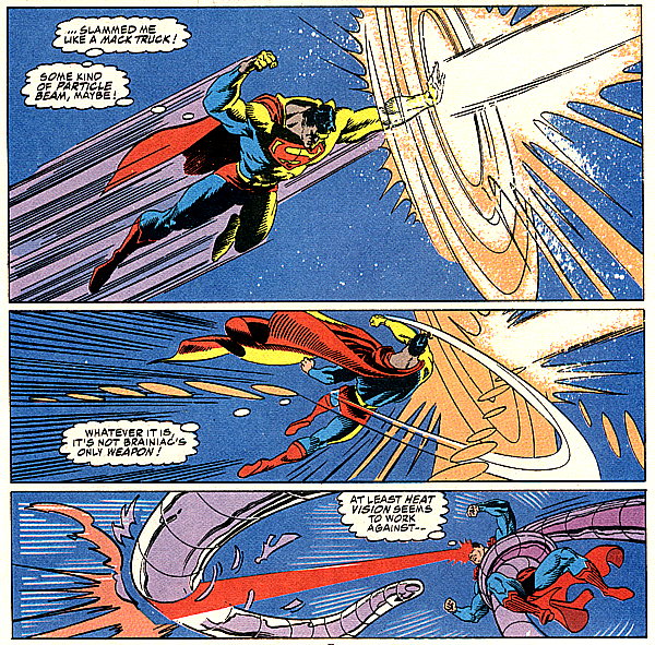
Jon Bogdanove was the regular artist for that Man of Steel series (with Louise Simonson on writing chores), and of the different teams that worked on each book, his style was maybe the most…non-house style-ish of the bunch? Now, I didn’t dislike his work, but if you asked me early on which of the four books was my least favorite, I probably would have said Man of Steel, partially because it was the odd-man-out in terms of how it appeared, but mostly because I was a dummy who didn’t know how to respond to something outside my narrow expectations.
I was definitely wrong in my stance, but I have a sense was there were others who felt the same way, probably for similar reasons (style doesn’t match the other books, and also people being dummies). No specific evidence for this, other than maybe seeing other fan comments in the ‘zines or perhaps even the lettercolumns of the Super-books themselves.
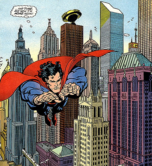
Now I know I’ve poked some gentle fun at Bogdanove’s work on this site before, with this bonkers Superman promo poster, but let the record show that I did come out in support of the man’s work in a following post. And like I say in that second post, his art is fun, stylish and energetic.
I don’t have the old store’s sales figures for the Superman line to do any comparisons. Yes, I know, logically, if the four (or five) titles effectively functioned as one serialized weekly comic, they should all sell the same, but believe it or not, that’s not how it worked, least not at our shop. (Action was probably the lowest selling, since it’s the one that doesn’t have “Superman” in the actual title.) I don’t remember anyone in our comic saver service excluding any specific Super-title from their lists…if they got one, they got ’em all.
So to sum up…Bogdanove’s work was fine, just (for me) took some getting used to because it looked so different from the other people who were generating Superman content. Actually, you know what Superman artist Bogdanove’s unique and fluid artwork reminds me of?
Joe Shuster.
…I’d say that’s pretty good company to be in.
Is he underrated? Yeah, sure, probably. Lots of comics artists are. That’s practically the definition of “comics artist” 99% of the time. And it doesn’t surprise me his art is getting some static from online commentators…online people don’t like anything.
Maybe some people don’t care for his work…as I said in this long-ago post, that’s fine, not everything is for everybody. But you, LouReedRichards, you and I, we’re Jon Bogdanove-liking buddies, and rest assured there are plenty of other fans out there who love his work as well, on the Superman titles and elsewhere.


I had a similar reaction to Bogdanove’s work — in retrospect I see its charms but it was a jarring switch from the renditions of Dan Jurgens, Tom Grummett, Bob McLeod, etc. I feel like Bog got even looser after the Death of Superman storyline, and his rendition of the Supermullet was the wildest and most out of control of the bunch.
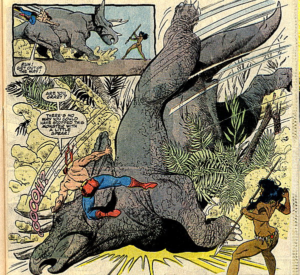
There was a plotline toward the end of that era of Superbooks in which Man of Steel featured a multi-issue dream sequence or somesuch that aped 1930s Superman comics, and Bogdanove was really in his element there.
Mike, do you realize today is the two-year anniversary of the day you blogged about Morlock 2001 and the Midnight Men #3? Your scans impressed me so much that I bought a copy.
And two years later, Gary Friedrich, Steve Ditko & Bernie Wrightson are all dead.
Coincidence???
…Well, yeah.
Bogdanove’s artwork started out looking a little more “traditional” when the book launched, IIRC, and then got more stylistic over time, but I was never sure if that was him or a change in inkers. I was always more a fan of the cleaner style of a Jurgens or Grummett, but I liked Bog’s art, too. It stood out.
Also, it was cool that, at least at the time, he lived in my home state of Maine and had a really good relationship with my LCS, so him coming to their signings and, eventually, conventions led to the Simonsons also coming to those same cons, and then the entire Superman team. They also befriended the entire Milestone team, and the convention where all of the Superman folks and all of the Milestone folks were guests is where they first concocted the idea for the Superman/Milestone “Worlds Collide” crossover.
Very little comics history gets made in Maine, so I always thought that was pretty awesome.
He was consistently my favorite, or at least one of my favorite, of the 90s Superman artists, specifically because of how energetic and stylized his work is. I just read SUPERMAN BLUE in trade recently, and it is very weird how radically the art style changes every 20 pages in that book, though…I suppose it was less notable when one had to wait at least a week between issues though…
I’d long stopped reading comics when he would have done Superman, but I was a big fan of his when he was on Power Pack in the 1980s. His style had a real energy to it and the kids actually looked like kids. Compare his Franklin Richards to John Byrne’s from the same time period, who looked like a shrunken Johnny Storm.
I honestly had no problem with Jon Bogdanove’s art at the time on the Superman books. It certainly stood out from the rest of the line, which was still a bit 80s DC in the Byrne/Ordway/Perez tradition and definitely wasn’t in the Image style that was everywhere those days. The problem was, if you coupled that odd look with the less than impressive writing Louise Simonson was doing, you had a book that most people found easy to pass on.
My memory of reading the books from the start of Death of Superman to the end of Reign was that every four weeks, I’d sigh because it was Man of Steel time, but that was largely caused by the pedestrian writing, not the art. The art was energetic and fun.
Thanks Mike!
It’s good to know that he’s appreciated. I appreciate you taking the time to address his work/my concern.
I’d never made the Shuster connection, but dang, that is nice company!
I guess I really should hunt down more of his Superman work to see the evolution of his style.
@Bryan, Power Pack was where I first saw his work and like you, I was impressed with his ability to actually draw children. Byrne’s FF run is my favorite run of any comic, ever, but you’re totally right about how he drew Franklin.
Your Bogandove liking buddy,
Lou
I really liked his work when I encountered in on Man of Steel,never got into Power Pack so I missed seeing him there. His style reminded me of the aesthetic of the Fleischer Superman cartoons from the 40’s.
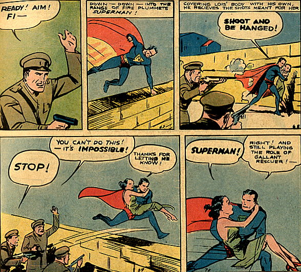
The resemblence to Shuster’s work did not go unnoticed back in the day. There’s a reason Man of Steel had the WWII-era story during that Kismet/split timelines thing.