Corduroy pillows.
Now, the thing about those images I posted yesterday…I know I read these comics when they came out. I, like commenter Dave-El once was, am a Superman comics completist, at least when it comes to the regular series themselves. So I bought all these Superman annuals for the year 1992, which all tied into the “Eclipso: The Darkness Within” crossover event for that year, and I read them all, and then I slid them into their plastic sleeve-thingies and filed them away into the vast Mikester Comic Archives.
I don’t specifically remember reading them, so I don’t recall my reaction at the time to seeing the art I provided examples of yesterday. I do have a vague sense of not generally caring for these particular comics, but it’s more a feeling of “I didn’t care for this crossover” than “these look really awful.” It’s very possible that, in the Image Comics/Rob Liefeld/extreeeeeeme-art era of the early ’90s, I just took the art in these books in stride…maybe a bit of an eyeroll, perhaps, but I endured it, read the story, and moved on. It’s just that looking at it now, and being able to see it as so indicative of the excesses of ’90s comics, when the need to fill pages was greater than the need for quality control, that the problems really stand out.
In fairness, not all the art in that Action Comics annual was so aggressively…whatever that was. It wasn’t great, or even good, but it was…passable, if wildly uneven, managing to get the story told even with the occasional “…the hell?” panel like that Superman splash.
That Captain Marvel splash panel actually wasn’t too bad artwise, even with the ropes of saliva dripping in his mouth. Mostly I posted it just because of the contrast between Cap’s traditional and ideal whimsical portrayal and his ill fit into ’90s storytelling extremism.
So, anyway: the 1990s. We sure put up with a lot, didn’t we?


I remember that issue, when Superman had the blood in his eyes. He had just found out Lois was in fact, made of Kleenex.
Personally, when I saw yesterday’s images, I was in agreement with Old Bull Lee’s comment. Those piccies aren’t great by any stretch of the imagination but, IMO, they’re not utterly terrible either. The Cap Marvel one looks quite good, other than the saliva strands.
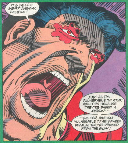
Today’s is worse though. There’s an overabundance of cross hatching and too much emphasis on Supes extremely large mouth. And I’m fascinated by that tongue which appears to be leaping up in defiance.
Holy HELL, that panel looks ridiculous. We really DID put up with a lot of crap in the ’90s.
Thank you, Nimbus. I wasn’t so much defending the 90s art as noting that there is plenty of sloppy crap in mainstream comics now, it’s just slicker.
20 years from now Mike Sterling Jr. will be writing a blog post about the horrible digital coloring fad of the 2000s, with a scan of a panel where Batman’s glove is 23 different shades of blue.
Sad to say, the 90s were clearly better than the 2000s for Captain Marvel and company, saliva ropes notwithstanding. And the crossover with Starman showed that he could handle the 90s just fine.
The dress-Mary-Marvel-up-in-fetish-gear 2000s? Not so good.
Superman looks like Elasti-Jay Leno here.
I admire the attention to detail indicated by the depiction of the Super-Uvula.
I laughed and laughed at that headline, Mike.
I love the 90’s. It was the era that cemented my interest in the artform and got me off my ass and drawing/writing my own books.
Sure it’s not up there with the ‘classics’ of the medium, but I also feel that it’s unfairly lambasted as a complete waste of everyone’s time. Lets not forget that comics have never sold so many copies before, nor will they ever do again. There must have been SOMETHING that people saw in those books besides funding their kids through college with a copy or X-Men #1 (Cover E).
“Lets not forget that comics have never sold so many copies before, nor will they ever do again.”
Is this true? I had been under the impression that during the 1940s, the most popular comics titles were regularly selling over a million copies monthly.
The 90s broke me, broke my heart and broke a 20+ year run of funny book collecting.
— MrJM
I remember the Superman stuff from this era going from Butch Guice, Kerry Gamill and Bob McLeod to….this. Not a good time to be a Superman fan.
1) I got hyperlinked by Mike Sterling! How cool is that?
2) The artist for today’s horrendous distortion of the Man of Steel may not have been solely to blame. Perhaps he was dealing with a coked up temp in the editor’s office screaming “Lines! I need more lines! Give me more lines!” and took it as art direction.
3) At the beginning of the Byrne era revamp, reading Superman was truly addictive: everthing was new, being reinvented; stories were tightly co-ordinated with characters developing and events progressing. Ex: The slow build evolution of the new Brainiac. (The new Brainiac is a circus mind reader? C’mon! But the editors kept saying “Trust us” in the lettercols and I did and it paid off.) Or the mystery of Lex Luthor Jr (“They Saved Luthor’s Brain”). But after awhile (particularly after Stern left Action Comics), things appeared more scattershot, widely careening from event to event. By then, Superman was less an addiction and more of a habit. I wish Superman could be addictive again.
When did Al Gore get heat vision?
I was 13 at the time and I loved the crossover but I do remember hating the art on this. I seem to remember the same artist on another part of it too, maybe the Justice League annual?
I think in my case it was because I was solely a DC kid and had never seen this kind of messy anatomy and linework before. I knew it was out there and I avoided it.
I missed most of the 90s excess, and own but a few Image comics. A friend gave me – flung out in disgust – the DC Vs Marvel collection a couple years ago, though, and I found out what I’d been missing. Check out Spider-Man on the first page, the very first page of the crossover fans had waited 30 years for. The twisted pretzel pose, the disregard for anatomy, the horribly skewed perspective in the background that puts Spidey 80 storeys up and still able to make out pedestrians’ outfits. It has to be the ugliest piece of art I’ve ever seen.
Yesterday’s artist stood out to me as quite sub-par mostly because I encountered his art as one of the fill-ins for Alan Davis on his first Excalibur run. Art that can pass muster in a random annual doesn’t quite have the strength to match up to a master like Davis.
On the other hand, it was during the ’90s that I discovered Stuart Immonen and that guy was and is dynamite.
“Is this true? I had been under the impression that during the 1940s, the most popular comics titles were regularly selling over a million copies monthly.”
No, it’s not even REMOTELY true. Action Comics, back in the 1940s, sometimes shipped over a million copies monthly (though actual sales were probably closer to 800-900,000). By the 1990s, comics weren’t selling very well at all. Comics sales numbers have steadily declined over the decades, especially with the rise of the direct market. And while someone might have funded their kids college education with those variant covers and the pandering to the speculative market in both the 80s B/W explosion and the 1990s variant cover madness…many more lost a LOT of money, the publishers in particular.
The 1990s left a LOT of publishers dead on the road. It wasn’t a bleak wastlenad, but for every Vertigo, there was a Malibu. For every Dark Horse, a Valiant.
I was bitterly disappointed when it looked like Wozniak was taking over as full-time artist on Excalibur. It was my absolute favourite comic at the time and the apparent loss of Alan Davis was heartbreaking.
I’ve come to appreciate Wozniak’s clumsy chunkiness a bit more over the years, but I’ll always be a Davis man.