Aparo Vs. Sienkiewicz.
So I posted that pic from a Batman comic featuring Bill Sienkiewicz’s inks over Jim Aparo’s pencils, which resulted, as some of you noted, in a seeming mismatch of artistic styles. Aparo’s clean lines (some samples of which you can look at here) are fairly well overwhelmed by Sienkiewicz’s much looser and scratchier style, but not always to poor effect. I thought I’d run a handful of panels and sequences from the book to present more examples of this particular collaboration. I’m no art critic, so my comments are mostly limited to “DUH, HERE ART, YOU LOOK,” so please excuse my lack of informative presentation.
While the faces from the previously posted panel looked a bit…off, to those of us used to Aparo’s usual illustrations of those characters, I like this portrait of the Penguin:
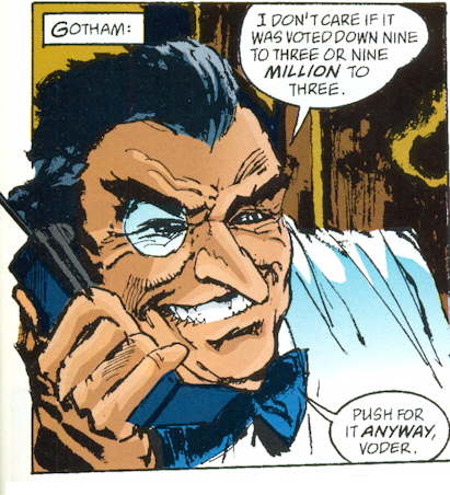
That almost looks like a caricature of an actual person, which makes the Penguin appear actually somewhat menacing.
The action sequences in the book come across okay, like this one:
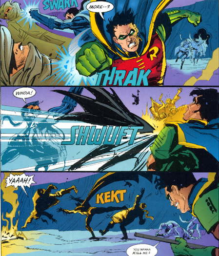
In general, the Aparo layouts come through fine, it’s just the details, particularly on the overrendered faces, that the discordance sets in.
Batman looks a little awkward in this panel, but I don’t know if that’s a layout problem or a finishing issue:
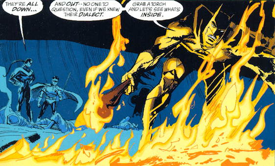
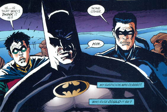
That’s fully an Aparo eyebrow on Robin in the first panel, there.
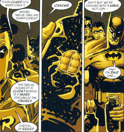
There are several pages in this story colored with a limited palette, like the above panels, and that seems to work to the art’s advantage, adding to the moodiness of the proceedings already enhanced by Sienkiewicz’s sketchy style.
This last panel from the story is quite moody and effective, I think…Nightwing’s a little on the wrinkly side, but crimefighting ages you, man:
Overall…an interesting experiment, but I think I prefer Aparo on his own. Or Sienkiewicz on his own. I’d totally read a regular Batman series drawn by Sienkiewicz, come to think of it.


I knew their faces looked weird in the previous post, but I put it down to mid-nineties weirdness, not artist/inker weirdness.
Really, if there’s any crime against art here it’s Nightwing’s rat-tail. That thing is just…what was it with DC and bad horrible hair on dudes in the nineties?
Looks like a poor attempt to ape Frank Miller and Klaus Janson’s style to me.
Bring on the Sienkiewicz Batman! That would be rather nice…
I never really appreciate Seinkiewicz when he inks other artists. His work over Sal Buscema on Spider-Man sounds great in theory, as I love both artists, but again, it just didn’t appeal to me.
But, but, but… Who is it?
Yeah Mike, now you’ve posted so much you actually have people sucked into the mediocre story!
The other trademark Aparo details are missing, not just the faces. The realistic precision clothing wrinkles and other textures are gone. Seems like a minor thing, but it’s one of those little Aparo touches that always made his art feel a three-dimensional.
I’m going to guess……Ra’s al Ghul?
[quick google]
Yup. Ra’s al Ghul.
I think we need more comics by Sienkiewicz in general! I’m one of the few people who bought and liked Stray Toasters way back when. Hell, I bought Daredevil #600 or #1200 or whatever it was just for his art! Same with Season 3 of the Venture Brothers (which I thought was weak on the whole, but whoo! that cover!).
I have very fond memories of this issue. So much so that, for no particular reason other that I probably read it too many times, I remember by heart one of its key dialogues:
Batman: Our legs can use the work.
Robin: He never lightens up, does he?
Nightwing: He’s THE BAT, man!
Pure Moench goodness.
For what is IMHO the best result of the collaboration between Aparo and Sienkiewicz on 90s Batman, check out issue 534, set in Calcutta. One of my favourite Batman comics ever.
So, have their been any all Sienkiewicz art Batman stories?
@ JRC
As far as I can remember, only one that comes to my mind is a Batman Black and White short story, in which Batman beats Blondie’s husband to a pulp. (Honestly).
Aparo/Sienkiewicz is a really strange pairing, though these examples of their collaboration are much less … awful(?) than the earlier panels you posted. I like both men’s work a lot (I’ll second the Stray Toasters comment above) but their styles are really at odds.
Dear God! Nightwing’s hair needs its own panel to contain it!
Huh…. I love Aparo, and am not a fan of Sienkiewicz. (At the very least I think he’s wildly overrated, but I won’t go into that spiel now.) But I thought the combination of the two was, if not great, fairly satisfying. At the time, Aparo had pretty much stopped inking himself. For the most part his art was being inked by the likes of Mike DeCarlo, whose inking was roughly in Aparo’s style but vastly inferior to Aparo’s own (which itself had started declining somewhere around the mid-100s of Brave & Bold). The result just looked like (very) bad Aparo. By contrast, the Aparo/Sienkiewicz combination was its own animal, and the rough texture made for a novel contrast with Aparo’s self-inked art.
Sienkiewicz drew a 7-page chapter of the Moench-written Batman #400 – not a full story, but it’s Sienkiewicz Batman continuity art.
@ HPL, thanks. I actually remember that one from a hardcover coolection–check your local library friends!
@ JRC: you’re more than welcome! Now I _have_ to go and find Batman 400, tho…
I’m with the Humanatee on this one: if you check the Aparo Knightfall issues, where he’s inked by Karl Story IIRC, well, it’s decent but kinda… dull. I remember when Bill came aboard, it felt like a breath of fresh air. And it’s still fresh, at least to my eyes.
Also, Aparo and Sienkiewicz paired again on a mini called GCPD, written by Dixon, anticipating Gotham Central, at least in concept.
Sienkiewicz drew the last chapter in a Batman 80-Page Giant from around 2000. It was a run-of-the-mill comic featuring Calendar Man, until the Sienkiewicz pages. Then, the comic turned suitably crazy.
Steven Grant wrote a Batgirl vs. Joker story in the late ’90s or early 2000s. Part of it was drawn by Sienkiewicz, part by Terry Moore (IIRC). It was released as a with the DC Firsts specials.
As noted above, he had a few pages in Batman 400 and Batman: Black & White.
I always liked this pairing. Aparo did good solid work, and that structure always came through, but it had more animation due to Sienkiewicz style/sketchiness. I always felt that this, while unconventional, made both artists work look better.
One weird collarobation that I thought worked surprisingly well was John Byrne inking George Tuska’s pencils in Champions #17, that series last issue. Byrne laid on a really heavy line, which suited Ghost Rider particularly well.