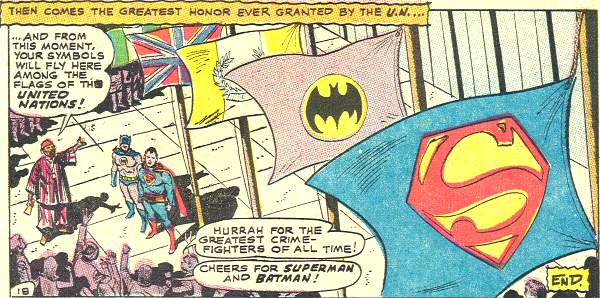
If only life were like that.

from World’s Finest #183 (March 1969) by Leo Dorfman, Ross Andru & Mike Esposito
Hey, I didn’t even realize when I pulled this comic aside that its cover date is the very month and year of my birth! (Its actual release date was likely a month or two previous, I think.) Huh, neat. To think my birth coincided with the raising of the Superman and Batman flags at the United Nations…where they fly even today.
Anyway, you guys had some comments on the redesign from yesterday, so let me respond to a couple:
Just Some Guy sez:
“Oh god! Searing pain in my retinas! The glare… too bright!”
Yeah, it is very…white, isn’t it? I’d been dead set on duplicating the exact look of the old site, which is one of the reasons it’s taken me so long to upgrade…I kept fiddling around with WordPress templates and getting frustrated and giving up. But I think this layout is a lot more open, and a lot less, I don’t know, 2003. I think I can live with it.
Plus, I finally changed the banner. Having some old friends staring back at me from across the top of my site helps ease the transition.
Walaka wonders
“Um, isn’t the apostrophe in your title backwards/upside down? What’s up with that?”
What, indeed? That’s just how the apostrophe is in this particular font used by this theme (Hanami, if you were wondering and if you hadn’t yet peeked at the link at the very bottom of the page). To tell the truth, it kind of bothered me at first, but just a little, and I kind of like it now. Just a little bit of weirdness in an otherwise stately design.
Plus, when I looked at the site on my work computer, it just had the standard straight-line computer apostrophe, so I guess whatever font that is isn’t installed in the shop’s computer. I just used “computer” three times in that sentence.
Pal Andres asks, in regards to my old comments:
“If I read the Blogger update correctly your old site will still be accessible, right?”
Well, it could be, if I go through the trouble of setting it up, but then I’d have two copies of my site on the internet and that could be confusing and screw up Googlers and Bingers and such. I mean, I could adjust settings so that Google wouldn’t index the other site or whatever, but one of the reasons I made the transition over to WordPress in the first place is to kind of keep things simple and in one place. Google’s new set-up would have required fiddling with subdomains and redirects to where Google would be hosting my actual posts, while all the media would still be served up by my hoster, and feh on that.
Employee Aaron declares
“The whiteness of your site will burn my retinas every morning from now on! Soon we will have progressive ruin the social networking site so we can compare Swampthing embroidered doilies!”
You’re fired.
C. Elam gives me more gray hair by suggesting
“I am sure you will be working on fixing links on a prodigious number of your entries, because that is the sort of thing that bothers folks like us. Good luck getting things back to ‘normal.'”
I do plan on fixing some of the internal links to other posts, but it’ll be a slow process since I’m gettin’ near to 3000 entries on this site, and I’d like to be able to sleep sometime. I’ll probably focus on the most recent year’s worth of posts, and work backwards from there.
Former employee Ray (and, in fact, the guy I replaced here at the shop!) pleads
“But you have to get the 1969 thing going. I MUST KNOW what you have done since 1969.”
I think instead of the rotating banner I used to have, that would display a new “since 1969” phrase every time you reloaded the site, I may instead be changing the phrase manually in my banner up there. Not quite as dynamic, I realize, but not everything can make the transition, I’m afraid!
I don’t have the rotating “what people are saying about PROGRESSIVE RUIN” thingie anymore, either, but I do plan on throwing those quotes onto my mostly-empty “About” page. Yes, even the one Dirk wrote about me six years ago about being “one of the better new comic bloggers to emerge so far this year.” I’m hanging onto that quote for dear life.
Ed queries
“Any plans to expand the blogroll to something approaching its former glory?”
Oh, yes, absolutely. But it’ll be a separate page, accessible via a button next to “HOME” and “ABOUT” up there by the banner. Assuming I can do that, that is. In fact, I would have done that today, except I spent all my blogging time doing that swank new banner image. (Who’s not a Photoshop expert? THIS GUY.)
One of the things that bothered me most about the other site is the sheer number of links in the sidebar. It looks cluttered and cramped, but I didn’t want to drop a bunch of links, either. By putting the links on a separate page, that’ll likely encourage me to add lots more of them, so hopefully I can get started on that soon. The links I do have in the sidebar were just kind of put up there to have a blogroll, and are mostly my closest internet pals, the folks with whom I do Fake AP Stylebook, and the mighty Neilalien, the first and most powerful of all comic webloggers.
Anyway, I hope that answered some of your questions about the site. It’s still a work in progress, and again, thank you for your patience and your readership. (And a reminder: you’ll probably need to resubscribe to the syndication feed for your RSS readers…just flip that little chromium switch there at the top of the page.)
In other news:
- Employee Aaron’s girlfriend Mel had a drawing of hers printed in Tank Girl: Skidmarks #3, out this week in a funnybook store near you. Well, okay, we sold out already, but it’s available for reorder and I’ve got more coming! Here’s a little snippet of it:

Pick up the issue and check out the whole pic! Oh, and read the rest of the comic, too. After you pay for it. With money.You can also visit her Deviantart site and take a gander at her pictures…which, um, may include that same Tank Girl drawing, BUT GO TO SHOP AND PAY MONEY FOR COMIC. Thank you.
- This gentleman is putting together a list of the “100 Best Comic Book Covers” from 1980 to present, and I’m sure he’s going to get a lot of “um, you forgot” and “wow, really?” responses that these lists always get, but hey, a lot of those are nice images. So anyway, go check it out. Tell him he forgot this cover.


Well, I must say that I like the white background. It’s simple yet stylish. (I also helps to camouflage my web browsing amongst all my white background technical documents whilst I’m at work).
And, regarding that apostrophe, it looks okay to me. Mind you, the font you use on this site – including the header – looks like Times New Roman to me. Is that intentional? (I’m personally not a fan of serif types myself).
Otherwise, good to see a more fitting banner! And a great ‘new’ site!
Thanks for the link, Mike, And I didn’t include that cover from the series, but there is another one from that series coming…
I wonder if you have considered the possibility that your blog’s “new look” might in fact be an alien symbiote that ends up biteing the arms off other blogs and stuff. You can’t just go around picking up strange blog layouts and fonts off of alien worlds every time theres a secret war, you know.
Hey, this loads a LOT fasteron dialup than the old site! Much obliged!
Oh man, someone else still uses antiquated dial-up? My condolences, Rock Ripsnort. (this name will delight me for days)
And Mike, you know I hurt because I love.
Seriously though, I think you should just work on your site as much as makes you happy and call it good. Which, you update every single day, so you’re a lot more committed than I ever will be. I mean “committed” in the nicest possible way, too.
If you are in need a new pull quotes, I posted this last month.
http://christopherelam.blogspot.com/2010/01/suddenly-one-year-later.html